Category: Uncategorized
-
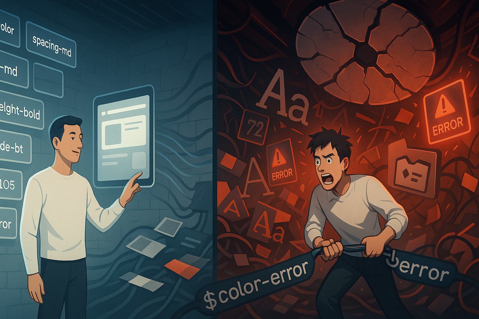
My Ongoing Love-Hate Relationship With Design Tokens
If you’ve ever found yourself knee-deep in a sprawling design system, tweaking a single button only to realize that half the app now looks broken — congratulations, you’ve probably tangled with design tokens. I have. More times than I care to admit. And that’s what brings me to this brutally honest confession of my ongoing…
-
The Figma Plugin That Saved My Career
I still remember the exact moment. It was 2:43 AM, my third cup of coffee was cold, and the deadline was a few hours away. I stared at my Figma file—layers overlapping, assets misnamed, spacing off by pixels, and design tokens scattered like confetti. I had promised a flawless design system handoff for a major…
-

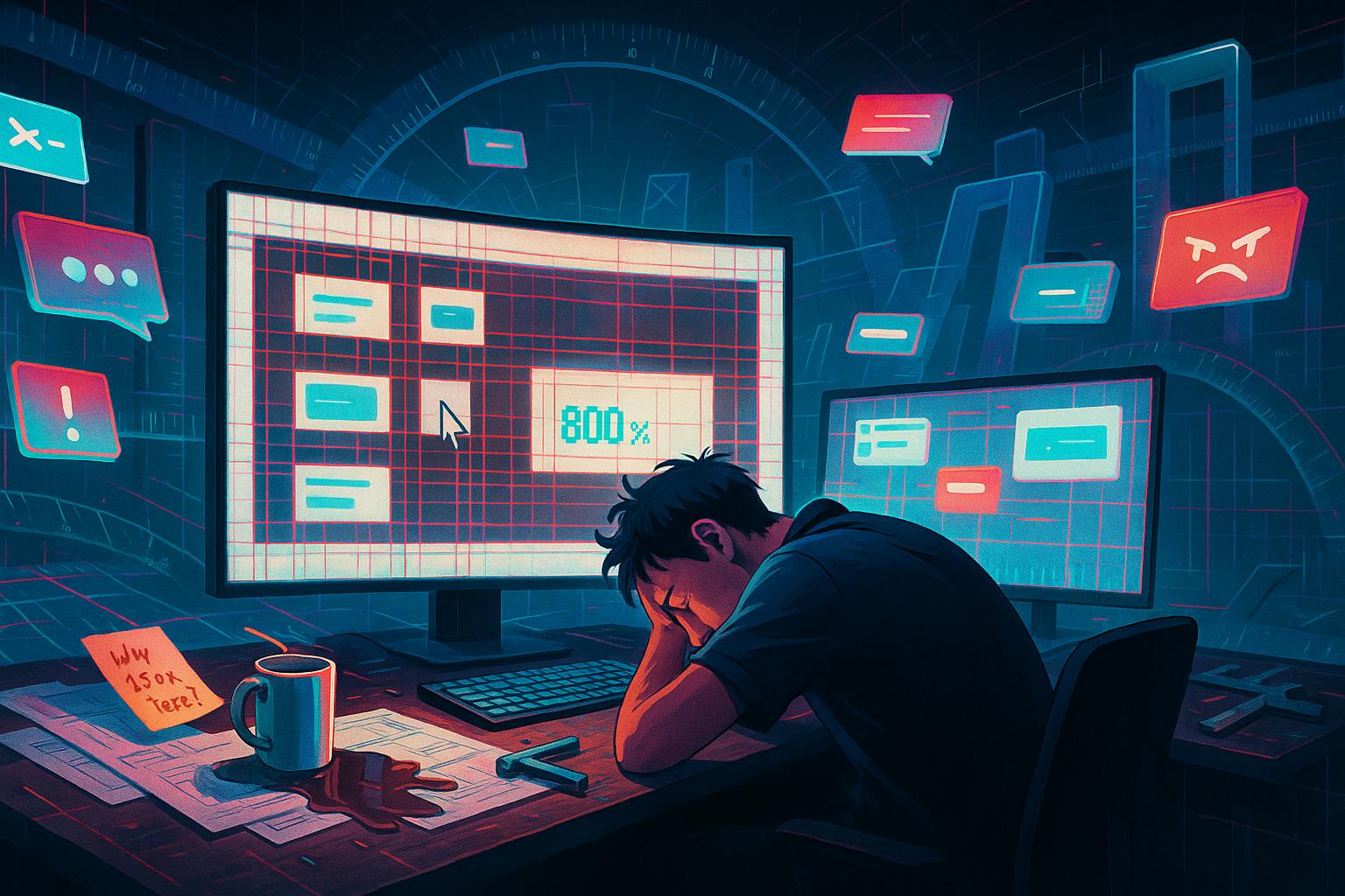
When Animations Go Wrong: My Frustrating Path to Smooth Transitions
There’s a very specific kind of heartbreak that only developers and designers know — it’s not when a feature doesn’t work, or when the API fails, or even when a deploy crashes the entire staging site. It’s when your animation looks janky. That’s what happened to me. What started as a quick “add some nice…
-
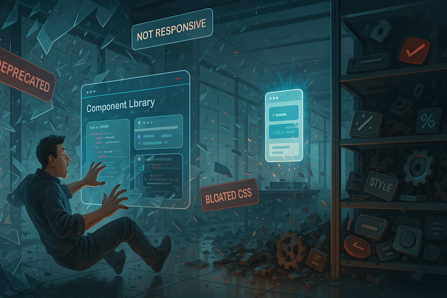
The Day I Discovered My Component Library Was a Lie
I remember it like it was yesterday. It was a cold Tuesday morning, coffee in hand, and I had just opened my editor, ready to knock out a few features. Everything was fine until I clicked into a component from our “custom” UI library and noticed something weird. Really weird. The props didn’t make sense.…
-
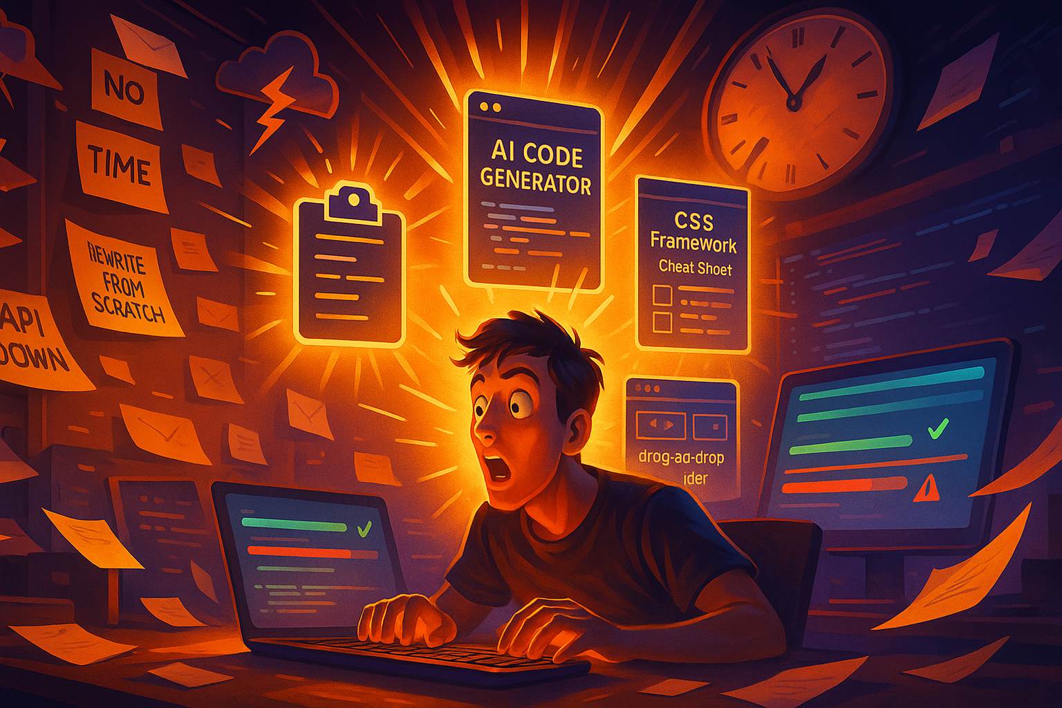
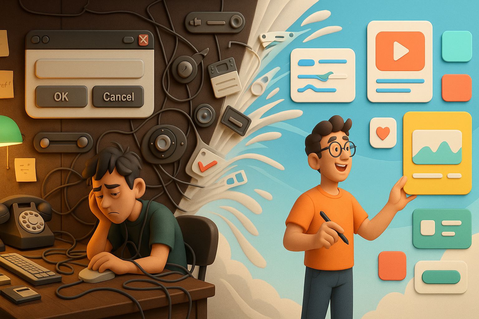
Tools I Swore I’d Never Use—Until They Saved My Deadline
I used to be stubborn about the tools I used. Like, comically stubborn. “Real developers don’t use GUI tools.” “Only lazy designers rely on AI generators.” “I’ll never need low-code platforms.” I said it all. And I meant it. Until one day… I had a deadline that wasn’t just tight—it was a full-blown ticking time…
-
Spacing Is Hard: The Tiny Pixels That Broke Me
There I was, proud of my clean, functional layout. I had just pushed a new design update live. It was sleek, minimal, with all the right typography choices and a grid that looked like it could pass a military inspection. Until… a user messaged me with a screenshot: “Is that text supposed to be overlapping?”…
-
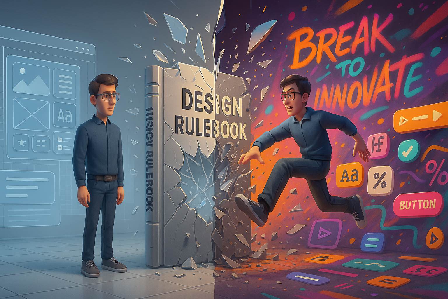
Why Every UI Dev Should Break a Design Rule Once
There’s a strange rite of passage many UI developers experience at some point in their career. You’re deep into the system grid, carefully aligning elements, keeping that pristine 8pt rhythm, your colors all sitting nicely within WCAG contrast compliance, and your typography dutifully obeys the hierarchy gods. Everything is correct. Everything is boring. That’s when…
-
I Gave Up Skeuomorphism and Found Joy in Flat Design
Let me take you back to a time when every digital button looked like a real-world object. You’d tap on a notepad app and see a yellow lined page, complete with a faux-leather header. Your calendar icon had shadows so deep you could fall into them. Back then, I was obsessed with making interfaces feel…
-
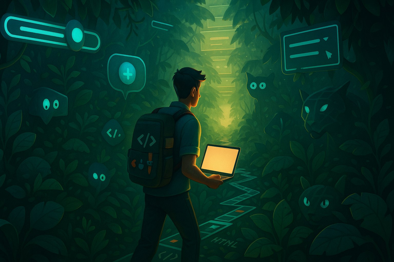
From Developer to Designer: My Journey Through the UI Jungle
When I started out in tech, I never imagined I’d care so deeply about the shade of a button, the weight of a font, or how generous my white space felt. But here I am—someone who once lived and breathed backend logic—now sketching wireframes on napkins and debating whether neumorphism is really dead. This is…
-

Dark Mode Drama: Designing for the Other Side
It all started with a late-night Slack message from a client: “Can we see what the app looks like in dark mode?” Simple enough, right? I had already designed the whole thing in a crisp, clean light interface with soft pastels and friendly blues. But this? This was the beginning of what I now call…