Category: Uncategorized
-
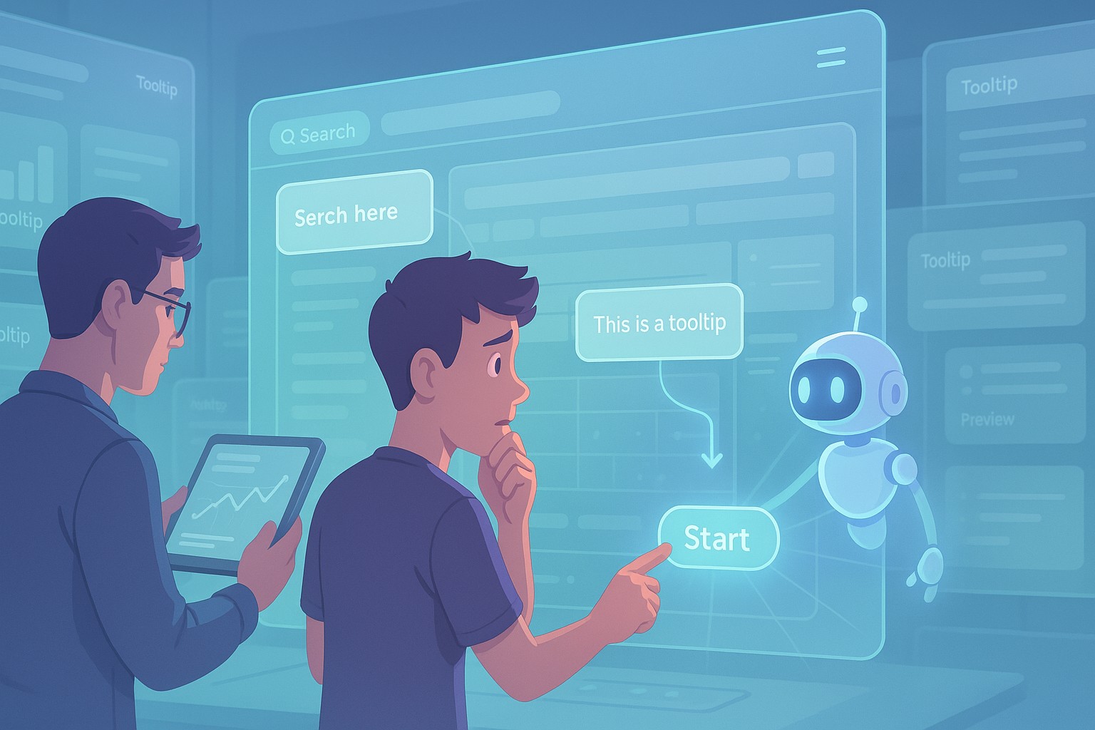
Contextual Tooltips and Onboarding: Reducing First‑Time User Friction
You’ve spent months designing the perfect product. The UI looks great. The features are rock-solid. But then users sign up… and bounce. No errors, no bugs, just friction. That awkward silence of a user landing in your app for the first time and not knowing what to do next. That’s where contextual tooltips and onboarding…
-

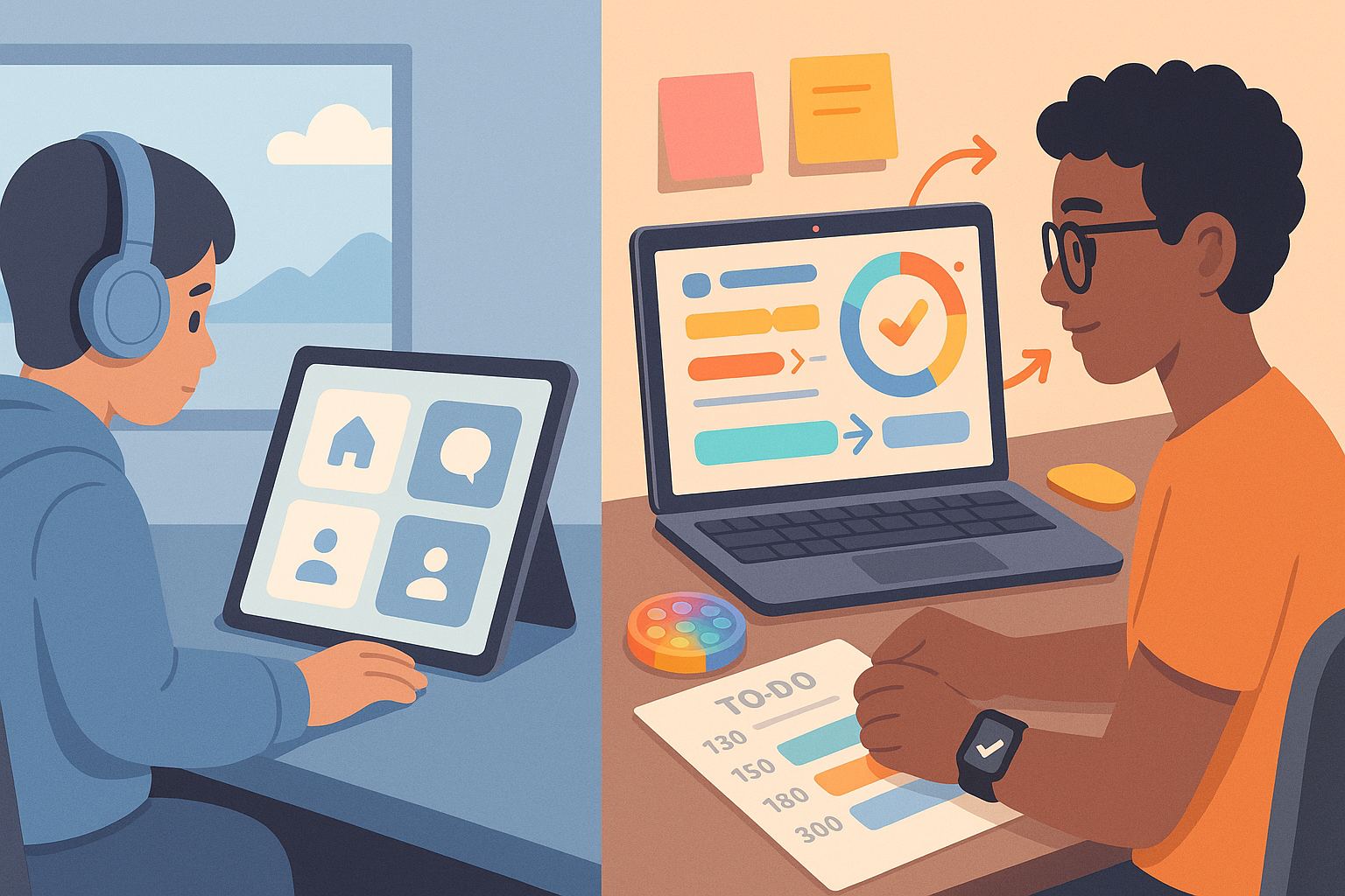
The Dark Side of Infinite Scroll: When Endless Content Hurts UX
When you open up your favorite social media app or news website, you might find yourself scrolling endlessly, diving deeper into content without ever reaching the bottom. That’s no accident—it’s a design choice known as infinite scroll, and it’s everywhere. It keeps users hooked, encourages more time on site, and serves up fresh content without…
-
Designing for Neurodiversity: UI Techniques for ADHD and Autism
You ever open a website and instantly feel overwhelmed? Or maybe you’re constantly clicking around trying to figure out what you were supposed to do? For most of us, that’s a minor annoyance. But for neurodivergent users, particularly people with ADHD or autism, poor UI design isn’t just annoying – it’s a complete barrier. Designing…
-
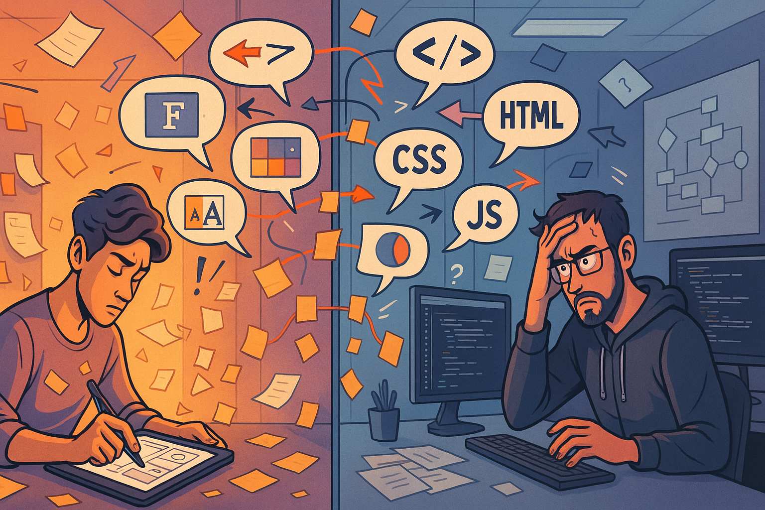
When Designers and Developers Don’t Speak the Same Language
If you’ve worked on any kind of digital product, you’ve probably experienced it. The mockups look slick, the client is excited, and then… something goes sideways. The buttons don’t animate the way the designer expected. The developer is confused about the layout logic. Feedback loops start getting longer. Frustration builds. This is what it looks…
-
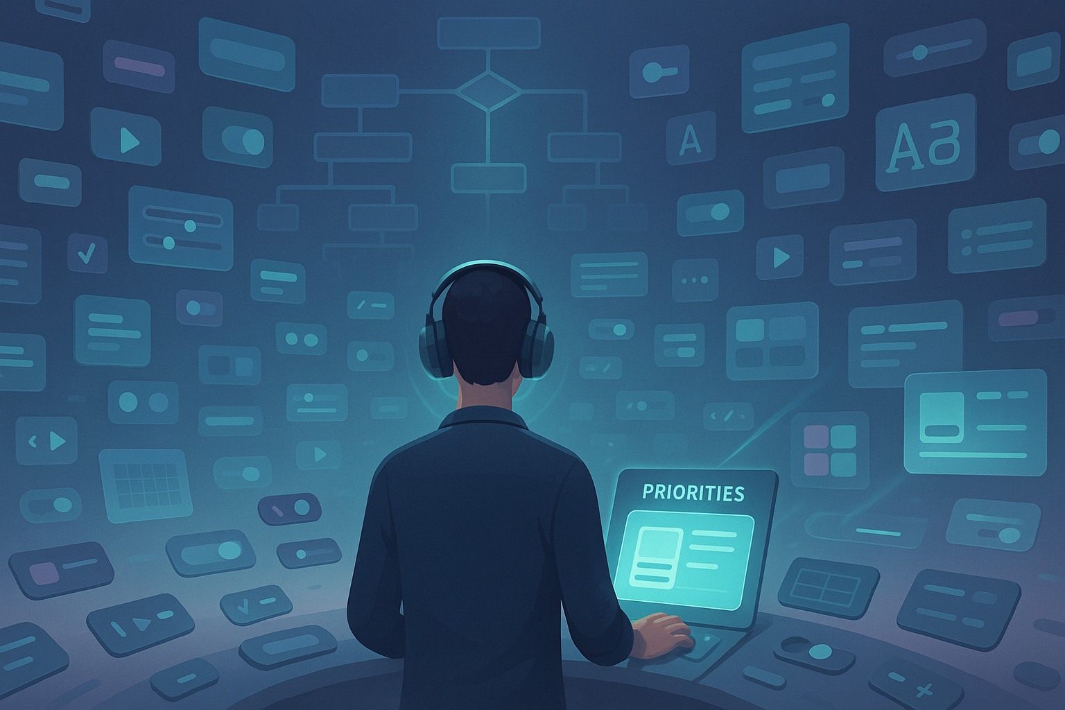
How I Deal With Decision Fatigue in UI Design
Decision Fatigue in UI Design Is Real—And It Can Wreck Your Flow If you’ve ever sat in front of a Figma file, blinking at 14 different button styles and wondering which shade of blue is “on-brand enough,” you know exactly what I’m talking about. Decision fatigue in UI design isn’t some abstract concept—it’s a daily…
-
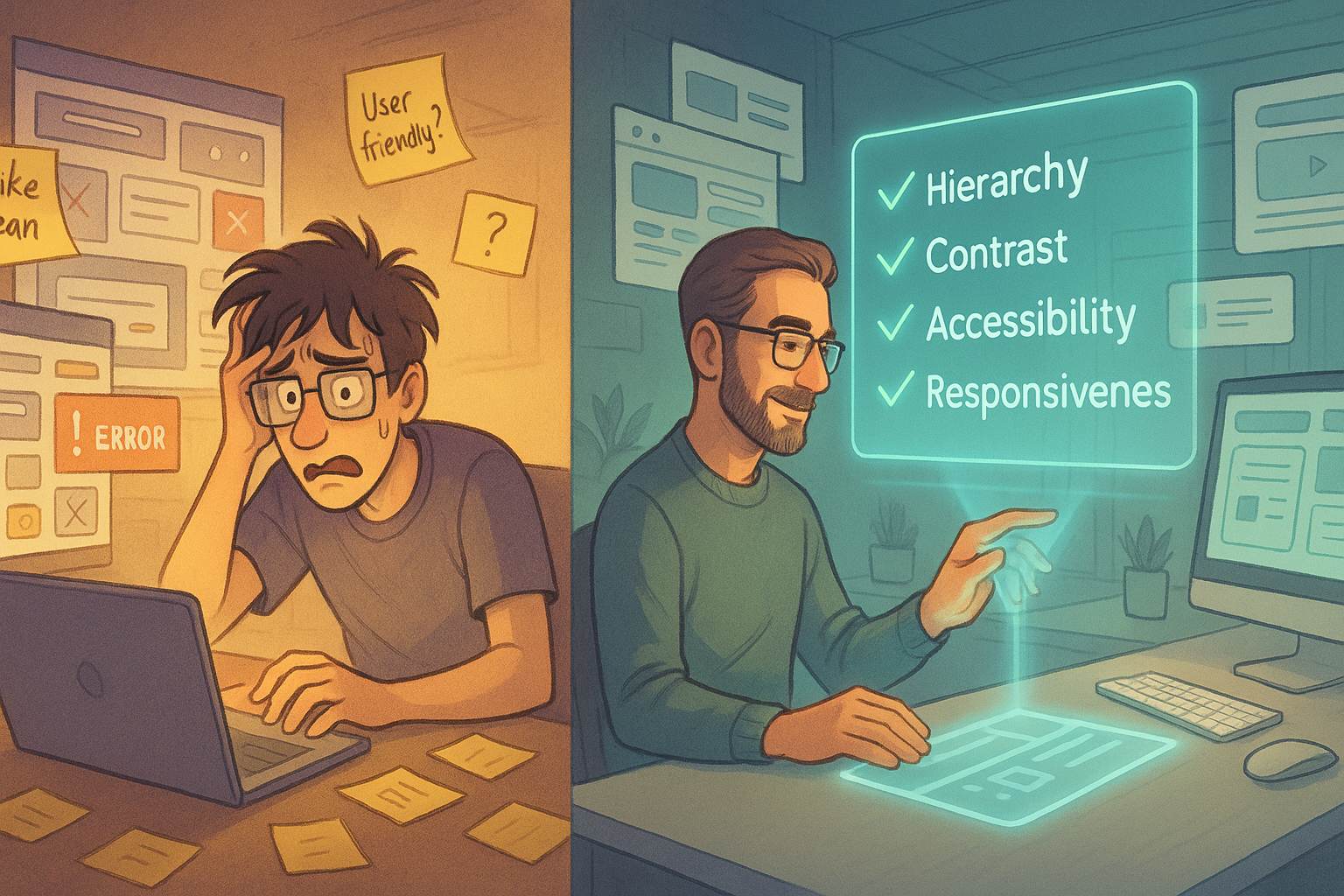
The UI Checklist I Wish I Had Years Ago
I remember my early days working on user interfaces like they were yesterday. I’d spend hours obsessing over colors, icons, and animations, only to discover that users couldn’t even find the submit button. Or worse — they’d find it, click it, and nothing would happen because I forgot to implement the loading state. Back then,…
-
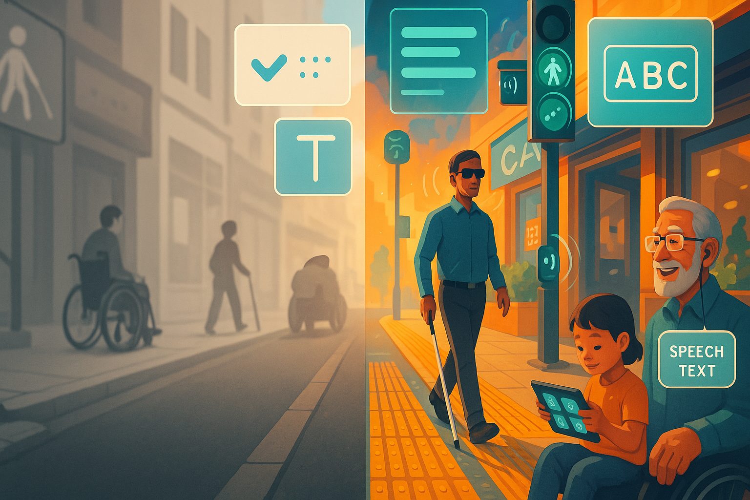
Designing for Accessibility Made Me a Better Human
I never thought that making buttons easier to see or giving alt text to images would change me. But here I am, years into my design career, looking back at how designing for accessibility made me a better human. This isn’t a fluffy feel-good story—it’s about empathy, awareness, and realizing that good design isn’t just…
-
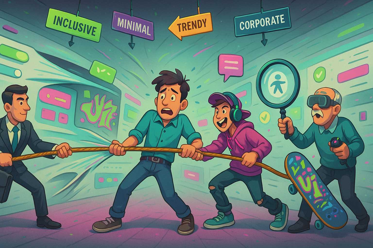
The Problem With Designing for “Everyone”
If you’ve worked in design—especially UX, product, or even marketing—you’ve probably heard the phrase: “We want to make something that works for everyone.” On paper, it sounds noble. Why wouldn’t you want to reach the widest audience possible? But here’s the truth: designing for everyone is a trap. Whether you’re creating a website, an app,…
-
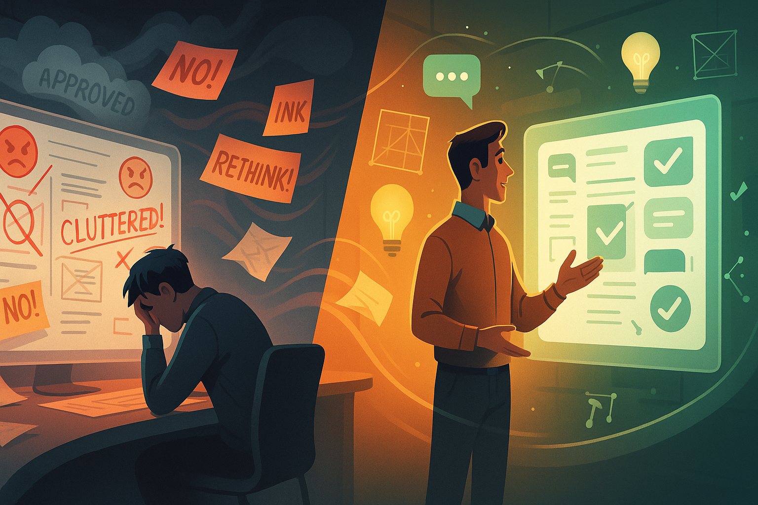
How I Handled My Worst Design Feedback Ever
Let me tell you a story. It’s not a glamorous one. It doesn’t involve winning awards, shipping record-breaking designs, or going viral on Dribbble. No, it’s about the time I got absolutely torn apart by a client—on a Zoom call, with their entire executive team watching. If you’re a designer, you’ve likely had your fair…
-
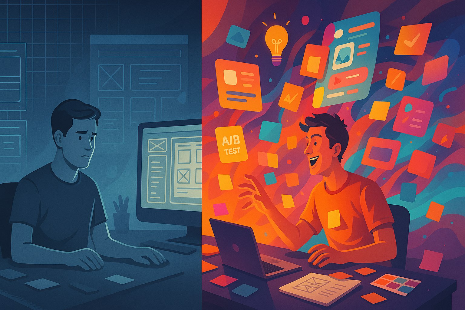
Why I Ditched Grids for Chaos (and Got Better Results)
I used to be a grid loyalist. Rigid rows, perfect alignment, pixel-perfect spacing — it all gave me a comforting sense of order. Whether I was working on a website layout or mobile UI, grids were my safety net. But somewhere along the way, I noticed something strange: my work, though clean, started feeling… sterile.…