Category: UI
-

Australia Post’s Parcel Tracking Redesign in 2024: When Convenience Was Replaced with Confusion
In 2024, Australia Post rolled out a major redesign of its online and mobile parcel tracking interface, promising users a “simpler, smarter, more transparent experience.” It sounded like a much-needed upgrade—millions of Australians rely on the service for real-time updates on everything from personal deliveries to business-critical shipments. But within days of the update, users…
-
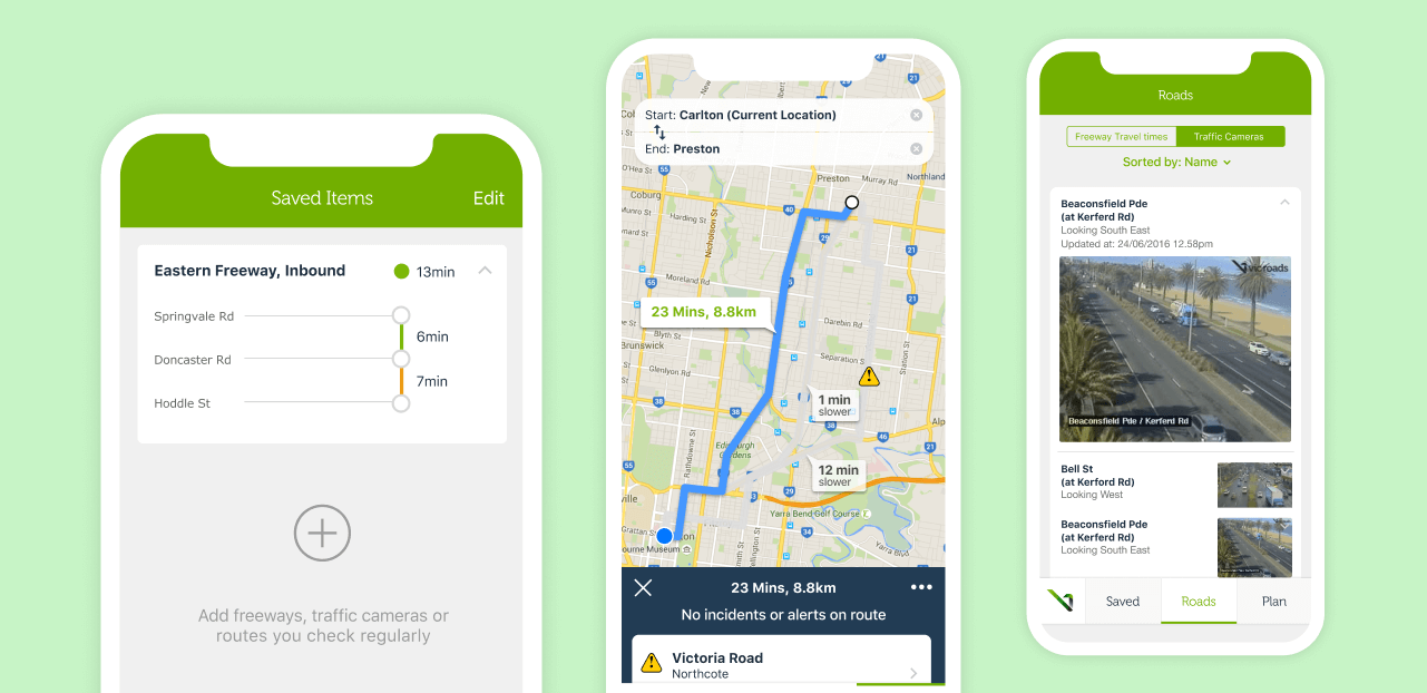
VicTraffic Website Redesign in 2024: When a Critical Public Service Became Practically Unusable
In 2024, Victoria’s Department of Transport released a highly anticipated redesign of VicTraffic, the state’s official real-time traffic update platform. Meant to serve as the daily digital companion for drivers, logistics companies, and commuters across Melbourne and regional Victoria, VicTraffic’s online platform was meant to streamline navigation, road closures, and live incidents. Instead, it became…
-

The Kayo Sports App Redesign Backlash in 2024: When Streaming Meets Bad UI Decisions
In 2024, Australia’s sports streaming platform, Kayo Sports, attempted to cement its place as the go-to destination for live and on-demand sports. Known for offering a wide array of sporting content, Kayo was seen as the leader in Australian sports streaming. However, their ambitious app redesign in mid-2024 ended up becoming a disaster in user…
-
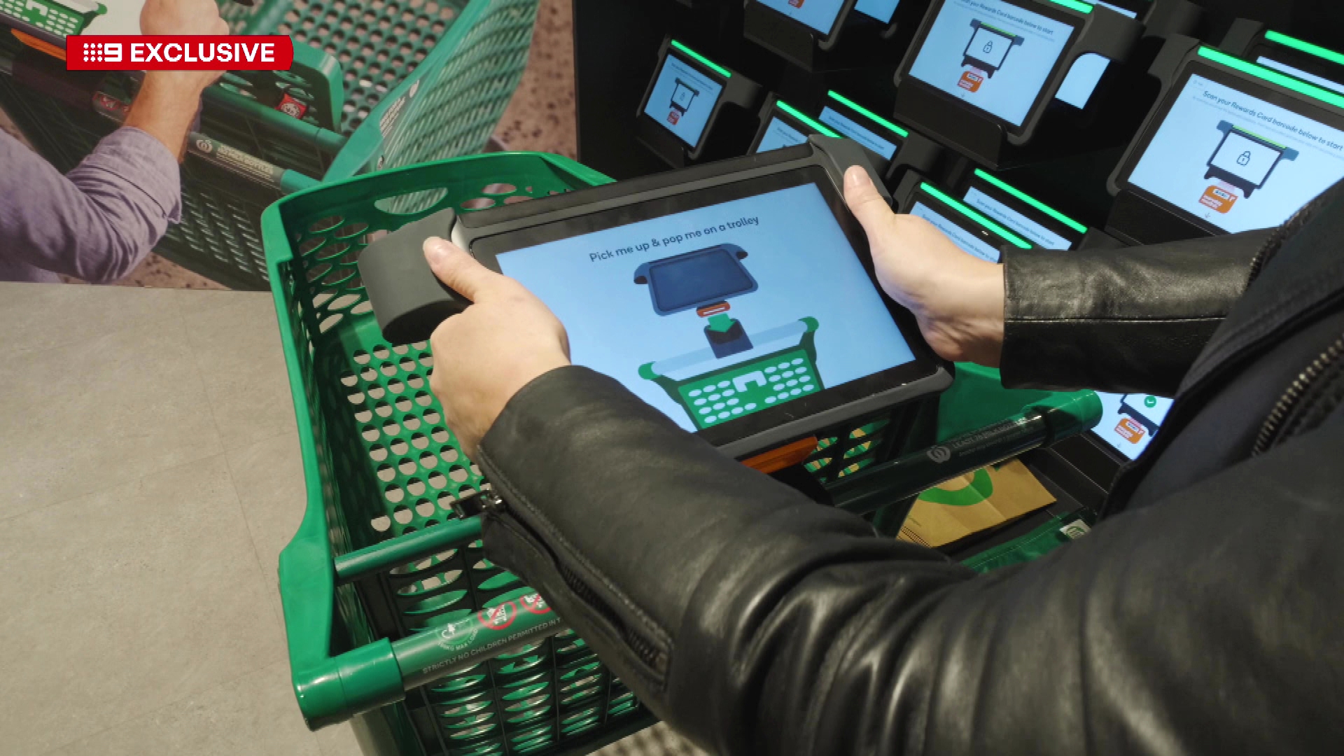
Woolworths Scan&Go App UI Failures in 2024: When Convenience Turned into Frustration for Shoppers
In 2024, one of Australia’s largest supermarket chains, Woolworths, embarked on an ambitious mission to digitize and simplify in-store shopping experiences through its updated Scan&Go mobile app. The vision was promising—allow customers to scan items as they shop, pay within the app, and skip the checkout queue altogether. It was marketed as a seamless, contactless…
-

The Opal App 2024 Redesign: How Poor UI Decisions Created Frustration for Sydney Commuters
In Australia’s transport sector, few digital tools are as widely used as the Opal app in New South Wales. Designed to streamline public transport payments and journey planning across Sydney and the greater NSW area, the Opal app was once seen as a pioneer in transport tech. But in 2024, a highly publicized overhaul of…
-

The Service Victoria UI Overhaul: How Australia Got It Right After MyGov’s Failures
In Australia’s digital history, few public services have been as maligned for their user interface as MyGov. The national platform’s complex, clunky, and impersonal UI became a textbook example of what happens when government services forget about the people they serve. But just as much as MyGov became a digital disaster, it also served as…
-

The MyGov UI Disaster: How Poor Design Failed Millions of Australians
In the realm of digital experiences, user interfaces can make or break entire systems. When designed well, they feel invisible—guiding users effortlessly toward their goals. But when they fail, the consequences can ripple through society, causing frustration, confusion, and in some cases, genuine harm. One of the most notorious examples of a UI failure in…
-

UI Patterns That Are Gone and Abandoned in 2025: What Designers Have Finally Left Behind
In 2025, the world of UI design has moved far beyond the shiny trends of the early 2020s. While the last few years were filled with bold experiments, some patterns have simply not stood the test of time. Others became victims of misuse, fatigue, or changing user expectations. In the age of ethical, user-first, and…
-

UI Patterns Trending in Melbourne’s Startup Scene in 2025: How Local Innovators Are Redefining Digital Experiences
Melbourne has always been known as a city of bold ideas, vibrant street culture, and creative rebellion. It’s no surprise, then, that its startup ecosystem in 2025 has become one of the most exciting playgrounds for cutting-edge user interface design. From fintech to food tech, health platforms to property apps, Melbourne’s startups are not just…
-
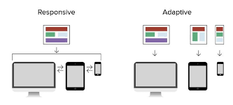
Adaptive User Interfaces: Designing for Dynamic User Experiences in 2025
In the rapidly evolving digital landscape of 2025, user expectations have shifted towards more personalized and context-aware experiences. Adaptive User Interfaces (AUI) have emerged as a pivotal trend, enabling applications to modify their layout, content, and functionality in real-time based on individual user behaviors, preferences, and environmental factors. Understanding Adaptive User Interfaces An Adaptive User…