Category: UI
-

Unlockd: How a UX Gamble and Privacy Confusion Took Down a Promising Aussie AdTech Startup
Unlockd was one of Australia’s most talked-about startups between 2016 and 2018—a Melbourne-born platform that promised to “revolutionise the mobile advertising model” by letting users earn rewards for watching ads on their phone’s lock screen. Backed by investors like Lachlan Murdoch and Vodafone, Unlockd raised over $50 million and partnered with major telecom providers in…
-

Hometime’s App Pivot Fiasco: When a UI Redesign Broke Trust with Hosts
Hometime, once a rising star in Australia’s short-term rental tech scene, positioned itself as the “operating system for Airbnb property managers.” By combining automated guest communication, cleaner scheduling, payments, and dynamic pricing into one sleek interface, the Sydney-based startup promised to make property management seamless and scalable. But in 2022–2023, Hometime underwent a major UI…
-
MilkRun’s Meltdown: How UI Decisions Hurt One of Australia’s Most Hyped Startups
In early 2023, MilkRun—a once-celebrated Sydney-based grocery delivery startup—announced its sudden shutdown after burning through tens of millions in funding and failing to gain sustainable traction. While most headlines focused on business strategy and burn rate, one of the most overlooked factors in MilkRun’s downfall was its flawed user interface and poor digital customer experience,…
-

The 2024 eSafety Commissioner Reporting Platform Redesign: A Broken Experience at a Critical Time
In 2024, the Australian eSafety Commissioner’s office unveiled a redesigned online reporting platform—intended to help Australians report cyberbullying, image-based abuse, harmful online content, and scams. This system plays a vital role in national digital safety efforts, especially for minors, vulnerable people, and victims of harassment. But when the new UI went live, the user experience…
-
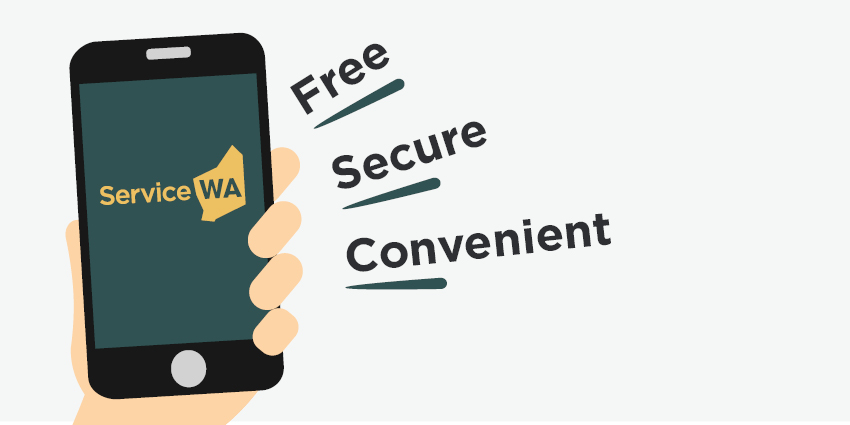
The 2024 ServiceWA App Expansion: When Convenience Features Turned into a Confusing Mess
Originally developed during the COVID-19 pandemic for proof of vaccination and check-ins, the ServiceWA app was meant to evolve into a long-term, all-in-one platform for accessing government services in Western Australia. In mid-2024, that transition became official—introducing digital licences, fines payment, fishing permits, health alerts, and more in a redesigned, modular interface. But rather than…
-

The 2024 VicEmergency App Redesign: A Life-Saving Tool Undone by UI Confusion
In 2024, Emergency Management Victoria released a complete redesign of the VicEmergency app, the official government platform for delivering real-time warnings about bushfires, floods, storms, and other emergencies across the state. The app is relied upon by millions of Victorians, especially those in rural and high-risk regions where up-to-the-minute information can literally save lives. The…
-
The 2024 HealthEngine Redesign Fallout: How a Medical Booking App Complicated Access to Care
HealthEngine, one of Australia’s largest digital healthcare booking platforms, has long been the go-to app for patients wanting to book GP appointments, manage scripts, or connect with nearby clinics. But in early 2024, a platform-wide redesign meant to “simplify the healthcare journey” launched to considerable hype—and quickly crashed into a wall of user frustration, misdirected…
-
The 2024 MyChild Portal Redesign: When Digital Transformation Hurt the Parents It Was Meant to Help
In 2024, the Australian Government launched a major update to the MyChild portal, a federal platform that allows parents and guardians to search for childcare providers, check eligibility for childcare subsidies, and manage enrolment support services. On paper, the overhaul was meant to modernize outdated systems and make access to childcare information more “intuitive, mobile-friendly,…
-

The 2024 JobSearch Redesign Failure: How a Government Platform Made Job Hunting Harder
In 2024, the Australian Government launched a full-scale redesign of the JobSearch platform—a key employment services portal used by job seekers, employers, and support providers across the country. Marketed as a modern revamp to “make finding a job simpler and more personalised,” the update aimed to replace legacy systems with a fresh, intuitive interface. But…
-
The ABC News App Redesign Controversy in 2024: When A Trusted Platform Lost Its Users
In 2024, the ABC News app, long considered one of Australia’s most reliable and neutral sources for national news, underwent a major redesign. With millions of users across the country relying on it daily for breaking news, live streams, and investigative journalism, expectations for the update were high. Instead, the overhaul led to widespread backlash,…