Author: thatuisavyguy
-
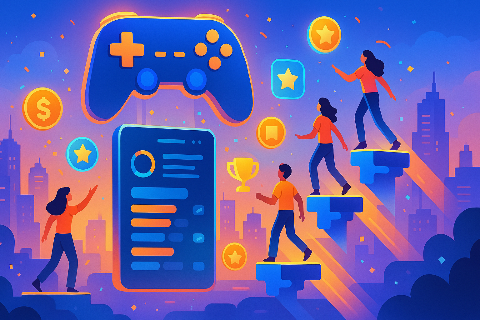
Gamified Onboarding: Techniques to Make Users Love Your Product From Day One When someone signs up for your product, their first experience matters a lot. It can be the difference between them becoming a loyal customer or dropping off after just a few clicks. That’s where gamified onboarding comes in. By adding elements of gameplay…
-
Adaptive Colour Schemes: How Dynamic Theming Enhances Accessibility and Brand Identity
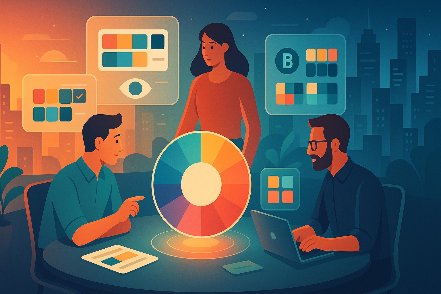
Colour has always been a powerful tool in design. It shapes the way users interact with digital products, influences decisions, and creates emotional connections. Over the years, design teams have relied on fixed colour palettes to maintain consistency. However, as digital experiences become more personalized and accessibility requirements grow, a single, static colour scheme just…
-
Micro‑copy That Converts: Crafting Effective UI Text for Higher Engagement
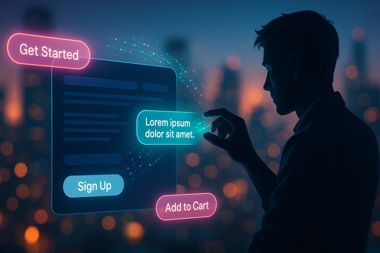
In today’s fast-paced digital world, every tiny detail on a website or app matters. Among the most overlooked but highly impactful elements is micro-copy. These are the short snippets of text that guide users, reassure them, and ultimately persuade them to take action. From the label on a button to the message that pops up…
-

In‑Vehicle AR Interfaces: The Future of Car Dashboards and Safety UIs
The world of cars is changing faster than ever. Just a decade ago, the most high-tech feature in a car might have been a touch screen for GPS or a voice command system that barely understood what you were saying. Today, we’re seeing a whole new level of innovation with augmented reality (AR) making its…
-
Voice & Gesture Interfaces: Building Inclusive Multi‑Modal Experiences for 2026
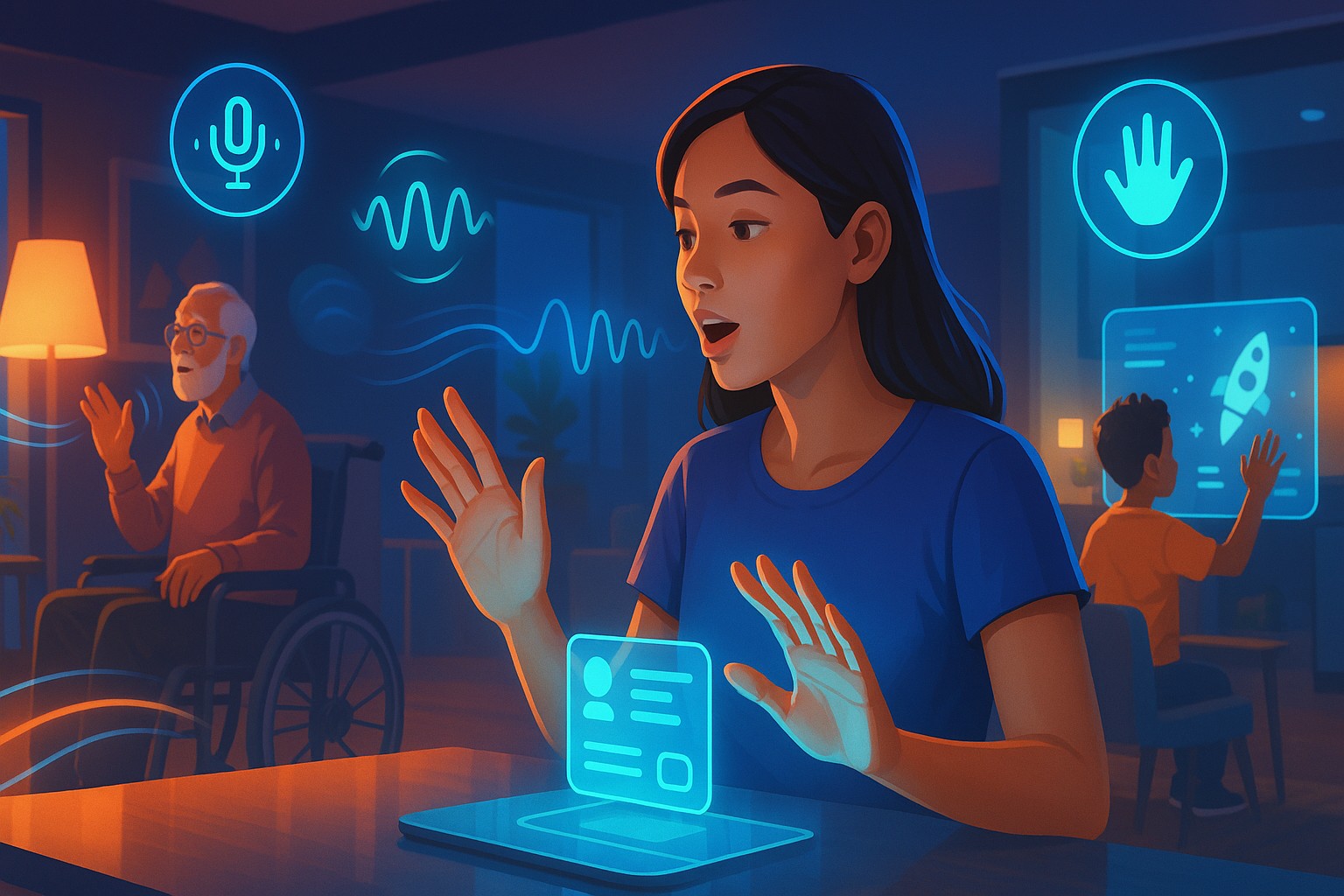
Technology is evolving at a pace we couldn’t have imagined a decade ago. In 2026, the way we interact with digital devices will look drastically different. Touchscreens, while still relevant, are no longer the only way to control apps and devices. Instead, voice commands and hand gestures are becoming mainstream, paving the way for a…
-
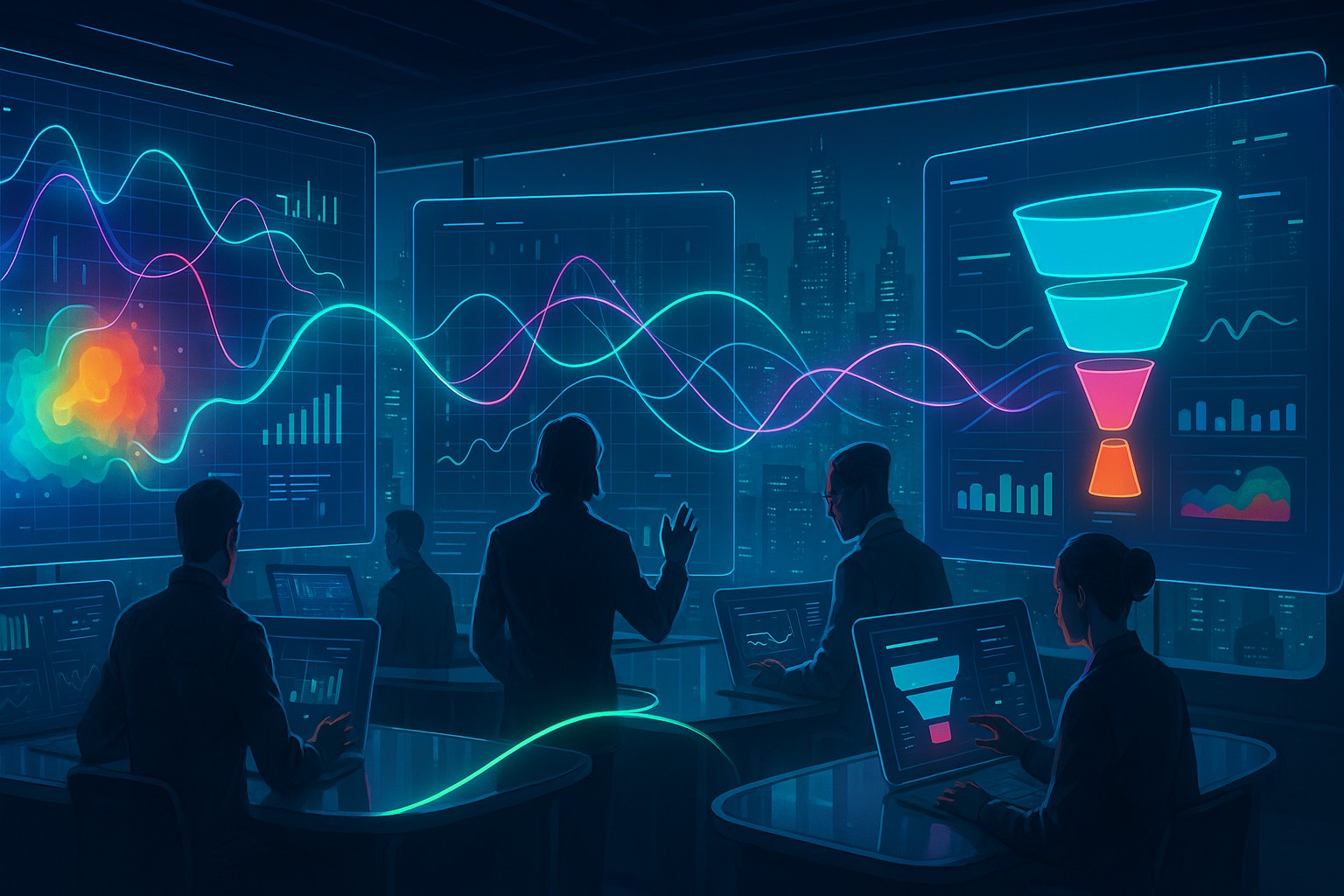
Data‑Driven UI Decisions: Using Analytics to Optimize User Journeys in Real Time
In today’s fast-paced digital world, users expect seamless, intuitive, and personalized experiences every time they interact with a website or app. It’s no longer enough to design a beautiful interface and hope for the best. Businesses need to understand how people actually use their products and continuously refine those experiences. That’s where data-driven UI decisions…
-
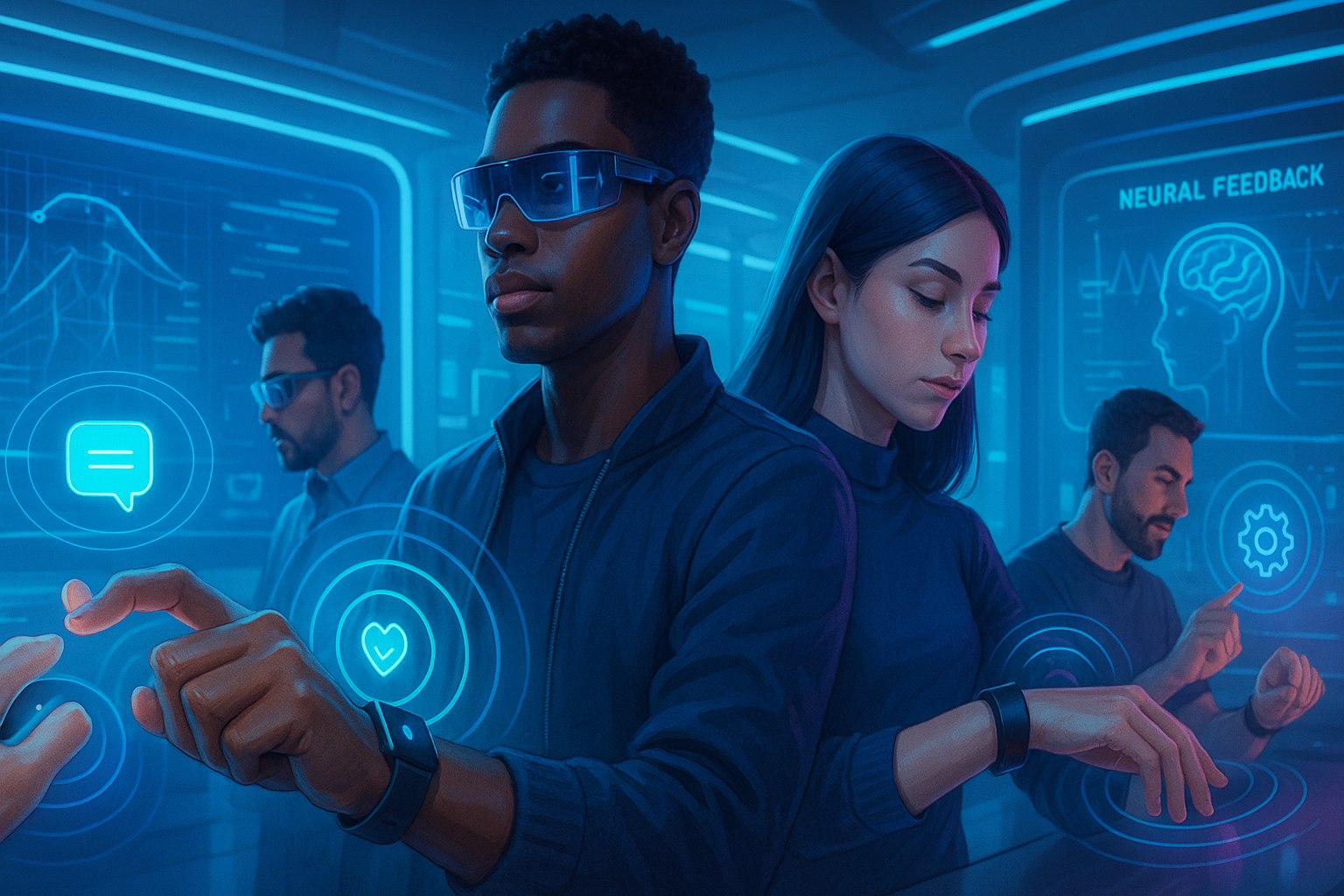
Designing for Wearables: Micro‑Gesture Interfaces and Haptic Feedback in 2026
Wearable technology has been on a fascinating journey over the last decade, transforming from basic fitness trackers into complex devices that rival smartphones in capabilities. In 2026, wearables are no longer niche gadgets; they are essential companions integrated into our daily lives. From advanced smartwatches and augmented reality (AR) glasses to health-monitoring rings and flexible…
-
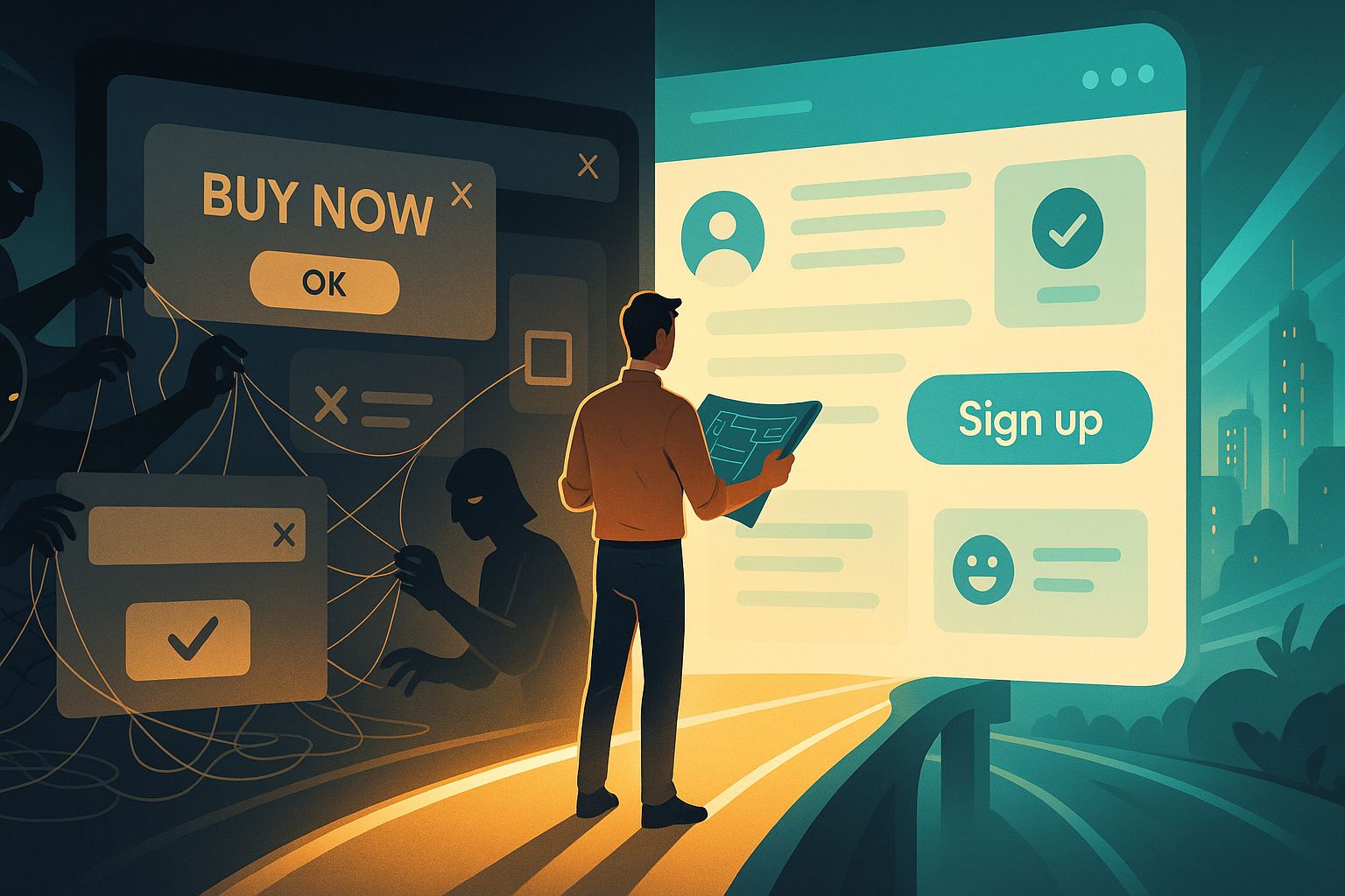
Ethical Design 101: Avoiding Dark Patterns and Building Trust With Your Users
When you think about great design, what comes to mind? For most people, it’s about aesthetics — beautiful layouts, smooth animations, and a clean interface. But good design isn’t just about looking good. It’s about creating an experience that feels fair, honest, and trustworthy. That’s where ethical design comes into play. Unfortunately, many websites and…
-
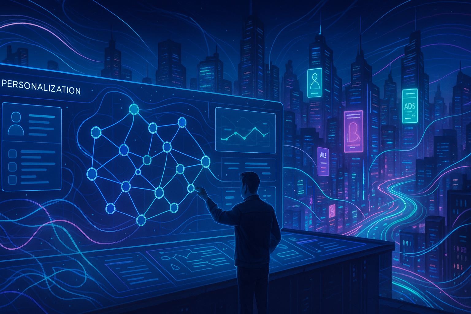
Building AI‑Driven Personalization Engines: UI Strategies for Predictive User Journeys
In today’s digital world, personalization has become the gold standard for user experience. Gone are the days when a generic interface or one-size-fits-all approach was enough to keep users engaged. Now, whether it’s e-commerce, streaming platforms, healthcare apps, or enterprise dashboards, users expect experiences that feel tailor-made for them. This is where building AI-driven personalization…
-
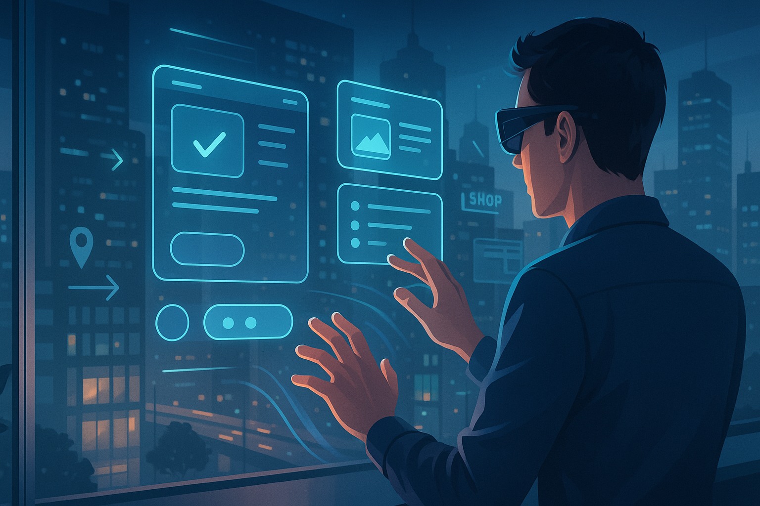
Augmented Reality UI Design: Creating Immersive Experiences Without Overwhelming Users
Augmented Reality (AR) has been on the rise for years, gradually making its way into our daily lives. From gaming and e-commerce to healthcare and industrial applications, AR is transforming the way we interact with digital information. But here’s the thing: while AR can create jaw-dropping experiences, it can also easily overwhelm users if not…