If you’ve been paying attention to web and app design lately, you’ll know that navigation menus aren’t just dropdowns and hamburger icons anymore. In 2025, designers are rethinking how users find their way around digital experiences. It’s not just about cramming links into a bar anymore—it’s about guiding people intuitively and efficiently.
As websites and apps become more complex, new navigation patterns are emerging that emphasize clarity, personalization, and adaptability. In this article, we’ll explore the future of navigation menus and how UI designers are creating smarter, more human-centered ways to move through digital spaces.
Let’s break down what’s changing and why your next project might need to rethink navigation from the ground up.
Why Navigation Menus Matter More Than Ever
Navigation is often the first interaction users have after landing on a website or app. And in 2025, user expectations have skyrocketed.
People expect:
- Instant clarity
- Fewer clicks to their goal
- Mobile-first, but desktop-respected layouts
- Personalized paths based on behavior
- Accessibility without compromise
A cluttered, confusing menu can sink your user engagement faster than slow page speed. That’s why the future of navigation menus is all about simplifying without dumbing things down.
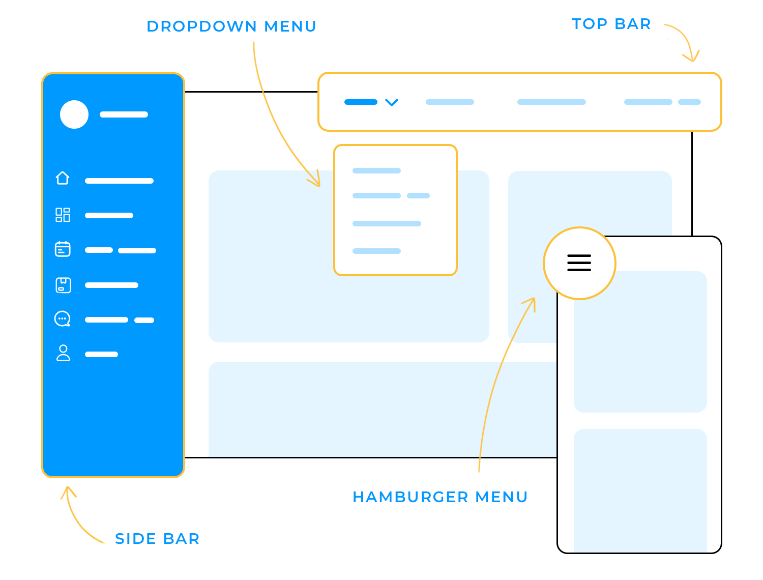
Off-Canvas Menus Are the New Default
Remember when side menus were a “mobile-only” thing? Not anymore.
In 2025, off-canvas menus—menus that slide in from the side—are becoming standard even for desktop sites. Why?
- They keep interfaces cleaner
- They create more room for content
- They scale naturally across devices
Today’s off-canvas designs often feature:
- Categorized mega-sections
- Quick search bars right inside the panel
- Dynamic badges (e.g., cart totals, notifications)
- Profile/account links at the top
It’s cleaner, more flexible, and more aligned with touch-based interaction patterns that are dominating user behavior.
Personalization is Redefining Menus
Another trend we can’t ignore: dynamic, personalized navigation.
Rather than serving the same set of links to every user, modern menus are adapting based on:
- Past user behavior
- Purchase history
- Search queries
- Location
- Time of day (seriously, night users sometimes get different menus!)
This approach isn’t about being creepy—it’s about reducing friction. If you usually visit the “Deals” section of an eCommerce site, why not surface that first? If you’re a returning course student, why not show “Continue Learning” prominently?
The smartest brands in 2025 are treating navigation not just as a tool—but as an ongoing conversation with the user.
Minimal Top Bars and Hidden Menus
We’re also seeing a rise in ultra-minimal navigation bars—especially in SaaS apps and productivity tools.
Instead of huge nav bars stuffed with options, designers are:
- Using collapsible toolbars
- Tucking secondary actions under three-dot menus
- Prioritizing just 2–3 main actions in the top nav
The goal? Keep users focused on core tasks without overwhelming them. And when they need something secondary, it’s there—but not screaming for attention.
Minimal doesn’t mean less powerful—it just means less noisy.
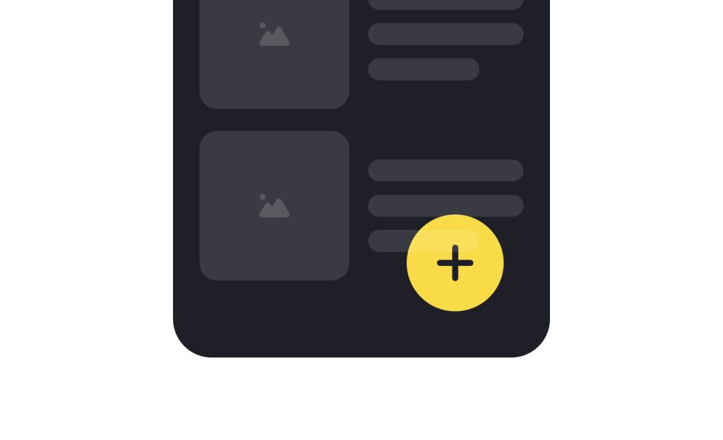
Floating Action Buttons (FABs) Are Going Mainstream
Once limited mostly to mobile apps, floating action buttons (FABs) are now showing up across web and hybrid experiences.
FABs work great for:
- Quickly creating new content
- Jumping to the most important action
- Streamlining navigation on small screens
In 2025, we’re seeing them evolve into context-aware FABs. Instead of offering a static “+” button everywhere, FABs now morph based on where you are in the app.
For instance:
- In a task app: FAB = “New Task”
- In a shopping app: FAB = “View Cart”
- In a calendar app: FAB = “Add Event”
It’s smart, adaptive, and a big step forward for mobile-first design.
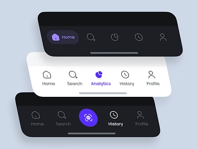
Multi-Modal Navigation for Foldables and Larger Devices
As discussed in the foldables article, larger and multi-screen devices are reshaping navigation patterns too.
Many apps now combine:
- A top bar for primary navigation
- A side bar for categories or filters
- A bottom navigation tab for quick actions
It sounds busy, but when done right, it feels intuitive. Users can choose their path depending on the context they’re in.
The key is progressive disclosure: show what’s immediately relevant, hide the rest until needed.
Search as Primary Navigation
Here’s a hot shift you’ll notice everywhere in 2025: search-first navigation.
Some apps and sites are minimizing traditional menus altogether and pushing users straight into search.
Examples:
- Airbnb now lets users search by “flexible dates” without picking a destination
- Notion and other productivity apps open the command bar by default
- E-commerce platforms surface quick-search above all else
This approach leans into what users are already doing: typing what they want, instead of browsing hierarchical menus.
Good search design = good navigation.
Accessibility Takes Center Stage
Modern menus aren’t just about convenience—they must be fully accessible from the start.
Top accessibility updates for navigation menus include:
- Keyboard navigation support
- Focus outlines for active elements
- Proper ARIA labeling for screen readers
- Responsive layouts without losing structure
No matter how trendy your navigation design is, if it doesn’t work for all users, it’s broken.
Accessibility is no longer a “feature”—it’s a baseline expectation.
Animation and Feedback: Subtle, Not Showy
Old menus used to “slide in” with dramatic effects. Not anymore.
In 2025, animation in navigation is:
- Faster
- Softer
- Purposeful
Micro-animations like slight fade-ins, subtle shifts, or hover reveals are in. Overly exaggerated menu flyouts are out.
Motion is used to signal cause and effect, not just to look cool.
Good navigation UI in 2025 feels responsive, tactile, and snappy.
How to Future-Proof Your Navigation Designs
Want to make sure your navigation menus don’t feel outdated next year? Focus on these principles:
- Clarity over cleverness
- Mobile-first but large-screen-friendly
- Personalization where appropriate
- Minimal visible options, maximum discoverability
- Accessibility baked in
- Fast and lightweight interactions
Navigation is not just about moving between pages anymore. It’s about guiding experiences.
And the future of navigation menus in 2025 is going to be about removing barriers, not adding layers.
FAQs
1. What is the biggest trend in navigation menus for 2025?
Personalized, off-canvas menus that adapt to user behavior and screen size.
2. Are hamburger menus outdated?
Not exactly, but they’re evolving. Many apps now combine hamburger menus with floating action buttons or progressive disclosure.
3. How important is search-first navigation?
Extremely. More users expect to type and find quickly rather than browse endless links.
4. Should all sites use floating action buttons?
Only if it makes sense. FABs work well for action-driven apps but can feel forced in simple websites.
5. What’s the #1 mistake to avoid with modern navigation?
Overloading users with too many options upfront. Guide them instead.
Leave a Reply