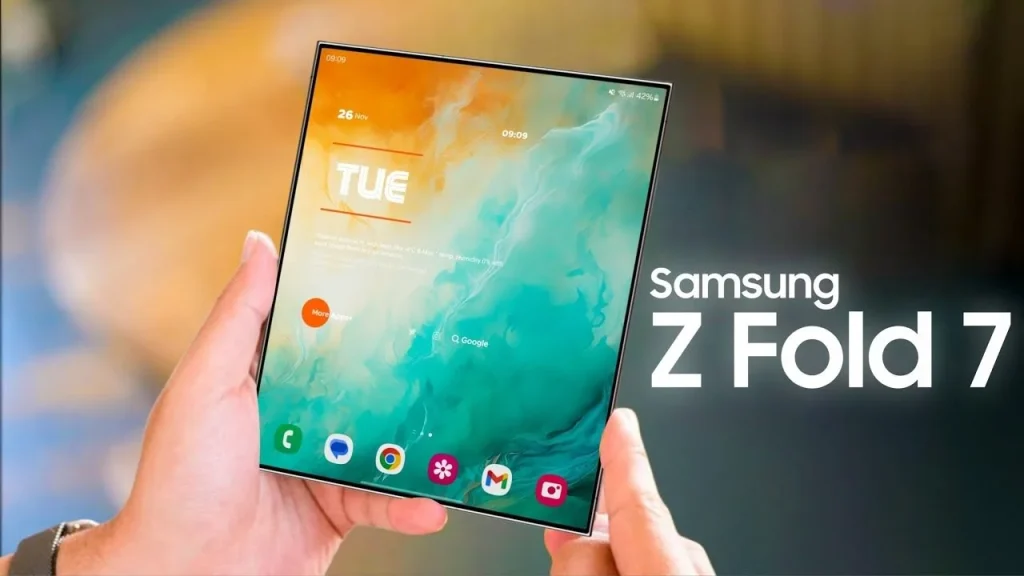
As foldable phones become more mainstream, designers are facing a new reality—our screens aren’t just rectangles anymore. They flip, fold, unfold, and sometimes even roll. In 2025, devices like the Galaxy Z Fold, Pixel Fold, and Oppo Find N are no longer rare tech flexes. They’re everyday tools. And they demand a whole new approach to UI.
Designing for foldables isn’t just a gimmick or a temporary phase. It’s a real opportunity to rethink layout, interactivity, and multitasking—if done well. In this article, we’ll dive deep into how UI design is evolving to meet this shift, what makes it different from standard mobile or tablet design, and how to get ahead of the curve.
So let’s talk about how designing for foldables in 2025 creates new UI challenges—and incredible creative opportunities.
What Makes Foldables Unique for UI Design?
Traditional mobile UI design relies on a few basic assumptions: a single screen, fixed aspect ratio, and minimal layout change during use. Foldables break all those rules.
You now have to design for:
- Two states: folded and unfolded
- Multiple aspect ratios (square-ish, ultra-wide, tall/narrow)
- App continuity between device configurations
- Multitasking scenarios with dual-pane or multi-window views
- Input variety, including touch, gestures, pens, and keyboards
This means everything—from buttons to breakpoints—needs to be rethought. It’s not enough to be responsive. Your UI needs to transform.
Rethinking Layouts: From One Panel to Many
On a foldable phone, your app might go from a compact mobile screen to a near-tablet layout instantly. That means you need to design:
- Modular interfaces that rearrange based on screen state
- Dual-pane layouts that mirror what we used to see in desktop apps
- Content hierarchy shifts (what’s important when folded isn’t always top priority when unfolded)
For example, a mail app might show just the inbox on the folded screen, but reveal both the inbox and reading pane when unfolded. Navigation bars, modals, and image galleries all behave differently when there’s room to breathe.
Designers need to think beyond media queries. Component-level responsiveness is now essential.
Designing for Foldables: UI Challenges That Designers Must Solve
Now, let’s break down the biggest UI design challenges for foldables in 2025:
1. Hinge Awareness
That gap in the middle isn’t just a visual divider—it’s a UX divider. Content shouldn’t fall awkwardly across the hinge. Designers need to position elements intentionally on one side or the other.
2. Gesture Conflicts
With edge gestures (like back swipes) and app-dragging becoming standard, foldables introduce more swipe zones than ever. Accidentally triggering a system action is a common problem.
3. Maintaining State Across Transitions
Users expect to pick up where they left off when switching from folded to unfolded. Losing scroll position or having content reload creates friction—and frustration.
4. Battery Optimization
Bigger screens = more battery drain. UI decisions can impact power usage, especially when animations, blur effects, and full-screen visuals come into play.
5. Too Much or Too Little UI
Unfolded layouts may feel empty if you just scale things up. Folded layouts can feel cramped if you don’t pare down. Designers have to balance utility and space with purpose.
Best Practices for UI on Foldables
Let’s move from problems to solutions. Here’s what forward-thinking UI designers are doing to make their apps foldable-friendly:
- Use adaptive containers rather than hard-coded layouts
- Design around the fold, not through it
- Think like a desktop designer for multitasking states
- Prioritize vertical scrolling in compact modes
- Enable drag-and-drop or split-view interactions on larger states
- Allow layout toggles (e.g., switch between full-width or column view manually)
- Test on emulators AND physical devices—real folding behavior matters
The key takeaway? Think in terms of experiences, not screens.
Foldables in the Wild: Real UI Examples That Work
Here are a few apps nailing foldable UI in 2025:
- Google Calendar: On a folded screen, you see a clean day view. Unfold it, and you get a week view with color-coded columns. Smooth transition, no confusion.
- Microsoft Outlook: Uses a responsive drawer on the left when folded, which becomes a persistent pane when unfolded. It’s the classic email client model, reimagined.
- TikTok: The video interface remains consistent, but menus and editing tools adapt depending on the screen state. They even redesigned comment drawers to slide in from the hinge edge.
These apps don’t just adapt—they embrace the fold.
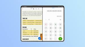
Designing for Foldables in Enterprise and Productivity Apps
Foldables aren’t just for consumers. Microsoft, Samsung, and others are betting on them becoming the future of portable productivity.
This means enterprise tools like:
- CRMs
- Project managers
- Spreadsheets
- Chat and collaboration apps
… all need to support dual-pane, multi-input, and fold-optimized UIs.
Imagine:
- Reviewing a document while chatting in Teams, side-by-side
- Taking notes with a pen on one screen while reading on the other
- Opening two CRM tabs at once—one for lead details, one for contact history
That’s not science fiction anymore. It’s just smart UI on foldables.
Accessibility and Foldables: A New Layer of Consideration
Foldables also change how we think about accessibility.
Some users prefer compact UIs with fewer distractions. Others benefit from the extra space when unfolded. Foldables allow both—but designers must make both modes equally usable.
That means:
- Allowing font scaling in both folded and unfolded views
- Supporting keyboard navigation and screen readers
- Ensuring color contrast stays consistent as layouts shift
- Letting users choose when to switch views—not just auto-trigger
Foldable UI can enhance accessibility—but only when it’s designed intentionally.
Why Designing for Foldables Isn’t Just a Trend
Some might say foldables are still niche. But with foldable device shipments expected to exceed 60 million units in 2025, the format is clearly growing.
Companies that invest early in foldable-optimized UI will:
- Improve user retention by delivering smoother experiences
- Stay ahead of mobile UX expectations
- Future-proof their design systems
- Differentiate in app stores and product reviews
Just like responsive design became a must-have a decade ago, designing for foldables is quickly moving from nice-to-have to must-do.
Designing for Foldables: A New UX Language in 2025
What we’re seeing in 2025 is more than just folding phones—it’s the emergence of a new UX language. One that combines the versatility of tablets, the familiarity of smartphones, and the flexibility of desktop-style interaction.
It’s not about designing “mobile-first” anymore. It’s about designing context-first.
When someone folds their phone closed, it’s not just a hardware event—it’s an emotional signal. “I’m done.” When they unfold it? “I need more.” Great UI understands that. And it responds accordingly.
That’s why designing for foldables is one of the most exciting UI shifts of this decade.
FAQs
1. What is the biggest challenge in designing UI for foldables?
Adapting layouts to both folded and unfolded states without breaking usability or layout flow.
2. Do foldable phones need separate designs from regular phones?
Not entirely, but you should optimize for fold-specific interactions and multiple aspect ratios.
3. Can I test foldable layouts without owning a foldable device?
Yes, tools like Android Studio and Samsung’s Foldable Emulator help simulate fold behavior.
4. Are foldable UIs harder to maintain?
They require more planning, but with the right design system and modular components, maintenance is manageable.
5. Will foldables become mainstream for all apps?
It’s very likely. As adoption increases, foldable optimization will become expected—not optional.
Leave a Reply