UI design trends come and go, but some create long-lasting debates within the design community. One of the hottest debates in recent years is Glassmorphism vs Neumorphism, two distinct visual styles that both promise sleek interfaces but approach user experience from very different angles. As we move past 2025, designers, agencies, and product teams are asking a critical question: which of these trends will stay relevant, and which might fade into design history?
In this article, I’ll break down the principles of both styles, compare their usability, accessibility, and business implications, and share predictions about how they’ll evolve beyond 2025. I’ll also talk about how these styles fit into modern design systems, practical pros and cons, and where each makes sense in real projects. By the end, you’ll have a clear sense of how to choose between them—or how to smartly combine elements of both.
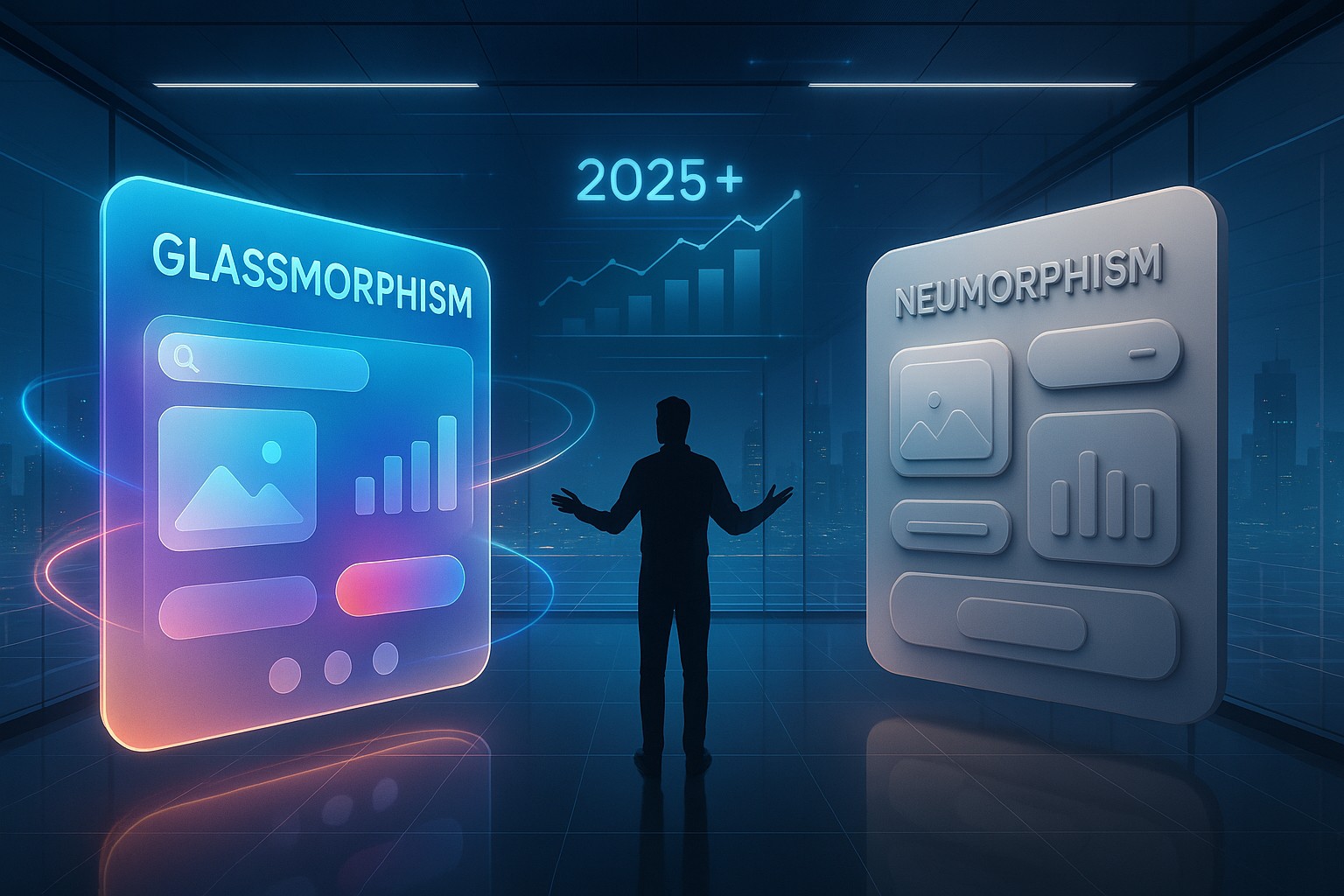
What is Neumorphism?
Neumorphism, short for “new skeuomorphism,” is a design trend that surfaced around 2019 and quickly caught attention because of its soft, tactile, almost physical look. Instead of flat design or heavy realism, it relies on subtle shadows, highlights, and rounded shapes that appear to be pressed into or protruding from the background. Imagine buttons that look like they’ve been gently molded out of clay, or switches that feel almost touchable even on a screen.
The style became popular because it felt fresh—minimalist yet interactive. It took cues from skeuomorphism, which once dominated UI with heavy textures, but stripped it down to flat colors and soft shadows. Neumorphism looks great in mockups, portfolios, and concept designs, which is why designers on platforms like Dribbble loved it.
But the excitement came with concerns. Neumorphism’s low contrast sometimes makes it hard to use, especially for accessibility. Buttons can look too subtle, making it unclear what’s clickable. In other words, it looks cool but isn’t always practical.
What is Glassmorphism?
Glassmorphism, by contrast, leans into a frosted glass aesthetic. It gained momentum when Microsoft’s Fluent Design and Apple’s macOS Big Sur showcased translucent layers with blur effects. The idea is to mimic the look of glass panes stacked on top of one another. Backgrounds blur through, giving depth and layering while still feeling modern and light.
It’s not just about aesthetics either—glassmorphism makes hierarchy clear. Translucent cards can stand out without needing heavy borders or harsh shadows. Designers often combine this look with bright neon accents, gradients, and vivid contrasts, which makes it more accessible than Neumorphism in many cases.
Like Neumorphism, Glassmorphism isn’t perfect. Too much transparency can hurt readability. On weaker devices, rendering blur effects can slow performance. Still, its balance of sleekness and usability has helped it spread quickly across web and mobile apps.
Why Designers Compare Glassmorphism vs Neumorphism
Both styles stand out because they feel futuristic, clean, and highly visual. They’re also relatively easy to spot and brandable. But the debate about Glassmorphism vs Neumorphism goes deeper than looks—it’s about usability, accessibility, and long-term viability.
Design isn’t just about what looks pretty. It’s about how people interact with products, how accessible interfaces are to users of all abilities, and how well styles scale in real-world applications. Let’s dig into the strengths and weaknesses of each.
Strengths of Neumorphism
- Visual uniqueness – Neumorphic designs look different from most mainstream apps, which can help products stand out.
- Tactile feel – It gives a sense of physical interaction, which can feel satisfying in certain contexts like toggles or switches.
- Minimalist elegance – By sticking to soft shadows and muted colors, it aligns with minimalist design trends.
Weaknesses of Neumorphism
- Accessibility issues – Low contrast means some users struggle to identify interactive elements.
- Scalability – Works well in small UIs but struggles in larger, data-heavy applications.
- Over-reliance on light backgrounds – It looks best with light gray tones, limiting design flexibility.
Strengths of Glassmorphism
- Clear hierarchy – Transparency makes layered interfaces easier to understand.
- Modern, futuristic appeal – It immediately feels sleek, which appeals to users who value cutting-edge design.
- Branding flexibility – Works with dark or light themes, gradients, and vivid accent colors.
Weaknesses of Glassmorphism
- Readability problems – Text on translucent surfaces can be harder to read without careful contrast.
- Performance load – Blur and transparency effects can affect performance on lower-end devices.
- Overuse risk – When every layer is translucent, the design starts to feel overwhelming.
Accessibility and Usability Beyond 2025
Accessibility is no longer optional. WCAG guidelines and legal requirements push companies to prioritize interfaces that work for everyone, including those with vision impairments. This is where Neumorphism faces an uphill battle. Without strong tweaks, its low-contrast nature is simply too limiting. Designers can increase contrast and add clearer outlines, but that almost removes the signature style.
Glassmorphism has its own issues, but they’re easier to solve. Designers can use opaque backgrounds for text, increase contrast ratios, and still keep the glass-like aesthetic. Because of this flexibility, it’s likely that Glassmorphism will continue to be used in mainstream products while Neumorphism remains more niche.
Business and Branding Perspectives
From a business perspective, trends matter because they influence perception. A fintech startup that wants to look modern and trustworthy might prefer Glassmorphism for its clean, layered professionalism. A lifestyle app or wellness platform might choose Neumorphism for its calming, tactile aesthetic.
But beyond branding, businesses need scalability. Enterprise software, dashboards, and complex applications need styles that support dense information without confusing users. Glassmorphism, with its ability to create clear layering, fits this better than Neumorphism.
How Designers Use Hybrid Approaches
Interestingly, the future might not be about choosing one over the other but blending them. Designers are already experimenting with interfaces that combine Glassmorphic layers for structure with Neumorphic buttons for interactivity. For example, a dashboard could use glass cards for main sections while action buttons use soft, pressed Neumorphic styles.
This hybrid approach could give designers the best of both worlds: clarity and uniqueness. And it may become the dominant method beyond 2025 as teams balance creativity with usability.
Glassmorphism vs Neumorphism in Real Projects
Let’s take some practical scenarios:
- Mobile banking app – Glassmorphism makes sense because clarity and trust are vital. Transparent layers can separate balances, transactions, and action buttons without clutter.
- Meditation app – Neumorphism fits well here because its soft, tactile buttons create a calming, minimal vibe that aligns with the brand.
- E-commerce dashboard – Glassmorphism is more useful due to its scalability and clear hierarchy of information.
- Conceptual portfolio site – Neumorphism works well for “wow factor” in personal projects, where accessibility concerns are secondary.
Predictions for UI Trends Beyond 2025
As we move forward, it’s likely that:
- Glassmorphism will dominate mainstream applications. Its flexibility, scalability, and easier accessibility fixes make it better suited for long-term adoption.
- Neumorphism will remain niche. Designers will use it in portfolios, experimental apps, and smaller products where aesthetics matter more than large-scale usability.
- Hybrid approaches will grow. Expect to see apps that combine translucent layering with tactile buttons, creating a more human-friendly design language.
- AI-driven personalization will adapt styles. By 2025+, interfaces may automatically shift between Neumorphic and Glassmorphic styles based on user preferences or device capabilities.
In short, the debate of Glassmorphism vs Neumorphism won’t end with one disappearing entirely. Instead, both will evolve, with Glassmorphism leading in mainstream adoption and Neumorphism surviving in creative niches.
FAQs
1. What is the main difference between Glassmorphism and Neumorphism?
Glassmorphism uses transparency and blur for a glass-like effect, while Neumorphism relies on shadows and highlights for a soft, tactile look.
2. Is Neumorphism accessible for all users?
Not always. Its low contrast can cause issues for users with vision impairments unless adjusted.
3. Why is Glassmorphism more popular in mainstream apps?
Because it’s more flexible, scalable, and easier to adjust for accessibility compared to Neumorphism.
4. Can I combine Glassmorphism and Neumorphism in one design?
Yes, many designers are blending the two styles for balance—using glass layers for structure and Neumorphic buttons for interaction.
5. Which trend is more future-proof beyond 2025?
Glassmorphism has a stronger chance of long-term adoption, but Neumorphism will continue in niche and creative spaces.
Leave a Reply