When you think about the digital experiences we interact with daily—apps, websites, streaming platforms—there’s one thing we all encounter but rarely give enough thought to: loading states. Those few seconds where an app spins up results, a website fetches content, or a payment screen processes a transaction might seem like minor pauses. But in reality, those moments can make or break user perception. That’s where the psychology of loading states comes in. Designing them with intent isn’t just about keeping people entertained—it’s about calming users, reducing stress, and shaping trust.
Why Loading States Matter More Than We Realize
It’s easy to dismiss loading indicators as technical necessities. After all, systems need time to fetch, compute, and deliver. But from a user’s perspective, waiting feels longer than it really is. Psychologists have studied the perception of time and discovered that when we are idle, time feels stretched. This phenomenon is why a 5-second delay with no feedback feels unbearable, while a 15-second delay with clear visual feedback feels manageable.
Loading states are more than just technical placeholders. They’re moments of communication between the system and the human on the other end. A simple spinner, a progress bar, or even a micro-animation can dramatically influence whether a user feels anxious, impatient, or reassured. The psychology of loading states has shown us that users don’t just want efficiency—they want acknowledgment that their time is valued.
The Human Brain and Wait Times
Our brains aren’t wired to enjoy waiting. When users tap a button or submit a form, they expect instant gratification. That’s dopamine—the reward chemical—at work. The longer the system takes to respond, the more tension builds. But here’s the trick: when loading states are designed thoughtfully, they can reduce stress signals in the brain. Instead of impatience, users experience calm acceptance.
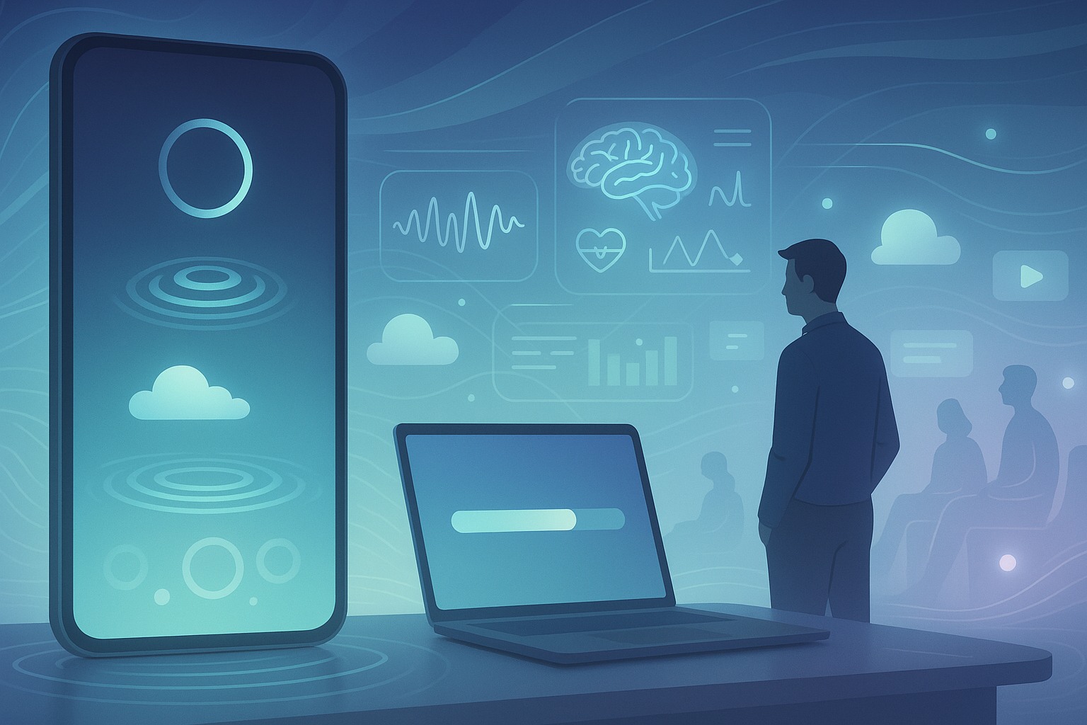
Designers use visual metaphors for this reason. For example, rippling water animations or smooth gradient transitions give the impression of progress and continuity, which tricks the brain into perceiving time as shorter. Even simple micro-interactions, like a progress bar that gently fills rather than jerks forward in sudden jumps, reassure users that the system is working.
Techniques for Calming Users During Loading
If you want to calm users while they wait, design choices need to be intentional. Here are some proven approaches:
- Provide clear feedback – Show users that something is happening. A blank screen creates frustration, but a loading animation communicates progress.
- Use metaphors of calmness – Animations inspired by nature (water ripples, floating clouds, pulsing circles) create psychological associations with relaxation.
- Show progress indicators – Progress bars or percentage counters reduce uncertainty. Even if the process takes longer, users feel reassured when they know how much is left.
- Add personality – Micro-copy like “Brewing your coffee…” instead of “Loading” can lighten the mood and distract users.
- Make it interactive when possible – In longer waits, mini games or playful interactions can transform frustration into delight.
The difference between a user staying or bouncing can sometimes be a single loading state.
The Psychology of Loading States in Mobile Apps
Mobile users have even less patience than desktop users. With thumb taps and quick swipes, the expectation is speed. But mobile internet connections vary, apps fetch data, and complex animations need time to render. Designers who understand the psychology of loading states add small touches that make mobile waiting less painful.
For instance, skeleton screens (temporary grey shapes that mimic the layout of the final content) are widely used. They reassure users that content is coming soon and give them a sense of continuity. Research shows that users perceive skeleton screens as faster than spinners, even if the actual load time is the same. Why? Because they trick the brain into believing progress is already happening.
Another clever trick is progressive loading—delivering visible parts of content first. Think of an image gradually sharpening from blurry to high resolution. Instead of forcing users to wait in silence, apps let them enjoy partial content while the rest loads. This approach reduces perceived waiting time and keeps engagement steady.
Designing Progress for Psychology
Progress indicators aren’t just functional; they’re emotional. A spinner that endlessly rotates without end is one of the worst offenders in user experience. Why? Because it creates uncertainty—users don’t know how long it will take. Uncertainty triggers frustration and impatience.
On the other hand, a progress bar with small visual cues of advancement gives people hope. Psychologists call this the goal-gradient effect: the closer people feel to completing a goal, the more motivated and patient they become. That’s why progress bars often accelerate near the end—even if technically inaccurate. The illusion of nearing completion boosts satisfaction.
Another strategy is anticipatory design. Instead of waiting for the entire process to complete, give users small pieces of progress. For example, confirming that their payment has been accepted before the receipt fully loads creates reassurance.
Emotional Triggers in Waiting
Loading states touch on deep emotional triggers:
- Uncertainty – Not knowing how long something will take is stressful. Clear indicators reduce this.
- Lack of control – Users feel helpless when they can’t affect speed. Giving feedback restores a sense of control.
- Expectation vs reality – If users expect instant results but face delays, disappointment is amplified. Setting realistic expectations upfront is key.
- Boredom – Idle waiting feels longer. Entertaining or calming animations fill the gap.
Designers who ignore these triggers risk creating frustration loops where users abandon tasks. But when handled with care, waiting transforms into a neutral—or even enjoyable—experience.
Real-World Examples of Good Loading State Design
Let’s look at some notable examples that highlight the psychology of loading states in action:
- Google Search – Even when results take a bit longer, Google shows a quick animation or highlights progress. The tiny movement of dots feels responsive and reduces impatience.
- Instagram Stories – While loading stories, Instagram preloads thumbnails and uses smooth transitions. Users rarely feel the waiting.
- Slack – Its quirky micro-copy like “Reticulating splines…” adds humor and personality, distracting users from delays.
- Duolingo – Uses playful animations and characters that make waiting feel like part of the learning journey.
These examples prove that waiting doesn’t have to be dead time—it can reinforce brand personality and build trust.
The Psychology of Loading States and Trust
Here’s the bigger picture: calming loading states don’t just reduce stress; they build trust. When an app communicates openly, shows progress, and respects user attention, people feel that the product is reliable. Conversely, poor loading experiences erode trust. Imagine waiting for a payment confirmation with no feedback—you instantly worry about double charges or failed transactions.
This is why many financial apps now invest heavily in loading design. Clear feedback, confirmation screens, and calm animations prevent panic and encourage continued usage.
Future Directions in Loading State Design
We’re moving into an era where loading states may become personalized. With AI predicting user behavior, apps could preload content before users even click. This reduces the need for waiting entirely. But even in such cases, there will always be moments of delay—network interruptions, large data fetches, or system updates.
The future will likely bring more biometric-driven designs, where animations adapt to user stress levels. Imagine a fitness app that notices a slightly elevated heart rate during a long load and displays soothing animations or messages tailored to calming the user. This human-centered approach could redefine how we perceive waiting.
FAQs about The Psychology of Loading States
1. Why do users get impatient during loading?
Because our brains crave instant feedback. Delays without feedback amplify stress.
2. Are progress bars better than spinners?
Yes. Progress bars reduce uncertainty while spinners often feel endless.
3. Do skeleton screens really make loading faster?
They don’t technically reduce time but they improve perceived speed.
4. Can loading states increase trust in an app?
Absolutely. Clear and calming states reassure users and make apps feel more reliable.
5. What’s the best way to design a loading state?
Combine clarity, progress indicators, and calming visuals to reduce stress.
Wrapping Up
The psychology of loading states is about much more than pretty animations—it’s about human psychology, emotions, and trust. By calming users during wait times, designers not only improve user satisfaction but also strengthen long-term engagement. Waiting will always exist in some form, but whether it feels unbearable or acceptable depends on design choices.
Leave a Reply