You’ve spent months designing the perfect product. The UI looks great. The features are rock-solid. But then users sign up… and bounce. No errors, no bugs, just friction. That awkward silence of a user landing in your app for the first time and not knowing what to do next.
That’s where contextual tooltips and onboarding come in. They can be the difference between a “meh” first impression and a “whoa, this is smooth” moment. In this article, we’re going deep into how to reduce first-time user friction using modern onboarding techniques—especially contextual tooltips, walkthroughs, and smart guidance systems.
Let’s make your users feel like they’ve been using your app forever, even when it’s only been five minutes.
Why First-Time User Friction Happens
First-time friction isn’t always about poor design. Sometimes, it’s just about assumptions.
You assume your user knows the mental model behind your dashboard. You assume they’ll guess that the tiny gear icon opens preferences. You assume they’ve used something like this before.
Reality check? Most people don’t read docs. They don’t “play around” if something looks confusing. They leave. Or worse, they stay confused.
Friction happens when there’s a gap between user expectations and product behavior. Good onboarding fills that gap.
What Are Contextual Tooltips and How Do They Help?
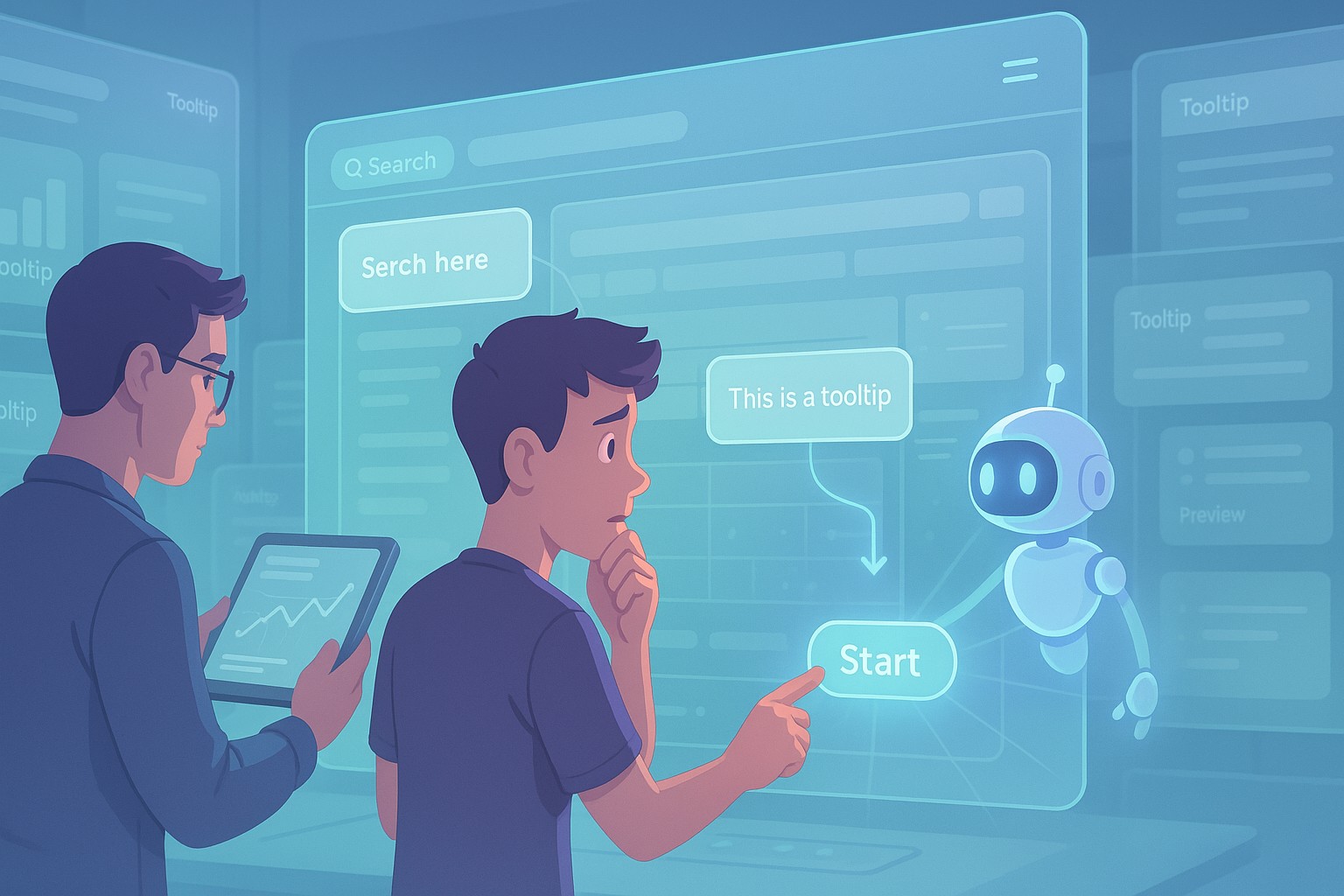
Contextual tooltips are UI elements that pop up to explain features in real-time, in the right place, at the right moment. They’re small, helpful nudges—not intrusive overlays or 10-step walkthroughs that demand your full attention.
Think of a tooltip that appears only when a user hovers over a complex chart legend, or a prompt that shows up the first time someone tries to upload a file.
Done right, contextual tooltips and onboarding guide users without babysitting them. They reduce the cognitive load and offer micro-education as users interact with your app.
And here’s the secret: people remember guidance that helps them complete a task—not abstract concepts explained in a modal 10 minutes ago.
Benefits of Reducing First‑Time User Friction
Let’s break this down. Why do we even care?
Here’s what you get when you reduce first-time user friction:
| Benefit | Explanation |
|---|---|
| Higher activation rates | More users reach their “aha” moment sooner |
| Lower churn | Confident users are more likely to come back |
| Fewer support tickets | You’ll save time and money on reactive support |
| Increased conversions | Users who understand your app faster are more likely to upgrade or convert |
| Better word of mouth | Happy users recommend your product more |
In other words, smooth onboarding = better business.
Tooltips vs. Walkthroughs vs. Product Tours
Not all onboarding methods are created equal. Each one serves a different purpose. Here’s a quick comparison:
| Method | When to Use | Pros | Cons |
|---|---|---|---|
| Contextual Tooltips | For real-time, task-based help | Non-intrusive, task-relevant | Might be missed if too subtle |
| Product Walkthroughs | When introducing complex flows | Controlled guidance, great for onboarding | Can feel rigid or annoying |
| Highlight Hotspots | For hidden features | Draws attention without disrupting flow | Easy to ignore |
| Full Product Tours | When the app is large or multi-step | Educates thoroughly | Risk of info overload |
The ideal setup? A blend. Use contextual tooltips to guide immediate actions and product tours to explain broader workflows.
Best Practices for Designing Contextual Tooltips
It’s tempting to just slap a tooltip on every button and call it a day. Don’t.
Here are some solid principles to follow:
1. Timing is Everything
Show the tooltip when it’s relevant—not when the user lands on the page. Trigger it after a specific action or delay, or when a certain element is interacted with.
Example: Show a tip about keyboard shortcuts only after someone uses the interface more than twice.
2. Less is More
Keep the copy short and specific. One sentence is often enough.
Bad: “This section is where you can create, edit, delete, and manage all types of tasks, projects, and workflows for your organization.”
Better: “Create and manage your tasks here.”
3. One at a Time
Don’t overwhelm users with a swarm of tooltips. If you need to show several, use a “step-by-step” approach—just like a mini walkthrough.
4. Don’t Repeat
Make tooltips dismissible and smart. If the user’s already seen it, don’t show it again. If they’ve used the feature successfully, skip the tip.
5. Style It Subtly
Your tooltip shouldn’t scream. Match your UI style. Use soft shadows, light backgrounds, and gentle animations. The goal is helpful, not flashy.
Examples of Effective Contextual Tooltips in Action
Let’s look at some real (or real-ish) examples of how this works.
1. Slack
When you first join a Slack workspace, a little tooltip explains the difference between Channels and Direct Messages. That tiny guidance saves users from posting company announcements to their manager’s DMs.
2. Figma
Figma introduces features like Auto Layout with smart tooltips only when users work with frames. They don’t flood you with instructions. It’s contextual learning.
3. Notion
Notion adds subtle hotspots (little glowing dots) to new features, which expand into mini-tooltips explaining what’s new. The experience is passive but useful.
4. Shopify
When merchants set up their store, Shopify guides them with just-in-time messages about where to go next—no guessing, just step-by-step momentum.
How Contextual Tooltips and Onboarding Reduce First‑Time User Friction
Let’s bring it all together.
By now, it should be clear that contextual tooltips and onboarding reduce first-time user friction by:
- Giving users help only when they need it
- Keeping explanations short, relevant, and non-intrusive
- Encouraging self-discovery instead of forced linear tours
- Adapting to different user types (beginners vs. power users)
- Creating that “I got this” feeling from day one
This isn’t just about design. It’s about user psychology. People hate feeling lost, but they also don’t want to be spoon-fed. Contextual onboarding hits that balance.
Building Your Own Tooltip and Onboarding System
You’ve got two options here: use a third-party onboarding tool or build your own.
Popular Tools (If You Don’t Want to Build It Yourself)
| Tool | What It Does Well | Notes |
|---|---|---|
| Appcues | Easy no-code tooltips, walkthroughs | Great analytics, but can be pricey |
| Intro.js | Lightweight guided tours | Free and simple for devs |
| Shepherd.js | Powerful open-source tour library | Great flexibility, but needs manual setup |
| Userpilot | In-app experiences + segmentation | Excellent targeting options |
| Pendo | Enterprise-grade with product analytics | Best for larger teams and products |
Building a Custom Solution
If you want full control (and you’ve got dev resources), a custom tooltip system can be more seamless.
You’ll need:
- A system to track tooltip state (shown/dismissed)
- A way to trigger tooltips conditionally (on hover, on click, on page load, etc.)
- A small component with positioning logic (don’t reinvent Popper.js)
- Optional: tour manager to step through a sequence
Bonus points for accessibility: make sure tooltips are keyboard-friendly and screen-reader safe.
Contextual Tooltips for Mobile Onboarding
Tooltips work on mobile too, but the approach is slightly different.
Tips for mobile:
- Avoid hover-based triggers (obviously)
- Anchor tooltips near thumb zones
- Keep copy even shorter—2 lines max
- Use modals or bottom sheets sparingly
- Make dismissal easy (tap anywhere outside)
Even on small screens, the right nudge can turn confusion into clarity.
Future of Contextual Onboarding: AI + Personalization
Imagine onboarding that adapts to each user in real-time.
We’re getting there.
Future systems will:
- Detect what kind of user someone is (beginner, expert, admin, etc.)
- Adapt onboarding content dynamically
- Use AI to recommend tips based on usage patterns
- Highlight unseen or underused features based on behavior
And maybe one day, onboarding won’t feel like onboarding at all. Just a product that gently teaches you as you use it.
FAQs
1. What is the purpose of contextual tooltips?
To provide relevant, timely help during specific user interactions.
2. How do I know if my onboarding has too much friction?
Check metrics like bounce rate after signup, time-to-first-action, and support tickets from new users.
3. Should I use tooltips or full product tours?
Use both—tooltips for micro-guidance, tours for structured onboarding.
4. Are tooltips annoying to users?
Only if they’re poorly timed or too frequent. Subtle, relevant ones usually help.
5. What tools can I use to create onboarding experiences?
Appcues, Intro.js, Userpilot, and Pendo are all popular choices.
Leave a Reply