Samsung is no stranger to pushing boundaries in mobile user experience. With every new iteration of its custom Android skin, it fine-tunes how millions of users interact with their devices. And now, in 2025, Samsung’s One UI 8 is preparing to make its debut alongside the Galaxy Z Fold 7.
At first glance, it may not seem like a revolutionary change. The icons are still familiar, the layout structure remains consistent, and the overall flow hasn’t been flipped on its head. But dig deeper and you’ll notice that Samsung is taking a bold but subtle approach this year—refining rather than reinventing, improving rather than overwhelming.
So what makes One UI 8 such a big deal? Let’s explore how this new update is reshaping mobile UI design and what it tells us about where user interface trends are heading—especially when it comes to accessibility, visual hierarchy, and user control.
What’s New in One UI 8?
Let’s start with the obvious question: what’s changed?
At a glance, One UI 8 doesn’t scream innovation, but it’s the tiny touches that make the biggest difference. Samsung has gone for a “don’t break what works” mindset, but instead of stagnation, it’s created a smoother, smarter UI that subtly elevates the mobile experience.
One major change is the visual treatment of system apps. In the Gallery app, for instance, contextual menus now use circular pill backgrounds rather than sharp-edged dropdowns. It’s a small shift, but it immediately feels more fluid and visually cohesive with the rest of the UI.
There’s also a focus on tidying up app layouts—like in the File Manager, where One UI 8 introduces a more grid-like structure with clearer icons, more intuitive folder hierarchies, and better grouping for recent downloads.
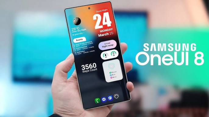
And then there’s the new “Now Brief” feature. This is Samsung’s spin on a contextual notification and information center. Unlike traditional widgets or the Google Discover feed, Now Brief shows relevant cards based on your habits, calendar entries, and app usage. It’s not trying to wow with new tech—it’s trying to get out of your way.
The Visual Design Tweaks That Actually Matter
Now let’s talk visuals. One UI has always leaned into rounded corners, tall touch targets, and soft animations. But One UI 8 turns down the noise even more.
System animations are lighter and quicker—menus fade in faster, transition effects have less “drag,” and icons feel a tad more responsive to touch. The emphasis here is on speed and smoothness, especially on devices with high refresh rates.
What stands out most is how Samsung is using color restraint. Where older One UI versions used gradients and pastel shadows, One UI 8 is shifting to flatter backgrounds and bolder contrast. The result? A cleaner look that improves legibility—especially helpful for users in direct sunlight or those with vision concerns.
It’s these nuanced details that make Samsung’s One UI 8 a subtle yet significant shift in mobile UI design. By reducing cognitive load and decluttering visual distractions, Samsung is allowing users to focus more on content and less on the interface itself.
One UI 8 and Accessibility: Quietly Getting Better
Accessibility isn’t the flashiest topic in UI design—but it’s where real innovation happens.
One UI 8 improves upon Samsung’s already decent accessibility options by:
- Introducing a simplified high-contrast mode with consistent color application
- Providing text size and weight scaling options that work app-wide
- Enhancing screen reader support with more clearly labeled UI components
- Improving voice command integration for core system apps
And, importantly, accessibility settings are now easier to discover. Samsung moved them closer to the top level of Settings rather than burying them several menus deep.
This aligns with a broader shift in the industry: accessibility-first design is becoming the norm, not the exception. Samsung is clearly following Apple’s lead here, but the execution is distinctly One UI—practical, customizable, and layered with options.
One UI 8’s Approach to Personalization and Theming
Customization has always been one of Samsung’s strong suits, and One UI 8 continues to lead the way.
Users can now:
- Apply system-wide icon packs without third-party launchers
- Use dynamic themes that match wallpaper colors, similar to Material You
- Customize lock screen widgets, clock layouts, and even fingerprint animations
But what makes it especially interesting is the AI-driven theming suggestion system. Based on your usage habits, color preferences, and even time of day, Samsung offers subtle visual adjustments you can approve or tweak.
In a world where hyper-personalization is becoming the norm, this puts Samsung’s One UI 8 at the forefront of adaptive mobile UI design—quietly making your phone feel like it’s yours alone.
The Foldables Factor: One UI 8 on the Galaxy Z Fold 7
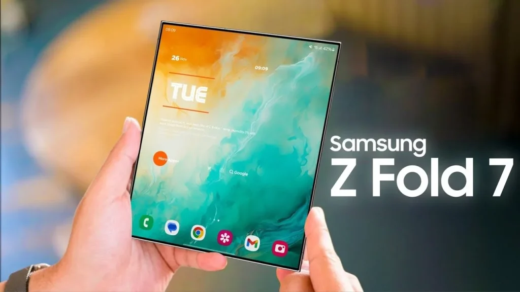
One UI 8 isn’t just designed for slabs—it’s built with foldables in mind.
The Galaxy Z Fold 7 will be the first device to ship with One UI 8, and it shows. The multitasking panel now uses floating windows with edge-snapping logic, and app continuity between folded and unfolded states feels snappier than ever.
There’s even better hover-state UI for when the phone is partially open, allowing users to interact with playback controls, note-taking apps, or calls while in “tent mode.”
If you want a look at the future of UI across multiple form factors, One UI 8 is quietly laying the groundwork.
AI in One UI 8: A Subtle Background Force
Unlike flashy AI features in some other Android skins, One UI 8 is taking a more restrained approach. Rather than generate images or write messages, its AI is more of a silent assistant.
For instance:
- It suggests keyboard input improvements based on your writing style
- Reorders quick settings tiles based on usage patterns
- Manages power allocation across apps to improve performance
There’s no big AI “moment”—but that might be the point. This isn’t AI trying to impress you; it’s AI trying to improve the interface behind the scenes.
And that’s the core of Samsung’s One UI 8: a subtle yet significant shift in mobile UI design—less flash, more function.
Performance and Stability: Finally Getting It Right?
Let’s be honest. One UI 7 had a few hiccups. Early rollouts caused lag, bugs, and some pretty nasty battery drain.
Samsung has taken that feedback seriously with One UI 8. Beta users are already reporting:
- Better RAM allocation for heavy multitasking
- More consistent animation speeds across third-party apps
- Fewer dropped frames during transitions
This makes One UI 8 one of Samsung’s most stable UI updates in years—a win for both developers and end users.
What This Says About the Future of Mobile UI
If there’s one takeaway from One UI 8, it’s this: refinement is the new innovation.
As design trends move toward minimalism, clarity, and accessibility, brands like Samsung are proving that small changes can have big impact.
And for UI designers, this update is a signal:
- You don’t always need to reinvent the wheel
- Subtle improvements can transform how users feel
- Accessibility and personalization are non-negotiable now
So whether you design mobile apps, SaaS dashboards, or entire platforms, One UI 8 is a great case study in what thoughtful modern UI looks like in 2025.
FAQs
1. What is the release date for One UI 8?
It’s expected to roll out with the Galaxy Z Fold 7 in mid-2025, with beta programs available before the public release.
2. Is One UI 8 available on older Samsung phones?
Yes, but availability depends on your device model. Samsung typically supports flagships from the past 2–3 years.
3. What’s the biggest design change in One UI 8?
Visual tweaks in system apps, smoother animations, and an overall cleaner UI layout—especially in core apps like Gallery and File Manager.
4. Is One UI 8 better for accessibility?
Yes, it includes improved high-contrast modes, clearer font options, and better screen reader support.
5. Does One UI 8 use AI features?
Yes, but subtly. It helps with personalization, system optimization, and predictive UI behaviors without feeling invasive.
Leave a Reply