You ever open a website and instantly feel overwhelmed? Or maybe you’re constantly clicking around trying to figure out what you were supposed to do? For most of us, that’s a minor annoyance. But for neurodivergent users, particularly people with ADHD or autism, poor UI design isn’t just annoying – it’s a complete barrier. Designing for neurodiversity isn’t a buzzword. It’s a responsibility. And it leads to better experiences for everyone.
Let’s dive into the real-world techniques, tweaks, and philosophies that go into inclusive UI design, especially when designing for neurodiversity: UI techniques for ADHD and autism.
Why UI Design Needs to Embrace Neurodiversity
Here’s the thing: neurodivergence isn’t rare. Around 15-20% of the global population is considered neurodivergent. That includes people with ADHD, autism, dyslexia, OCD, and other cognitive differences.
Ignoring their needs means ignoring a massive group of users. But even beyond that, when we design for edge cases, we often create better systems for everyone. Good design shouldn’t be a privilege.
Understanding How ADHD and Autism Affect UX
Before you can design better, you have to understand what you’re designing for.
ADHD (Attention Deficit Hyperactivity Disorder) typically affects:
- Focus and sustained attention
- Impulse control
- Working memory
- Sensory regulation (especially in overstimulating environments)
Autism Spectrum Disorder (ASD) is associated with:
- Sensory sensitivities (visual noise, sound, motion)
- A preference for routine and predictability
- Challenges with interpreting ambiguous interfaces
- Difficulty filtering out irrelevant information
These challenges don’t mean “less capable.” They mean differently capable. So your UI needs to adapt to that difference.
UI Techniques for ADHD and Autism
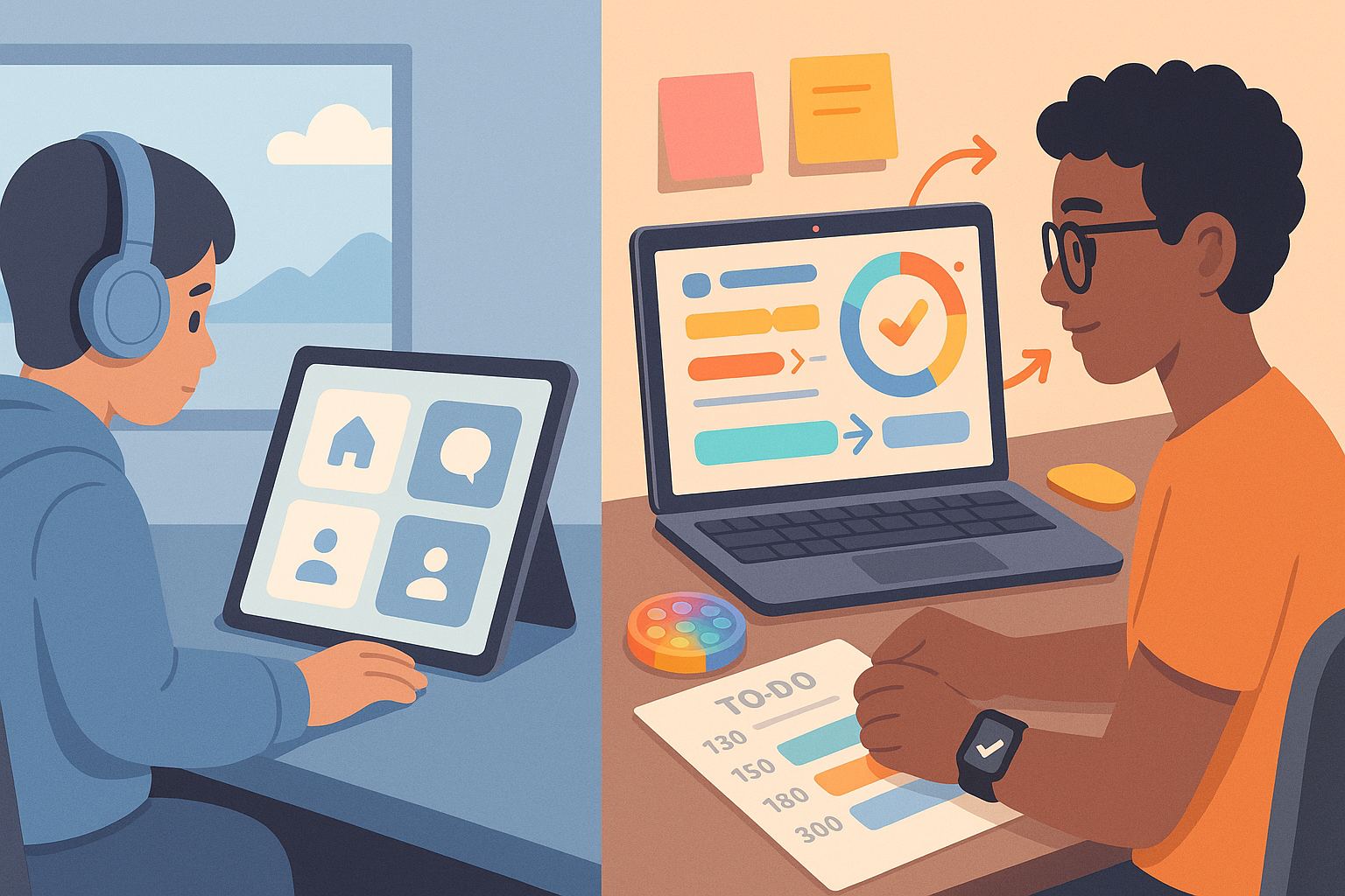
1. Simplify, Then Simplify More
A clean layout isn’t just about aesthetics. For someone with ADHD, a cluttered interface can completely derail their ability to complete a task. And for autistic users, unpredictable layouts can create anxiety.
- Use whitespace liberally.
- Stick to one primary action per screen.
- Avoid flashing banners, autoplay videos, or unexpected animations.
- Group similar elements together to reduce cognitive load.
2. Predictability Is Power
Designing for neurodiversity means making the experience feel safe and reliable. That’s especially important for users on the autism spectrum.
- Use consistent placement for buttons and navigation.
- Avoid surprise content (like popups or unexpected tooltips).
- Keep terminology uniform across pages.
- Offer a progress bar or breadcrumb navigation so users know where they are.
3. Clear, Literal Language
Ambiguity is a nightmare for autistic users, and vague language can confuse people with ADHD who may skim.
- Use direct language like “Delete File” instead of “Execute Action.”
- Avoid idioms, jokes, or metaphors unless you’re sure they’re understood.
- Give concise feedback like “Form submitted” instead of just reloading the page silently.
4. Reduce Visual Noise
What feels like a fun, dynamic layout to one person might feel overwhelming and distracting to another.
- Ditch the parallax scroll.
- Skip rotating banners and carousel sliders.
- Limit color palette to a few high-contrast choices.
- Avoid textures and gradients that simulate depth without purpose.
5. Support Focus With Microinteractions
Designing for ADHD? Think microinteractions.
- Highlight active form fields clearly.
- Use subtle motion to guide attention, not hijack it.
- Offer reminders and nudges (e.g. “You haven’t saved your changes”)
- Let users snooze or dismiss persistent notifications.
6. Let Users Control the Experience
Personalization helps. A lot.
- Let users switch to a “minimal mode.”
- Offer a “reduced motion” toggle.
- Provide options to increase font size, spacing, and contrast.
- Make dark mode and light mode easily accessible.
7. Break Tasks Into Steps
Multi-step processes help users with ADHD stay on track and help autistic users feel less overwhelmed.
- Use wizard-style flows with one clear task per screen.
- Show users what’s next and allow them to go back.
- Give users a preview of what will be required at the start.
- Use visuals to reinforce each step.
8. Feedback That Calms, Not Confuses
Instant feedback reduces anxiety. But it has to be clear and calming.
- Use friendly tones: “You’re all set!” is better than “Operation Complete.”
- Use icons (like a green checkmark) alongside text.
- Make error messages specific and actionable.
- Don’t just say “Something went wrong.” Say what, and suggest how to fix it.
Designing for Neurodiversity: UI Techniques for ADHD and Autism in Real Products
It’s not just theory. Let’s look at how these ideas show up in apps and websites that get it right:
1. Notion: This productivity tool offers toggleable complexity. You can start with a simple note and build a dashboard. For ADHD users, that ability to start small and expand is gold.
2. Duolingo: Progress bars, celebratory animations, and tiny learning chunks make it friendly for neurodivergent learners. It reduces overwhelm while keeping things engaging.
3. Apple’s Settings App: Minimalist design, consistent patterns, and clear labels make it easy to find things. Plus, accessibility settings allow full control over text, motion, and audio.
4. Headspace: Designed with calm in mind, it uses soft colors, minimal text, and gentle transitions. It’s welcoming for anyone easily overstimulated.
Testing With Neurodivergent Users
You can follow every rule above and still miss the mark if you don’t test with real neurodivergent users.
- Run usability tests with users who have ADHD and autism.
- Offer test participants options to give feedback in different ways (written, verbal, visual).
- Observe not just success rates, but stress levels and navigation patterns.
- Ask them how the UI feels to use, not just whether it works.
Even a single neurodivergent user in your testing group can reveal insights you wouldn’t catch otherwise.
Designing Interfaces That Welcome, Not Exclude
Designing for neurodiversity isn’t just good UX. It’s good ethics. And frankly, it makes your product better. When you design with ADHD and autism in mind, you create:
- Less clutter
- More clarity
- Higher focus
- Stronger trust
- Better results for everyone
If you’ve ever wondered what makes a UI feel “friendly,” this is it.
You don’t need a whole new design system to be inclusive. You just need better habits:
- Ask yourself: would this overwhelm someone?
- Can I make this task one step simpler?
- Is this language too clever for its own good?
- Do users have control?
By answering these, you’ll naturally move toward interfaces that welcome neurodivergent users—and all users, really.
And if someone ever asks you what inclusive design means, just point them to the basics of designing for neurodiversity: UI techniques for ADHD and autism.
5 FAQs About Designing for Neurodiverse Users
1. Do I need to make separate versions of my app for ADHD and autistic users?
No, the goal is flexible design that adapts to all users, not segregation.
2. What tools help test accessibility for neurodivergence?
Tools like Stark, axe DevTools, and inclusive design checklists can help – but real user feedback is best.
3. Is dark mode better for neurodivergent users?
Often yes, but offer both dark and light modes so users can choose.
4. Should I always avoid animation?
Not always. Subtle, intentional motion can guide attention. But always offer a “reduce motion” option.
5. How do I convince my team this matters?
Show how inclusive design improves UX for everyone. Plus, there’s a business case: better usability leads to higher retention.
Leave a Reply