Decision Fatigue in UI Design Is Real—And It Can Wreck Your Flow
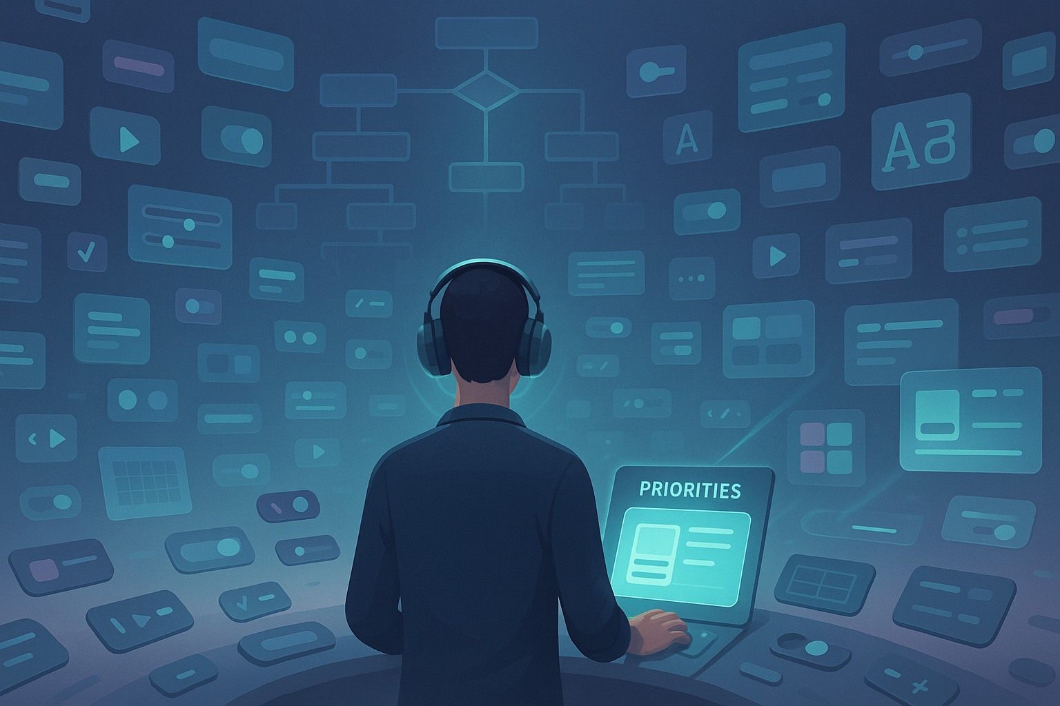
If you’ve ever sat in front of a Figma file, blinking at 14 different button styles and wondering which shade of blue is “on-brand enough,” you know exactly what I’m talking about. Decision fatigue in UI design isn’t some abstract concept—it’s a daily mental tax that slowly chips away at your creativity.
It happens when you’ve made too many small choices—colors, type sizes, icon placements—until suddenly your brain decides, “Nope, I’m done.” That’s when mistakes creep in, designs get inconsistent, and feedback loops start spinning out of control.
So today I’m going to break down how I deal with decision fatigue in UI design and how I’ve set up guardrails that allow me to stay creative without burning out by lunch.
What Is Decision Fatigue (And Why UI Designers Are So Prone to It)
Decision fatigue is a psychological phenomenon where your ability to make choices deteriorates after a long session of decision-making. In UI design, you’re hit with thousands of micro-decisions every day:
- Should this card have a 12px or 16px padding?
- Should I go with a sidebar or a bottom tab nav?
- Should I use icons with labels or just icons?
Unlike many other jobs, we don’t just make decisions—we make visible, user-facing decisions that need to feel effortless, even when they’re anything but.
Over time, this drains your mental energy and can lead to indecisiveness, inconsistent work, and delayed timelines.
My System for Managing Decision Fatigue in UI Design
The reason I say “how I deal with decision fatigue in UI design” is because there’s no universal cure. But here’s the mix of systems, mindsets, and habits that works for me.
1. I Build and Stick to Design Systems
Design systems save lives. Okay, maybe not literally—but they absolutely save your sanity.
Once I started working with a modular design system, I noticed a 60–70% drop in the number of small design decisions I had to make per project. No more reinventing the wheel on every screen.
My core design system includes:
- A fixed set of typography rules (3 headings, 2 body sizes, and one caption style)
- Predefined spacing values: 4, 8, 16, 24, 32, and 64
- A limited color palette with use-cases baked in (e.g. “Primary,” “Danger,” “Success”)
- Component libraries that cover buttons, inputs, modals, cards, and alerts
The beauty is, when everything’s predefined, most of your decisions are already made. I just drag, drop, and tweak where necessary.
2. I Use Decision Batching (A Game Changer)
I batch all my decisions by category. I don’t jump around from fonts to buttons to icons in one sitting. Instead, I allocate chunks of time to just make decisions within one category.
For example:
- Monday 9–10am: All typography styles and hierarchy
- Monday 10–11am: Button states and interaction patterns
- Monday 1–2pm: Navigation layouts
This way, my brain gets into a focused mode and avoids context switching, which is one of the worst things for decision fatigue.
3. I Limit My Options (Deliberately)
The more choices you give yourself, the more mental debt you accumulate.
Here’s a classic mistake I used to make: opening Google Fonts and scrolling through 500 typefaces for every project.
Now? I’ve got a go-to shortlist of fonts I know inside-out:
| Font Type | Choices I Allow |
|---|---|
| Headings | Inter, Poppins, or DM Sans |
| Body | Inter or Roboto |
| Special | Just one decorative option max |
The same goes for colors. I work with a primary palette and only allow myself to introduce new shades if there’s a strong reason. This keeps the interface tight, and my mental focus tighter.
4. I Timebox the “Tweak Phase”
This one’s controversial, but crucial. I give myself a strict time limit for tweaking things like:
- Rounded corner radii
- Box shadows
- Animation speeds
- Icon alignment
If I don’t hit a decision within 5 minutes, I mark it for later review during feedback. Otherwise, I fall into pixel perfectionist mode and burn 2 hours deciding between a 2px or 4px shadow.
5. I Rely on “Default Decisions” for Repeated Tasks
Over time, I’ve built up a library of default decisions. These are patterns or choices I default to unless there’s a reason not to.
Some examples:
| UI Element | Default Choice |
|---|---|
| Primary button | Full width, solid fill, 8px radius |
| Input field | Label on top, 12px padding |
| Error message | Red-500 with bold text |
| Mobile nav | Bottom tab with icons and labels |
I think of these like my “muscle memory decisions.” They reduce the cognitive load and speed things up drastically.
6. I Say “Good Enough” More Often
Perfectionism feeds decision fatigue. There’s a point in most designs where 90% of the value is done, and the last 10% is just ego or fear of critique.
Saying “good enough” doesn’t mean shipping low-quality work. It means recognizing diminishing returns.
Sometimes I’ll pause and ask myself:
- Will the user even notice this?
- Will changing this make the product measurably better?
- Am I doing this for the user—or for my pride?
Nine times out of ten, the answer tells me to move on.
7. I Take Breaks Before I Burn Out
I used to power through long design sprints, only to crash hard and redo everything later.
Now, I stop before I’m tired. The trick? I set alarms to take breaks even if I’m mid-flow. That keeps my energy high and my choices sharp.
Also, sleep helps. A lot. I can’t tell you how many times I’ve made better UI decisions after walking away and coming back the next morning.
8. I Outsource Feedback Loops
Another major win for my mental bandwidth: I stopped being the only person giving feedback on my work.
I now use async feedback tools like:
- Loom to walk through my design decisions
- Figma comments from teammates or clients
- Slack or Notion checklists for design QA
This means I don’t have to carry every single judgment call. Letting go of control = letting go of decision fatigue.
9. I Document My Patterns
Every time I face a repeat decision, I log it. Whether it’s in Notion, a shared style guide, or even a personal checklist, documenting patterns helps me avoid rethinking things in future projects.
Here’s a small snapshot of one of my docs:
| Decision Type | My Default | Notes |
|---|---|---|
| Toast Notification | Slide in from top-right | Use only for non-critical alerts |
| Modal Layout | Centered, 90% width on mobile | Always closeable by clicking outside |
| Empty States | Illustration + action CTA | Encourage meaningful next step |
It might take a few extra minutes today, but it saves hours next week.
10. I Use the “Three-Option Rule” With Clients
When I present work to clients or stakeholders, I don’t give them five wildly different concepts. I present:
- A safe version (on-brand, no surprises)
- A bold version (a little risky but exciting)
- A hybrid (something in between)
That way, they don’t get decision fatigue either—and I don’t have to juggle 12 rounds of scattered feedback.
Two Places Where Decision Fatigue Sneaks In Most
Let me call out two specific places where decision fatigue creeps in, even when you think you’re safe.
Design Handoff
This is where I used to get stuck in pixel tweaks that didn’t matter. Now I use checklists and tokens to ensure handoff-ready files, and I don’t stress about every single state.
Design Reviews
Every stakeholder wants to “just see one more version.” Learn to set boundaries and present only what you’ve decided is ready. Otherwise, you’ll burn out trying to cater to everyone’s vision.
Why It Matters: Your Sanity Is a Design Asset
Let’s be real. The quality of your decisions is the quality of your UI. You can’t produce clean, logical, usable designs if you’re running on mental fumes.
That’s why how I deal with decision fatigue in UI design isn’t just about speed—it’s about protecting clarity, quality, and creativity. You owe it to yourself, and to your users, to be intentional with your energy.
FAQs
1. What is decision fatigue in UI design?
It’s the exhaustion from making too many small design decisions, leading to burnout or poor choices.
2. How can I avoid decision fatigue in my design workflow?
Use systems like design tokens, limit your options, and document repeat decisions.
3. Should I create a design system even for small projects?
Yes—even a lightweight one can drastically reduce cognitive load.
4. Can AI tools help with decision fatigue?
They can! Tools like layout suggestions, color palette generators, and auto-layouts reduce choices.
5. Is it bad to reuse old design patterns?
Not at all. Reusing smart de۷faults is a sign of maturity, not laziness.
Leave a Reply