I never thought that making buttons easier to see or giving alt text to images would change me. But here I am, years into my design career, looking back at how designing for accessibility made me a better human. This isn’t a fluffy feel-good story—it’s about empathy, awareness, and realizing that good design isn’t just about aesthetics or conversions. It’s about people.
When I first started designing websites, accessibility was just another item on a checklist. Use ARIA labels? Check. Color contrast? Check. Keyboard navigation? Sure, why not. But I didn’t feel anything about it. It was like flossing—I knew I should do it, but it felt more like a chore than a purpose.
That changed dramatically when I watched someone use a screen reader to navigate a website I had designed. The gaps, the frustrations, the roadblocks—suddenly it wasn’t about code or compliance anymore. It was about the real human experience. And once you’ve seen that, you can’t unsee it.
Let me walk you through how this shift happened, what I’ve learned, and why I believe that designing for accessibility made me a better human—both professionally and personally.
Understanding Accessibility: More Than Just Checkboxes
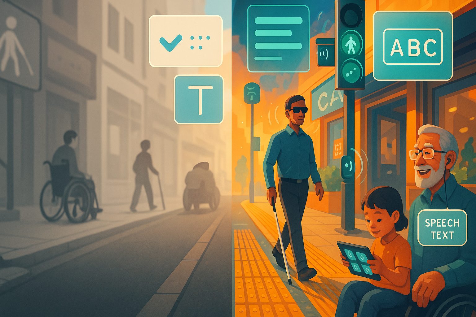
We often reduce accessibility to guidelines and tools—WCAG compliance, screen readers, color contrast checkers. But accessibility is really about inclusive thinking. It’s about designing so that everyone, regardless of ability, can interact with your content without needing help.
When I started exploring accessibility more seriously, I realized how narrow my understanding of “users” had been. I designed for people like me: full-sighted, able to use a mouse, with fast internet and no cognitive impairments. But what about someone with a tremor trying to hit a tiny button? Or someone who’s colorblind and can’t tell red from green in a form error?
Accessibility asks us to step out of ourselves—to think about others, their limitations, and their context. And that mental shift started changing how I saw not just my users, but people in general.
How Designing for Accessibility Made Me a Better Human
You might be wondering how tweaking HTML attributes or thinking about color contrast can improve your character. But stay with me.
1. It Taught Me Empathy Through Design
When you build for accessibility, you’re constantly thinking about people who aren’t like you. You’re putting yourself in someone else’s shoes: someone who can’t use a mouse, someone who reads with their ears, someone who gets overwhelmed by too much input.
It’s humbling. And it makes you pause. You start noticing curbs without ramps, elevators that speak only in English, signs with fonts too small to read. Suddenly, the world isn’t built for everyone. It’s built for the average, the able. But real humans aren’t average—they’re diverse.
2. It Helped Me Design With Purpose, Not Just Polish
I used to get really caught up in micro-interactions, subtle gradients, animations, and typography. But when I began thinking about accessibility, my focus shifted. What’s the purpose of this component? Does it help someone? Or is it just there to look cool?
Designing for accessibility brings your attention to hierarchy, clarity, readability, and structure. You’re not designing to impress—you’re designing to communicate.
3. It Improved My Communication Skills
One of the big “aha” moments I had was realizing that a screen reader user hears your page like a story. That made me start writing better alt text, better headings, and better labels.
It taught me to be concise, descriptive, and thoughtful. And that extended into other areas of life—writing emails, giving feedback, or even talking to family. Accessibility teaches you to say what you mean clearly and consider how others will interpret it.
4. It Made Me See Privilege More Clearly
Using a computer without a mouse. Reading an article without vision. Filling out a form with dyslexia. Accessibility made me realize how easy things are for me—and how unfair it is that others have to work so much harder for the same outcome.
It made me more patient with people. It made me advocate for change in my workplace. And it made me grateful in ways I hadn’t expected.
5. It Encouraged Me to Slow Down and Think
Good accessibility isn’t something you slap on at the end. It’s not a plugin or a checklist item. It’s something you design from the beginning.
That means taking the time to consider flows, labels, errors, navigation, and how all of it feels for someone using assistive tech. That process forced me to slow down, listen more, test more, and ask better questions.
In short, accessibility taught me to care more—and that affected how I treat people everywhere, not just on my websites.
Real-World Lessons from Accessibility Failures
We’ve all seen inaccessible designs in the wild. Here are a few scenarios I encountered that stuck with me:
| Issue | Impact on Users |
|---|---|
| No focus indicator on buttons | Keyboard users couldn’t tell where they were on the page |
| Placeholder text instead of labels | Screen reader users had no context for form fields |
| Poor color contrast | Low-vision users couldn’t read important information |
| Non-descriptive link text like “Click here” | Users had no idea what the link was for |
| Modal dialogs without focus trapping | Screen reader users couldn’t escape the modal |
Each of these failures resulted in frustration—or worse, exclusion. And every time I encountered one, I learned to fix not just the code but also the mindset that created it.
Why Teams Resist Accessibility (And Why That’s Dangerous)
Even now, in 2025, many teams treat accessibility as a “nice-to-have.” It gets deferred, deprioritized, or outright ignored because:
- “We don’t have users with disabilities.”
- “It’s too expensive.”
- “It slows us down.”
These are myths. If your product is public, then you do have users with disabilities—you just haven’t talked to them. And the cost of not designing for accessibility? Lost customers, lawsuits, damaged reputation, and frankly, bad design.
Accessibility isn’t a blocker. It’s a catalyst for better design, better content, and better user experience.
Accessibility Improvements That Changed My Process Forever
There are a few accessibility changes I made that I’ll never design without again:
| Practice | Why I Won’t Skip It |
|---|---|
Semantic HTML (proper use of <button>, <nav>, <section>, etc.) | Screen readers rely on these to structure content |
| Keyboard testing | If it doesn’t work with Tab, it doesn’t work |
| Visible focus states | Essential for keyboard navigation and usability |
| Color contrast checking | Ensures everyone can read your content |
| Descriptive link and button text | Helps all users understand what they’re clicking |
Using headings properly (h1 to h6) | Creates a logical flow and improves comprehension |
These aren’t just technical niceties. They’re decisions that show respect for the human on the other end of the screen.
The Unexpected Ripple Effect
Designing for accessibility didn’t just make me better at web design. It made me more inclusive in every area of my life. I became more aware of:
- How I speak in meetings (avoiding jargon)
- How I write documentation (clear, simple language)
- How I build teams (diversity isn’t optional)
- How I view public spaces (noticing barriers I hadn’t seen before)
And perhaps most importantly, it made me listen more. Accessibility is never about assuming. It’s about asking, testing, observing, and adapting.
Designing for Accessibility Made Me a Better Human—And It Can Do the Same for You
If you’re a designer, developer, product manager, or anyone who touches digital interfaces, I promise you this: accessibility work will change you.
It will make you more thoughtful. More empathetic. More aware. More patient.
It will frustrate you at times, sure. But it will also make you prouder of what you create. Because when your work is accessible, it means you considered people who are often forgotten—and that’s a powerful act of care.
Accessibility is one of the few areas in design that improves everyone’s experience, not just a subset. Faster navigation, better UX, clearer interfaces—all of that comes from doing this right.
So if you’re still wondering whether it’s worth it to invest your time into accessible design, take it from me: designing for accessibility made me a better human. And I wouldn’t go back for anything.
FAQs
1. What does accessibility mean in design?
It means creating digital products that people of all abilities can use independently.
2. Who benefits from accessible design?
Everyone—from users with disabilities to people on mobile devices or slow internet.
3. Isn’t accessibility just about screen readers?
Nope! It includes visual, auditory, cognitive, and motor accessibility too.
4. How do I start designing more accessibly?
Start with basics: semantic HTML, contrast, keyboard testing, and proper labels.
5. Is accessibility required by law?
In many countries, yes. And even when it’s not, it’s ethically the right thing to do.
Leave a Reply