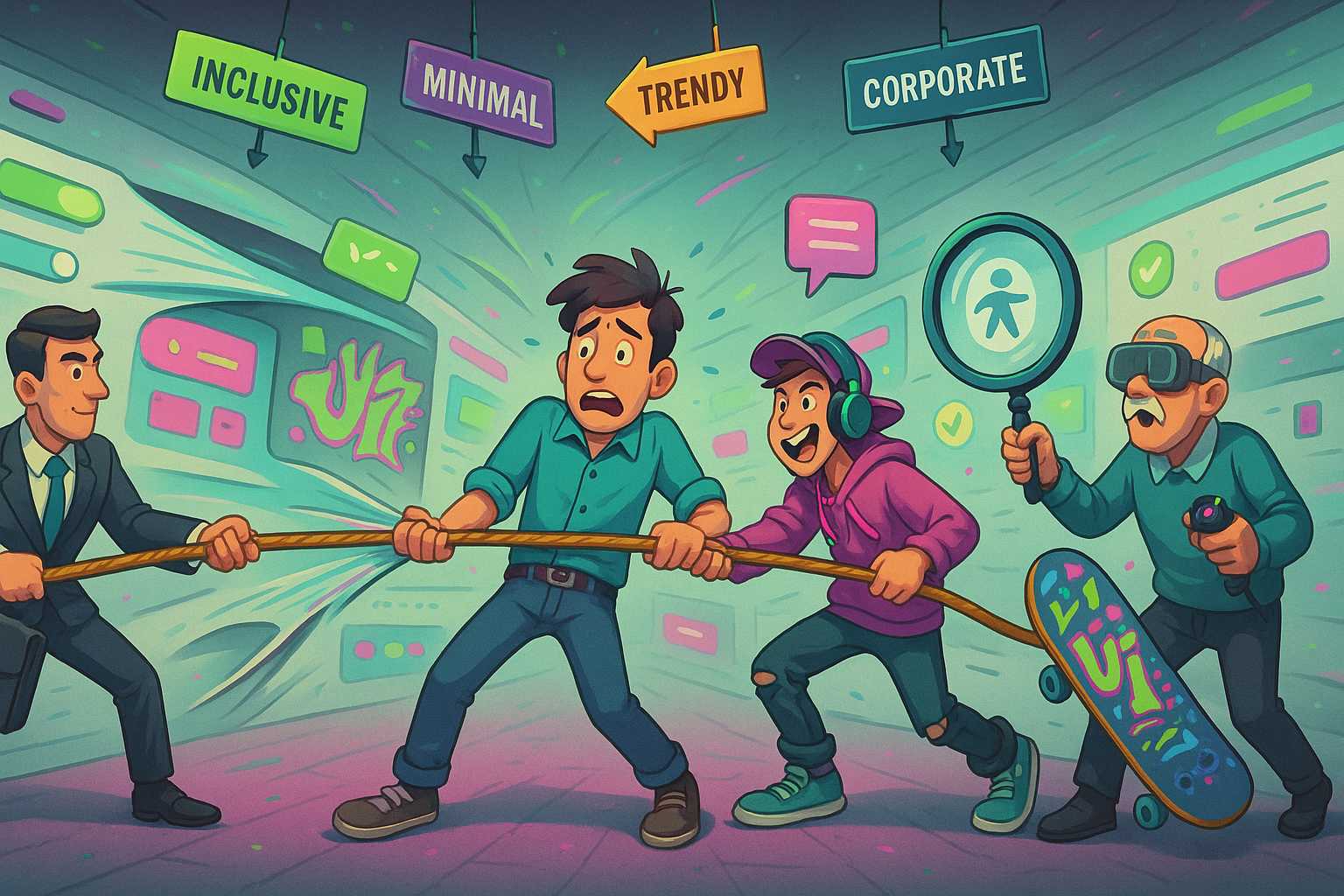
If you’ve worked in design—especially UX, product, or even marketing—you’ve probably heard the phrase: “We want to make something that works for everyone.” On paper, it sounds noble. Why wouldn’t you want to reach the widest audience possible? But here’s the truth: designing for everyone is a trap.
Whether you’re creating a website, an app, a product, or even a brand, the moment you try to please everyone, you risk pleasing no one. Let’s dig into why this happens, what the consequences are, and what better approaches actually look like.
Why Designing for “Everyone” Feels Safe (But Isn’t)
Designing for everyone often comes from a well-meaning place. You want your design to be inclusive, broad-reaching, and accessible. Maybe stakeholders think a wider appeal equals more users, more revenue, or more impact.
But the problem with designing for “everyone” is that it’s a vague, imaginary audience. And you can’t design well for someone who doesn’t exist in specific, measurable terms.
Let’s say you’re designing a fitness app. Your team wants to serve:
- Teen athletes
- Stay-at-home parents
- Office workers with no gym access
- Senior citizens with mobility issues
If you try to build one experience that covers all these cases, what happens? You water down your features. You generalize your language. You make compromises. And worse, you leave everyone slightly annoyed instead of making one group truly delighted.
The Problem With Designing for “Everyone” in Real Products
Look at some of the biggest digital products today—Facebook, LinkedIn, YouTube. In their early days, they didn’t aim to serve “everyone.” Facebook started for Harvard students. LinkedIn targeted professionals. YouTube? Originally a dating site, believe it or not. Their focus helped them grow into giants.
When Airbnb was starting out, they didn’t say, “We want to build a travel platform for everyone.” They focused on budget-conscious travelers who were open to staying in strangers’ homes. That was the spark. Later, they expanded, but only after nailing a core audience.
Trying to build for everyone too early often leads to bloated features, confusing UX, and weak positioning. If you’ve ever opened an app and thought, “What even is this supposed to do?”—you’ve likely experienced this firsthand.
The Illusion of Inclusivity
Another tricky angle is that saying you’re designing for “everyone” makes it sound like you’re being inclusive. But true inclusion isn’t about making everything blandly universal. It’s about understanding real user groups and meeting them where they are.
Inclusive design doesn’t mean avoiding focus—it means designing with your users, especially marginalized ones, in mind. If you try to smooth out every edge so “no one is left out,” you end up losing the unique features and voice that actually make a product usable and lovable.
Real Design Is About Trade-Offs
Designing for “everyone” pretends that trade-offs don’t exist. But in practice, every design decision favors one group over another. A dark color scheme might be great for gamers, but not for older users. A minimalist interface might be great for tech-savvy users but confusing for someone unfamiliar with mobile apps.
That doesn’t mean you shouldn’t care about accessibility or adaptability—but it means you need to pick your battles. Know who your primary users are. Make choices for them. Then, expand carefully to adjacent groups, if and when it makes sense.
The Consequences of Designing for “Everyone”
Here are a few ways this mindset can hurt your product:
1. Feature Creep
Trying to satisfy too many personas leads to adding more and more features. Before long, your clean interface is buried under a dozen buttons nobody uses.
2. Generic Copywriting
You end up writing vague, uninspiring copy like “Do more with your time” or “Empower your lifestyle” because you don’t have a clear idea who you’re talking to.
3. Inconsistent Design Patterns
You might mix casual and formal tones, bright and muted colors, or desktop-first vs mobile-first layouts all in the same product because you’re trying to juggle everyone’s preferences.
4. Low User Retention
When users don’t feel like a product was made with them in mind, they bounce. Loyalty is built on resonance, not neutrality.
Designing for Someone Is Better
Instead of designing for everyone, design for someone. Build a clear, focused user persona. Understand their frustrations, habits, and goals.
You can still have multiple user groups, but they need prioritization. Ask:
- Who is our primary user?
- Who are secondary or future audiences?
- What do we need to nail for the first group before expanding?
Designing for “everyone” is not just unrealistic—it’s dangerous. Products that thrive often start by solving a narrow, painful problem really well for a specific audience. Then they grow, one niche at a time.
When You Should Broaden (Carefully)
It’s not that you can’t expand. But successful broadening comes after clarity and validation. For instance:
- Slack started as a tool for internal communication at a game company.
- Instagram started with hipster photographers and iPhone 4 users.
- Zoom focused on remote teams in the education and enterprise sectors.
After success in those spaces, they each expanded outward. And because their foundations were strong, their products adapted well to new groups.
The Psychology Behind It
When you try to target everyone, you lose psychological triggers like:
- Specificity: People relate to details that reflect them.
- Empathy: Users want to feel understood, not tolerated.
- Delight: Great UX often comes from going the extra mile for a specific need, not covering all bases.
Trying to cater to all user types too early feels safe but it’s just spreading your energy thin. Real connection, conversion, and satisfaction come from focus.
Case Study Table: Specific vs Broad Design
| Product | Initial Focus Audience | Result of Focused Design |
|---|---|---|
| Harvard students | Explosive growth through exclusivity | |
| Slack | Internal dev teams | Strong UX for collaborative chat |
| Clubhouse | Tech influencers | Viral by targeting invite-only users |
| MySpace | Everyone (eventually) | Lost focus, declined rapidly |
| Zoom | Remote professionals | Became essential during the pandemic |
As seen in this table, products with a focused initial user base often outperform those trying to be a catch-all platform right out of the gate.
Common Myths About Designing for “Everyone”
Let’s quickly debunk some popular myths:
Myth 1: “A broader audience equals more revenue.”
Reality: You only make money when users feel seen and served. That doesn’t happen when you’re vague.
Myth 2: “If we design for a niche, we’ll get stuck there.”
Reality: Most great products started niche and expanded later.
Myth 3: “We can add personalization later.”
Reality: Without core structure designed around clear personas, personalization will feel bolted on, not built in.
The Problem With Designing for “Everyone” in Visual UI
Let’s get visual for a second.
Say you’re building a landing page. You want to appeal to both startup founders and large enterprise buyers. The founder wants minimal pricing info, “Start for Free” buttons, and case studies of scrappy teams. The enterprise buyer wants security info, whitepapers, and contact sales forms.
Can you put all of that on one page? Technically, yes. But now you’ve got a messy, unclear funnel. Neither audience feels prioritized. Better approach? Split the experience. Target different personas on different pages or flows.
Focus Creates Freedom
It may seem counterintuitive, but narrowing your target actually gives you more creative freedom. Once you know exactly who you’re designing for, your design decisions become easier. Voice, tone, layout, features—they all align. You can experiment within clear constraints, not flail in ambiguity.
When a client or boss says, “Make it appeal to everyone,” it’s okay to push back. Ask them: “Who’s our most important user?” Then start there.
The Real Work: Saying “No”
Designing for “someone” requires saying “no” to good ideas that don’t serve your core user. That’s hard. It’s emotional. But it’s necessary. The best teams know what to cut as well as what to add.
Just because a feature works for another group doesn’t mean it belongs in your product—at least not now. Get clear. Get specific. And only then, expand with intention.
Wrapping It Up
The problem with designing for “everyone” isn’t that it’s unethical or lazy—it’s that it just doesn’t work. It leads to vague, bloated, forgettable products. You end up chasing a crowd that never shows up.
Instead, pick someone. Get close to them. Build for them like they’re the only person who matters. Because in the beginning, they are.
Then, if you do it right, “everyone else” might just follow.
FAQs
1. Isn’t designing for everyone more inclusive?
Not really. True inclusivity is about focused accessibility, not generic experiences.
2. What if my boss insists on reaching everyone?
Push for prioritization. Ask who the primary user is.
3. Can’t I just personalize the product later?
Only if your foundation supports it. Otherwise, it feels tacked on.
4. What’s a good example of niche-first success?
Slack, which focused on internal team chat before becoming mainstream.
5. Does focusing on one group limit growth?
Nope. It actually helps create stronger, clearer growth paths.
Leave a Reply