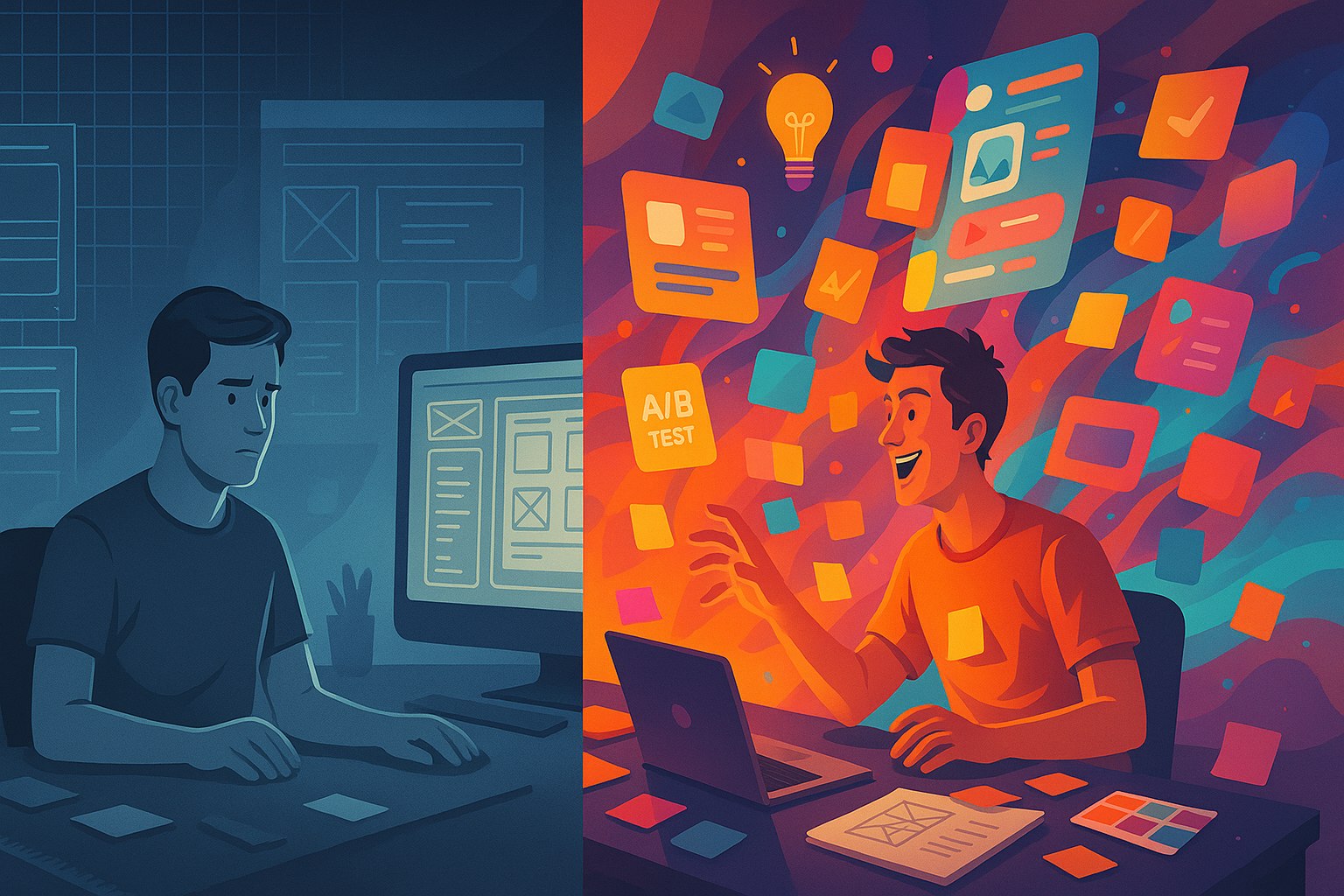
I used to be a grid loyalist. Rigid rows, perfect alignment, pixel-perfect spacing — it all gave me a comforting sense of order. Whether I was working on a website layout or mobile UI, grids were my safety net. But somewhere along the way, I noticed something strange: my work, though clean, started feeling… sterile.
That’s when I started playing with controlled chaos — asymmetric layouts, overlapping elements, broken grids, surprising spacing, and even intentional imperfections. At first, it felt like I was breaking the rules. But soon, I realized that letting go of rigid structure and embracing visual chaos brought results I hadn’t expected: better engagement, more memorable interfaces, and stronger emotional responses.
So yeah, here’s why I ditched grids for chaos (and got better results). And how you can too — without creating an unusable mess.
Grids Are Great, But Safe
Let’s get this out of the way first: I’m not against grids. They have their place. They create harmony, flow, and predictability. That’s why they’re used in everything from Swiss design posters to the most successful e-commerce platforms.
But the keyword here is predictability. And predictability has a dark side: it’s forgettable.
Think about how many websites or apps you’ve used recently that looked “professional” but left absolutely no impression. Most likely, they were clean grid-based layouts. You scrolled, consumed, left. You didn’t feel anything.
For brands that want to build identity, trust is good — but memorability is better.
The Turning Point: When Grids Made Me Invisible
I remember the project that tipped me over. I was designing a landing page for a creative tech company. The brand voice was bold, eccentric, and rebellious. But somehow, my grid-locked layout ended up feeling like a banking app.
Every section was neatly aligned. Every module sat in a perfect 12-column Bootstrap grid. The client’s feedback? “It looks too normal.”
Ouch.
That one comment made me rethink everything. I took the same content and reworked it into an intentionally chaotic layout — large type breaking out of its container, rotated images, overlapping call-to-actions, text spilling beyond the viewport. It was wild. It was risky.
But it worked.
The revised design tripled the average time on page and got double the scroll depth. Why? Because people wanted to explore it. They were curious.
That’s when I realized that “Why I ditched grids for chaos” wasn’t just a personal design journey — it was a conversion strategy.
What I Mean by “Chaos” (And Why It’s Not Actually Chaos)
Let’s clarify something. When I say “chaos,” I don’t mean randomness or sloppiness. I mean controlled disruption — breaking alignment on purpose, adding tension, using scale and contrast to guide the eye rather than predictable boxes.
Here are some of the techniques I’ve used successfully:
| Technique | What It Does | Why It Works |
|---|---|---|
| Overlapping Layers | Adds depth and surprise | Visually breaks monotony |
| Intentional Asymmetry | Creates movement | Makes the page feel dynamic |
| Breaking the Container | Typography that bleeds out | Grabs immediate attention |
| Irregular Spacing | Mimics real-world messiness | Feels more human |
| Surprising Z-Index | Floating buttons/images | Creates tactile feel |
None of this is truly random. In fact, I usually sketch these layouts by hand or wireframe them carefully. But to the user, it feels bold and unpredictable — and that’s what makes it powerful.
Why I Ditched Grids for Chaos on Client Projects
Once I saw how well it worked, I started using this approach more often — even on client work. Of course, I tailored it depending on the brand’s personality.
One e-commerce fashion client wanted their homepage to feel “avant-garde.” We used oversized imagery layered under semi-transparent text blocks, staggered product cards, and navigation that only revealed itself on hover. It looked like a high-fashion magazine.
Another case was a startup that wanted to feel “anti-corporate.” We used chaotic grid-breaking layouts that mimicked old-school zines — rotated headers, scribbled underline effects, and jagged section dividers. The bounce rate dropped by 40% compared to their old, templated grid layout.
The chaos created emotion. And in UI, emotion converts.
From Chaos to Connection: The Psychology Behind It
There’s a reason messy rooms feel more lived-in than spotless ones. Our brains respond to irregularity and surprise. We’re pattern-seeking creatures, so when something breaks the expected pattern, it grabs our attention.
Here’s what happens when you design with a touch of chaos:
- Increased engagement: Users stay longer to figure out “what’s going on”
- Better memory retention: Unusual layouts stick in the brain
- Emotional resonance: Imperfect interfaces feel more human
And in today’s world of perfection-polished apps and ultra-smooth templates, a little rawness can feel refreshing.
Tools That Help Me Embrace Controlled Chaos
You don’t need to be a rule-breaking genius to do this. These are the tools and tactics I use to make chaos work:
| Tool/Technique | Use |
|---|---|
| Figma’s Freeform Layouts | Turn off grid snapping |
| Layered Typography | Mix font sizes and weights intentionally |
| Custom Grid Systems | Instead of standard 12-columns, use irregular blocks |
| Brutalist Inspiration Boards | Save references that ignore the “rules” |
| Mobile-First Breakpoints | Let chaos adapt per screen size |
And yes, I still check for accessibility, mobile usability, and visual hierarchy. Controlled chaos doesn’t mean poor UX. It just means more personality.
Where Chaos Works Best (And Where It Doesn’t)
Let me be honest — this approach isn’t a silver bullet. Sometimes, grids are better. Especially if:
- You’re designing something data-heavy
- The content hierarchy is complex and must be scannable
- The audience expects convention (e.g., enterprise dashboards)
But if you’re working on anything creative, artistic, lifestyle, portfolio-based, or disruptive — chaos can be your secret weapon.
Use it when the brand voice says things like:
- “We’re not like everyone else”
- “We want to break the mold”
- “Make it feel human, raw, expressive”
Because that’s exactly what controlled chaos delivers.
The SEO Angle: Does Chaos Hurt Rankings?
One of the questions I get is whether these chaotic layouts affect SEO. And the short answer is no — as long as the underlying code structure is clean.
I still use semantic HTML. I still prioritize CLS, LCP, and Core Web Vitals. Chaos is only in the visual presentation, not in the markup. Texts are readable, headings are properly structured, and navigation is logical.
So if you’re wondering whether ditching grids for chaos will mess with your SEO — don’t worry. Google doesn’t care if your buttons are tilted or your H1 tag overlaps an image.
How My Clients Reacted When I Ditched Grids
This was the most surprising part. I expected pushback. But once they saw the visual prototypes and user metrics, they were all in.
Clients loved how their brands stood out. They liked that their websites “didn’t feel like every other one.” And when they saw bounce rates drop and engagement go up, they wanted more.
Now, some even request chaos by default: “Can you make this a little less clean?”
FAQs
1. Can chaotic design still be user-friendly?
Yes, as long as there’s intentional hierarchy and clear CTAs.
2. Does chaos mean ignoring accessibility?
Not at all — you can still follow accessibility best practices.
3. Will this approach work for corporate brands?
Sometimes, but it’s best suited for creative or bold brands.
4. How do you keep visual chaos from becoming confusing?
By anchoring it with consistent spacing, color themes, and type hierarchy.
5. Do I need to ditch grids completely to try this?
Nope! You can still use them as a base and layer chaos on top.
Leave a Reply