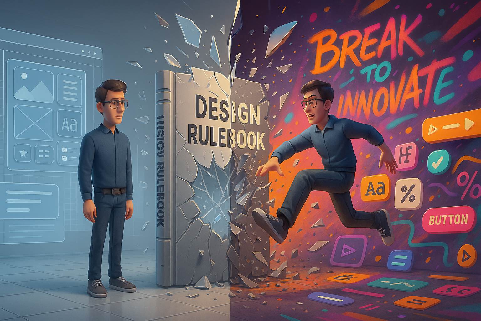
There’s a strange rite of passage many UI developers experience at some point in their career. You’re deep into the system grid, carefully aligning elements, keeping that pristine 8pt rhythm, your colors all sitting nicely within WCAG contrast compliance, and your typography dutifully obeys the hierarchy gods. Everything is correct. Everything is boring.
That’s when it hits you. Maybe it’s a rebellious spark, maybe it’s burnout disguised as inspiration — but something whispers, “What if you just… didn’t follow the rule this time?”
And just like that, you break it.
It might be a wild animation, a rogue font, an off-grid button placement, or a layout that makes your Figma plugin cry. But here’s the catch: sometimes, that rule-breaking move works. It feels risky, but the result feels alive.
Let’s talk about why every UI dev should break a design rule once — not out of carelessness, but to grow, to learn, and to innovate.
The Myth of “Perfect” Design
Design systems are amazing. They give consistency, scalability, and harmony. But they’re not sacred texts. Following every rule with religious devotion often results in designs that are functional but forgettable. Ever noticed how many corporate apps feel the same? It’s because developers and designers fear doing anything unexpected.
When you never challenge the grid, you never find out how it might flex. When you always use safe colors, you miss out on emotional impact. And when you treat user feedback as the only north star, you forget that innovation doesn’t always come from consensus.
Some of the most iconic digital experiences came from people who weren’t afraid to bend or break the rules. Think about the first time neumorphism showed up. Or the brutalist web design trend. Or even Apple’s original skeuomorphism. All of these broke something — and that’s exactly what made them stand out.
Breaking a Rule Isn’t the Same as Being Sloppy
Let’s be clear. This article is not an excuse to publish messy UIs, unreadable layouts, or inaccessible disasters.
There’s a huge difference between breaking a rule deliberately and ignoring best practices because you don’t know them. You’ve got to earn the right to break a rule by first knowing what it does and why it exists.
For example, if you mess with alignment, you should know what you’re disrupting and what you’re getting in return — maybe a dramatic visual emphasis, or a sense of playful chaos. That’s very different from just eyeballing things and hoping they look okay.
So when we say why every UI dev should break a design rule once, we’re really talking about intentional, thoughtful exploration. Not throwing spaghetti at the canvas.
Creativity Lives at the Edges
Creative breakthroughs rarely happen in the middle of the road. They’re more likely to occur when someone swerves into unexplored territory. The same applies to UI development.
You don’t find new animation patterns by copying Google’s Material specs. You invent them when you ask, “What if my button didn’t fade — what if it bounced, or wobbled like jelly?”
You don’t create new layouts by duplicating Bootstrap templates. You discover them when you abandon rows and columns and try layering with z-indexes, or nesting elements in asymmetric patterns.
These experiments might not always work, but they teach you things. They spark questions like: “Why does this feel wrong?” “What would make it feel right?” And in answering those, you level up.
You don’t have to break all the rules. But just one — just once — could be enough to reset how you think.
A Real Example: The Ugly Dropdown That Worked
A friend of mine once built a dropdown that looked awful. It had sharp corners, clashing colors, and a hover effect that resembled a UI glitch. It looked like a mistake.
But users loved it. Why? Because it felt fast. It gave the sense that this part of the app was low-stakes and instant. It wasn’t elegant — but it was effective. And that dropdown ended up converting better than the “correct” one it replaced.
Sometimes, the brain responds more to feeling than to logic. And sometimes, breaking a design rule introduces just enough friction to make an interface memorable.
That’s why every UI dev should break a design rule once — it’s not just about creativity, it’s about seeing what happens when you step outside the predictable.
H2: Why Every UI Dev Should Break a Design Rule Once (on Purpose)
We all start out afraid of making a mistake. Especially in teams where “pixel-perfect” is worshipped like a deity. But real growth often starts when you ask: what if I did it differently?
Here are a few examples of rules worth testing — and possibly breaking:
- Typography hierarchy: Try flattening the type scale. Or exaggerating it. What does that do to the feel of the layout?
- Spacing system: Break the 8pt rule and use irregular spacing to create visual tension.
- Color palette: Add a neon accent that doesn’t belong — and see if it draws attention where you want it.
- Grids and alignment: Try offsetting one key element slightly off-grid. Does it emphasize? Or distract?
- Motion: Animate something in an “unprofessional” way — maybe too bouncy, too slow, too playful. Does it still feel good?
These experiments won’t all succeed. But one of them might.
The Best Rule Breakers Know When to Stop
You can’t design chaos forever. Eventually, the system wants to return. Even the best experiments need boundaries.
This is where maturity as a UI developer comes in — knowing when you’ve pushed something far enough. You need feedback. You need to prototype and test. You need to know when to rein it back in.
But once you’ve felt the thrill of rule-breaking and learned from it, you won’t go back to blindly obeying guidelines again. You’ll approach each decision with curiosity — and that’s the mark of a true creative developer.
H2: When You Should Break a Design Rule as a UI Dev
Let’s put some practical criteria on it. Here’s when rule-breaking can be productive, not destructive:
- You’re designing for emotional impact, not just usability.
- You’ve hit a creative wall and need to jolt yourself out of sameness.
- You’re building something for a niche audience that appreciates novelty or risk.
- You’re in early exploration mode, not shipping to millions tomorrow.
- You understand the rule deeply enough to break it without breaking everything else.
One of the best times to break a design rule is during personal projects, internal tools, or limited-scope prototypes. These let you push boundaries without hurting your team’s roadmap.
You Might Even Start a New Trend
Every rule in design started as a suggestion — something someone tried that caught on.
Flat design wasn’t born in a committee. Someone took a risk and stripped away the gloss, the drop shadows, the bevels. Brutalism, claymorphism, glassmorphism — they all started with one person saying “What if I don’t follow the usual path?”
So who says you can’t start the next wave?
That one weird layout you tried on your side project could become the next Dribbble trend. That color combination you thought was too loud could be exactly what your portfolio needs to stand out.
That’s the core of why every UI dev should break a design rule once. It’s not rebellion for rebellion’s sake — it’s curiosity, courage, and the pursuit of something a little more you.
What If It Fails?
Then you learn.
That’s the worst that can happen. You’ll have one less mystery in your design process. You’ll know why that layout didn’t work, or why that weird hover effect felt wrong. That knowledge makes your future designs stronger.
And most of the time, those failures aren’t even that bad. A tweak here, a revert there — and you’re back to the clean, stable system. But you’ll come back with sharper eyes.
Final Thoughts
The design world doesn’t need more clones. It needs more voices. More experiments. More questions. That starts with one brave moment of, “Let’s try something different.”
So go ahead. Break the rule. Just one. See what happens.
You might surprise yourself.
FAQs
1. Isn’t breaking design rules risky for accessibility?
Yes — which is why you should break them with intention and testing. Always check accessibility afterward.
2. Can I break rules in a professional project?
It depends. Early exploration and internal tools are great playgrounds. For production, get team buy-in.
3. How do I know which rule to break?
Start with one that feels too rigid. Pick something visual like spacing or animation.
4. What if my team doesn’t support this approach?
Try it in a side project or mockup first. Show the value before pushing for change.
5. Do famous designers really break rules?
Absolutely. Many design trends started with someone challenging the norm.
Leave a Reply