It took me years. Literal years. I’d open Figma, try to drag a button just a few pixels, and suddenly my whole layout would collapse like a Jenga tower. I would undo, rage-click, curse under my breath, and swear I’d never use Auto Layout again. But today, I want to share how I finally made peace with Figma Auto Layout. Not just as a tool I tolerate, but one I now actually rely on—daily.
This article isn’t a technical manual. There are plenty of those. This is more like a conversation between frustrated designers—especially those of us who once thought “Auto Layout” was just Figma’s fancy way of saying “good luck keeping things in place.” If you’ve ever whispered “why is everything hugging the wrong thing,” this one’s for you.
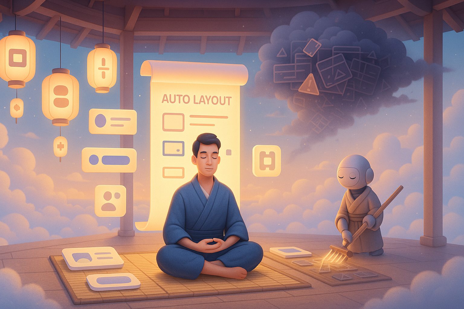
The Early Days: Me vs. Figma Auto Layout
When Auto Layout first became part of my workflow, it felt like I had handed over control to a robot that had a totally different vision of alignment than I did. I’d set up a card component, wrap it in Auto Layout, add a text label, and boom—everything would shift in unexpected directions.
Buttons would stretch to infinity. Text would vanish. Padding would double or disappear. I’d google “Figma Auto Layout not working” more times than I’d like to admit.
The concept sounded magical. You wrap things in frames, and Figma automatically handles positioning, spacing, resizing, and alignment. But in practice? It felt like every layout decision I made came with a hidden tradeoff.
I needed to learn how to think in Auto Layout—how to approach it with intention, not as a last-minute wrapper.
What Changed: Real Projects Demand Real Systems
The big turning point came when I started working on a design system for a product team. We weren’t just mocking up screens anymore. We were building components that had to scale, snap into templates, and adapt to responsive containers.
Manual layout wouldn’t cut it.
So I sat myself down, cleared a few hours, and went into what I now call Auto Layout Bootcamp. I didn’t watch tutorials. I didn’t read docs. I opened a blank page and said: “Let’s make a button. Let’s make it the right way.”
And honestly, that was the breakthrough. It wasn’t about knowing all the settings. It was about starting simple and layering on complexity only as needed.
Building a Mental Model of Auto Layout
Figma Auto Layout finally clicked for me when I stopped thinking in terms of pixels and started thinking in relationships. Every frame wasn’t just a box—it was a container with rules.
Here’s what helped me:
- Everything is a container. You can have Auto Layout inside Auto Layout. Think Russian nesting dolls, but with padding.
- Direction is everything. Horizontal vs. vertical isn’t just about layout—it’s about intent. Are items stacking or lining up?
- Padding is sacred. Padding defines the space between content and the frame edge. Spacing defines the gap between items inside.
- Alignment does the heavy lifting. You don’t need to nudge elements by hand. Set alignment rules and let the system do the work.
It was around this point that I could feel the shift. The chaos was becoming calm. Layouts were predictable. When something broke, I understood why.
And that’s how I finally made peace with Figma Auto Layout—it wasn’t just about learning the tool. It was about changing how I think about design structure.
The Role of “Hug,” “Fill,” and “Fixed”
This trio deserves a section of its own. Once I wrapped my head around hug contents, fill container, and fixed width/height, I unlocked a whole new level of confidence.
Let’s break it down:
- Hug contents: The frame size adapts to fit its children. Great for buttons that should resize based on the text inside.
- Fill container: The child stretches to fill the available space. Use this in responsive layouts, or when you want columns to share space equally.
- Fixed: You control the dimensions. This is the least flexible, but useful when precision matters.
Understanding when and where to use these three changed my entire workflow. I stopped fighting Figma. I started negotiating with it.
Common Auto Layout Traps (And How I Escaped Them)
If you’re struggling, chances are you’re falling into one of these classic traps:
1. Nesting too much, too fast
I used to wrap every little thing in its own Auto Layout frame. Then I’d lose track of what was doing what. The fix? Don’t nest unless you need the control.
2. Misusing Fill and Hug
Trying to get a button to expand? Don’t set the text to fill; set the container to hug and the text to fixed width or leave it alone. Read that again.
3. Mixing directions
Putting horizontal items inside vertical frames (and vice versa) without understanding the consequences can create madness. Always ask: “What direction should this layout flow in?”
4. Ignoring alignment settings
Left-aligning a button? Centering a header? Don’t drag it manually—set the alignment on the parent frame.
Once I realized I was the one introducing chaos, not Figma, I started treating Auto Layout like a dance partner. You have to lead, not shove.
The Best Part of Making Peace With Auto Layout
Okay, I’ll say it again for the SEO gods and fellow frustrated designers: how I finally made peace with Figma Auto Layout wasn’t by learning every feature—it was by changing my mindset. By respecting the rules instead of bypassing them.
Today, my components are:
- More reusable
- Responsive by default
- Easier to maintain
- Cleaner to hand off to developers
I rarely reach for the alignment tools anymore. I let the system work for me. And when something breaks, it usually takes seconds to fix instead of minutes.
Auto Layout is now the first thing I reach for when building anything from navbars to entire page templates.
Real-World Auto Layout Scenarios
Let’s walk through a few real situations where Auto Layout shines.
Scenario 1: Responsive Cards You want a card with an image, a title, and a paragraph. The content length varies. You wrap each piece in a vertical Auto Layout frame. Now your card grows with content—and you don’t need to manually adjust height.
Scenario 2: Centered Modals Previously, you’d nudge elements until they looked centered. Now? Wrap everything in a vertical frame, align center, add spacing, and boom—your modal is perfectly balanced.
Scenario 3: Dynamic Lists Auto Layout makes it easy to have repeating items like notifications, product cards, or chat bubbles. You just duplicate the item and spacing remains consistent.
Scenario 4: Nested Buttons with Icons You can finally have a button with an icon, label, and right-aligned arrow—all perfectly spaced. You just need the right direction, spacing, and hug settings.
Auto Layout doesn’t just save time—it prevents visual drift.
When Not to Use Auto Layout
Here’s the thing: Auto Layout is powerful, but it’s not always the answer.
- If you’re working on highly experimental, free-form UI—like splash screens, digital art, or animations—it can get in the way.
- If you need pixel-perfect control over overlaps, stacking, or absolute positioning, regular frames or absolute layout might suit better.
But for 90% of product and web UI work? Auto Layout wins.
How I Teach Auto Layout to Juniors Now
After years of struggle, I started mentoring junior designers. When they ask “should I use Auto Layout?” I always say yes—but start with intention.
Here’s my teaching formula:
- Start with one component (e.g., a button).
- Build it with manual spacing first.
- Wrap it in Auto Layout.
- Adjust settings until the result is identical, but now dynamic.
- Change the text—see how it adapts.
By showing how Auto Layout replaces manual adjustments with logic, they understand its value.
Figma Auto Layout: It’s a Muscle
Like Flexbox in CSS, Auto Layout is awkward at first—but once it’s in your muscle memory, it becomes second nature.
I now design faster, hand off cleaner files, and barely touch the alignment buttons. And the best part? When I revisit old files, I can tweak layouts in seconds, not hours.
That’s why how I finally made peace with Figma Auto Layout feels like such a milestone in my design journey. It’s not just about using a feature. It’s about evolving how I think about layout altogether.
FAQs
Q1: What’s the difference between Hug and Fill in Figma Auto Layout?
Hug fits content, Fill stretches to available space.
Q2: Can I mix Auto Layout with regular frames?
Yes, but it’s best to use Auto Layout consistently within components.
Q3: How do I center items in Auto Layout?
Use alignment settings inside the Auto Layout frame.
Q4: Why is my button stretching too wide?
Check if its text or container is set to Fill instead of Hug.
Q5: Is Auto Layout worth learning?
Absolutely—it saves time and makes your designs scalable.
Leave a Reply