HealthEngine, one of Australia’s largest digital healthcare booking platforms, has long been the go-to app for patients wanting to book GP appointments, manage scripts, or connect with nearby clinics. But in early 2024, a platform-wide redesign meant to “simplify the healthcare journey” launched to considerable hype—and quickly crashed into a wall of user frustration, misdirected appointments, and backlash from clinics and patients alike.
What was promised as a streamlined, modernised patient experience became yet another case of form over function, where UI trends took priority over accessibility, usability, and reliability in a context where clarity is absolutely critical.
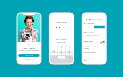
Clean Looks, Broken Flows
The redesigned app ditched the functional but clunky tab system in favour of a more “experience-first” interface. The home screen now featured:
- A carousel of promotions for flu jabs, dental offers, and “health tips”
- A rebranded navigation model with generic icons instead of clear labels
- A hidden appointment history buried three taps deep under “Account”
Instead of launching straight into appointment search (the platform’s primary use case), users were now greeted by “Explore Your HealthEngine” tiles and pop-up messages encouraging them to “engage” with their health. This made it unnecessarily difficult for users who just wanted to book a GP visit.
For a platform dealing with patients—many of whom were sick, anxious, or elderly—the redesign prioritised aesthetics and engagement metrics over clarity and efficiency.
Appointment Booking Turned Into Guesswork
Previously, booking an appointment was straightforward: select a clinic, choose a time, confirm. The new system introduced an abstracted “smart booking” journey:
- Users now had to choose between “Find care now,” “Explore providers,” or “Plan my health journey”
- The time selector was replaced with a calendar grid that didn’t display real-time availability
- Appointments were often not confirmed on the spot, but marked “Pending approval” without explanation
This caused a flood of confusion. Clinics began reporting higher no-shows and incorrect bookings. Users complained that they had no idea whether their booking was finalised or not. And with many patients unaware that they were using a third-party system rather than booking directly with the clinic, they assumed the fault lay with their doctors.
Clinic Feedback Ignored
Behind the scenes, hundreds of clinics using HealthEngine began experiencing operational headaches. The new dashboard for managing appointments was similarly redesigned with stylised panels and “insights” that distracted from core functions. Clinics had to click through multiple nested menus to see daily bookings, and the “Messages” tab now buried urgent patient notes under automated promo messages from the platform itself.
Worse, the new UI didn’t make appointment sync failures obvious. Many clinics only realised a booking had failed when patients didn’t show up or called to confirm—eroding trust in the system.
Despite repeated feedback from practice managers and receptionists, HealthEngine only issued minor updates throughout 2024, with no rollback to the original booking view.
Accessibility and Mobile Performance
HealthEngine’s new interface was riddled with accessibility issues:
- Small font sizes and light grey text made reading difficult for elderly users
- Button labels were vague (“Start My Journey,” “Go to HealthHub”) and lacked ALT tags
- Screen reader compatibility was inconsistent, with navigational context missing entirely
The mobile app, despite being the most common access point, suffered from performance lag, especially on Android. Users frequently reported the app freezing during checkout, or failing to load their profile or booking history at all.
In a medical context, this created serious consequences, with patients missing vital appointments or being double-booked due to backend delays and UI ambiguities.
Trust Issues Rekindled
HealthEngine had previously faced scrutiny for controversial practices around data sharing. Though the 2024 redesign did not reintroduce these issues directly, the lack of transparency in the new user interface—particularly around confirmation messages, provider filtering, and patient data use—rekindled distrust.
For example, users were auto-enrolled into promotional notifications and health surveys through UI patterns that bordered on dark patterns. These choices weren’t just irritating—they violated user expectations for a healthcare platform, where consent and clarity are paramount.
No Support, No Documentation
The update rolled out with no guided onboarding, tutorials, or documentation for users or clinics. There was no in-app explanation of what had changed, and no toggle to switch back to the previous layout.
Users were left to figure things out themselves—resulting in a flood of support tickets, complaints, and app store reviews. Even HealthEngine’s own FAQ section lagged behind the changes, referring to buttons and tabs that no longer existed.
The Numbers Told the Story
By the second half of 2024, app reviews on iOS and Android had both dropped by over a full star. Negative feedback flooded the stores:
- “Unusable since the update”
- “Where is the book now button??”
- “This app caused me to miss my GP appointment”
- “Worst health app UX I’ve ever seen”
Meanwhile, competing platforms like HotDoc and even direct clinic booking portals saw noticeable upticks in traffic—a clear sign that users were jumping ship.
Lessons from the HealthEngine UI Misstep
- In healthcare, speed and clarity matter more than visual flair.
- Do not bury the most-used action (booking an appointment) behind unnecessary steps or abstract menu names.
- Never remove confirmation clarity for something as sensitive as medical bookings.
- Accessibility isn’t optional when your user base includes older adults and those with chronic conditions.
- Trust, once shaken, is nearly impossible to recover in the healthcare space.
FAQs
1. What was the main failure in the HealthEngine 2024 redesign?
The booking process was made more abstract and unclear, removing immediate access to appointments and confirmations.
2. Why did clinics struggle with the new UI?
The clinic dashboard hid essential information under stylised panels and deprioritised real-time booking sync alerts.
3. Was the app accessible for all users?
No. It failed to meet modern accessibility standards and performed poorly on mobile devices.
4. How did users react to the redesign?
With frustration, confusion, and a drop in trust. App reviews fell, and users moved to competitor platforms.
5. Has HealthEngine fixed these issues?
Some small updates have been made, but the core UI model remains, and no full rollback has occurred.
Leave a Reply