In 2024, the Australian Government launched a major update to the MyChild portal, a federal platform that allows parents and guardians to search for childcare providers, check eligibility for childcare subsidies, and manage enrolment support services. On paper, the overhaul was meant to modernize outdated systems and make access to childcare information more “intuitive, mobile-friendly, and connected.” In practice, however, it became a frustrating, time-consuming mess of poor UI decisions, especially for low-income families and non-technical users.
The redesign was met with immediate backlash from parents, early childhood educators, and advocacy groups. The platform—intended to simplify the often overwhelming childcare process—ended up doing the exact opposite.
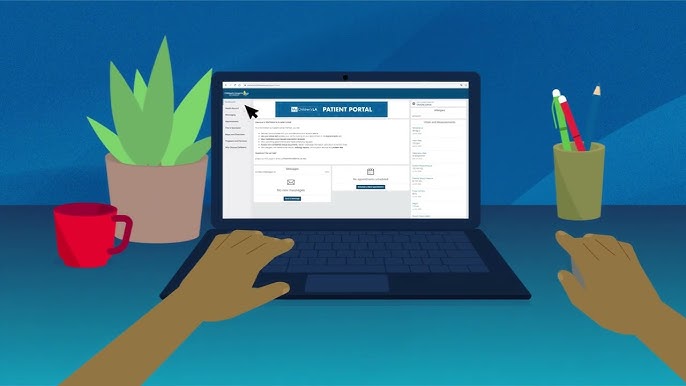
A Maze of Menus, Not a Path to Childcare
The previous version of the MyChild portal, while dated, had a clear structure: search by location, filter by care type, and view availability or subsidy options. The new version abandoned this model in favor of a dashboard-heavy layout filled with cards, widgets, and flowery language like “Your Family Journey” and “Explore Options.”
Instead of simply entering a postcode and seeing a list of nearby childcare providers, users were pushed through a maze of steps asking:
- How many children do you have?
- What are your long-term learning goals?
- Are you interested in flexible care or holistic care?
- Would you like to attend a digital parenting webinar?
These non-essential questions were mandatory, causing parents in urgent need of care to get bogged down in irrelevant UX layers before they could even see a provider list. The design assumed every user had time to explore, when in reality many just needed care urgently.
Subsidy Calculator Gone Wrong
Another major failure was the redesigned Child Care Subsidy (CCS) calculator. The original version was straightforward: input income, hours worked, number of kids, and get an estimate.
The new version was animated, interactive—and broken. It used sliders that didn’t work well on mobile, required login to get an estimate (despite public access previously), and failed to show any result if one field was left blank.
Even worse, the language used became overly technical, replacing simple prompts like “Enter your income” with “Nominate your combined adjusted taxable income projection.” Users unfamiliar with tax jargon were completely lost.
Search Functionality That Failed Parents
The portal’s biggest value used to be its childcare provider search. But in the update, this was completely rebuilt—and not in a good way.
Search results now:
- Did not show phone numbers without logging in
- Required location services to be turned on (postcode entry was removed)
- Defaulted to sponsored providers, pushing public and community childcare services to the bottom
- Had no real-time filtering by vacancies or age group
One parent described the experience as “scrolling through Airbnb for your toddler, except half the listings didn’t work, and the map never loaded.”
The search map feature was buggy on mobile and often showed irrelevant regions unless users refreshed multiple times. This left families in regional areas thinking there were no options nearby when, in fact, providers were simply being excluded by a broken filter.
Accessibility Was an Afterthought
As with many other public digital misfires in 2024, accessibility issues were rampant. The redesigned portal:
- Didn’t scale fonts properly on mobile
- Lacked keyboard navigation
- Had unlabeled form inputs that failed screen readers
- Used pastel colors with poor contrast for critical actions like “Apply” or “Get Estimate”
This had a direct impact on users who relied on accessibility tools. Multiple complaints were logged with the Human Rights Commission from parents who couldn’t independently apply for subsidies due to the portal being incompatible with their assistive devices.
Poor Performance and No Offline Access
On slower connections—common in rural Australia—the site would take over 20 seconds to load. The dynamic interface made frequent background API calls, meaning that even clicking “Next” would cause full-page reloads and data loss. There was no save function for partially completed subsidy forms, so many parents had to restart the process multiple times.
Offline access? Not available. Downloadable PDFs and printable summaries—previously part of the system—were removed, replaced by “view-only” dynamic cards that disappeared once users logged out.
Lack of Communication and Support
When the site went live, no user onboarding or guidance was provided. There were no tooltips, no walkthroughs, and no “what’s new” summary. Parents who had used the portal for years were left completely disoriented. Even customer service staff at Centrelink reportedly had to retrain on the fly as users bombarded phone lines.
By mid-2024, calls to the childcare helpline increased 35%, with most complaints tied directly to the new interface. An internal audit leaked to media showed that form abandonment rates increased by 40%, and completion rates for subsidy applications dropped sharply after the update.
What Went Wrong?
- Unnecessary personalization and gamification made the UI bloated and confusing.
- Search was broken—no filtering, forced GPS, and biased results.
- Critical tools like the CCS calculator became unusable for many.
- Accessibility standards were ignored, leaving out key demographics.
- The redesign launched without testing or support, assuming all users were tech-savvy and available full-time.
Public and Political Response
Advocacy groups like The Parenthood and regional family centers publicly condemned the redesign, stating that the government had created a digital divide in childcare access. Public pressure eventually forced Services Australia to commit to “reworking navigation and search features.”
Still, no rollback was offered, and no public apology was issued—just quiet updates and patches.
FAQs
1. What was the worst part of the MyChild portal redesign?
The search tool became unreliable, hiding providers and making it difficult to locate care.
2. Why did the CCS calculator cause problems?
It was locked behind login walls, used jargon-heavy language, and failed without clear error messages.
3. Was the platform accessible for all users?
No. It failed accessibility standards, especially for screen reader users and people on mobile devices.
4. Did the update help users in any way?
Not really. Most feedback pointed to confusion, delays, and increased reliance on helplines.
5. Has the government fixed the portal since the backlash?
Some minor fixes have been implemented, but core issues around UI clarity and search persist into 2025.
Leave a Reply