In 2024, the ABC News app, long considered one of Australia’s most reliable and neutral sources for national news, underwent a major redesign. With millions of users across the country relying on it daily for breaking news, live streams, and investigative journalism, expectations for the update were high. Instead, the overhaul led to widespread backlash, user confusion, and claims of hidden agendas and compromised usability.
The redesign wasn’t just visual—it was structural. It changed how content was delivered, how users navigated the app, and how news stories were prioritized. What followed was a public outcry that turned a UI decision into a national controversy, sparking conversations around user trust, transparency, and the role of design in public media.
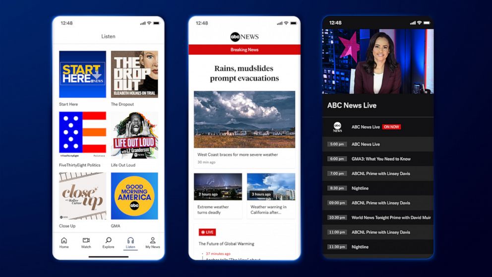
A New Look That Hid What Users Valued
The biggest issue was that the home screen was completely restructured. Previously, users were welcomed with a clean, chronological feed of top stories from all categories. The new version introduced an algorithmically curated feed, prioritizing “Suggested for You” stories based on browsing behavior.
While this is a common pattern in private media platforms, many Australians viewed the move by the ABC—a publicly funded institution—with deep suspicion. Users accused the platform of filtering content, creating echo chambers, and “hiding” important stories. What used to feel like an open door to the day’s top events now felt like a closed loop of unknown priorities.
The UI failed to provide clear settings to disable or control the algorithm, leading to frustration and a sense of being manipulated. Many saw it as a betrayal of ABC’s long-standing commitment to editorial neutrality and accessibility.
Critical Features Were Buried
Another source of anger was the decision to remove the Live tab from the main navigation. Live parliamentary broadcasts, press conferences, and breaking coverage—previously just one tap away—were buried deep within secondary menus.
For politically engaged users and journalists, this was a functional and symbolic loss. It broke workflows and removed a core element of the app’s identity. Social media erupted with accusations that the redesign was an intentional effort to reduce public access to live, unfiltered events, particularly in politically volatile moments.
A Poor Experience for Regional and Older Users
The new interface, optimized for gesture-based navigation and larger screens, alienated users in regional Australia, many of whom rely on older devices, slower connections, or are less familiar with complex gestures. Swipe-based controls, hidden drawers, and full-screen cards replaced the simple list interface that had worked for years.
Feedback from older Australians and people with disabilities was harsh. The font was smaller. The contrast was weaker. Touch targets were smaller. Several prominent disability advocates posted detailed breakdowns showing non-compliance with WCAG standards, especially for low-vision users.
Instead of making news more accessible, the redesign added friction for the very demographics that rely on ABC as a vital connection to national information.
A Wave of Uninstalls and a Drop in Trust
Within weeks of the redesign, app reviews on both the App Store and Google Play plummeted. One-star reviews cited everything from confusing navigation to “manipulated news feeds.” Some called the app “a mini Facebook” and questioned whether ABC’s public funding model was still being honored in the product design.
More than the drop in ratings, the ABC faced something worse: a drop in public trust. Users didn’t just dislike the design—they suspected motive behind it. ABC’s leadership eventually issued a public statement denying political influence, but the damage had been done.
Even some ABC journalists voiced frustration, noting that audience reach dropped sharply, particularly for important live streams and investigative content that was now harder to find. The editorial teams were at odds with the design and product teams—who had, reportedly, been pushing for modernization without adequately testing with real users.
What the Redesign Got Wrong
- User control was removed. Algorithmic feeds without opt-outs or transparency are not suitable for public broadcasters.
- Navigation became opaque. Critical features like Live and Category browsing were buried.
- Accessibility was compromised. Small fonts, poor contrast, and gesture-based navigation failed older and disabled users.
- No rollout strategy. The new design launched without beta testing or the option to switch back, despite serving a national audience.
- Distrust replaced utility. In trying to modernize, ABC forgot its core value: being the reliable, impartial, and accessible source for all.
Lessons for Public Digital Platforms
The ABC News app redesign in 2024 shows how public digital platforms cannot apply private-sector UI strategies blindly. While commercial apps chase personalization and engagement metrics, public service platforms must prioritize neutrality, accessibility, and universal usability.
The backlash has since led to internal reviews at ABC. In early 2025, the app reintroduced a simplified category view, a clearer Live section, and the option to sort news chronologically. But many users haven’t returned, citing a loss of trust that goes beyond interface design.
FAQs
1. Why was the ABC News app redesign controversial?
It introduced algorithmic curation without control, removed critical features, and alienated regional and older users.
2. What features were removed or hidden?
The Live tab, simple chronological feeds, and direct access to categories were deprioritized or buried.
3. How did the redesign affect accessibility?
Font sizes, contrast ratios, and tap targets worsened, making the app hard to use for older and disabled Australians.
4. Was the redesign politically motivated?
ABC denied any political influence, but users and journalists raised concerns about content visibility and trust.
5. Has the ABC fixed the app?
Some features have been rolled back and improved, but public trust and user satisfaction are still recovering.
Leave a Reply