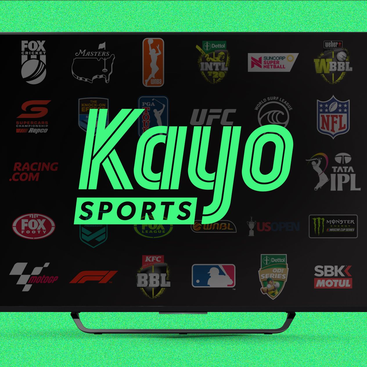
In 2024, Australia’s sports streaming platform, Kayo Sports, attempted to cement its place as the go-to destination for live and on-demand sports. Known for offering a wide array of sporting content, Kayo was seen as the leader in Australian sports streaming. However, their ambitious app redesign in mid-2024 ended up becoming a disaster in user interface design, alienating loyal users and flooding social media with complaints. The Kayo Sports case is now seen as a prime example of how bad UI decisions, especially in fast-paced industries like streaming, can lead to user frustration, abandonment, and reputational damage.
The Kayo redesign was intended to simplify the experience, make discovering live sports easier, and push more personalized recommendations. However, what seemed promising in boardroom discussions turned into chaos in the hands of users.
The most glaring mistake was removing the traditional ‘Live Now’ tab from the main navigation, which had previously allowed users to quickly access all currently streaming sports. Instead, Kayo introduced an algorithm-driven homepage that prioritized ‘Recommended for You’ carousels. This change completely broke the habit loop of regular sports fans who wanted instant access to live games. Users now had to dig through multiple categories, scroll endlessly, or rely on an unreliable AI system to suggest the match they were already expecting to watch.
The overreliance on personalization without offering a clear manual override option frustrated hardcore fans, who complained that they had to search for events they previously could find with a single tap. Instead of making discovery easier, Kayo’s app became a maze of auto-curated playlists, burying the very thing most users came for—live sports.
Another major UI decision that backfired was the introduction of large autoplaying promotional banners on the home screen, which not only ate up screen space but also slowed down the app on older devices. Users found themselves bombarded with highlights or upcoming events, while struggling to find key features like ‘Catch Up’ or ‘Split View’. The once snappy and focused interface now felt bloated, cluttered, and designed more for advertising than for user needs.
Accessibility was another casualty of the redesign. Kayo’s new dark-themed interface introduced low-contrast text and over-stylized typography, making navigation difficult for users with visual impairments or older users. Small text sizes, poor spacing, and confusing icons left many users unable to locate critical features like account management, settings, or even the search function. The lack of proper accessibility consideration sparked backlash from disability advocates and led to negative press.
The Split View feature, a fan favorite that allowed users to watch up to four games simultaneously, was inexplicably moved into a hidden settings menu, causing confusion among regular users. For a platform that built its brand on sports multitasking, hiding this feature felt like a betrayal to its core audience. The redesign prioritized new, flashy homepage carousels over the bread-and-butter features that loyal subscribers loved.
Perhaps the most damaging UI misstep was the aggressive push toward premium upsells and sponsored content, now embedded directly into the main content feed, disguised as recommendations. Users felt tricked into clicking on paid events or advertisements, eroding trust and sparking accusations of dark patterns. Transparency in content labelling was thrown out the window in favor of subtle, manipulative design tactics that blurred the line between genuine sports content and sponsored promotions.
The result? Kayo Sports saw a spike in app store ratings plummeting, social media backlash, and user churn to competitors like Stan Sport and traditional TV options. The sports fan community, known for its loyalty and vocal feedback, flooded forums, Reddit threads, and app reviews with complaints about the new UI making the app unusable for die-hard sports fans.
Internally, reports emerged of Kayo’s product team prioritizing stakeholder demands for ad revenue and data collection over genuine user feedback gathered during beta testing. Instead of listening to their most engaged users, the redesign focused on pushing flashy, ad-driven experiences that ultimately compromised the core product promise—fast, easy access to live sports.

By late 2024, the company was forced to issue public apologies, restore the ‘Live Now’ tab in a rushed patch, and roll back several of the most hated changes. Still, the reputational damage lingered, and Kayo found itself playing defense as users flocked to competing services with more intuitive and respectful UI approaches.
The Kayo Sports UI redesign fiasco has since become a staple cautionary tale for Australian digital product teams. It demonstrates how misplaced priorities, ignoring existing user behaviors, and prioritizing stakeholder metrics over customer experience can derail even the strongest digital platforms.
Key lessons from the disaster include:
- Respect user habits. When users open a sports app, they expect immediate access to live games—not to be taken on an algorithmic detour.
- Personalization should be opt-in and never replace core navigation patterns. Users should always have control.
- Never hide flagship features. Split View was a differentiator, not an extra. Hiding it behind menus sent a signal that Kayo no longer understood its users.
- Transparency in content matters. Blurring ads with content breaks trust and leads to churn.
- Accessibility is non-negotiable. Over-stylized, low-contrast designs alienate significant user groups and create bad PR.
In 2025, Kayo Sports continues to repair its user experience, slowly rebuilding trust with clearer navigation, opt-in personalization, and a renewed focus on performance and usability over marketing gimmicks. But the 2024 debacle remains a powerful lesson that good UI starts and ends with respecting the user’s journey—not the product team’s assumptions, nor the marketing department’s KPIs.
FAQs
1. What was the biggest UI mistake in the Kayo Sports 2024 app update?
Removing the ‘Live Now’ tab, forcing users to rely on flawed personalized feeds to find live sports.
2. Why did users criticize the new Kayo app homepage?
It prioritized autoplaying promos, ads, and recommendations over clear, easy access to live games and essential features.
3. How did the redesign affect accessibility?
Poor contrast, small typography, and confusing icons made the app difficult to navigate for users with visual impairments or on older devices.
4. What was the impact on Kayo’s user base?
A spike in app uninstallations, negative reviews, and user migration to competitors, forcing Kayo to roll back key features.
5. What can digital teams learn from the Kayo UI failure?
That ignoring user habits, hiding core features, and over-prioritizing stakeholder goals over user needs can turn a leading platform into a cautionary tale.
Leave a Reply