
In 2024, one of Australia’s largest supermarket chains, Woolworths, embarked on an ambitious mission to digitize and simplify in-store shopping experiences through its updated Scan&Go mobile app. The vision was promising—allow customers to scan items as they shop, pay within the app, and skip the checkout queue altogether. It was marketed as a seamless, contactless shopping journey fit for the digital age. However, despite the innovation hype, the rollout quickly became a textbook example of how poor UI decisions can erode user trust, trigger frustration, and damage brand reputation.
The Scan&Go app redesign, initially positioned as a futuristic step toward frictionless shopping, introduced several critical UI flaws that left customers stranded in-store, struggling to complete basic tasks, and ultimately abandoning the technology altogether. What was intended to enhance convenience ended up creating more friction than traditional checkout lanes.
One of the most glaring UI failures was the complex and non-intuitive onboarding process. Shoppers downloading the app were met with a confusing mix of screens asking for location permissions, credit card details, loyalty account linking, and acceptance of lengthy terms and conditions—all before they could even scan their first item. For many casual shoppers or first-time users, the process felt overwhelming, opaque, and disproportionate to the simple task of buying groceries. There was no option to try the app as a guest or explore a demo mode. Woolworths had, perhaps unknowingly, introduced a barrier before the benefit, turning away users who just wanted to grab a few items and go.
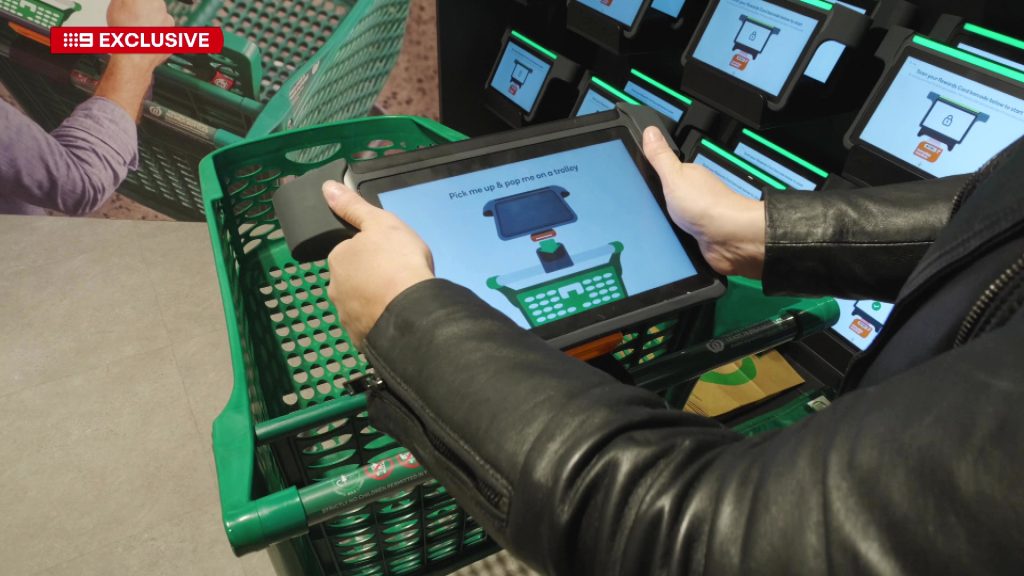
Once inside the app, the UI made critical missteps in the scanning experience itself. The redesigned interface replaced the once-simple, camera-focused screen with a cluttered interface overloaded with promotions, loyalty points banners, and product recommendations. The scan button was no longer front and center, buried under layers of secondary actions and calls to join the Everyday Rewards program. Shoppers found themselves fumbling with the interface, often accidentally clicking on promotions instead of scanning their items—leading to frustration and delays in what was supposed to be a time-saving process.
In 2024, the Woolworths app also forced updates mid-shop, introducing redesigned screens and flows without prior warning. Regular users who had grown accustomed to the old flow suddenly found themselves lost in a new interface that had no onboarding or guidance. Reports of users stuck in aisles unable to figure out how to pay or verify their purchase flooded Woolworths’ customer support channels. The inconsistency and lack of communication left many feeling abandoned.
Another massive UI flaw was the poor feedback loops during checkout confirmation. Once a customer scanned their items and reached the payment phase, the app displayed ambiguous messages like “Processing…” with no indication of status progress or error resolution paths. In multiple cases, users encountered payment failures, but the app offered no clear guidance on what to do next. Did they need to rescan everything? Could they retry payment? The app remained silent, leaving users guessing and frustrated—often forcing them to walk back to the traditional checkout lanes after already spending extra time.
Accessibility was also notably overlooked. The heavy reliance on small touch targets, lack of voice assistance integration, and poor contrast ratios made the app virtually unusable for elderly customers or those with vision impairments. In-store usability tests conducted informally by tech bloggers revealed that older customers abandoned the app within minutes, preferring the familiar, humanized checkout experience.
Moreover, the app’s over-reliance on user location tracking created privacy concerns and usability issues. In multiple instances, customers reported that the app refused to start scanning until it precisely detected that they were within a specific Woolworths location—even if they were already inside. GPS inaccuracies, especially in shopping centers with poor reception, created a scenario where users had to walk to certain aisles or near the entrance just to “activate” the app. This rigid dependency on technology ignoring real-world unpredictability resulted in widespread annoyance.
But perhaps the most damaging element of the UI overhaul was the disconnect between the digital and physical store experience. Unlike competitors like Amazon Go, which seamlessly integrated app, store, and staff support, Woolworths’ staff were poorly trained on the app’s flows and failures. Customers experiencing app issues in-store found that staff couldn’t assist or had no way to resolve technical problems—amplifying feelings of abandonment and irritation.
These compounded UI failures didn’t go unnoticed. Social media lit up with frustrated Woolworths customers sharing screenshots of app crashes, endless loading loops, and awkward in-store experiences. The brand’s app ratings plummeted across the App Store and Google Play, and multiple customers publicly stated they would never trust the app again, opting instead for Coles’ simpler, cashierless experiences or self-checkout.
The Scan&Go app disaster of 2024 has since become a cautionary tale across Australian UX and product design communities. It underscored how even well-intentioned technology projects with significant investment can collapse when user flows are overcomplicated, critical tasks are buried, and empathy for real-world usage is lacking. Woolworths had all the ingredients for success—brand trust, user base, infrastructure—but UI decisions made in isolation from user testing and in-store context turned innovation into inconvenience.
By 2025, Woolworths was forced to scale back the app’s promotion, quietly reverting some features and redesigning core flows to bring back simplicity, transparency, and reliability. They also launched an aggressive UX research initiative, finally engaging with customers, store staff, and accessibility experts to co-design the next iteration.
The key lessons from Woolworths’ Scan&Go UI disaster are now widely circulated in Australian digital design playbooks:
- Don’t hide the primary action behind clutter. Scanning and paying must always be front and center.
- Onboarding must be frictionless. Let users experience the core benefit before demanding loyalty account linking or data entry.
- Respect user habits. Drastic UI changes require gradual rollouts, onboarding, and clear communication.
- Design for the real world. GPS and connectivity failures must be anticipated, with fallback modes always in place.
- Ensure the physical and digital are connected. Store staff must be empowered to support digital tools, not sidelined by them.
Woolworths’ Scan&Go fiasco reminds everyone that UI is not just about looking sleek—it’s about serving people’s needs, respecting their time, and removing friction from everyday tasks. When convenience apps become inconvenient, users abandon them—and they take their loyalty with them.
FAQs
1. What was the worst UI decision in the Woolworths Scan&Go 2024 app update?
Burying the scan function behind promotional clutter, making the core task harder instead of easier.
2. Why did customers abandon the app?
Frustrating onboarding, inconsistent flows, payment errors without feedback, and lack of staff support created an unreliable, stressful experience.
3. How did the app’s use of location tracking cause problems?
It refused to function unless precise store location was detected, often failing inside shopping centers with poor reception.
4. What lessons did Woolworths learn?
That customer convenience must be prioritized over loyalty program pushing, and UI decisions must be grounded in real-world user testing.
5. How is Woolworths fixing the app in 2025?
They’ve simplified the interface, prioritized scanning and paying, and launched co-design initiatives with actual customers and store teams.
Leave a Reply