Forms are the backbone of interaction on the web. Whether someone is signing up for a new service, booking an appointment, or filling out an application, forms are often the point where a user either continues smoothly or abandons the process entirely. That’s why Progressive Disclosure in Forms: Step-by-Step Input for Better Usability is a topic worth digging into, especially if you want to improve conversion rates and reduce friction. Instead of overwhelming users with endless fields on a single page, progressive disclosure allows you to reveal form inputs step by step, guiding the user in a calm and logical sequence.
In this article, I’ll break down what progressive disclosure means, why it works so well in forms, and how you can apply it to your own design projects. We’ll look at real-life patterns, psychological factors, and best practices that make step-by-step input not just a design choice, but a usability booster.
What is Progressive Disclosure?
Progressive disclosure is a UX design technique where only the most relevant and necessary information is shown to the user at first, while additional details or options are revealed later as needed. The philosophy behind it is simple: don’t overwhelm people with everything at once. Instead, give them just enough to make the next decision or complete the next action.
In the context of forms, this could mean breaking a 20-field form into five short steps, each asking for related details. For example, instead of presenting fields for personal details, payment, shipping, and confirmation all at once, you show just the personal details section first. Once that’s done, the payment section appears, then shipping, and so on.
Why Progressive Disclosure Works for Forms
Long, cluttered forms are intimidating. Many users look at them and think, “This is going to take forever.” By contrast, when a form is broken into steps, users perceive it as more manageable. They can complete each small chunk quickly, which builds momentum and reduces anxiety.
There’s also a psychological principle at play called the completion bias. People feel motivated to finish tasks when they’re broken into small, achievable steps. Each “next” button feels like progress, which encourages users to continue.
Another factor is cognitive load. The human brain doesn’t like holding too many things in working memory at once. A step-by-step form reduces cognitive load by presenting only what’s necessary right now. That clarity makes it easier for people to focus and reduces the chances of errors.
Benefits of Step-by-Step Input for Better Usability
Let’s explore some clear advantages of using progressive disclosure in forms:
- Reduced abandonment rates: Users are less likely to give up when they don’t feel overwhelmed.
- Better data quality: When the form is clear and guided, users are more likely to input accurate data.
- Mobile friendliness: Step-by-step inputs are easier to handle on small screens, where a giant form would be frustrating.
- Personalization opportunities: You can adjust subsequent steps based on previous answers, tailoring the experience.
- Improved accessibility: Smaller, logical chunks of inputs are easier for screen readers and assistive tech to handle.
These benefits explain why more and more modern websites and apps are moving toward step-by-step flows instead of massive all-in-one forms.
How Progressive Disclosure in Forms Improves User Flow
Imagine walking into a government office and being handed a 10-page form to complete before you even know what it’s for. Most people would feel stressed. Now imagine someone instead guiding you through each section, asking one or two questions at a time, and only moving on once you’re done. That’s essentially what progressive disclosure does online.
Users can focus, stay engaged, and feel supported through the process. This improvement in user flow isn’t just theoretical; it translates to real-world business metrics like higher conversion rates and fewer support inquiries.
Best Practices for Designing Step-by-Step Forms
If you want to implement progressive disclosure in forms, here are some tried-and-true guidelines:
1. Group related fields
Keep inputs that belong together in the same step. For example, “Personal Info” should be one step, while “Payment Info” should be another. This helps users build a mental model of the process.
2. Show progress
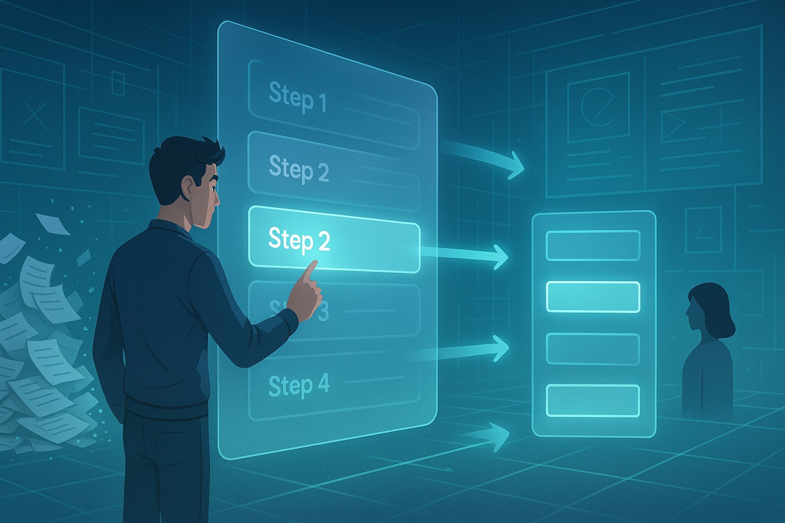
Use a progress bar, numbered steps, or clear labels like “Step 2 of 4” so users know how far they’ve come and how much is left.
3. Keep steps short
Don’t overload a single step with too many questions. Aim for about three to six fields per step.
4. Use smart defaults and validation
Where possible, pre-fill data or validate it in real-time so users don’t have to backtrack later.
5. Offer context when needed
If a field might be confusing, provide inline help, tooltips, or microcopy, but only when it’s relevant. That’s another form of progressive disclosure.
6. Make it mobile-friendly
Design with small screens in mind. Large buttons, clean layouts, and minimal scrolling improve usability.
7. Allow going back
Users should be able to revisit previous steps without losing progress.
Examples of Progressive Disclosure in Action
Some of the best-known companies use step-by-step forms to great effect:
- Airbnb: When booking, you’re guided through selecting dates, choosing a place, and then payment. You’re never shown everything at once.
- LinkedIn: When creating a profile, you’re encouraged to fill sections step by step, starting with basics before moving into career history.
- E-commerce checkout: Many online stores break checkout into steps: cart review, shipping info, payment, and confirmation.
These patterns feel natural because they mirror real-life interactions.
Mistakes to Avoid in Progressive Disclosure
Of course, not all implementations are perfect. Some mistakes designers make include:
- Too many steps: Breaking a short form into too many micro-steps can frustrate users.
- Hidden fields: If users can’t see what’s coming, they may feel tricked if later steps ask for unexpected information.
- Poor navigation: If users can’t go back to edit earlier answers, the process feels rigid.
- Overly complex progress bars: Keep indicators simple. Too much visual noise defeats the purpose.
Avoiding these pitfalls keeps the experience smooth.
The Role of Microinteractions
Microinteractions—like a glowing highlight when a field is completed or a smooth transition between steps—play a big role in making progressive disclosure feel seamless. These small touches reassure users that their input was registered and that they’re moving forward successfully.
Animations should be quick and subtle, never distracting, but enough to give a sense of flow.
Progressive Disclosure and Accessibility
Accessibility should always be part of the conversation. Step-by-step forms can improve accessibility when done right, but they can also create barriers if implemented poorly. For example, using JavaScript-heavy transitions without semantic markup can confuse screen readers. To make step-by-step forms inclusive:
- Use semantic HTML for forms and inputs.
- Provide ARIA labels for step indicators.
- Ensure each step can be navigated with a keyboard alone.
- Announce transitions clearly for screen readers.
When you combine progressive disclosure with accessibility, you create a form that works well for everyone.
The Psychology Behind Progressive Disclosure
Humans are wired to prefer small, digestible tasks over big, daunting ones. That’s why checklists, gamification, and progress bars are so effective. Progressive disclosure leverages this psychology in forms. Each small victory—like completing a step—releases a bit of dopamine, motivating the user to keep going.
This psychological design thinking shows why step-by-step input is more than just a visual choice; it’s about aligning with how people naturally process information.
Future Trends in Form Design
As AI and personalization tools evolve, forms may become even smarter. Imagine forms that adapt not only to your previous answers but also to your behavior patterns. If you always choose the same shipping option, the form might skip that step or pre-select it for you.
We may also see voice-driven forms, where progressive disclosure happens through conversational UIs. Instead of clicking “Next,” users might simply answer questions one by one through voice input.
Bringing It All Together
Progressive disclosure in forms is about respecting the user’s time and attention. By guiding them step by step, you create an experience that feels easier, faster, and more intuitive. It’s a win for usability and for businesses that want to boost engagement and reduce form abandonment.
For designers and developers, the key is balance. Don’t overcomplicate it, but don’t underdeliver either. Aim for just enough disclosure to keep users focused, supported, and confident in completing the form.
FAQs
1. What does progressive disclosure in forms mean?
It means revealing inputs step by step instead of showing everything at once.
2. Why is step-by-step input better for usability?
Because it reduces cognitive load, feels easier to complete, and keeps users motivated.
3. How many steps should a form have?
Usually between 3–6 steps is best, but it depends on the complexity of the form.
4. Should I always use progressive disclosure?
Not always—short forms are fine as one page, but longer or more complex forms benefit from step-by-step design.
5. How can I make progressive disclosure accessible?
Use semantic HTML, ARIA labels, clear navigation, and ensure it works with screen readers and keyboards.
Leave a Reply