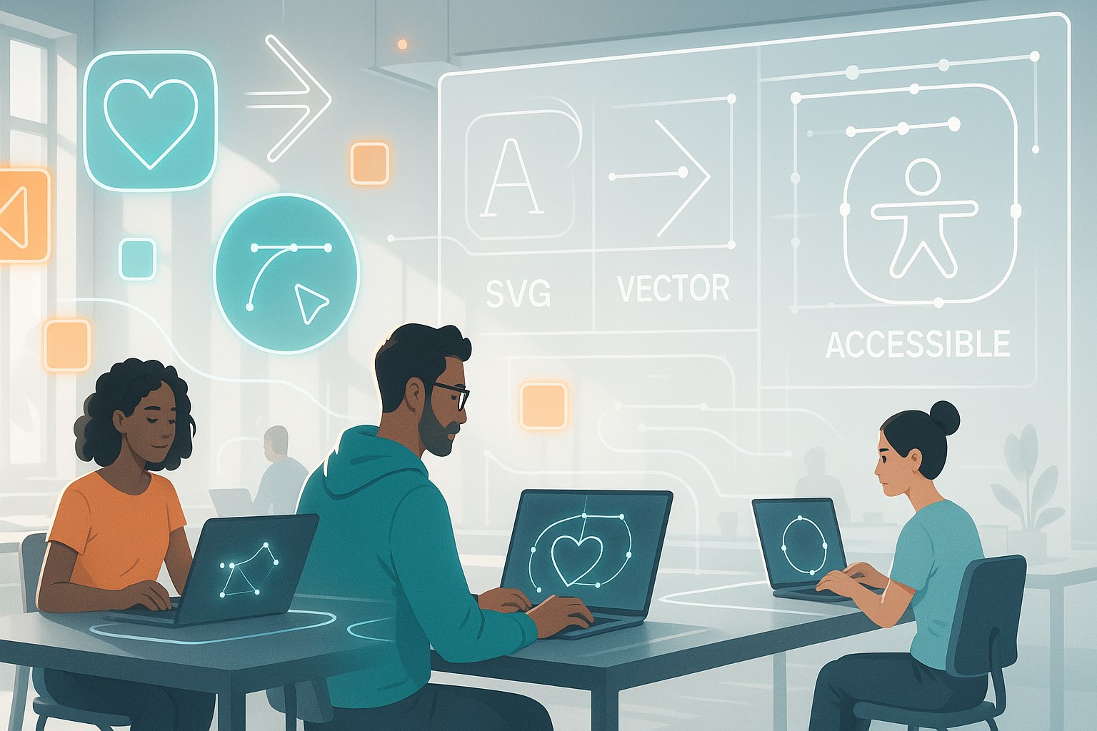
When you think about websites today, one of the first things you notice is how visuals dominate the experience. Icons, logos, and illustrations all rely heavily on vector graphics. Among them, SVGs (Scalable Vector Graphics) stand out because they are crisp, scalable, and lightweight. But while designers often focus on aesthetics, accessibility sometimes gets pushed aside. This is where the idea of descriptive SVGs: making vector graphics accessible comes into play. It’s not just about having sharp icons that resize gracefully; it’s also about ensuring that everyone, including people with disabilities, can understand and benefit from those graphics.
Let’s dig into what makes SVGs special, why accessibility is critical, and how you can build a better, more inclusive web by designing with accessibility in mind.
Why Accessibility in SVGs Matters
Accessibility is no longer optional. Modern websites need to cater to diverse audiences, and that includes people with vision impairments, motor disabilities, or those relying on screen readers. Without accessible graphics, you risk excluding a portion of your audience.
Think about it: what’s the point of a fancy icon if a screen reader user hears nothing or only gets “image” without context? A “download” arrow should be understood as “Download File” and a heart icon should read as “Favorite” or “Like.” Accessibility in SVGs ensures your icons and visuals communicate meaning, not just style.
Plus, in many countries, accessibility is tied to legal requirements. Websites that fail to meet accessibility guidelines like WCAG (Web Content Accessibility Guidelines) risk lawsuits or penalties. Beyond compliance, though, the bigger reason is inclusivity—it’s just the right thing to do.
What Makes SVGs So Useful?
Before we get into accessibility, let’s quickly refresh why SVGs dominate web design:
- Scalable: They look perfect on any screen size or resolution, from a tiny phone to a 4K display.
- Lightweight: Usually smaller than bitmap images, which means faster loading.
- Editable: You can tweak them with CSS or JavaScript, making them dynamic and adaptable.
- Accessible by nature: Unlike raster images, SVGs are code-based, which means text and structure inside them can be made available to assistive technologies.
It’s that last point that makes them perfect candidates for accessibility improvements.
Descriptive SVGs: Making Vector Graphics Accessible
So what does it mean to make SVGs “descriptive”? At its core, it means providing context. A screen reader doesn’t “see” shapes or paths—it needs labels, titles, or descriptions that translate the graphic into meaningful information.
For example, an SVG that looks like a shopping cart can have the following added:
<svg role="img" aria-labelledby="cartTitle">
  <title id="cartTitle">Shopping Cart</title>
  <path d="..."/>
</svg>
That simple addition allows assistive technologies to announce “Shopping Cart” instead of a meaningless “graphic” or “path.” Descriptions can be expanded further for complex graphics, ensuring users get enough context to interact meaningfully.
Practical Ways to Make SVGs Accessible
There are multiple approaches to making SVGs more accessible. Here are the most important ones to consider:
1. Use <title> and <desc>
The <title> element names the SVG, while <desc> provides extra context. For instance:
<svg role="img" aria-labelledby="logoTitle logoDesc">
  <title id="logoTitle">Flamincode Logo</title>
  <desc id="logoDesc">A stylized flame in orange and teal forming a code bracket</desc>
  <path d="..."/>
</svg>
Screen readers now announce both the title and the description, giving users meaningful information.
2. Assign ARIA Roles and Labels
ARIA (Accessible Rich Internet Applications) attributes let you control how assistive technologies interpret your SVG.
- role=”img” helps identify the graphic.
- aria-label or aria-labelledby provides descriptive text.
- aria-hidden=”true” hides decorative SVGs.
Example:
<svg aria-label="Download File" role="img">
  <path d="..."/>
</svg>
3. Hide Decorative Icons
Not every graphic needs a description. Background patterns, borders, or purely decorative icons can be hidden with:
<svg aria-hidden="true" focusable="false">
  <path d="..."/>
</svg>
This keeps assistive tech from cluttering user experience with irrelevant details.
4. Provide Text Alternatives Nearby
Sometimes embedding descriptions in the SVG itself isn’t enough. A chart or infographic might need a detailed text explanation below it. That way, users with visual impairments still understand the information being conveyed.
5. Focus on Contrast and Visibility
Accessibility isn’t only about screen readers. Users with low vision benefit from SVGs with strong color contrast and clear shapes. For example, a warning triangle should have sharp lines and bold colors that remain legible even in high-contrast modes.
Examples of Accessible SVG Use Cases
To make this concrete, here are some practical scenarios:
Case 1: Accessible Buttons
A button with a “plus” icon should not only show the icon but also tell the user what it does.
<button aria-label="Add Item">
  <svg aria-hidden="true">
    <path d="..."/>
  </svg>
</button>
Here, the button gets the label, while the SVG is hidden.
Case 2: Logos
Logos are often SVG-based. Adding a <title> ensures that users hear “Company Logo” instead of nothing.
Case 3: Complex Infographics
A map or chart can’t be fully explained through <title> alone. Instead, pair it with long descriptions or captions in HTML. This hybrid approach ensures accessibility without overloading the SVG markup.
SEO Benefits of Accessible SVGs
Interestingly, accessibility and SEO go hand in hand. Descriptive SVGs not only help users but also give search engines more context. Just like alt text for images, the labels and descriptions in SVGs can help crawlers understand your site better. This can improve visibility for icons, logos, and even data-driven graphics.
In other words, when you make vector graphics accessible, you’re also improving your SEO strategy.
Best Practices Checklist
Here’s a quick checklist to keep in mind:
- Always use
<title>for meaningful icons. - Add
<desc>if the SVG is complex. - Use ARIA attributes wisely.
- Hide decorative graphics with
aria-hidden. - Ensure high color contrast.
- Provide alternative text descriptions for charts and infographics.
- Test with screen readers to confirm behavior.
Accessibility Tools for SVG Testing
To confirm your SVGs are accessible, try these tools:
- NVDA (Windows screen reader)
- VoiceOver (built into macOS and iOS)
- JAWS (popular screen reader for Windows)
- axe DevTools (browser extension for accessibility audits)
- WAVE (Web Accessibility Evaluation Tool)
Testing is key. Even if your markup looks correct, the actual experience for users might differ across devices and screen readers.
Descriptive SVGs in Real Design Systems
Modern design systems like Material Design and Carbon emphasize accessible icons. They provide guidelines not just for the look and feel, but also for semantic usage. Descriptive SVGs play a huge role here, ensuring that every button, card, and navigation item makes sense to all users.
For example, Material Design icons often come with clear naming conventions and labels. If you’re building your own design system, take this as inspiration: don’t just create icons, create accessible assets.
Common Mistakes with SVG Accessibility
Even experienced developers slip up sometimes. Here are pitfalls to avoid:
- Forgetting to add a
<title>at all. - Over-describing decorative icons, cluttering the experience.
- Using vague labels like “icon” instead of “Search Icon” or “Menu Icon.”
- Assuming visual contrast is enough without checking accessibility standards.
- Not testing across different screen readers.
Avoiding these mistakes is just as important as following best practices.
The Future of Accessible Vector Graphics
As technology evolves, SVGs are only going to get more important. With responsive design, animations, and interactive UI elements, they’re everywhere. The push for inclusive design means we’ll likely see better frameworks, tools, and perhaps even automatic accessibility generation for SVGs.
But the fundamentals remain the same: clear labeling, thoughtful descriptions, and inclusive design thinking.
Conclusion
Accessible design is about more than compliance—it’s about respect for your users. When you create descriptive SVGs, you’re not just adding metadata; you’re ensuring that your work is meaningful for everyone. The beauty of SVGs lies not just in how sharp they look, but in how versatile they are for accessibility.
So the next time you drop an SVG into your site, take a few seconds to ask: Will every user understand this? If the answer is yes, you’ve not only improved accessibility but also made your website stronger, more inclusive, and even better for SEO.
FAQs
1. What’s the easiest way to make SVGs accessible?
Add a <title> element and use ARIA labels for meaningful icons.
2. Do all SVGs need descriptions?
No, decorative SVGs should be hidden with aria-hidden="true".
3. How does SVG accessibility help SEO?
Descriptions and labels give search engines more context, improving ranking.
4. Can screen readers read SVG paths directly?
No, they only recognize the labels, titles, and ARIA attributes you add.
5. What if my SVG is too complex?
Provide detailed text alternatives outside the SVG, like captions or summaries.
Leave a Reply