When people talk about websites or apps feeling “fast,” they don’t always mean the raw technical speed. They’re often referring to how responsive the interface feels in the moment. That’s where the concept of visual feedback latency comes in. Designing for perceived performance is just as important as actual performance, because users judge an app not only by milliseconds of load time, but by the quality of interaction cues they receive.
In this article, I’ll dive deep into what visual feedback latency means, why perceived performance matters, and how you can design your applications in a way that makes them feel faster, even if the technical speed is not perfect.
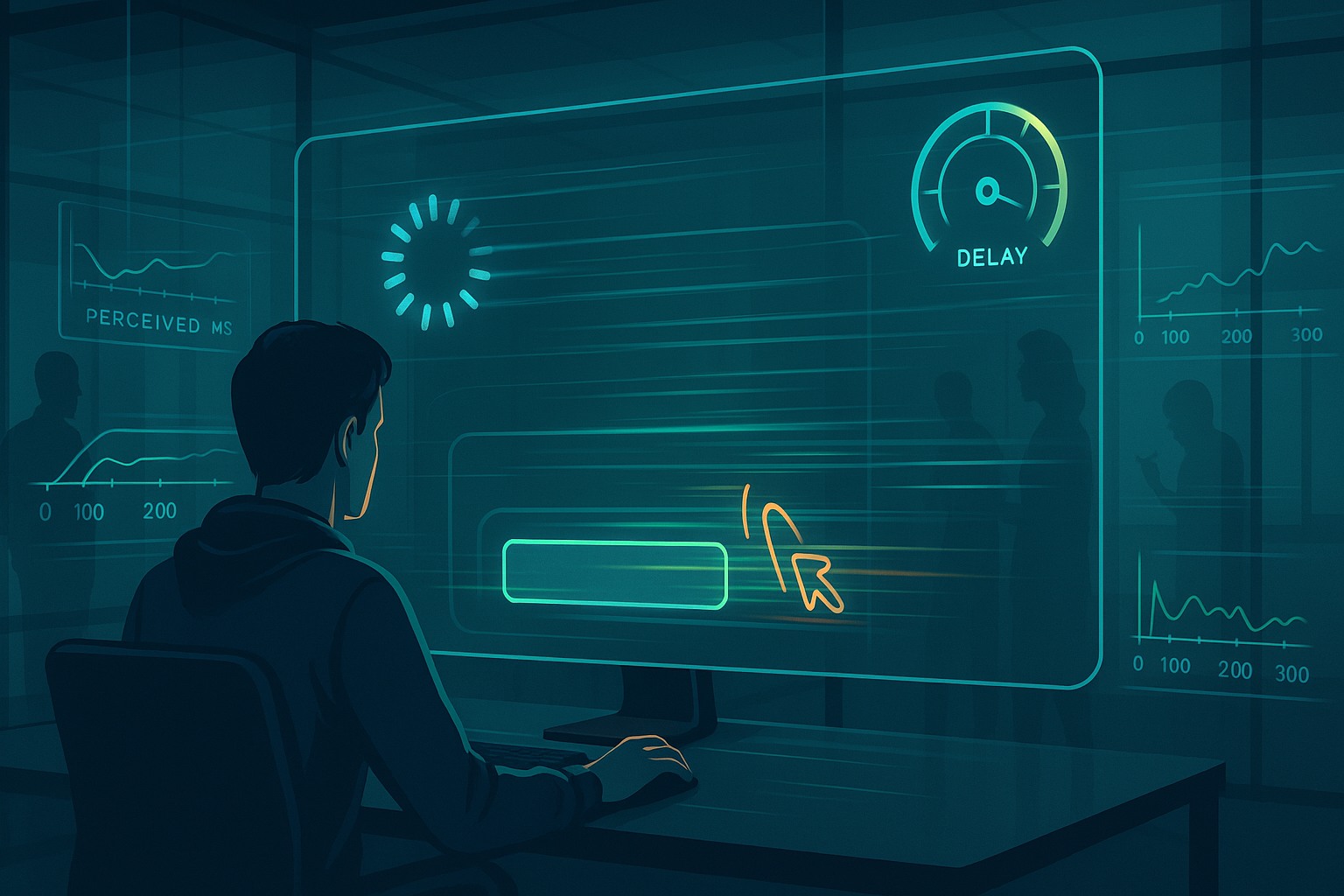
Understanding Visual Feedback Latency
At its core, visual feedback latency is the delay between a user’s action and the system’s visible response. Imagine you click a button but nothing happens for half a second. That small gap makes the system feel sluggish, even if the backend is actually processing everything in the background.
The human brain is sensitive to delays. Anything under 100 milliseconds usually feels instant. Between 100 and 300 milliseconds, people start noticing lag. Beyond 500 milliseconds, users often feel frustrated. These thresholds are not arbitrary; they’re based on decades of human-computer interaction research.
So when we talk about designing for perceived performance, we’re really talking about respecting these cognitive limits. It’s not enough to make your system efficient—you also need to show your users that something is happening as soon as they interact.
Why Perceived Performance Often Matters More
A funny truth in design is that users forgive slowness if it feels like progress. That’s why a cleverly animated loading spinner or skeleton screen can buy you time. The actual performance might not improve, but the perceived performance gets better.
For example, think about apps like Instagram or Twitter. When you refresh your feed, you don’t stare at a blank screen waiting for content to load. Instead, you see placeholders, shimmer effects, or transitional animations that give you the sense that the app is active and working for you.
This psychological trick reduces frustration and keeps engagement high. A raw delay without feedback, on the other hand, makes users doubt whether their action even registered. That’s the real danger of poor visual feedback latency—it erodes trust in your product.
Microinteractions and Their Role in Reducing Latency
Microinteractions are the tiny responses baked into digital interfaces: a button that ripples when tapped, a switch that toggles smoothly, a notification that gently fades in. These small design touches don’t actually change system speed, but they reassure users that the system is listening.
Here are a few practical examples:
- Button presses: Instead of waiting for a server response, highlight the button instantly with a pressed state.
- Form submissions: Disable the button and show a spinner inside it while processing.
- Navigation taps: Use loading indicators or transitions rather than leaving a frozen screen.
When used thoughtfully, microinteractions mask visual feedback latency by bridging the time gap between input and response. They create an illusion of immediacy.
Skeleton Screens vs. Spinners
Two of the most common UI patterns for handling delays are skeleton screens and spinners. Both are meant to address latency, but they communicate differently.
- Spinners: These show that something is loading, but they don’t give context about how long it might take. If the spinner lasts too long, frustration builds quickly.
- Skeleton screens: These are grey placeholders shaped like the content that’s coming. They make it look like progress is already underway, and research shows users perceive skeleton screens as faster than spinners, even if the underlying load time is identical.
If you’re designing for perceived performance, skeletons often win. They reduce uncertainty and feel less passive.
The Science of Delays: Thresholds That Matter
It’s useful to remember some practical thresholds when designing around latency:
- 0 to 100 ms: Feels instant. Ideal for button states and quick UI updates.
- 100 to 300 ms: Still acceptable, but noticeable. Perfect for microinteractions to mask delay.
- 300 to 1000 ms: Users notice slowness. Use animations, skeleton screens, or progress bars.
- 1 to 10 seconds: Tolerable if progress is clear. Break content into chunks and give constant updates.
- 10+ seconds: Users abandon tasks unless you provide strong feedback (e.g., progress tracking or messaging).
These guidelines come from classic usability studies but remain relevant today. If you design around them, you can control the narrative of speed.
Designing for Perceived Performance in Mobile Apps
Mobile apps face unique challenges. Network latency, low device power, and environmental distractions all make delays more noticeable. That’s why mobile design often leads innovation in latency handling.
Some techniques include:
- Optimistic updates: Showing the result immediately, then syncing with the server in the background. (e.g., liking a post instantly before the backend confirms).
- Pull-to-refresh animations: Making loading feel interactive and intentional.
- Lazy loading content: Loading images or data only when they come into view.
By combining these with microinteractions, mobile designers set the standard for handling feedback latency gracefully.
Case Studies: Apps That Master Visual Feedback
- WhatsApp – Messages show a single check instantly after sending, even before they’re delivered. This reduces perceived latency by signaling that the system accepted the action.
- Google Search – Results often start appearing while the page is still loading. Skeletons and instant feedback make it feel faster.
- Slack – Shows optimistic updates in chats. Messages appear immediately, then adjust if a network issue occurs.
- YouTube – Thumbnails and metadata load first, followed by video streams. This layered loading minimizes the frustration of waiting.
Each of these apps proves that perceived speed often matters more than raw speed.
Avoiding Bad Patterns
While animations and placeholders can reduce perceived delays, overusing them backfires. Some common mistakes include:
- Fake progress bars: Bars that jump backward or stall destroy trust.
- Overly long animations: Fancy but slow transitions feel like lag, not polish.
- Ambiguous feedback: A spinner that doesn’t explain what’s happening leads to confusion.
The golden rule: never fake progress. Users forgive slowness but not dishonesty.
Testing Perceived Performance
How do you test whether your design actually improves perceived performance? A few approaches:
- User testing: Ask people how responsive the app feels, not just how fast it measures.
- A/B testing: Compare spinner vs skeleton, optimistic vs conservative updates.
- Analytics: Track abandonment rates during key loading moments.
Combining qualitative and quantitative data gives you a clear sense of whether your latency design works.
Visual Feedback Latency: Designing for Perceived Performance in Web Apps
For web apps, handling latency is often about masking network slowness. Here are some proven strategies:
- Preloading: Fetching assets before they’re needed.
- Progressive rendering: Showing parts of the UI before everything is ready.
- Feedback-first design: Ensuring every click or tap has an immediate visual response.
Web users are often multitasking, so even short delays feel more frustrating. That’s why perceived performance can make or break retention.
The Role of Animation Timing
Animations are not just eye candy—they’re critical tools for latency design. But timing is everything:
- Fast interactions: Use snappy animations under 200 ms.
- Medium delays: Use easing and progress cues to fill 300–800 ms.
- Long delays: Use staged animations and progress updates to keep engagement.
Done well, animations transform dead waiting time into an engaging experience.
Future Trends in Feedback Latency Design
Looking forward, we’ll see more intelligent systems that adjust feedback dynamically. Examples include:
- Adaptive skeletons: Placeholders that match user context (e.g., showing last cached content).
- AI-driven predictions: Systems that guess what users will click next and preload accordingly.
- Personalized thresholds: Interfaces that adjust feedback speed based on the individual’s past behavior.
The science of perceived performance is only getting smarter, and designers need to keep up.
FAQs
1. What is visual feedback latency in simple terms?
It’s the time gap between your action and the system’s visible response.
2. Why is perceived performance important?
Because users care about how fast things feel, not just how fast they are technically.
3. Are skeleton screens better than spinners?
Usually yes, because they show progress more clearly and reduce uncertainty.
4. How can animations help with latency?
They fill small delays with movement, making waiting feel less frustrating.
5. What’s the worst mistake in handling feedback latency?
Showing fake or misleading progress, which breaks user trust.
Conclusion
Visual feedback latency isn’t just a technical detail—it’s a core part of user experience. If your app feels unresponsive, users won’t care how powerful your backend is. Designing for perceived performance means respecting human attention, giving instant cues, and shaping delays into something that feels purposeful.
By mastering techniques like microinteractions, skeleton screens, and optimistic updates, you can build digital products that feel faster and friendlier. In the end, it’s not only about cutting milliseconds—it’s about designing moments that reassure and engage people.
Leave a Reply