When working on modern digital products, design systems have become the backbone of consistency, efficiency, and collaboration. One of the most practical aspects of a design system is creating a design pattern library that helps teams manage UI components in a structured way. But building a design pattern library: naming and organizing UI components effectively is not just about storing buttons and modals in one place. It’s about creating a shared language across designers and developers, ensuring every part of the interface is intuitive, reusable, and scalable.
In this article, I’ll walk through the process of setting up such a library, why naming matters more than we think, how to organize UI components without chaos, and what best practices can save you from a messy system that no one wants to use. Along the way, we’ll also answer common questions that teams often face when starting or maintaining their own libraries.
Why a Design Pattern Library Matters
Let’s start with the basics: why should you even invest time in building a design pattern library? If you’ve ever worked on a product where every button looks slightly different, or where one developer calls a modal a “popup” while another calls it a “dialog,” you know the pain of inconsistency.
A design pattern library solves this by:
- Centralizing UI components for easy reuse
- Reducing duplicate work across the team
- Creating alignment between design and development
- Accelerating onboarding for new team members
- Helping maintain accessibility and responsive standards
Without one, your project risks ballooning into a patchwork of styles and mismatched naming conventions, which slows down both design and code.
Naming UI Components: The Foundation of Clarity
When people hear “naming,” they often shrug and think it’s just semantics. But in reality, naming is one of the hardest and most important parts of building a design pattern library. A poorly named component creates confusion, while a well-named one immediately conveys purpose.
Here are a few tips for naming components:
- Be descriptive, not clever – Instead of calling a component “ShinyButton,” call it “PrimaryButton.” This tells the team exactly what it is.
- Use consistent terminology – Don’t mix “modal” and “dialog” in the same system. Choose one and stick with it.
- Match user-facing labels when possible – For example, if a navigation element is called “breadcrumb” in UX writing, don’t rename it to “path-trail” in your library.
- Avoid overly generic names – Naming everything “container” or “box” doesn’t help anyone.
- Think about scalability – “CardSmall” and “CardLarge” might work now, but what if you need medium or extra-large variations later?
A strong naming system creates predictability. Developers know where to find things. Designers know what to expect when they hand off work. And everyone saves time.
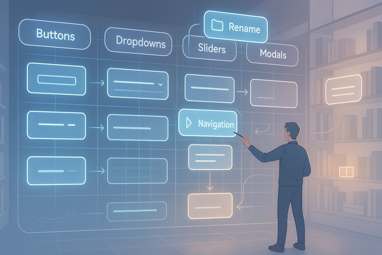
Organizing UI Components for Maximum Reusability
Now that we’ve covered naming, let’s look at organization. Even with perfect names, a messy structure can make your design pattern library unusable. Imagine a library where buttons are buried under “Forms” while links are buried under “Typography.” That’s confusing.
A better approach is to group components logically based on their role:
- Atoms: The smallest building blocks like buttons, inputs, icons
- Molecules: Combinations of atoms, like input + label + error message
- Organisms: More complex sections like navbars, cards, or modals
- Templates/Layouts: Page-level patterns that define structure
This atomic design methodology works because it mirrors how components actually get built in modern front-end frameworks like React or Vue. It also makes it easier to scale your library as your product grows.
The Role of Documentation
A design pattern library without documentation is like a toolbox without labels. Sure, the tools are there, but no one knows which to use or how. Documentation doesn’t have to be boring or overloaded with jargon. It just needs to provide enough context for people to make the right choices.
Good documentation includes:
- Component description: What it is and when to use it
- Visual examples: Screenshots or live previews of different states
- Code snippets: Ready-to-copy examples for developers
- Accessibility guidelines: Notes on keyboard support, ARIA labels, and contrast ratios
- Dos and Don’ts: Quick tips on misuse to avoid inconsistency
If you do this well, your library becomes more than just a storage place—it becomes a true source of truth.
Collaboration Between Designers and Developers
One of the biggest challenges in building a design pattern library: naming and organizing UI components is bridging the gap between design and development. Designers think visually; developers think in terms of functionality and code. If you don’t establish a collaborative process, your library will eventually drift apart into two disconnected versions.
Here are a few ways to keep alignment:
- Hold regular syncs between design and dev teams
- Use the same naming conventions across Figma and codebase
- Store documentation where both groups can access it easily
- Create feedback loops when components are added or updated
A library that only designers maintain will frustrate developers, and one that only developers maintain will frustrate designers. The best ones are co-owned.
Keeping the Library Lean
Another common mistake is thinking that bigger is better. Teams start stuffing every variation into the library, and soon it becomes bloated and overwhelming. The goal is not to catalog every possible component under the sun, but to keep the library lean, relevant, and useful.
To achieve this:
- Focus on components that are reused often
- Retire or archive outdated components
- Avoid unnecessary duplication (e.g., five types of “blue buttons”)
- Regularly audit your library to remove clutter
Think of your design pattern library as a curated collection, not a junk drawer.
Scaling Over Time
When your product grows, so will your library. Scaling isn’t just about adding new components; it’s also about maintaining order. This means updating naming systems, reorganizing categories when necessary, and making sure documentation evolves with new features.
The key is to set governance early. Decide who owns the library, who approves changes, and how updates are communicated. Without governance, your library will quickly fall into chaos.
Building a Design Pattern Library for Accessibility
Accessibility often gets overlooked when teams rush to build out their libraries. But if accessibility isn’t baked in from the start, you’ll face technical debt later. Every component should be designed and coded with accessibility in mind.
That means:
- Buttons should have clear focus states
- Color choices should meet contrast standards
- Components should be keyboard navigable
- Forms should have proper labels and error handling
By making accessibility a default part of your design pattern library, you ensure inclusivity and compliance while saving time in the long run.
Example Structures
To make this more concrete, here’s an example of how you might structure a component library in both Figma and a front-end framework:
| Category | Components Included | Notes |
|---|---|---|
| Atoms | Button, Input, Icon, Checkbox, Radio | Base elements |
| Molecules | Search bar, Input + Label, Dropdown + Icon | Combine atoms |
| Organisms | Navbar, Card, Modal, Carousel | Larger reusable patterns |
| Templates | Login page, Dashboard layout | Define screen structures |
This kind of structure allows teams to quickly navigate and find what they need without second-guessing where something belongs.
FAQs
1. What is the main purpose of a design pattern library?
To provide a centralized, reusable collection of UI components that ensure consistency and speed in product design and development.
2. How do you decide what to include in the library?
Start with the most commonly reused components and expand gradually. Don’t overload it with one-off patterns.
3. Should designers or developers own the library?
Ideally both. It should be co-owned to maintain alignment across teams.
4. How often should a design pattern library be updated?
Regularly—set a review cycle (e.g., every quarter) to audit components and keep things clean.
5. What tools are best for managing a library?
For design: Figma, Sketch, Adobe XD. For development: Storybook, Bit, or a dedicated component repository.
Final Thoughts
Building a design pattern library is not just an exercise in storage; it’s about creating a shared framework that makes collaboration smoother and products more consistent. By focusing on naming, organizing UI components logically, and keeping documentation clear, you’re setting your team up for long-term success.
If you’re starting fresh, begin small. Build out the most common patterns first, establish a naming system, and get buy-in from both designers and developers. Over time, refine, scale, and evolve the library as your product grows.
A well-structured design pattern library isn’t just a nice-to-have—it’s a cornerstone of modern product development.
Leave a Reply