Responsive design has come a long way. From float-based layouts and media queries to Flexbox and Grid, every step brought us closer to truly flexible web design. But something was always missing. Media queries, while powerful, rely on the viewport—not the element. That means your components are still context-blind. Until now.
Enter CSS container queries—a long-awaited feature that opens a new door in the world of component-based design. In this article, we’re diving deep into mastering CSS container queries, exploring what they are, how they work, why they matter, and how you can start using them today to build smarter, more adaptable layouts.
We’ll also get hands-on with code samples, real-world use cases, and best practices to help you fully embrace this new approach to responsive layouts.
What Are CSS Container Queries?
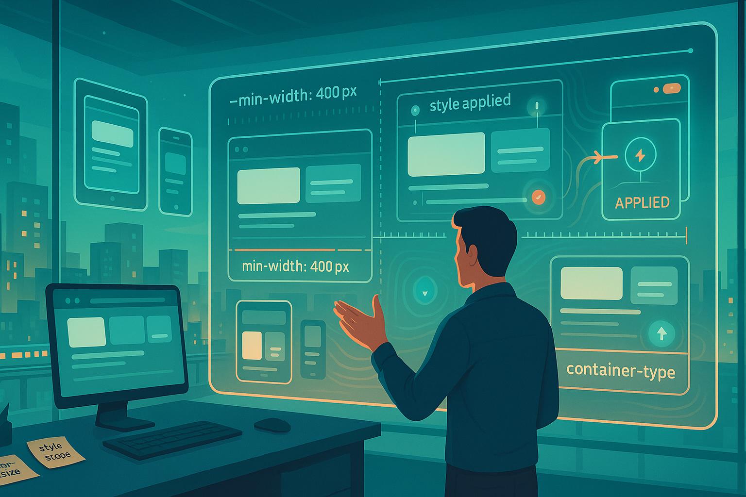
If you’ve ever used media queries, you’re already familiar with the basic concept: apply styles conditionally based on some size—usually the viewport. But container queries flip that on its head. Instead of checking the size of the entire screen, they look at the size of the element’s container.
So rather than asking, “Is the screen at least 768px wide?”, you’re asking, “Is this component inside a container that’s at least 768px wide?”
Here’s the basic syntax:
.container {
  container-type: inline-size;
  container-name: card;
}

@container card (min-width: 600px) {
  .card-content {
    flex-direction: row;
  }
}
That’s it. You define a container, give it a name (optional but useful), and write styles that respond to that container’s size. Now your component is no longer at the mercy of the global screen.
Why Container Queries Matter More Than Ever
We live in a component-based world. React, Vue, Svelte, Web Components—you name it, they all focus on building self-contained, reusable parts. But if your component’s layout can only respond to the viewport, it’s not really self-contained.
This has led to countless workarounds:
- Using utility classes with media queries in the parent
- Passing down screen-size props
- Overriding layout inside components based on breakpoints
With CSS container queries, those hacks disappear. Your components become truly portable and flexible, adapting to the context they’re placed in.
Setting Up: What You Need to Use Container Queries
Good news: container queries are supported in all modern browsers (Chrome, Edge, Firefox, Safari) as of late 2023. That means you can start using them right now—no polyfills required.
To get started:
- Set
container-typeon the parent element. - Optionally add a
container-nameif you want to target it specifically. - Write your
@containerrules.
Example:
.card-wrapper {
  container-type: inline-size;
}

@container (min-width: 500px) {
  .card-content {
    display: flex;
    flex-direction: row;
  }
}
Note: The container must have a size constraint (like width) to work. That means things like display: block or inline-block alone won’t cut it.
Real-World Use Case: Responsive Card Layouts
Let’s say you’re designing a card component. On small screens or containers, it should stack vertically. On wider ones, it should shift to horizontal.
Here’s how it might look:
<div class="card">
  <div class="card-image"></div>
  <div class="card-body">
    <h3>Title</h3>
    <p>Description text</p>
  </div>
</div>
.card {
  container-type: inline-size;
  padding: 1rem;
  border: 1px solid #ddd;
}

.card-image {
  height: 200px;
  background: #ccc;
}

.card-body {
  padding-top: 1rem;
}

@container (min-width: 600px) {
  .card {
    display: flex;
    gap: 1rem;
  }

  .card-image {
    width: 40%;
    height: auto;
  }

  .card-body {
    padding-top: 0;
  }
}
Notice how the layout flips only when the card container is wider than 600px. This means you can place the card in any context—sidebar, modal, main page—and it will adapt.
Container Types: inline-size vs size
The two main container types are:
container-type: inline-size– responds to width only (most common)container-type: size– responds to both width and height
You’ll usually stick with inline-size, unless you’re designing something like a square tile that adapts to both dimensions.
Container Names: Why and When to Use Them
While unnamed container queries work fine for most cases, adding a name makes things easier when multiple containers are nested.
.card {
  container-type: inline-size;
  container-name: card;
}

@container card (min-width: 800px) {
  .card-content {
    grid-template-columns: 2fr 1fr;
  }
}
This gives you targeted control and helps prevent accidental overrides in nested layouts.
Mastering CSS Container Queries for Component Libraries
If you’re building design systems or UI libraries, container queries are a game-changer.
Imagine building a button group that changes alignment based on the space it’s given—not the screen. Or a sidebar that adapts from vertical to horizontal when placed inside a narrow component like a modal.
Here’s a simple horizontal/vertical switcher:
.button-group {
  display: flex;
  flex-direction: column;
  gap: 0.5rem;
  container-type: inline-size;
}

@container (min-width: 500px) {
  .button-group {
    flex-direction: row;
  }
}
Now your button-group works everywhere without needing screen-size awareness.
Debugging and Tooling Tips
Debugging container queries is a bit different than traditional media queries. Thankfully, modern browsers help out.
Chrome DevTools now includes a “Container Queries” section in the Styles pane, showing which container is matched and which conditions are met.
Tips:
- Make sure your container has a defined size.
- Use the
container-typeandcontainer-nameexplicitly. - Inspect your layout with browser dev tools and resize the container (not just the window).
CSS Container Queries vs Media Queries: A Quick Comparison
| Feature | Media Queries | Container Queries |
|---|---|---|
| Based on | Viewport size | Container size |
| Use case | Global layout changes | Component layout changes |
| Scope | Entire page | Specific component |
| Portability | Limited | High |
| Requires container | No | Yes (container-type) |
Container queries don’t replace media queries—they complement them. Use media queries for global layout decisions and container queries for fine-tuning components.
Best Practices for a New Approach to Responsive Layouts
Since we’re mastering CSS container queries here, let’s go over some best practices:
- Use container queries for components, media queries for pages.
- Always set
container-typeand give your containers predictable sizing. - Avoid over-nesting container queries—you don’t want to lose track of your styles.
- Name your containers in complex layouts—it’s worth the clarity.
- Don’t go breakpoint-crazy—container queries work best when you let content define the layout.
Accessibility Considerations
Container queries don’t inherently affect accessibility, but they influence layout, which can impact user experience.
- Maintain consistent DOM order across breakpoints.
- Avoid drastic shifts that might confuse keyboard users.
- Keep readable font sizes across different containers.
- Test your components with screen readers at different container widths.
Performance Implications
You might wonder: do container queries slow down rendering?
Browser vendors have worked hard to make container queries performant. While they do add some overhead (since layout recalculations now depend on container sizes), it’s negligible for most real-world apps.
Still:
- Avoid unnecessary nesting.
- Use well-structured containers.
- Profile your app if you notice jank.
What’s Coming Next?
CSS is evolving fast. In the context of mastering CSS container queries, it’s also worth noting what’s around the corner:
- Style queries: Apply styles based on styles, not just size.
- Container query units: Like
cqw,cqh,cqi, etc. for sizing relative to the container.
.card {
  font-size: 2cqw; /* 2% of container width */
}
These features give you even more power to build adaptive, intelligent components that feel truly native to their context.
FAQs
1. Are container queries supported in all browsers?
Yes, as of late 2023, all major browsers including Chrome, Safari, Firefox, and Edge support them.
2. Do container queries replace media queries?
No, they complement them. Use media queries for global layouts and container queries for components.
3. Can I use container queries with CSS Grid and Flexbox?
Absolutely. In fact, they pair beautifully with modern layout systems.
4. Do container queries slow down my website?
Not significantly. Modern browsers handle them efficiently, but keep an eye on deeply nested components.
5. Is it hard to refactor existing layouts to use container queries?
It depends, but starting with isolated components makes it manageable and rewarding.
Leave a Reply