I remember my early days working on user interfaces like they were yesterday. I’d spend hours obsessing over colors, icons, and animations, only to discover that users couldn’t even find the submit button. Or worse — they’d find it, click it, and nothing would happen because I forgot to implement the loading state. Back then, I thought UI was about being clever or pixel-perfect. But now, after building dozens of apps and watching countless users fumble their way through well-intentioned screens, I’ve come to appreciate something far more powerful: a good UI checklist.
If I had the UI checklist I’m about to share with you, I could have saved myself — and my users — a lot of frustration. So here it is, written for the developer I was years ago, and maybe for you too.
1. The UI Checklist I Wish I Had Years Ago: The Basics
Let’s start with the foundation. These are the things that are so basic, they’re often overlooked. But if you get these wrong, no amount of fancy design will save you.
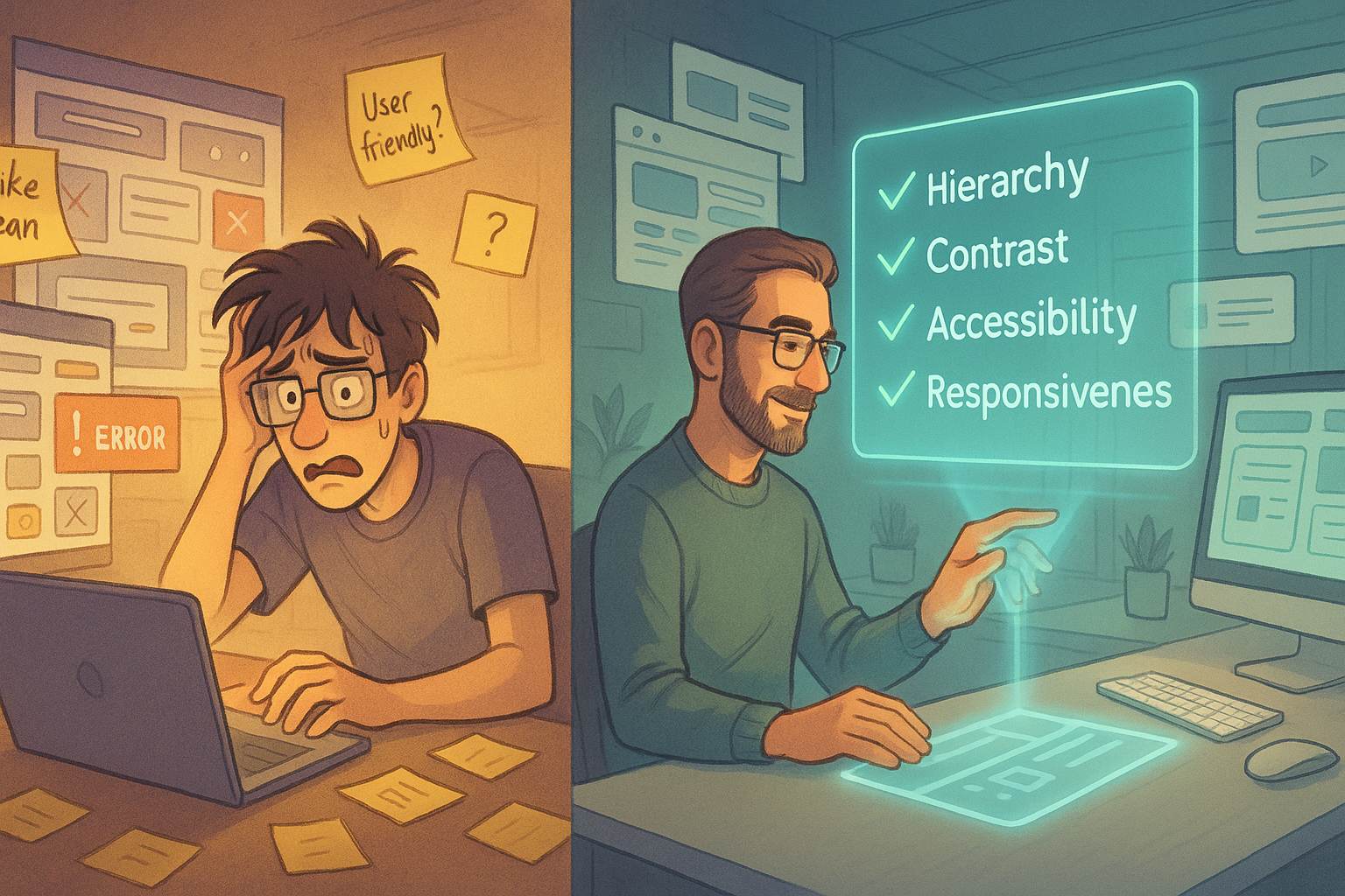
✅ Clear Hierarchy
Are the most important actions and information immediately visible? Is the screen scannable in 3-5 seconds?
✅ Consistent Spacing
Your margins and paddings should follow a rhythm. Use a scale like 4/8/16/32px.
✅ Legible Typography
Body text shouldn’t be smaller than 14px on mobile. Avoid gray-on-gray crime scenes.
✅ Mobile Responsiveness
Don’t make users pinch-zoom. Test on real devices, not just in Chrome dev tools.
✅ Contrast and Accessibility
Use tools like WebAIM to check contrast. Can a user with low vision still navigate your interface?
It’s funny how many times I learned these things the hard way. If I had the UI checklist I wish I had years ago back then, I probably wouldn’t have lost a client over unreadable form fields.
2. Forms That Don’t Suck
Forms are one of the most common and most painful UI elements for users. Let’s fix that.
✅ Label Everything
Place labels above inputs, not as placeholders. Placeholders disappear once you start typing — and that’s not helpful.
✅ Group Related Inputs
Don’t scatter related fields (like first and last name) across the screen. Group them together visually.
✅ Error States
Show clear error messages in context. “Invalid input” means nothing. “Password must be 8+ characters” is better.
✅ Success Feedback
Always show users when something worked. Use toasts, green borders, or checkmarks.
✅ Loading States
If your form does something that takes longer than half a second, you better show a spinner or at least a disabled button with “Submitting…”.
This checklist alone can turn a frustrating signup flow into something users don’t rage-quit halfway through.
3. Navigation That Doesn’t Make You Feel Lost
A user should never have to stop and think, “Where am I?” or “How do I go back?”
✅ Clear Active States
Highlight the current page or tab. Breadcrumbs can also help.
✅ Intuitive Icons
Use common iconography. Don’t reinvent the hamburger menu.
✅ Back Navigation
Always offer a clear path back. Relying solely on browser back buttons is lazy and dangerous.
✅ Avoid Deep Nesting
Try to keep navigation no more than 2 levels deep. People get lost in deep navs.
✅ Sticky Nav on Mobile
On small screens, allow persistent navigation or a floating action button for common actions.
This was a game changer for me. Early in my career, I built an admin panel so confusing that even I had to guess where I was. A proper nav checklist would’ve spared us all.
4. Microinteractions Matter More Than You Think
These are the tiny details that make a UI feel alive — or dead.
✅ Button Feedback
Click a button? It should animate, change color, or show a ripple effect.
✅ Hover and Focus States
Your buttons, links, and inputs should all visually respond to mouse hover and keyboard focus.
✅ Transitions
Use subtle transitions (200–300ms) for modals, dropdowns, and tabs. Instant changes feel jarring.
✅ Empty States
Don’t just show a blank page. Add helpful text, an icon, or a CTA (e.g., “You have no items — add your first”).
✅ Animations with Purpose
Avoid flashy animations unless they help direct attention or improve understanding.
Without these details, your UI will feel sterile and uninviting. With them, it feels polished and trustworthy — like someone actually cared.
5. Touch Targets and Thumb Zones
Designing for mobile isn’t just about responsiveness. It’s about ergonomics.
✅ Touch Targets ≥ 48x48px
Don’t make users aim like snipers.
✅ Avoid Edge Interactions
Don’t place buttons too close to screen edges where users might accidentally swipe.
✅ Place Controls Within Reach
Important buttons should be easy to tap with one thumb, especially on large phones.
✅ Tap Feedback
Every tap should feel like it did something — even if it’s just a ripple.
✅ Gestures? Teach Them.
If you’re using swipe gestures or long presses, add visual hints or onboarding.
This part of the UI checklist I wish I had years ago would’ve helped me avoid all the rage clicks and accidental exits from my early apps.
6. State Management You Can Actually See
A UI isn’t just pixels — it’s a living, breathing system with states.
✅ Loading
Show a spinner, skeleton screen, or shimmer when content is loading.
✅ Empty
Explain what the user can do when there’s no data.
✅ Error
Offer a retry button and a friendly message. Avoid cryptic codes.
✅ Success
Show a confirmation message, toast, or animation.
✅ Sync States
Show syncing, saving, or uploading indicators when data is being transmitted.
Ignoring state transitions makes your app feel buggy or broken — even when it’s working fine.
7. Accessibility Shouldn’t Be Optional
This should never be an afterthought — but sadly, for many years, it was for me.
✅ Keyboard Navigation
Can users tab through interactive elements?
✅ Screen Reader Support
Use aria-labels, roles, and semantic HTML correctly.
✅ Focus Management
When a modal opens, trap focus inside it. When it closes, return focus to the previous element.
✅ Colorblind-Friendly Palettes
Avoid relying on color alone to convey information.
✅ Descriptive Alt Text
All images that convey meaning should have meaningful alt text.
The moment I started designing with accessibility in mind, my interfaces became more usable for everyone — not just for users with disabilities.
8. Content and Messaging
You can have the best design, but if your UI text is confusing or cold, it’s all for nothing.
✅ Use Real Words
Avoid jargon and technical terms. Use the language your users speak.
✅ Write in Active Voice
“Upload failed” is clearer than “The file could not be uploaded.”
✅ Friendly Error Messages
“Oops! Something went wrong. Try again?” is better than “500: Server Error.”
✅ Inline Help
Use tooltips, hints, and microcopy to guide users without overwhelming them.
✅ Clear CTA Labels
“Start Free Trial” is better than “Submit.”
Great UI writing is invisible — it guides users gently and confidently without drawing attention to itself.
9. The UI Checklist I Wish I Had Years Ago for Developers
As a dev, here’s what you need to sanity-check before shipping your UI:
| Feature | ✅ Checked? |
|---|---|
| All buttons have loading and disabled states | |
| Inputs have labels and validations | |
| Mobile view tested on real device | |
| All links work and have proper states | |
| Keyboard navigation works on major components | |
| Accessibility audit completed (Lighthouse, etc.) | |
| Error boundaries and fallback UIs implemented | |
| UI looks good with both short and long text |
And one last tip: test with real users. Or even just a teammate who’s never seen the app. Watching someone else use your UI is the fastest way to spot flaws.
10. The Real Value of a Good UI Checklist
If you’ve made it this far, you’ve probably already realized why I keep saying “the UI checklist I wish I had years ago” — because it’s not just a list. It’s a mindset.
It’s a reminder that great UIs aren’t built from instinct alone. They’re built from intentionality. Every spacing decision, every button label, every modal transition — it all adds up to how a user feels. And if they feel confident, seen, and in control, you’ve done your job well.
So save this checklist. Print it. Add your own points to it. Because whether you’re designing a dashboard, a blog, or a mobile app — the little things add up. And they’re what separate “meh” from “wow.”
FAQs
1. How do I start using a UI checklist?
Start with your next project. Review the checklist before launch.
2. Can I share this UI checklist with my team?
Yes, absolutely. It’s meant to help everyone improve.
3. How often should I update the checklist?
Update it as you learn. Treat it like living documentation.
4. What tools help check UI quality?
Use tools like Figma’s accessibility plugins, Lighthouse, and Contrast Checker.
5. What’s the best way to learn good UI?
Watch users struggle with your app. Then fix what made them struggle.
Leave a Reply