I remember it like it was yesterday. It was a cold Tuesday morning, coffee in hand, and I had just opened my editor, ready to knock out a few features. Everything was fine until I clicked into a component from our “custom” UI library and noticed something weird. Really weird.
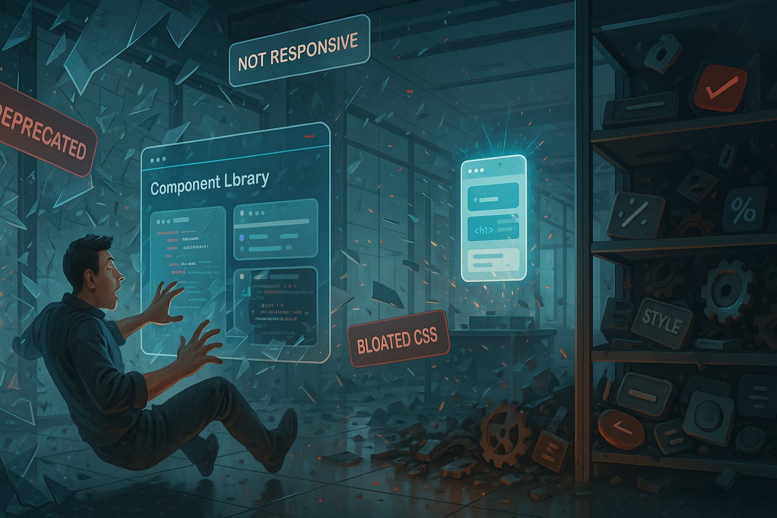
The props didn’t make sense. The logic was duplicated. The styling was inconsistent. As I pulled at the threads, I realized the horrifying truth: the day I discovered my component library was a lie. It wasn’t a unified, consistent, well-maintained system. It was a patchwork mess of half-baked components, copied from different sources, loosely tied together under a single folder.
And that’s when the real work began.
The Illusion of Control
We had always talked proudly about our “in-house component library.” It was our design system. Our shared language. The foundation of our UI. Except, it wasn’t.
At some point, we had started importing bits from Material UI, Tailwind components, Bootstrap snippets, and some entirely custom-styled monstrosities with hardcoded margins. They all lived under the /components directory, but beyond that? Chaos.
The naming conventions weren’t just inconsistent—they were misleading. PrimaryButton wasn’t used as the primary button. ModalV2 was in production, even though we said it wasn’t. Worse still, the props passed into components didn’t reflect their intended behavior. Half the components had boolean flags like isFancy or noShadow—the kind of stuff that made no sense six months after they were written.
The day I discovered my component library was a lie, I realized that every assumption I had made about “reusability” and “modularity” was resting on sand.
Why Teams Lie to Themselves About Component Libraries
Let’s be honest: we all want a beautiful, centralized component library that just works. But what usually happens is something like this:
- One developer builds a
Cardcomponent for a dashboard. - Another builds a
Cardcomponent for the checkout page. - A third developer copies both, tweaks some padding, and ships their own version.
- All three end up in the codebase, and nobody knows which one to use.
Multiply that by forms, modals, dropdowns, inputs, buttons, tooltips, and loaders, and you’re in UI hell.
Teams lie to themselves. They say, “We have a shared library.” But really, they just have a shared folder with the same name on the import path.
The Real Cost of a Fake Library
When I first joined the project, I thought I was saving time by using pre-built components. I was wrong.
Here’s what that fake component library cost us:
- Developer time wasted trying to figure out which variant to use.
- Bug fixes that were duplicated across different components doing the same thing.
- UI inconsistencies because padding, colors, and animations weren’t unified.
- Delayed releases due to rework and QA confusion.
- Onboarding pain for new devs trying to understand the logic.
We had fooled ourselves into thinking we were working smart. But we were building tech debt disguised as convenience.
That Moment of Clarity
The turning point came when we tried to implement dark mode.
Sounds easy, right? Toggle a class or use a theme context. But no—the components had hardcoded colors. Inline styles. Random !important rules. Some used CSS Modules. Others had styled-components. A few had raw className strings written directly into JSX.
We couldn’t update the theme in one place. We had to go component by component, hunting for colors, replacing them, and hoping we didn’t break anything else.
That’s when I said out loud, “The day I discovered my component library was a lie might also be the day I fix this mess.”
H2: The Day I Discovered My Component Library Was a Lie: Root Causes
So why does this happen?
1. No Gatekeeping
Anyone could add a new component. No one reviewed them for reuse. There were no standards, no checklist. That meant every dev was reinventing the wheel, over and over again.
2. Lack of Ownership
Who owned the component library? No one. That’s who. Which meant no one maintained it, no one documented it, and no one updated it when the design team made changes.
3. Inconsistent Design Collaboration
Designs were handed over as static Figma files, and the devs interpreted them however they saw fit. No design tokens. No color system. Just vibes.
4. Tech Stack Drift
We started with one styling solution, switched halfway through the project, then added Tailwind “for quick fixes.” This led to three co-existing, conflicting methods of styling.
5. Speed Over Standards
Deadlines. Always deadlines. “Just copy that button from the dashboard.” “We’ll clean it up later.” Except later never came.
H2: Rebuilding From the Rubble of the Day I Discovered My Component Library Was a Lie
So what do you do after such a discovery?
You start fresh—but smarter.
Step 1: Audit Everything
We wrote a script to scan the entire codebase for components, their usage, and styling patterns. We documented what was used most and what could be deprecated.
Step 2: Define Rules
We established component naming conventions, prop naming guidelines, and required documentation for every shared component. Lint rules enforced these standards.
Step 3: Pick a Stack—and Stick to It
We chose Tailwind + Headless UI + custom wrapper components using a centralized theme config. No more mixing and matching styling paradigms.
Step 4: Design Tokens and Theming
We worked with design to define color variables, spacing units, border radii, and font sizes—all as tokens. Every component used those tokens. Now, when we want to change spacing globally, it’s just a config change.
Step 5: Ownership Rotation
One dev from each squad is rotated every sprint to do a review and cleanup of shared components. This made the component library a living thing, not a graveyard.
What I Learned (The Hard Way)
- If a component is copied more than once, it belongs in the shared library.
- If a prop needs an explanation longer than its name, the component is too complex.
- If theming isn’t baked in from the start, it’ll never be easy to add later.
- If no one owns the library, then everyone will ignore it.
I learned to respect component design the same way I respect API design. Because your UI is an interface too—between you and your users.
When Is It Too Late to Fix a Component Library?
Honestly? Never.
Even if you have 200 components, it’s still worth investing the time to fix things. We started small. One button, one card, one input. Then we slowly replaced the rest, sprint by sprint.
Now, every new page we build takes less time. Fewer bugs. More consistency. And it’s easier to onboard new developers because the system actually makes sense.
The Lasting Impact
Rebuilding our component library wasn’t just a technical fix—it was a cultural shift. It forced better communication between devs and designers. It introduced structure into our workflows. It gave us back confidence in our own code.
Now, when someone asks, “Do we have a component for that?” the answer is “Yes,” and it works.
And every time I look back, I remember the day I discovered my component library was a lie—and I’m thankful it happened.
Because it forced us to build something real.
FAQs
1. How can I tell if my component library is actually a mess?
Look for duplicate components, inconsistent styles, and unclear prop usage.
2. What should be in a good component library?
Reusable UI elements with consistent styling, proper documentation, and clear ownership.
3. Can I use Tailwind and still have a clean component library?
Absolutely. Tailwind works well if paired with a clear design system and conventions.
4. What if my team doesn’t agree on standards?
Start small, document why the standards matter, and iterate with buy-in from stakeholders.
5. How long does it take to rebuild a broken component library?
It depends on the size of your codebase, but small improvements can start paying off immediately.
Leave a Reply