If you’ve ever found yourself knee-deep in a sprawling design system, tweaking a single button only to realize that half the app now looks broken — congratulations, you’ve probably tangled with design tokens. I have. More times than I care to admit. And that’s what brings me to this brutally honest confession of my ongoing love-hate relationship with design tokens.
Let me be clear: I believe in the power of design tokens. In fact, I want to love them. I’ve seen the slick conference talks, read the case studies, even helped build a system or two where tokens were at the heart of everything. But the emotional rollercoaster they’ve put me through? That’s another story.
When Design Tokens Felt Like Magic
There’s this initial honeymoon phase with design tokens. You define a color once — say primary-color: #0057FF — and suddenly it’s available everywhere. Button? Got it. Navbar? Styled. Hover state? Boom. All centralized. All beautiful.
The first time I built a theme switcher with just a few changes in the token JSON file, I felt invincible. It was like I’d discovered UI sorcery. The tokens mapped neatly to SCSS variables, then to CSS custom properties. The app obeyed. Designers smiled. Developers high-fived. This was the dream, right?
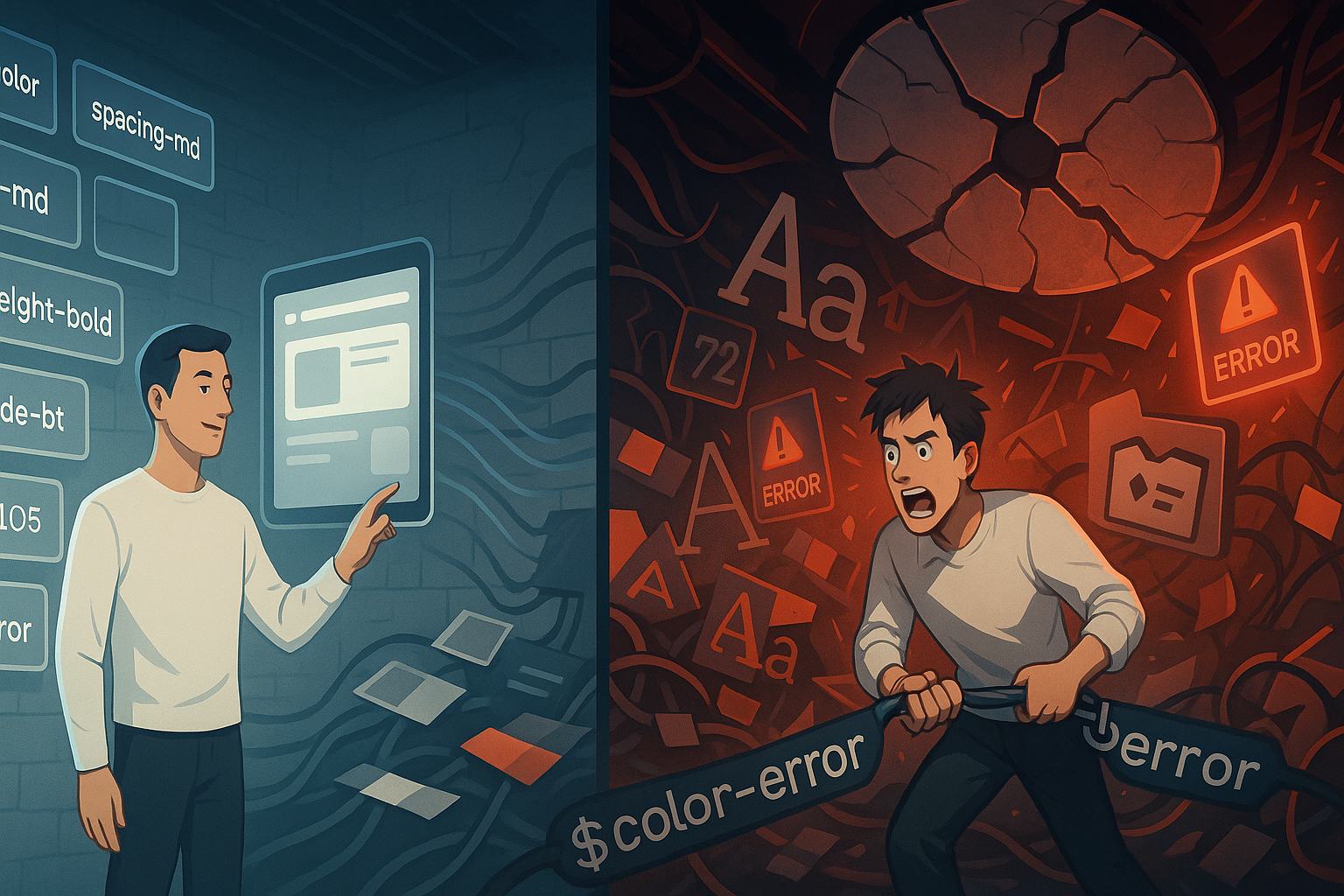
…And Then Everything Started Breaking
Fast-forward a few weeks. The product team needed a “special” version of the header for a partner portal. “Just tweak the colors,” they said. Easy, I thought. Until I realized that the changes weren’t tokenized — or worse, they clashed with existing tokens. So I did what many of us do: I added a new token.
Then another.
Then three more for that one little corner case.
By the time I looked up, I had primary-color, primary-color-alt, primary-color-alt2, and the infamous primary-color-partner-special-v3. It was no longer clean or elegant. It was a house of cards.
How Design Tokens Turn Into Design Debt
If you’ve ever thought that design tokens are supposed to prevent design debt, well, I did too. But it turns out they can create their own breed of technical debt — especially when used inconsistently across teams or projects.
Here’s how the pattern goes:
- You start with a clear set of tokens.
- New stakeholders or projects come in.
- Design requirements shift.
- Instead of refactoring tokens, you add more.
- Pretty soon, no one knows which tokens to use — or worse, which ones are safe to delete.
This is where my ongoing love-hate relationship with design tokens really flared up. I loved what they promised, but hated what they became when scaled without discipline.
The Token Naming Apocalypse
Naming tokens is the modern-day equivalent of naming your kids. You want something descriptive, scalable, future-proof — but not too long. Do you go for color-primary or color-primary-base? What if it’s used only on buttons? Then maybe color-button-primary-bg?
It only gets worse with typography. I once inherited a system with tokens like font-size-h1, font-size-heading-xl, and typography-huge. All of them meant the same thing. The team had gone through three rebrands, and the tokens were a graveyard of decisions that no one wanted to touch.
This isn’t a token problem. It’s a people problem. But that’s the thing — design tokens are people problems wrapped in technical wrappers.
When Tools Make Things Worse (and Better)
Design token tools can be both saviors and saboteurs. Style Dictionary? Lifesaver. Tokens Studio for Figma? Absolute gem — until someone syncs 400 tokens without reviewing them, and your Git diffs look like a hurricane hit your theme files.
We tried automating token generation from Figma. It worked. Then the design team introduced new spacing tokens that clashed with our legacy ones. What followed was a Slack thread 87 messages long, ending with “let’s just hardcode it for now.”
Automation without governance is a grenade with a ribbon on it.
Why I Still Love Design Tokens Anyway
Despite all this, I still come back. Like a stubborn romantic clinging to the potential of a toxic relationship, I hold onto hope. Because when design tokens do work, they’re brilliant.
- You change one value, and 200 components update.
- You build a dark theme in an afternoon.
- You empower non-developers to tweak UI variables without breaking stuff.
Design tokens are the language between design and development. They make scalability possible. They make consistency achievable — if not always guaranteed.
And that’s why this is a love-hate relationship, not a breakup.
How I Survived Token Overload (Sort of)
Here are some hard-won lessons I’ve picked up after several token-bloated projects:
1. Start small, grow with intent.
Don’t tokenize everything on day one. Start with core essentials — color, typography, spacing. Expand only when patterns emerge.
2. Create a naming convention — and enforce it.
Whether it’s color-surface-bg-primary or font-heading-l, stick to a logic. Document it. Fight for it.
3. Clean house regularly.
Set aside time to audit tokens. If no component uses it, it’s a zombie. Delete it or archive it.
4. Educate everyone.
Tokens aren’t just for developers. Designers, QA, even content writers should understand their purpose and limitations.
5. Don’t be afraid to refactor.
Yes, refactoring tokens hurts. But leaving them untouched is worse.
My Ongoing Love-Hate Relationship With Design Tokens in Enterprise Settings
Things get especially complicated when you’re dealing with enterprise-grade design systems. Multiple brands. White-labeled apps. Internationalization. Suddenly, a simple color token has to support RTL, accessibility contrast ratios, and internal design legacy.
In these cases, your design token setup becomes a design system in its own right — one that demands just as much testing, governance, and oversight as the components themselves.
If you’re not careful, you end up with the illusion of a scalable system, when in fact you’re just managing a glorified global stylesheet with extra steps.
Why We Keep Coming Back
At the end of the day, we keep using design tokens not because they’re easy, but because they’re the least bad option. CSS variables alone don’t scale well. Hardcoded values are a disaster. Inline styles are chaos. Tokens? Tokens offer structure.
So, despite the headaches, I’m still here — tweaking tokens, auditing names, creating Figma libraries, and hoping that this time we get it right.
Because maybe the next design system will be the one where the love finally outweighs the hate.
FAQs About Design Tokens
1. What are design tokens?
Design tokens are named variables that store design decisions like colors, spacing, typography, and more — used to ensure consistency across design and code.
2. Are design tokens only for developers?
No. Designers, especially those using tools like Figma with token plugins, can also use and manage them.
3. How do you organize design tokens?
Group them by category (color, typography, spacing), use namespaces, and follow a strict naming convention to avoid chaos.
4. Should I use design tokens in small projects?
Not always. For tiny apps, they may add unnecessary complexity. But for anything scalable or team-based, they’re a solid investment.
5. Can design tokens support multiple themes (e.g., dark mode)?
Absolutely. That’s one of their best use cases — defining multiple sets of values under the same token keys.
Leave a Reply