You know that moment when you finally step back from your work and everything suddenly clicks? Yeah, I had one of those moments not too long ago—and it was equal parts embarrassing and enlightening. The title of this article, That Time I Realized My Color Palette Looked Like a Hospital Ward, is not just clickbait. It actually happened. And it changed the way I approach color theory, branding, and user psychology in web design forever.
It all started with a portfolio review.
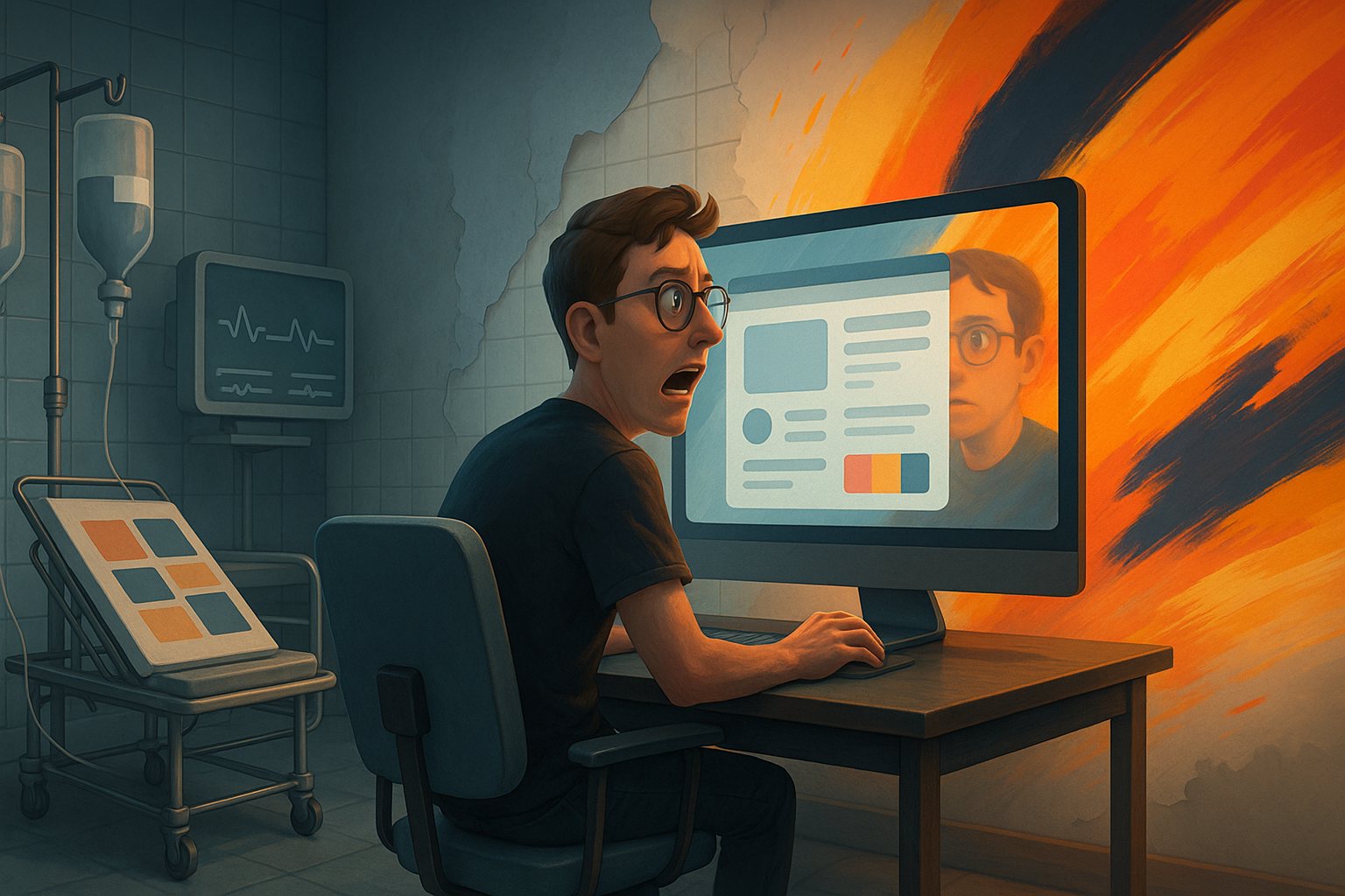
I was working on a web app design for a health startup. Naturally, I gravitated toward cool tones—white backgrounds, light grays, pale blues. I thought I was being clean and minimal. But when I presented the screens to a designer friend over coffee, she winced.
“It looks like a hospital ward.”
I laughed at first, but she wasn’t joking.
She elaborated: “Sterile. Lifeless. Kinda… cold. Is that what you’re going for?”
And just like that, a wave of realization crashed over me. She was right. I had unknowingly designed an entire user interface that evoked the exact kind of clinical anxiety I personally feel when walking into a medical center. I didn’t build something minimal. I built something emotionally disconnected. That was that time I realized my color palette looked like a hospital ward.
When Clean Becomes Cold
The rise of minimalism in web and product design pushed a lot of us to associate white space and subtlety with elegance. But the truth is, minimal doesn’t mean void of feeling. Colors have weight. They carry cultural and emotional significance.
I had fallen into a trap of overusing pale tones. My buttons were soft gray, my headers a weak navy, and my cards had zero visual warmth. It felt sleek in theory, but in practice, it was freezing. And not in a cool Scandinavian way. In a “blood pressure monitor is beeping” way.
Why Designers Default to Pale Blues and Grays
There’s a psychological safety in sticking to blue and gray palettes. They’re hard to mess up, and most people perceive them as professional. Blue especially is seen as trustworthy, calm, and secure. But when that’s all you use—without any accents, contrast, or warmth—you risk pushing people away rather than inviting them in.
In hindsight, I think I was designing for my own comfort, not the user’s emotional journey. I wanted to keep it “safe,” but safe turned into forgettable.
That Time I Realized My Color Palette Looked Like a Hospital Ward (Again)
A few weeks later, I stumbled on an older project in my Dribbble archive. And guess what? Same problem. Same cold palette. It dawned on me that this wasn’t just a one-off issue—it was a pattern.
I realized I had learned about color theory in a vacuum. I understood hue, saturation, and contrast—but not how to translate those into emotional tone. I wasn’t just missing warmer colors. I was missing intentionality.
From Sterile to Sensory: The Palette Rebuild
The very next day, I did a full teardown of my own color system.
I asked myself some brutally honest questions:
- What emotions am I actually trying to evoke?
- Do these colors match the brand’s personality?
- Would I want to use this product every day?
And then I gave myself permission to get messy. I brought in corals. I experimented with ochres, rust, olive, navy—not just sky blue. I stopped thinking in terms of “light mode” and “dark mode” and started thinking in mood. I wanted screens that felt alive.
Suddenly, everything felt more human. The buttons popped. The cards invited clicks. The headers spoke. The app didn’t just look better—it felt better.
Relearning Color Through Emotion
After that little wake-up call, I started studying how great designers use color. Not just to please the eye, but to build emotional resonance.
Brands like Duolingo, Headspace, and Notion all taught me something different:
- Duolingo: Playful saturation. Even functional UI has character.
- Headspace: Warm pastels, evoking calm and optimism.
- Notion: Muted tones with minimal contrast, but balanced with micro-interactions and typography.
These weren’t color palettes made in isolation—they were part of a story. And that story was deeply aligned with the product’s tone, mission, and user behavior.
The Psychology of Color Isn’t Just Theory
What I discovered during this whole journey was that the psychology of color isn’t some artsy fluff. It has real implications. For instance:
- Blue can be calming—but it can also feel sterile.
- Red attracts attention—but too much induces anxiety.
- Yellow feels optimistic—but in excess, it can be exhausting.
- Gray is modern—but without contrast, it becomes bland.
When used with purpose, these traits can be superpowers. But when used without thinking, they become liabilities.
Tips I Wish I Knew Before Falling Into the Hospital Ward Trap
- Audit in grayscale first—but finalize in color: Check contrast early, but don’t stop there.
- Set emotion-based goals: Ask what users should feel at each step.
- Use warm and cool tones strategically: Warmth draws in, coolness organizes.
- Always test with real content: Lorem ipsum is a liar.
- Don’t fear bold accents: You’re not being loud; you’re being intentional.
Now I Ask This One Question
Before I lock in a color system for any client project now, I ask: Would I want to live in this UI?
It’s a strange question—but surprisingly effective.
Would I enjoy spending time here? Would it energize me? Calm me? Irritate me? Bore me?
If it feels like walking into a DMV or a dental clinic, I scrap it and start again.
Real-World Project Before and After
Let me show you what this looks like in practice. I recently redesigned a finance dashboard. The original design leaned heavily on blue-gray: muted, cold, corporate. Predictable.
In the revised version, I added navy as the anchor, but softened the charts with warm ochres and added salmon accent states for interactive elements. The result? A dashboard that still felt professional—but with just enough warmth to feel welcoming.
User feedback said it all: “It feels less like I’m doing taxes, and more like I’m planning something meaningful.”
That Time I Realized My Color Palette Looked Like a Hospital Ward Was a Gift
I didn’t just change my color strategy. I changed the way I think about UX in general.
Design isn’t just about making things look good. It’s about making people feel something—reassured, motivated, safe, excited.
So now when I open Figma, I don’t just see swatches and hex codes. I see a palette of emotional levers.
And I’ll never go back to the sterile ward again.
FAQs
1. How do I know if my color palette feels too cold or sterile?
If your UI lacks visual warmth and emotional tone, users might describe it as dull or clinical. Seek feedback or test reactions.
2. What are good alternatives to pale blues and grays?
Try warmer tones like terracotta, olive, coral, or rich navy for depth and emotion.
3. Can minimal design still feel warm and human?
Absolutely. It’s about the tone of the palette, not just the number of colors used.
4. Is it okay to use bold colors in serious industries like finance or healthcare?
Yes, when used with intention and balance. Even a hint of warmth can improve UX.
5. What tools help with building better color palettes?
Coolors, Adobe Color, and Figma plugins like Contrast or Happy Hues are great starting points.
Leave a Reply