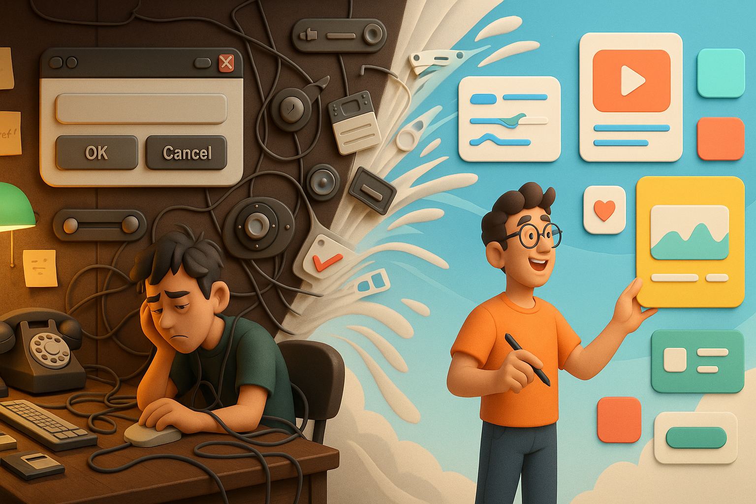
Let me take you back to a time when every digital button looked like a real-world object. You’d tap on a notepad app and see a yellow lined page, complete with a faux-leather header. Your calendar icon had shadows so deep you could fall into them. Back then, I was obsessed with making interfaces feel “real.” Skeuomorphism was my design religion. But eventually, something snapped. I got tired. Tired of drop shadows. Tired of bevels. Tired of pretending pixels were leather. So, I gave up skeuomorphism and found joy in flat design.
And let me tell you — it was liberating.
The Rise and Fall of Skeuomorphism
Skeuomorphism is basically a fancy term for “making digital things look like their real-world counterparts.” It’s like drawing a floppy disk icon for a save button or using faux wood for a bookshelf app. When the iPhone launched, skeuomorphic design made sense. People were new to touchscreens. Interfaces that mimicked real-life objects gave users a sense of familiarity and comfort.
Designers like me went wild with it. I remember spending hours perfecting leather grain textures, adjusting gradient overlays, and adding reflections to icons. It was a craft, almost an art form. Every element had a shadow, a gloss, or a stitch. And it felt cool — for a while.
But then the novelty wore off. My interfaces began to feel bloated. They were pretty, sure, but they weren’t necessarily functional. Buttons were unclear. Layouts became too busy. Users started asking, “What does this do?” That’s when I knew: my obsession with realism was getting in the way of usability.
When Flat Design Walked In
The shift wasn’t sudden, but when it came, it was bold. I remember seeing Microsoft’s Metro UI and later Google’s Material Design. But it was Apple’s jump with iOS 7 that shook the world. Suddenly, gradients disappeared. Skeuomorphism was gone. Everything became flatter, simpler, cleaner.
At first, I resisted. I thought, “Flat design is boring. It’s lazy.” But curiosity got the better of me. I started experimenting — removing shadows, stripping textures, simplifying icons. To my surprise, I didn’t hate it. In fact, I loved how my UIs started to breathe. The content stood out more. The navigation became clearer. Design felt purposeful again.
That’s when I realized: I gave up skeuomorphism and found joy in flat design.
Why Flat Design Felt So Good
You’d think giving up all those rich textures and realistic elements would make design dull. But it did the opposite. Flat design gave me more freedom.
Here’s what changed for me:
- Speed: I could build mockups faster. No more fussing over textures and bevels.
- Clarity: UI elements became instantly recognizable. No ambiguity.
- Focus: Instead of spending hours on visual gimmicks, I focused on layout, typography, and user flow.
- Scalability: Flat assets were easier to adapt across screen sizes and resolutions.
More importantly, users responded positively. My clients said things like, “It just feels clean,” or “I finally know where to click.” That’s when I knew I was onto something.
Flat Design Doesn’t Mean Boring
One misconception I had (and many designers still have) is that flat design equals uninspired design. That couldn’t be further from the truth. Flat design still gives you room to play — with color, space, typography, iconography, and motion.
Take buttons, for example. In skeuomorphic design, they’d look like actual 3D objects. In flat design, it’s just a colored rectangle. But with the right hover effects, transitions, and microinteractions, that rectangle feels just as delightful — if not more so.
Typography plays a massive role too. With fewer distractions, type takes center stage. I started experimenting with big, bold fonts. Subtle weight shifts. Creative alignments. Suddenly, flat design wasn’t minimal — it was expressive.
Learning to Let Go of Visual Crutches
Skeuomorphism gave me a sense of safety. It was like holding onto a rope in a dark room. But the truth was, I was using it as a crutch. I was overcompensating with visuals instead of solving design problems.
Flat design forced me to answer tough questions:
- Do users understand what this icon does?
- Can they navigate without a big shiny arrow?
- Is the interface guiding them naturally?
This was design in its purest form — not decorating, but communicating.
And it felt like growing up.
Challenges I Faced During the Switch
It wasn’t all smooth sailing. The transition came with challenges:
- Clients who loved gloss: Some didn’t want to let go of their shiny, shadow-heavy dashboards. I had to educate them, sometimes by building two mockups side-by-side.
- Finding hierarchy without depth: Without drop shadows or textures, how do you make things feel clickable? I leaned on contrast, spacing, and color.
- Avoiding the “too flat” trap: Early flat designs often felt too sterile. No visual rhythm. I had to learn how to balance simplicity with warmth — sometimes with soft shadows, sometimes with animations.
Still, every challenge pushed me to grow. And slowly, flat design became my new default.
Joy in Simplicity
There’s something poetic about clean interfaces. When you strip everything down, what’s left has to work. Flat design made me a better communicator — not just visually, but conceptually.
When I say I gave up skeuomorphism and found joy in flat design, I’m really saying I found purpose. I found clarity. I found a new kind of creativity — one that’s rooted in function, not just decoration.
Flat Doesn’t Mean Lifeless: Add Microinteractions
Once I embraced flat design, I found ways to bring life back into the interface — not through shadows or leather, but through motion. A button could pulse gently when hovered. A menu could glide in from the side. A card could bounce slightly when dragged.
These microinteractions replaced old visual tricks. They felt modern, intentional, and even fun. They gave users feedback in subtle, delightful ways. It wasn’t about showing off — it was about helping people feel in control.
Colors and Contrast: My New Best Friends
In the skeuomorphic world, color often took a back seat to texture. But in flat design, color and contrast are everything. You don’t have leather or gradients to create depth — you have to think in layers of color.
I started exploring bold combinations — coral and navy, mint and charcoal, soft pastels paired with dark text. Accessibility became a bigger focus, too. I used tools to check contrast ratios, and I learned how to communicate hierarchy using brightness and tone alone.
Funny how color went from decoration to communication.
Typography: The Quiet Hero of Flat Design
One of the best things about flat design? It made me respect typography. In skeuomorphism, fonts were often overpowered by shiny buttons and textures. But in a flat world, typography is the hero.
I began experimenting with hierarchy using font weight and spacing. I learned the value of consistent type scales. Headlines started carrying emotion. Paragraphs became easier to read. And best of all, users noticed. They’d say things like, “This app just feels easier,” and I knew the typography was working.
Accessibility: The Unsung Benefit
Here’s something people don’t talk about enough: flat design, when done right, is way more accessible. No unnecessary shadows that confuse users. No ultra-detailed icons that look like something else at small sizes.
Flat interfaces tend to be higher contrast, more legible, and more adaptable. They’re easier to support with screen readers. They’re simpler to animate. They load faster. Honestly, it’s a win for everyone.
And if we’re being real, making your product easier for all people to use should never be an afterthought.
Design Trends Come and Go — But Simplicity Stays
I’m not here to bash skeuomorphism forever. Design is cyclical. Who knows — in a few years, we might see hyper-realistic UIs again (Apple’s new Vision Pro already hints at some 3D realism). But what flat design taught me is timeless.
Keep it simple. Design with purpose. Let the content shine. Trust your users.
Even now, as trends shift toward neumorphism or glassmorphism, I still hold on to the core lessons I learned when I gave up skeuomorphism and found joy in flat design.
Final Thoughts: Finding Balance
If there’s one thing I want designers to take away from my experience, it’s this — don’t get stuck in visual habits. Don’t worship a style. Worship clarity. Worship usability. Flat design might not have shiny buttons or stitched leather, but it makes space for what really matters: the user.
And that’s where real joy lives.
Frequently Asked Questions
1. What is skeuomorphism in design?
Skeuomorphism is a style where digital elements imitate real-world objects to feel familiar.
2. Why did flat design replace skeuomorphism?
Flat design offers simplicity, speed, and better usability, especially for modern interfaces.
3. Is flat design better than skeuomorphism?
It depends on context, but flat design is more flexible, responsive, and accessible today.
4. How do you make flat design engaging?
Through typography, color, spacing, and microinteractions — not textures or shadows.
5. Will skeuomorphism ever come back?
Possibly. Design trends evolve, and we might see modern versions like neumorphism rise.
Leave a Reply