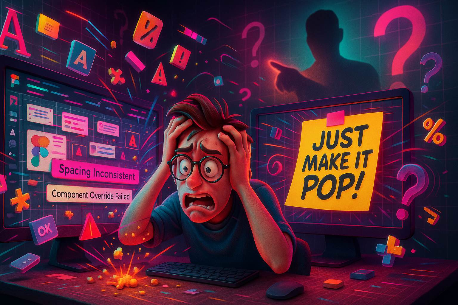
If you’ve been in design long enough, you’ve probably heard the phrase that makes every designer’s eye twitch just a little: “Just make it pop.” It often shows up at the end of a long email chain, slapped onto a Figma file filled with weeks of careful alignment, color calibration, and hierarchy decisions. And suddenly, you’re hit with that one vague, panic-inducing piece of feedback that completely derails your workflow.
This is what I like to call pixel-perfect anxiety — the pressure to make every single detail flawless, often amplified when a client expects you to “add magic” without giving any tangible direction. In this article, we’re going to unpack why this phrase causes so much tension, how to deal with it like a pro, and how to keep your creativity intact even when you’re asked to “just make it pop” for the fifth time in one project.
What Does “Just Make It Pop” Even Mean?
Let’s be honest — we all know it doesn’t really mean anything. Or rather, it means something different to every single client.
Some want brighter colors. Others mean more animations. Sometimes it’s about contrast. Sometimes it’s about layout. Sometimes it’s… well, they don’t even know. It’s a filler phrase. A placeholder for, “This doesn’t feel exciting and I don’t know how to articulate why.”
The result? You’re left guessing, trying to mind-read your way into a solution that may or may not align with their hidden expectations.
So what do you do?
The Source of Pixel-Perfect Anxiety
Designers live in a world of precision. We spend hours kerning letters, aligning margins, tweaking shadows so they feel just right. So when a vague comment like “just make it pop” appears, it clashes with the whole pixel-perfect mindset we’ve trained ourselves to follow.
That clash — the one between structure and ambiguity — is what triggers pixel-perfect anxiety.
It’s not just about one request. It’s the fear that:
- You’ll make changes the client still won’t like.
- You’re chasing a moving target.
- The effort you put into making everything perfect will be lost in the noise.
Pixel-Perfect Anxiety: When Clients Say ‘Just Make It Pop’ (Part 1)
Let’s walk through a very real scenario.
You’ve delivered a polished home page design. Clean typography, consistent spacing, balanced color palette. You even double-checked it across devices. The client replies, “Looks good. Can you just make it pop a bit more?”
Your heart sinks. What do they mean? What exactly doesn’t pop? The CTA button? The hero section? The entire layout?
This is the beginning of the design spiral: your polished, careful design work is now subject to nebulous whims. This is where anxiety grows — when the foundation of good UX and visual hierarchy is threatened by vague aesthetic demands.
What Clients Might Actually Mean by “Make It Pop”
Let’s break down this mystery phrase into some of its possible meanings:
- Increase contrast — maybe they feel the visuals are too soft or subtle.
- Add color — often interpreted as needing more saturation or vibrance.
- Use animation or movement — some clients want microinteractions or hover effects.
- Highlight a specific element — usually the CTA or a product image.
- Make it more modern or trendy — this could mean anything from gradients to neumorphism.
Understanding the intended emotion behind the phrase can help clarify things. Are they excited? Are they underwhelmed? Ask more questions, like:
- “Is there a specific area that feels flat to you?”
- “Would you like more color or more interaction?”
- “Can you show me a website you think has the kind of ‘pop’ you want?”
How to Respond Without Losing Your Mind
Step one is don’t take it personally.
Feedback like this isn’t an attack on your skills, even if it feels like it. In many cases, it’s just bad communication. Clients aren’t always equipped to describe design elements — that’s why they hired you.
Here’s a healthier way to deal with it:
- Translate the feedback into actionable possibilities.
- Ask questions to clarify what they mean.
- Present multiple versions showing different degrees of “pop.”
- Educate as you go — explain what changes you made and why they matter.
This keeps you in control while guiding the client toward a clearer visual language.
When Pixel-Perfection Becomes a Trap
Here’s the hard truth: perfectionism is not scalable. That obsession with getting every single pixel perfect can hold you back, especially when paired with vague feedback.
Sometimes we focus so much on getting it “just right” that we:
- Miss deadlines.
- Burn out.
- Over-deliver unnecessarily.
- Micromanage details that nobody even notices.
The real win isn’t in achieving flawlessness — it’s in delivering great work that solves a problem and meets business goals.
Pixel-perfect anxiety thrives when designers lose sight of that bigger picture.
Pixel-Perfect Anxiety: When Clients Say ‘Just Make It Pop’ (Part 2)
The second time you hear the phrase during a project, it stings more. You’ve already tried a few enhancements — a bolder headline, a gradient background, maybe a hover animation on the CTA — but you’re still getting that same line.
It starts to feel like you’re just throwing glitter at the screen and hoping something sticks.
The anxiety isn’t just about this one project anymore. It builds up:
- You second-guess your decisions.
- You start designing for approval rather than results.
- You lose confidence in your creative instincts.
That’s why it’s important to create boundaries in your workflow. Boundaries around revision limits, around scope, and around how design feedback is gathered and processed.
The Role of Visual Hierarchy and Intentional Design
If your designs are solid in terms of hierarchy, balance, and usability, don’t abandon them just to chase vague energy.
Instead, try teaching your clients the why behind your design choices:
- “This headline is in black because it maximizes legibility.”
- “This button stands out because it uses the brand’s accent color.”
- “We kept whitespace here to draw attention to the hero message.”
Sometimes, walking them through your thought process is all it takes to turn a “make it pop” into a “this is perfect.”
A Toolbelt for the ‘Pop’ Moments
Here are a few techniques you can use when a client asks for more visual excitement — without going off the rails:
- Subtle gradients to add depth
- Contrast boosts (especially background vs text)
- Microinteractions on hover or click
- Drop shadows (use sparingly)
- Typography emphasis (bold, italic, color contrast)
- Animation or parallax effects (only where it adds value)
- Imagery upgrades (better quality, lifestyle-based)
The trick is to apply these like seasoning — just enough to enhance the dish, not overpower it.
Rewriting the Feedback Loop
You can reduce pixel-perfect anxiety by changing how feedback is collected:
- Use checklists — ask clients to comment on specific areas: layout, colors, imagery, etc.
- Provide design systems or component libraries to minimize wild suggestions.
- Use Loom or video walkthroughs to guide clients through design rationale.
- Set a feedback deadline so it doesn’t drag on endlessly.
A clear system helps both you and the client speak the same language — one built around goals, not just feelings.
When You Should Push Back (And When You Shouldn’t)
There’s a balance to be found between educating the client and serving them. Not every battle needs to be fought. But when vague feedback starts to compromise the usability or brand integrity of the design, speak up.
Use statements like:
- “We can make it more vibrant, but too much color might reduce readability.”
- “If we add movement here, we’ll need to optimize for accessibility.”
- “Overemphasis on visuals might distract from the call to action.”
It’s not about saying no — it’s about giving context so that “yes” actually makes sense.
The Hidden Gift in Every “Just Make It Pop”
While frustrating, vague feedback can also be a creative opportunity.
Sometimes, “just make it pop” leads you to try something bold — a bigger headline, a splash of color, a layout tweak — and that push does improve the design. It takes you out of your safe zone. And if you stay grounded in design fundamentals, that little nudge can lead to surprising breakthroughs.
Not every vague request is an enemy. It might just be an unintentional creative prompt.
Final Thoughts
Pixel-perfect anxiety is real. It’s that gut-twisting reaction when your structured world of design is invaded by the chaos of unclear expectations. But it doesn’t have to paralyze you.
The next time you hear “just make it pop,” take a breath. Decode the message. Lean into communication. Use your design knowledge to guide the project back to clarity.
And remember — your job isn’t to impress with pixels. It’s to express solutions that work.
FAQs
1. What is pixel-perfect anxiety in design?
It’s the stress designers feel when small visual details are over-scrutinized, especially with vague feedback like “just make it pop.”
2. How should I respond to “make it pop”?
Ask clarifying questions, offer examples, and translate their feedback into actionable suggestions.
3. Why do clients use vague phrases like this?
Often, clients lack the vocabulary to describe what they’re feeling or want. It’s more about emotion than specifics.
4. Should I follow every design suggestion from a client?
Not necessarily. Your role is to guide the client with your expertise and explain the reasoning behind your design decisions.
5. How can I prevent revision overload and anxiety?
Set clear revision limits, use structured feedback forms, and educate clients throughout the process.
Leave a Reply