Introduction
Ever felt like your design system has become a wild jungle, where components sprout inconsistently and guidelines get trampled? You’re not alone. Many teams start with the best intentions, only to see their UI library morph into a confusing mess. That’s where design system governance comes in—a structured approach to keep everything tidy, on-brand, and easy to maintain. In this article, we’ll dive deep into Design System Governance: Keeping Your UI Library Clean and Consistent, unpacking principles, workflows, tools, and tips so your library stays in tip-top shape.
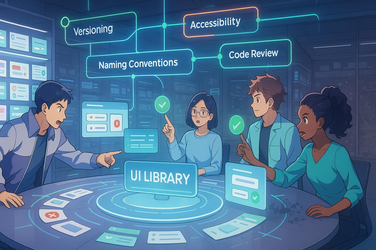
What Is Design System Governance?
At its core, design system governance is the process and set of policies that ensure a UI library remains coherent, up-to-date, and usable for everyone—from designers to developers. Think of it as the “rules of the road” for your design assets, dictating who can add or modify components, how changes get reviewed, and which tools keep everything in sync.
Without governance, you risk:
- Duplicate components with slight variations
- Outdated styles lingering in code
- Confusion about where to find the “source of truth”
- Frustration among team members navigating the chaos
Governance isn’t about stifling creativity; it’s about channeling it in a way that preserves consistency and accelerates development.
Why Governance Matters for Your Team
You might be thinking, “Do we really need another layer of process?” The short answer is yes—especially as your product grows. Here’s why:
- Scalability: When new designers or engineers join, they need a clear way to contribute without reinventing the wheel.
- Quality Control: Review workflows catch inconsistencies early, preventing those “uh-oh” moments down the line.
- Brand Integrity: A governed system ensures your brand’s look and feel stays intact across all touchpoints.
- Efficiency: Less time spent debating color codes or padding values means more time shipping features.
Governance transforms your design system from a side project into a strategic asset.
Core Principles of Design System Governance
Before setting up processes, align on a few guiding principles:
- Clarity: Policies should be easy to understand. Nobody wants to wade through a 50-page manual.
- Transparency: Everyone can see what’s coming, what’s approved, and why decisions were made.
- Collaboration: Involve cross-functional teams—designers, developers, product managers—in governance discussions.
- Flexibility: Your governance model should adapt as your team and product evolve.
- Accountability: Assign clear roles so review requests don’t get lost in limbo.
## Design System Governance Framework
A robust governance framework typically includes:
- Governance Board or Committee
- Representatives from design, engineering, and product.
- Meets regularly to review proposed changes and set priorities.
- Contribution Workflow
- A clear process for proposing new components or updates (e.g., via pull requests or design tool libraries).
- Templates for submission, including rationale, use cases, and accessibility checks.
- Approval Criteria
- Defined standards for design tokens, accessibility, responsiveness, and theming.
- Checklist items that must be satisfied before merging.
- Versioning and Change Logs
- Semantic versioning (major, minor, patch) to communicate impact.
- Automated changelogs to document what’s new or breaking in each release.
- Documentation Hub
- A centralized site or design tool library where team members can browse components, guidelines, and recipes.
- Search functionality to quickly locate the right assets.
Building Your Governance Team
Governance isn’t a solo gig. You need a small, dedicated team to steer the process:
- Design System Lead: Oversees the system’s vision and roadmap.
- Design Advocate: Ensures new components adhere to UX principles and accessibility standards.
- Developer Champion: Manages code quality, versioning, and build pipelines.
- Product Liaison: Prioritizes features based on user and business needs.
Rotate roles periodically to keep perspectives fresh and prevent burnout.
Keeping Your UI Library Clean and Consistent
This header brings us back to the heart of our topic. Keeping your UI library clean and consistent starts with proactive housekeeping:
- Regular Audits: Schedule quarterly reviews to identify and retire unused or duplicate components.
- Linting and Code Rules: Enforce style rules through automated linters (e.g., ESLint for code, Stylelint for CSS).
- Design-to-Code Parity: Use tools like Storybook or Figma Tokens to sync design tokens and ensure your code matches the latest specs.
- Component Ownership: Assign “owners” to each component who are responsible for triaging issues and reviewing updates.
- Deprecation Strategy: Clearly label components as “deprecated” and provide migration guides for teams to transition to newer versions.
Tools to Support Governance
A smooth governance workflow often hinges on picking the right tools:
- Design Tools:
- Figma: Libraries, Team Libraries, and Design Systems plugins.
- Sketch or Adobe XD: Shared libraries with version control.
- Documentation & Style Guides:
- Storybook: Live component explorer with code examples.
- Zeroheight: Bridges design tools and dev docs seamlessly.
- Notion or Confluence: Collaborative spaces for guidelines and tutorials.
- Version Control & CI/CD:
- GitHub/GitLab: Pull requests, protected branches, and automated checks.
- Semantic Release: Automates versioning and changelog generation.
- Design Tokens Sync:
- Style Dictionary: Transforms tokens into platform-specific formats.
- Specify: Manages tokens and synchronizes across tools.
Establishing an Effective Contribution Workflow
A clear, simple contribution workflow is the backbone of governance:
- Proposal Stage:
- Contributor creates a PR or draft document outlining the new component or change.
- Includes design mockups, accessibility checks, and code scaffolding.
- Review Stage:
- Governance Board reviews against the approval criteria.
- Automated checks run linting, unit tests, and accessibility audits.
- Feedback Loop:
- Contributors address review comments.
- Repeat reviews until criteria are met.
- Merge & Release:
- Once approved, the change merges into the main branch.
- CI/CD pipeline publishes updated package or library version.
- Announce & Onboard:
- Send a digest email or Slack notification.
- Update documentation hub with examples and migration notes.
Measuring Governance Success
You won’t know governance is working unless you measure its impact. Consider tracking:
- Component Usage: Monitor how often each component is used across projects.
- Review Cycle Time: Time between PR submission and merge.
- Issue Backlog: Number of backlog items related to design system bugs or inconsistencies.
- Contributor Satisfaction: Regular surveys to gather feedback on the governance process.
- Release Frequency: Are governance checks slowing you down, or are they optimized?
Use dashboards to visualize trends and adjust processes as needed.
Common Pitfalls and How to Avoid Them
Even the best-planned governance can hit snags:
- Over-Engineering Processes: Too many gates slow down teams. Keep workflows lean.
- Lack of Buy-In: If teams see governance as bureaucratic, they’ll bypass it. Emphasize benefits and involve stakeholders early.
- Documentation Rot: Outdated guides are worse than none. Schedule regular doc sprints to refresh content.
- Siloed Ownership: Don’t let a single person hoard knowledge. Spread ownership and train backups.
- Ignoring Feedback: Governance should evolve—embrace suggestions and iterate.
Scaling Governance for Multiple Products
As your company grows, you might juggle several products sharing the design system:
- Product-Specific Branches: Allow minor customizations while preserving core consistency.
- Theming Mechanisms: Support different brand palettes or typography scales via tokens.
- Scoped Components: Create product-scoped variants with clear naming conventions.
- Cross-Product Council: Representatives from each product team meet to align on major changes.
This hybrid approach balances autonomy with centralized governance.
The Social Side of Governance
Governance isn’t just about tools and rules; it’s about people. Cultivate a healthy community around your design system:
- Office Hours and Workshops: Host weekly drop-in sessions for Q&A and demos.
- Community Slack or Teams Channel: Central hub for discussions, feedback, and shout-outs.
- Component Showcases: Monthly “component of the month” highlights to keep morale high.
- Recognition Programs: Acknowledge top contributors and celebrate wins.
A positive culture makes governance feel like a team sport, not a bureaucratic hurdle.
Automation and Continuous Improvement
Automation is your best friend for sustainable governance:
- Auto-Generated Docs: Use Storybook addons or plugins that pull in component metadata.
- CI/CD Checks: Automatically run accessibility audits (axe-core), visual regression tests (Chromatic), and performance benchmarks.
- ChatOps Notifications: Get notified in Slack when a new version publishes or when a PR is stale.
Continuously refine your automation scripts based on metrics and team feedback.
Bringing It All Together
By now, you should have a solid understanding of Design System Governance: Keeping Your UI Library Clean and Consistent—from setting up a governance board to automating your workflows and nurturing a thriving community. Remember that governance is a journey, not a destination. Your process will evolve as your team grows and technology advances.
Set clear principles, choose tools that fit your culture, measure success, and never stop iterating. With governance in place, you’ll spend less time firefighting inconsistencies and more time shipping delightful user experiences.
FAQs
1. What is the difference between design systems and design system governance?
Design systems are the actual library of components, tokens, and guidelines. Governance is the set of policies and workflows that keep that library organized, consistent, and up-to-date.
2. How often should we audit our UI library?
Aim for quarterly audits to retire unused components, fix inconsistencies, and update documentation.
3. Can small teams benefit from governance?
Absolutely! Even small teams gain efficiency and consistency by setting lightweight governance rules.
4. Which tools are best for design-to-code parity?
Tools like Storybook, Figma Tokens, and Style Dictionary help sync design tokens and code, ensuring parity.
5. How do we handle breaking changes in our UI library?
Use semantic versioning: bump major for breaking changes, minor for new features, and patch for bug fixes. Provide clear migration guides
Leave a Reply