If you’re like most designers or developers working in a growing team, you’ve probably hit that wall where updating a button color or a font size becomes a massive headache. That’s exactly why building a scalable design token system in Figma isn’t just a nice-to-have—it’s essential. In today’s fast-paced product world, maintaining consistency across platforms while being flexible enough to scale is a top priority. Design tokens are the bridge that makes this possible.
Let’s dive into what it takes to create a truly scalable design token system inside Figma, using strategies that actually work in real-world teams—not just theory.
What are design tokens and why should you care?
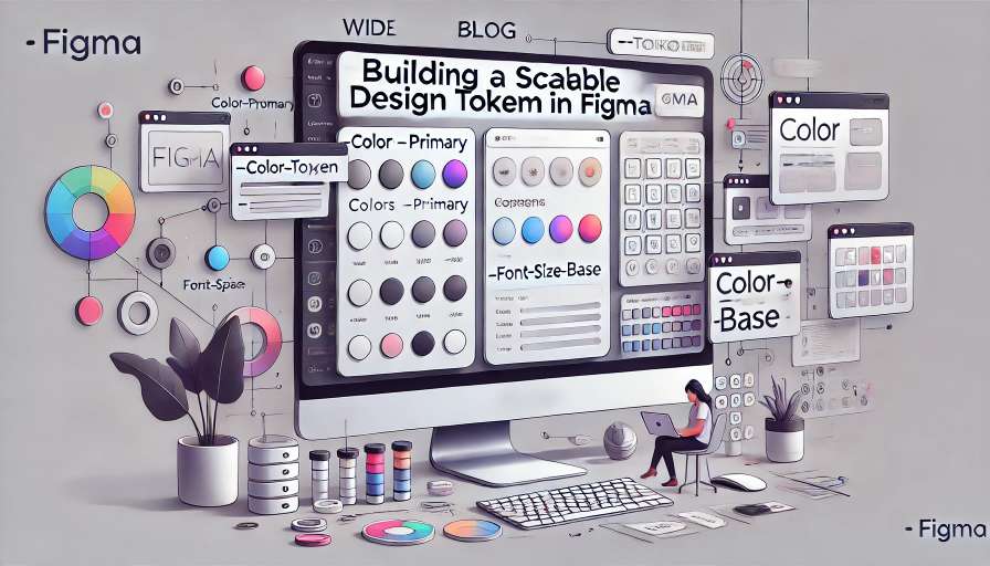
Design tokens are the smallest possible pieces of a design system. Think of them as variables—colors, spacing, typography, border-radius, shadows—defined once and reused everywhere. Instead of hardcoding a color like #0066FF 20 times, you’d define it once as a token like primary-color and reuse that.
The big win? Consistency, reusability, and easier cross-platform theming. Whether you’re designing a native mobile app, a responsive web interface, or a smartwatch UI, tokens keep everything uniform.
In Figma, this means translating abstract concepts like “primary color” or “heading font” into shareable, editable, and updateable styles that the entire team can use.
The need for scalability in design tokens
When a project is small, defining a few colors and text styles might be enough. But things change when you’re designing for a product with multiple brands, light and dark modes, accessibility variants, and platform-specific tweaks. You start to see the cracks.
A scalable design token system in Figma solves this by:
- Providing a single source of truth
- Supporting theming across brands or platforms
- Making handoffs between design and dev smoother
- Allowing easy updates without chaos
So how do you make one?
Planning Your Design Token System
Understand what needs to be tokenized
Start by defining what properties will become tokens. Usually, this includes:
- Colors (background, text, border, etc.)
- Typography (font family, size, line-height, weight)
- Spacing (margins, paddings)
- Border radius
- Shadows
- Z-index or elevation (especially for apps)
Each of these should be considered with scalability in mind. For example, don’t just define “blue”—define it as color-primary, color-secondary, color-info, etc., and map actual values to those.
Create a token naming strategy
Good naming saves your sanity.
Stick to a clear hierarchy that reflects both purpose and usage. Here’s a pattern that works well:
category-purpose-state
Examples:
color-background-defaultspacing-smfont-heading-lgborder-radius-rounded
Avoid names like blue-1 or h1-font. Those are fine for quick drafts but don’t scale well.
Define themes from the start
If you plan to support light/dark themes or brand variations, define abstract tokens (color-primary) that point to different values depending on the theme.
In Figma, this usually means using variable collections, which we’ll get to next.
Setting Up a Scalable Design Token System in Figma
Use Figma Variables
As of recent updates, Figma now supports variables, which allow you to define and reuse values like colors, numbers, and strings throughout your designs.
Create collections for each type:
ColorTypographySpacingRadiiElevation
Then group your variables into modes—like light and dark, or brandA and brandB.
Example:
| Token | Light Mode | Dark Mode |
|---|---|---|
color-background-default | #FFFFFF | #121212 |
color-text-primary | #000000 | #FFFFFF |
These variable modes let you toggle entire themes inside Figma with one click—super useful for simulating light/dark mode or brand changes.
Apply tokens using styles
Figma still requires you to use styles for things like text and color fills, so bridge your tokens by applying variable values to your styles. That way, your button style is linked to color-primary, which can then change across modes.
Text styles should also use variables for font size, weight, and line height if possible.
Integrating with Code
A scalable design token system isn’t just about design—it’s about connecting design and code. After all, your dev team will need access to these tokens.
Exporting tokens
Figma variables can be accessed via API, or exported using plugins like:
- Token Studio (formerly Figma Tokens)
- Design Tokens Generator
- Figmagic
These tools let you export tokens as JSON or CSS custom properties, which can be consumed in tools like:
- Tailwind config
- Style Dictionary
- Sass/LESS maps
- Android/iOS style assets
This closes the loop and ensures your Figma tokens are in sync with your production UI.
Automate token sync
If you’re working in a big team, set up GitHub actions or CI/CD pipelines to auto-sync your Figma tokens to your frontend codebase on a schedule or with manual triggers. This avoids token drift and manual copy-pasting.
Common Pitfalls to Avoid
Avoid premature complexity
It’s easy to over-engineer token systems. Don’t try to define a million tokens from the start. Begin with your core UI primitives (colors, fonts, spacing), and let the system evolve as needs arise.
Don’t rely only on color names
Instead of blue-1 or gray-700, go with semantic names like color-border-default or color-error-background. These are more maintainable when you change your palette.
No mixing platform-specific values
If you’re designing for multiple platforms (iOS, Android, Web), use platform-agnostic tokens. Then in code, map them to platform-specific implementations.
Best Practices for Scaling Your Token System
- Keep tokens atomic. Don’t combine multiple properties into a single token.
- Use component libraries. Link your tokens to components like buttons and inputs so changes cascade properly.
- Document everything. Even in Figma, include notes for each token group to explain usage.
- Version your tokens. If you’re using JSON files or Git, treat them like code—review changes, write commit messages, etc.
- Train your team. A token system only works if everyone knows how to use it. Do short onboarding sessions or create a Figma handbook.
Two H2s Using the Keyword
How to Start Building a Scalable Design Token System in Figma
If you’re starting from scratch, remember this is a journey, not a one-day task. You don’t need a perfect system on day one. Just start small and evolve. Many teams begin with basic color and typography tokens, and then add spacing, radius, shadows, etc., over time.
When building a scalable design token system in Figma, stay close to how your developers think—use semantic naming, align your structure to the codebase, and export tokens in a way that works for your stack.
Why Building a Scalable Design Token System in Figma Future-Proofs Your Design Workflow
This isn’t just about better buttons—it’s about design ops. Tokens act as infrastructure. They reduce bugs, improve velocity, and bring design closer to dev. They also unlock future capabilities like theming, accessibility variants, and real-time updates to UI.
As Figma’s ecosystem grows, support for variables and API access will only get better. Now is the time to build the foundation.
FAQs
1. Can I use Figma variables for text properties like font size?
Yes, but currently only number-based variables can be linked. Use text styles for full control.
2. How do I manage tokens across multiple brands in Figma?
Use variable modes to define different values for each brand and switch between them.
3. What plugin is best for exporting design tokens from Figma?
Token Studio is currently the most popular and widely supported option.
4. Are design tokens just for developers?
Not at all. They help designers maintain consistency and scale systems efficiently too.
5. Should I define spacing tokens in pixels or abstract names?
Define them using abstract names like spacing-sm, and map them to pixel values behind the scenes.
Leave a Reply