In early 2023, MilkRun—a once-celebrated Sydney-based grocery delivery startup—announced its sudden shutdown after burning through tens of millions in funding and failing to gain sustainable traction. While most headlines focused on business strategy and burn rate, one of the most overlooked factors in MilkRun’s downfall was its flawed user interface and poor digital customer experience, which quietly chipped away at user trust and loyalty.
For a brand that promised “groceries delivered in under 10 minutes” with a slick, youthful image, the reality was a chaotic, confusing app experience that couldn’t keep up with its own promise. And when your entire business depends on a single digital touchpoint, bad UI isn’t just an inconvenience—it’s a dealbreaker.
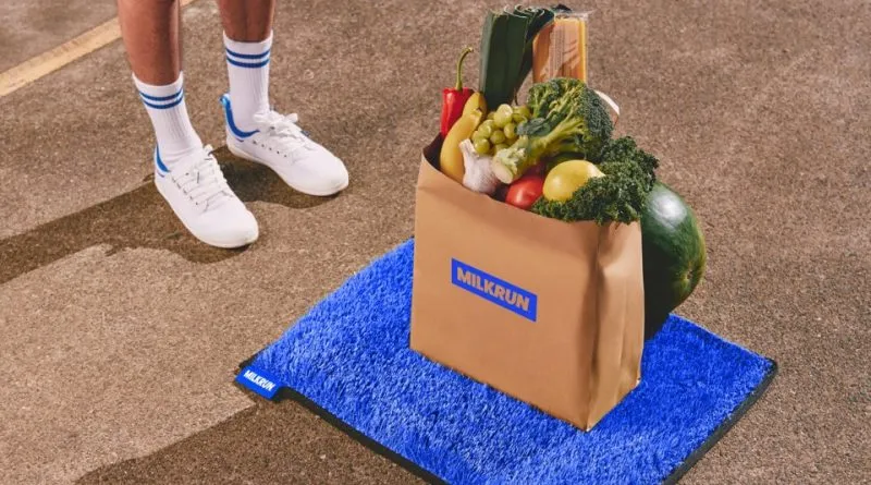
The Promise: Seamless, Instant Delivery
From day one, MilkRun positioned itself as the Uber of groceries—fast, local, and cool. It launched with viral marketing, neon-toned branding, and a Gen Z aesthetic. The app was central to everything:
- Product discovery
- Ordering
- Delivery tracking
- Payment
- Reordering
But despite strong branding, users quickly realised that the app’s design didn’t support the speed and clarity the service claimed to deliver.
Confusing Product Discovery
Users opened the app expecting a curated, streamlined grocery experience. What they got was:
- A cluttered UI with too many categories and banner promos
- Duplicate or missing items, especially in high-demand categories like fresh produce
- No clear filtering for dietary needs or brands
- Inconsistent stock visibility—some items appeared available but were removed post-checkout
For a startup that banked on impulse purchases and ultra-fast checkout, this lack of clarity killed momentum. People spent more time hunting for eggs than actually checking out.
Broken Cart and Checkout Logic
A major complaint involved cart errors and unclear minimum spend rules. Users would:
- Add $20 worth of groceries
- Go to checkout and receive a vague error about “order not meeting threshold”
- Adjust cart, only for stock to change mid-order, forcing another edit
The cart UI didn’t:
- Dynamically update with stock changes
- Surface free delivery limits clearly
- Warn users when delivery slots were unavailable until after final steps
This invisible friction left users annoyed—and many simply closed the app mid-order, abandoning their baskets for competitors like Woolies Metro or Uber Eats Market.
Delivery Tracking That Did More Harm Than Good
Perhaps the most damaging UX flaw was MilkRun’s delivery tracking screen. It promised real-time status but delivered:
- Laggy updates
- No estimated time of arrival (ETA)
- Map views that didn’t load or showed riders in the wrong suburb
Users complained about:
- Receiving “Your rider is here” messages when no one was
- No way to contact drivers directly
- Deliveries marked complete before arrival
This created distrust, especially with groceries—where timeliness and freshness are critical.
In forums and Twitter threads, customers shared screenshots of blank tracking screens, app crashes, and deliveries showing up 45 minutes late without apology or refund. The app’s false sense of urgency (“arriving in 5 mins!”) backfired when reality didn’t match the UI.
No Feedback Loop or Resolution Tools
When things went wrong—which, in the startup’s scaling phase, they often did—the app offered no intuitive way to resolve issues.
There was:
- No live chat
- No built-in complaint form with order reference
- A support email buried in the FAQ
Users had to switch apps to email or find a link, often while dealing with missing groceries or late-night delivery issues. This broke the trust loop completely—especially for a brand targeting convenience-seekers.
Poor Accessibility and Technical Stability
On a more fundamental level, the app:
- Had tiny tap targets that frustrated older users
- Didn’t support voice control or accessibility tools
- Crashed frequently on Android and lower-end iPhones
- Lacked dark mode or custom font scaling
For a company built around speed and digital-first convenience, these oversights excluded large portions of the market—and created constant friction for everyone else.
The Impact: Users Drifted Away
As competitors improved their own apps, MilkRun’s UX flaws stood out. While their branding was memorable, their interface wasn’t usable.
Users began returning to:
- Uber Eats for predictable delivery tracking
- Woolworths Metro60 for reliable stock and pricing
- DoorDash and local services with better refund and support flows
Even loyal customers cited the app’s confusing flow, poor tracking, and unreliable order management as the reason they stopped using it.
When MilkRun abruptly shut down in April 2023, few were surprised. What shocked people was how quickly it went from media darling to failed case study.
Lessons from the MilkRun UI Failure
- Cool branding can’t fix broken UX. If the app doesn’t work smoothly, users leave—no matter how edgy your ads are.
- Fast services need fast, accurate interfaces. Real-time delivery promises must be backed by real-time, reliable tracking.
- Friction in checkout is fatal. Any guesswork at the cart level kills conversion.
- Customer support must be built-in. Users should never have to leave the app to fix a problem.
- Your UI is your business. Especially when your service is 100% digital.
FAQs
1. What was MilkRun’s biggest UI flaw?
A combination of broken delivery tracking, unreliable product stock indicators, and a confusing checkout flow.
2. Why did users stop trusting the app?
Because of repeated failures to deliver on speed promises, incorrect map data, and no easy resolution tools.
3. Was the app designed for speed?
Ironically, no. It looked fast, but behaved slowly and didn’t offer real-time feedback or urgency where it mattered.
4. Did competitors do better?
Yes—Uber Eats, Metro60, and DoorDash all had more stable apps with clearer tracking and better support flows.
5. Could better UI have saved MilkRun?
It wouldn’t have solved operational costs, but a smoother, more reliable app may have helped retention and reduced churn dramatically.
Leave a Reply