
In 2024, Victoria’s Department of Transport released a highly anticipated redesign of VicTraffic, the state’s official real-time traffic update platform. Meant to serve as the daily digital companion for drivers, logistics companies, and commuters across Melbourne and regional Victoria, VicTraffic’s online platform was meant to streamline navigation, road closures, and live incidents. Instead, it became a perfect storm of poor UI decisions, broken functionality, and lost public trust—turning one of the most important utilities into a frustrating user experience.
VicTraffic’s legacy site had its flaws. It was clunky, slow on mobile, and not particularly modern. But it did one thing well: it showed live road conditions quickly and clearly. With the 2024 redesign, the focus shifted from usability to aesthetics and modernization—at the expense of function.
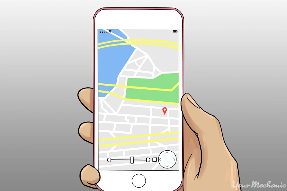
The most jarring change in the new version was its complete dependence on an oversized, interactive map. Previously, users could choose between a list view of incidents or a compact map view. But the new site forced all users—on desktop and mobile—to navigate a bloated, full-screen map interface that struggled to load and was riddled with clutter. Even users with high-speed internet reported delays, failed tiles, and inconsistent data rendering.
Icons for road hazards, closures, and congestion were redesigned with new symbols that lacked immediate recognizability. Instead of simple color-coded icons, the new system used vague shapes with no textual labels until hovered over—completely non-functional for mobile users or those using screen readers. What was once a quick scan for incidents now required zooming, tapping, and deciphering cryptic symbols across the map.
Search functionality was another major failure. Users previously accustomed to typing in road names, highway codes, or suburbs were now forced to use a location pin tool that often snapped inaccurately or returned no results. The omission of a basic search bar led to outrage among regular users, especially logistics drivers and emergency planners who relied on it daily.
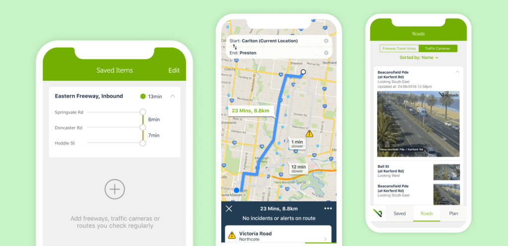
Even more frustrating was the removal of filtering features. In the previous version, users could toggle between incident types—roadworks, weather hazards, lane closures, congestion. The new UI bundled everything under generic “alerts,” with no filtering options. A user looking for closures due to flooding would now have to manually click every icon within a region to determine relevance. It was a clear step backward in usability.
The mobile version of the site—critical for users on the road—was even more broken. Load times were slow, controls overlapped on smaller screens, and the sticky header blocked key interface elements. In some cases, popups and modals didn’t respond at all on Android browsers. The site, while claiming to be “mobile-optimized,” was functionally unusable on phones, precisely when drivers needed it most.
Accessibility was all but forgotten. Screen readers couldn’t interpret the map, tab navigation was broken, and keyboard-only users found themselves stuck in an endless scroll loop. Disability advocates and regional accessibility forums criticized the state for launching such a critical public tool without even basic WCAG compliance.
What made the situation worse was the lack of user onboarding. The new interface launched with no help overlays, no tooltips, and no documentation. Regular users were left to figure it out themselves or, worse, abandon it altogether. A chorus of complaints flooded local Facebook community groups, traffic radio talkbacks, and feedback portals.
The impact was real. Drivers missed critical alerts. Trucking routes were disrupted. Schools and emergency services reported delays in disseminating traffic info to parents and staff. A design intended to be sleek and modern became a source of confusion and inefficiency, especially during bushfire season and major roadwork periods.
By late 2024, the backlash prompted VicRoads and the Department of Transport to issue statements promising improvements. A basic list view was reintroduced as a fallback, and additional filters were added back after months of complaints. But the damage to trust was done. Media outlets covered the failings, and the platform’s usage statistics dropped sharply compared to previous years.
What went wrong?
- Form over function. The redesign prioritized sleek design over practical usability for one of the most utility-driven services in the state.
- No user testing with actual stakeholders. The platform was clearly not tested with truck drivers, regional commuters, or those with accessibility needs.
- Mobile was deprioritized. Despite being a primary use case, the mobile experience was broken from launch day.
- Essential features were stripped. Removal of search, filters, and list view broke long-established user habits.
- Lack of fail-safes. No offline mode, no fallback text-based feed, and no integrations with existing transport systems or emergency services.
The VicTraffic website disaster is now discussed in Australian UX communities as a textbook case of poor stakeholder alignment, bad implementation of maps-as-UI, and failure to consider real-world users under time pressure. What should have been a public good became a public grievance.
FAQs
1. What was the biggest failure of the VicTraffic 2024 redesign?
Replacing the simple, searchable list of incidents with a bloated, slow, full-screen map that confused and frustrated users.
2. Why did mobile users find the new site unusable?
Controls overlapped, load times were poor, and the interface didn’t respond properly on small screens.
3. Was accessibility considered in the redesign?
No. Screen reader support, keyboard navigation, and basic accessibility compliance were missing or broken.
4. What were users most angry about?
The removal of search, filters, and familiar interface elements that made the platform easy to use during commutes or emergencies.
5. What did VicTraffic do to fix the backlash?
They reintroduced basic features like a list view and filtering, and promised further improvements based on user feedback.
Leave a Reply