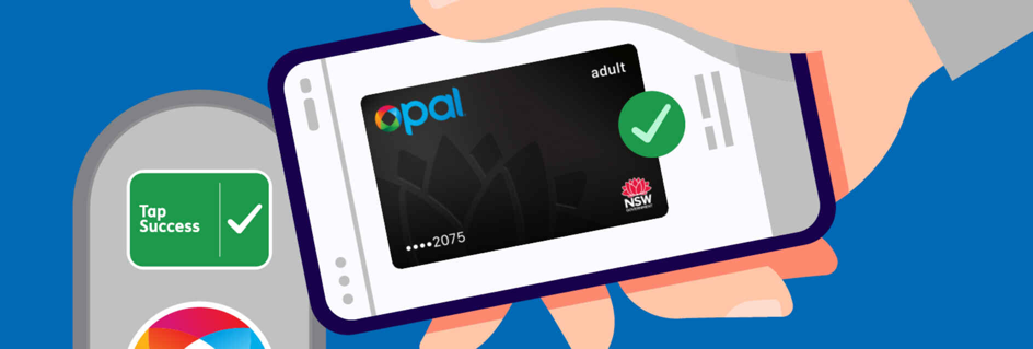
In Australia’s transport sector, few digital tools are as widely used as the Opal app in New South Wales. Designed to streamline public transport payments and journey planning across Sydney and the greater NSW area, the Opal app was once seen as a pioneer in transport tech. But in 2024, a highly publicized overhaul of the app’s user interface became a disaster case study in the risks of redesigning critical public apps without grounding the process in user experience research. What was intended to modernize the app instead alienated commuters, triggered a flood of negative feedback, and forced Transport for NSW to scramble with emergency fixes.
The Opal app redesign was initially positioned as a leap into the future of smart ticketing. With the introduction of contactless credit card payments across the Opal network, the agency aimed to integrate trip planning, fare payments, and travel history into a unified, polished interface. The intention was good. But the execution of the UI overhaul introduced a series of design choices that broke established user behaviors, confused regular commuters, and created friction in tasks that had previously been seamless.
One of the most controversial UI decisions was the move to bury the “Top Up” feature behind several clicks, requiring users to navigate a newly designed wallet-style interface rather than offering a clear, visible button on the home screen as it had in previous versions. For an app that served hundreds of thousands of daily commuters, many of whom relied on quick top-ups while rushing to catch a train or bus, this was a critical failure. Regular users who were accustomed to opening the app, topping up their balance in two taps, and moving on were now faced with a cluttered, gamified dashboard full of secondary features, loyalty points, and unnecessary widgets—while the primary function was deprioritized.
The redesign also introduced complex, multi-step journey planning flows, replacing the simple “Plan a Trip” interface with a stylized, map-heavy screen that prioritized aesthetic over function. Where previously users could quickly enter a destination and get route options, the new UI required users to select journey modes in separate tabs, toggle between bus, ferry, and train options manually, and confirm trips through confusing modal pop-ups that obscured important information like platform numbers or walking distances. The new design was visually flashy but sacrificed usability, especially during peak travel times when users needed fast, reliable information.
Another widely criticized change was the decision to introduce mandatory sign-ins for basic features like checking travel history or fare costs. While the agency framed this as a security upgrade, the lack of a “Guest Mode” meant that casual users or tourists who simply wanted to check trip costs or plan a route were now forced to create accounts, agree to terms, and share personal information—creating unnecessary friction and sparking privacy concerns.
Accessibility was another area where the new UI stumbled badly. In attempting to create a modern, card-based design with vibrant colors and layered effects, the app’s UI created serious contrast issues, making key text unreadable for users with low vision or in outdoor light conditions. Screen reader users reported difficulty navigating the app’s nested menus and complex card layouts, while the lack of haptic feedback or keyboard support alienated many users with mobility challenges.
Perhaps the most damaging aspect of the Opal app redesign was the lack of user communication and transparency. The update was rolled out with little warning, no onboarding for existing users, and no option to revert to the previous interface. Overnight, commuters woke up to a completely changed app that looked different, worked differently, and offered no guidance. This sparked frustration, confusion, and thousands of complaints on social media, app store reviews, and direct feedback to Transport for NSW.
Instead of welcoming the upgrade, users felt blindsided, with many describing the new UI as “made by designers who don’t use the system” or “a textbook example of how not to redesign a utility app.” The lack of empathy in the rollout only amplified the backlash.
Developers and designers within the Australian digital community were quick to dissect the failures. Many pointed out that the redesign ignored well-established UX principles for transport apps, such as prioritizing speed, clarity, and accessibility over aesthetic novelty. By focusing on trends like card-based layouts, gamification, and visual clutter, the design team lost sight of the app’s primary use cases: quick top-ups, rapid journey planning, and account management while on the go.
The Opal app’s failure became even more apparent when compared to apps like Transit App or Google Maps, which continued to offer cleaner, faster, and more intuitive interfaces for journey planning and fare checking. Commuters in Sydney began abandoning the official Opal app in favor of these alternatives, undermining Transport for NSW’s goal of centralizing services in one trusted app.
In response to the mounting backlash, the agency was forced to issue an apology, push emergency updates, and conduct hasty UX reviews. By mid-2024, some of the worst UI decisions—like the buried top-up button and forced sign-ins—were rolled back. But by then, trust had already eroded, and the damage to the Opal app’s reputation was done.
The Opal app redesign serves as a potent reminder that in critical, high-frequency apps, UI decisions cannot be made in a vacuum of aesthetics and stakeholder desires. User research, real-world testing, and iterative, transparent rollouts are non-negotiable. The agency’s attempt to modernize the interface without anchoring it in the needs and behaviors of actual commuters turned a potentially positive upgrade into a PR and usability disaster.
Australian UI and UX professionals now refer to the Opal app 2024 redesign as a cautionary tale in workshops and conferences. It stands as a stark lesson that form must always follow function, especially in public utilities where the user base is broad, diverse, and dependent on the tool working reliably under pressure.
In 2025, Transport for NSW is still working to rebuild user trust, conducting deeper research with commuter groups, accessibility advocates, and frontline staff to repair the damage. The incident has also triggered broader discussions within Australian government and transport agencies about the need for better digital governance, co-design practices, and user-centered testing before rolling out UI overhauls.
Ultimately, the Opal app disaster is a lesson in humility for designers and decision-makers: when you design for the public, your opinions about beauty, trends, or what’s “cool” don’t matter nearly as much as how the interface serves real people, in real contexts, during their busiest, most stressful moments.
FAQs
1. What was the biggest UI mistake in the Opal app 2024 redesign?
Burying essential features like balance top-ups behind multiple clicks, breaking long-established user habits.
2. Why did commuters criticize the journey planning interface?
Because it became overcomplicated, hiding basic information behind unnecessary pop-ups and fragmented steps.
3. Did the redesign ignore accessibility best practices?
Yes, with poor contrast, unreadable text in bright conditions, and confusing layouts that failed screen readers.
4. How did users react to the update?
With overwhelming frustration and backlash on social media, app stores, and direct complaints to Transport for NSW.
5. What can other transport apps learn from this?
That user-centered design, clear communication, and respecting established behaviors are critical for high-frequency utility apps.
Leave a Reply