In the realm of digital experiences, user interfaces can make or break entire systems. When designed well, they feel invisible—guiding users effortlessly toward their goals. But when they fail, the consequences can ripple through society, causing frustration, confusion, and in some cases, genuine harm. One of the most notorious examples of a UI failure in Australia’s digital history is the collapse of the MyGov portal under the weight of pandemic demand, exposing how poor design, lack of foresight, and an overcomplicated interface can create a nationwide crisis.
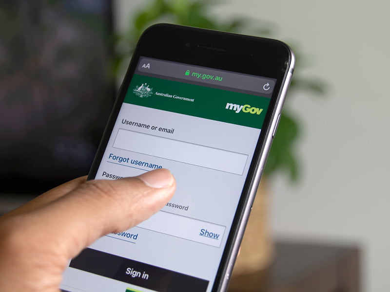
By 2020, Australians were becoming accustomed to using MyGov, the central online portal for accessing a wide range of government services, from Medicare to Centrelink to the Australian Taxation Office. On paper, it was a clever idea: a single, secure login to manage everything related to citizen services. But behind the sleek promise, the UI was plagued with design flaws, usability failures, and an outdated architecture that struggled under pressure. When the pandemic hit in 2020 and the government rolled out emergency payments through Centrelink, Australians flooded the MyGov website—and it crumbled.
While the technical backend failures made headlines, what was less discussed at the time—but just as critical—was how poor UI decisions amplified the disaster. MyGov’s user interface was designed with little empathy for real users under stress. Forms were complicated, multi-step authentication processes were poorly explained, and the language used throughout the portal was bureaucratic and cold. Users were forced to navigate between multiple services, each with its own inconsistent UI patterns, creating confusion and errors.
One of the most glaring UI failures was the login and authentication process itself. MyGov required users to log in through multiple steps, including password, secret questions, and SMS verification codes, often in poorly designed workflows that led users into loops of error pages without clear recovery paths. Users faced errors that were cryptic and jargon-filled, like “Error 429: Too many requests,” offering no explanation or reassurance. This left many users—particularly the elderly, disabled, and non-English speakers—feeling abandoned by the system.
As panic spread and demand surged, the UI failed to provide basic cues of system status or estimated waiting times. Users were left staring at spinning loaders or error messages for hours without knowing if they should refresh, try later, or give up entirely. The lack of empathy in these interfaces caused frustration to boil over into social media storms, with thousands sharing screenshots of MyGov’s failures, from broken pages to inaccessible forms that wouldn’t load on mobile devices.
Another UI disaster within the MyGov ecosystem was the design of the Centrelink claims forms themselves. These forms required users to fill in dozens of fields, often using language that was only familiar to bureaucrats, not everyday Australians. There was no guidance, tooltips, or progressive disclosure to ease users through the process. Instead, users faced walls of text, dense drop-downs, and required document uploads that failed to accept common formats or exceeded size limits without warning. Every aspect of the UI signaled to users that the system wasn’t designed for them—it was designed for administrators.
Beyond the frustration, the impact of these UI failures was tangible. Vulnerable Australians missed out on critical payments, spent hours navigating dead ends, and, in many cases, gave up altogether. What should have been a moment where digital services provided support and relief instead became an example of how bad UI can create digital exclusion at a massive scale.
The disaster highlighted several lessons about UI design that designers, product teams, and governments in Australia have since taken to heart.
First, critical systems require user-centered design from the ground up. MyGov’s UI was designed to satisfy policy and security requirements, but with little testing or iteration based on real user behavior. In contrast, systems that thrived during the pandemic, like Victoria’s QR check-in apps, were praised for their simplicity, clarity, and speed—demonstrating that even in complex systems, user-first design is possible and essential.
Second, language matters more than ever in high-stress digital interactions. MyGov’s use of technical jargon, bureaucratic terms, and error codes created barriers for users who needed comfort, clarity, and actionable guidance. Today, more Australian digital services are adopting plain language, humanized microcopy, and user-friendly error handling that helps users recover rather than panic.
Third, interfaces need to respect the emotional state of their users, especially during crises. MyGov failed to provide any empathy cues, status updates, or reassuring progress indicators, leaving users feeling lost and helpless. In 2025, smart UI patterns now incorporate real-time feedback, estimated wait times, and even humanized chat assistants to reduce user anxiety in complex flows.
Fourth, responsive design is not optional in public services. MyGov’s forms and pages often failed to work properly on mobile devices, despite the majority of Australians relying on mobile as their primary internet device. In 2025, it is now a baseline expectation that every public-facing digital service works flawlessly across devices, networks, and contexts.
Finally, design systems need to be consistent and user-friendly across departments and services. MyGov’s ecosystem felt like a Frankenstein of disconnected portals stitched together under one brand. Each service used different UI patterns, forms, and navigation, forcing users to constantly re-learn interfaces. In the wake of the disaster, Australian government services began investing in unified design systems that create coherent, familiar experiences across all touchpoints.
The MyGov UI disaster is now taught in design schools across Australia as a case study in what happens when systems are designed from the inside out, rather than from the user’s perspective. It serves as a stark reminder that UI failures are not just design failures—they are failures of trust, inclusion, and basic human dignity. Digital systems, especially those providing critical services, must be designed not just to function, but to support, comfort, and empower users in their moments of need.
In 2025, many of Australia’s new public and private digital platforms have learned from the MyGov disaster. Startups, agencies, and government departments have adopted human-centered design principles, invested in accessible, inclusive interfaces, and prioritized simplicity over bureaucratic complexity. The scars of the MyGov debacle have, in a way, made Australia’s digital landscape stronger and more empathetic.
But the lesson remains evergreen: UI is not decoration. It is the interface between people and the services they rely on. When that interface fails, the consequences are not abstract—they are deeply personal, and sometimes, devastating. The MyGov disaster is a testament to the power of design—and the responsibility that comes with it.
FAQs
1. What was the biggest UI flaw of MyGov during the pandemic?
The overcomplicated login process, combined with cryptic error messages and inconsistent navigation, left users confused and frustrated.
2. Why did Australians criticize MyGov’s UI so heavily?
Because it failed at every critical moment—pages broke, forms were inaccessible, and the interface lacked empathy during a national crisis.
3. How has Australia improved public UI since the MyGov disaster?
By adopting human-centered design principles, unified design systems, and simplifying digital interactions across all government platforms.
4. Is MyGov still in use today?
Yes, but with major overhauls in UX, accessibility, and language to address the failures exposed during the pandemic.
5. What key lesson can designers learn from the MyGov disaster?
That UI design in critical systems must prioritize user needs, emotions, and accessibility above all else, especially in times of crisis.
Leave a Reply