In the ever-changing landscape of UI design, 2025 has seen the return and evolution of a style that some thought was just a passing fad—neumorphism. This design approach, blending elements of skeuomorphism with the cleanliness of flat design, has re-entered the UI conversation in new, more refined ways.
For designers, product teams, and brands looking to create modern, tactile, and visually immersive interfaces, neumorphism is offering a fresh alternative to brutalism, flat design, or hyper-minimalism. But, as with every design trend, it’s not about applying it everywhere—it’s about where and how you use it that makes it work.
This article dives into what makes neumorphism relevant in 2025, the mistakes of its early days, how designers are now using it strategically, and the balance between aesthetics, usability, and accessibility.
What Is Neumorphism, Really?
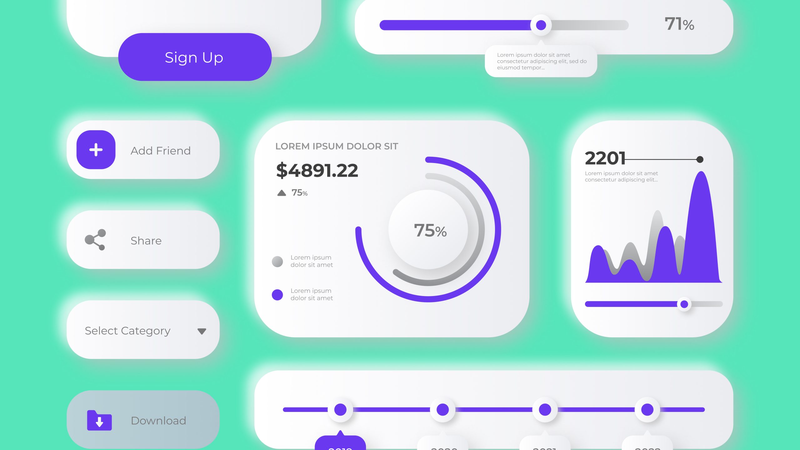
Let’s quickly clear up the confusion. Neumorphism is a visual style where interface elements are designed to look like they are part of the same material as the background, subtly extruded through the use of inner and outer shadows.
It’s not hyper-realistic skeuomorphism, where buttons look like actual buttons from the physical world. Instead, neumorphism gives interfaces a soft, 3D-like quality that feels futuristic and calming, while still maintaining the cleanliness and simplicity of flat UI patterns.
In its purest form, neumorphism features:
- Soft, diffused shadows and highlights
- Low-contrast color palettes, often pastel or monochromatic
- Rounded corners and pill-shaped buttons
- Depth created through light and shade rather than borders or outlines
Why Neumorphism Is Trending Again in 2025
When neumorphism first popped up around 2019–2020, it was everywhere—Dribbble shots, Behance portfolios, even startup dashboards. But the backlash was swift. Designers quickly realized that low-contrast elements, while beautiful, were terrible for accessibility and scalability.
Fast forward to 2025, and the design community has matured. Neumorphism is no longer being treated as a blanket style applied to entire apps. Instead:
- It’s used sparingly, often for key interaction points or decorative UI touches
- Designers are combining it with high-contrast color schemes for better accessibility
- Neumorphic elements are being paired with flat, material, or glassmorphism styles to create layered, tactile experiences
In short, neumorphism has found its place—as a tool in the UI toolkit, not the entire toolbox.
Where Neumorphism Works Best Today
One of the biggest mistakes in early neumorphism use was applying it to everything, everywhere. Buttons, cards, forms, even text fields were all given the soft treatment, creating visually monotonous, hard-to-navigate interfaces.
In 2025, smart designers are using neumorphism for:
- Key call-to-action buttons, making them feel more touchable and prominent
- Switches, toggles, and sliders, where the tactile quality enhances user interaction
- Onboarding screens and landing pages, where the focus is more on aesthetics and emotional engagement than utility
- Fintech apps or wellness apps where a soft, calming UI tone is part of the brand identity
It’s no longer the hero of the entire UI—but a subtle enhancement used to guide attention, create depth, or evoke emotion.
The Usability and Accessibility Challenge—And How to Solve It
Let’s be honest. The biggest reason designers abandoned neumorphism in the early days was simple: it broke accessibility rules. Buttons didn’t look like buttons. Fields disappeared into the background. Users with low vision struggled to navigate even basic forms.
In 2025, those lessons have been taken seriously:
- Designers ensure minimum contrast ratios of 4.5:1 for text and interactive elements
- Neumorphic buttons now feature color changes, iconography, or motion cues to indicate interactivity beyond just shadows
- Teams test UI prototypes on real users, using both dark and light themes, ensuring tactile design works across devices and lighting conditions
- Developers use CSS variables and scalable design tokens, so shadows and highlights respond dynamically to themes, device resolutions, and user settings
If neumorphism has a future, it’s a future where accessibility and inclusivity aren’t optional—they’re the foundation of the design process.
Neumorphism + Glassmorphism + Flat UI? Yes, Please.

Another trend emerging in 2025 is the fusion of UI styles. Where older design teams would strictly follow one design system (material, flat, brutalist), today’s product teams are blending neumorphism with:
- Glassmorphism overlays, creating translucent layers that float above softly extruded backgrounds
- Flat UI elements, using neumorphism only for selected hero elements like CTAs or avatars
- Micro-interactions and haptic feedback, reinforcing the tactile illusion by pairing neumorphic elements with subtle animations and vibrations on mobile devices
This hybrid approach lets brands keep their UI feeling fresh, layered, and modern, without falling into the trap of design for design’s sake.
Tools, Frameworks, and Trends for Neumorphism in 2025
Design tools have caught up too:
- Figma and Adobe XD now offer neumorphic UI kits that are WCAG-compliant, with adjustable shadows, blur strengths, and color palettes
- CSS-in-JS libraries and Tailwind CSS plugins include neumorphism-ready classes, making implementation faster and more consistent
- Design systems like Google Material You and Fluent Design have begun experimenting with soft shadows and depth, taking cues from neumorphism without fully embracing its purist form
For designers, this means:
- Faster prototyping
- Easier testing
- Smoother developer hand-off
In 2025, neumorphism is no longer a hacky visual style—it’s integrated into design systems thoughtfully and strategically.
FAQs
1. Is neumorphism still popular in 2025?
Yes, but in a more refined, hybrid form—used sparingly and combined with other styles.
2. Is neumorphism bad for accessibility?
It can be if done carelessly. But with proper contrast, cues, and testing, it can meet accessibility standards.
3. Should I use neumorphism in business apps?
Only if it supports the brand tone or product experience. For most B2B tools, subtle neumorphic touches work better than full-on designs.
4. Does neumorphism work better in dark mode or light mode?
Both can work, but designers often prefer dark mode because the shadows and highlights pop more.
5. Is neumorphism a long-term trend or a phase?
It’s evolving into a design accent rather than a dominant trend—so expect to see it used tastefully for years to come.
Leave a Reply