In Australia, government websites have long been a source of user frustration.
Clunky layouts, confusing flows, outdated designs — these were often the norm.
But in recent years, one platform has defied the stereotype: Service Victoria.
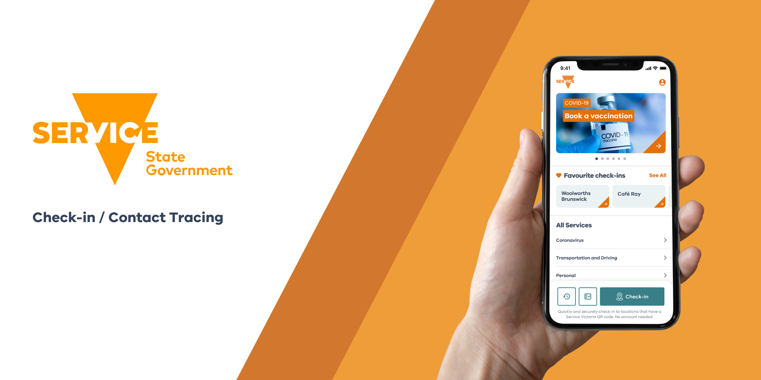
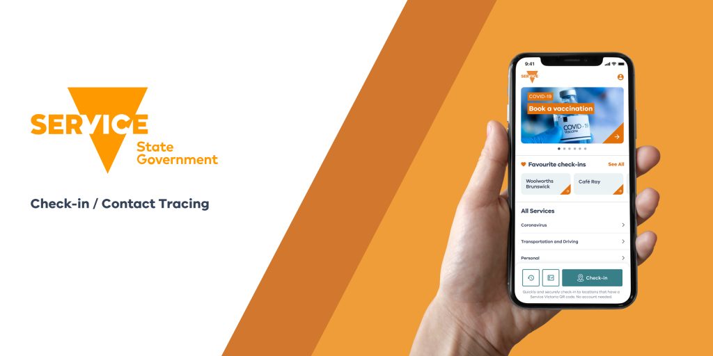
Service Victoria — the state’s centralized digital portal for driver licenses, registrations, certificates, and public services — underwent a major UI overhaul that transformed it from just another government tool into a national model for user-centered digital design.
This article explores:
✅ What the old Service Victoria interface was like
✅ What specific changes the UI redesign introduced
✅ How the overhaul improved user experience and public trust
✅ Best practices and lessons for designers and public agencies
✅ FAQs on designing successful large-scale public interfaces
Let’s dive into how a positive UI overhaul created one of Australia’s standout government digital experiences.
What Was Wrong With the Old Service Victoria Interface?
Before its redesign, Service Victoria’s platform reflected many of the issues common to public sector digital services.
🔹 1️⃣ Outdated Visual Design
The old interface:
- Used dense blocks of text and small, fiddly buttons
- Relied on inconsistent color schemes across different pages
- Lacked visual hierarchy, making it hard to quickly find key actions
Users often felt overwhelmed or confused when visiting the site or using the app.
🔹 2️⃣ Clunky, Multi-Step Flows
Simple tasks, like renewing a license or paying a fine, required:
- Multiple clicks across unrelated pages
- Re-entering the same personal details over and over
- Digging through unclear menus to locate forms
This led to high drop-off rates and poor task completion.
🔹 3️⃣ Limited Mobile Friendliness
With increasing numbers of Australians accessing government services on their phones, the old Service Victoria experience fell short:
- Slow load times
- Poorly optimized layouts for small screens
- Frustrating tap targets and dropdown menus
Mobile users — especially those in rural or lower-connectivity areas — were disproportionately affected.
What Did the UI Overhaul Change?
Service Victoria’s design team set out to fundamentally reimagine how citizens interact with government services online.
Here’s what they did.
✅ Introduced a Clean, Minimalist Visual Language
The new interface uses:
- Plenty of white space for readability
- Bold, consistent color accents aligned with Victoria’s government branding
- Simple, intuitive icons next to each service category
- Clear typographic hierarchy to guide users visually through each page
The result? A modern, calming, and confidence-building interface.
✅ Streamlined Navigation and Information Architecture
The design team restructured the platform around:
- Top-level categories that reflect how real users think, not internal government structures
- A powerful search feature that helps users jump directly to what they need
- A collapsible menu system for easy browsing without overwhelming the user
This dramatically reduced cognitive load and simplified common user journeys.
✅ Mobile-First, Performance-Optimized Design
Recognizing the shift toward mobile access, the overhaul included:
- Fully responsive layouts that adapt beautifully across devices
- Touch-friendly buttons and forms
- Faster load times through optimized assets and caching
These improvements made Service Victoria one of the smoothest mobile government experiences in Australia.
✅ Added Personalization and Smart Features
The new platform offers:
- Saved user profiles for faster future transactions
- Smart reminders for renewals or upcoming deadlines
- Contextual help embedded directly within forms and processes
This moves the experience from being a static portal to a dynamic personal assistant for public services.
✅ Emphasized Accessibility and Inclusion
The design overhaul embedded:
- WCAG-compliant color contrasts, text sizes, and semantic labeling
- Screen reader and keyboard navigation support
- Multilingual options to serve Victoria’s diverse communities
The platform now ranks among Australia’s most accessible public digital services.
How Did Users Respond?
The overhaul’s impact was immediate and measurable.
✅ Task completion rates (like license renewals or payment confirmations) rose sharply.
✅ User satisfaction scores jumped, especially among mobile and first-time users.
✅ Complaints about confusing layouts or lost progress dropped significantly.
✅ Public trust in Service Victoria as a digital-first agency grew — a rare achievement for a government platform.
Media coverage even praised the redesign as a national model for digital government done right.
Best Practices and Lessons for Designers
Service Victoria’s success holds valuable insights for designers and product teams.
✅ Invest in Research and Co-Design
The redesign process included:
- Extensive user interviews and journey mapping
- Workshops with citizens across age groups, abilities, and tech comfort levels
- Co-design sessions where real users provided feedback on wireframes and prototypes
Design is most successful when built with, not just for, the people it serves.
✅ Prioritize Clarity Over Complexity
Instead of adding flashy features, the team focused on:
✅ Reducing unnecessary clicks
✅ Simplifying language
✅ Highlighting essential tasks
Simple, clean, and purposeful design beats feature bloat every time — especially in public service platforms.
✅ Design Mobile-First, Desktop-Smart
The mobile experience was treated not as an afterthought, but as the primary design driver.
This resulted in:
- Scalable layouts
- Fast performance on limited connections
- An intuitive, tap-friendly experience
Desktop users, meanwhile, benefited from the same clarity and responsiveness.
✅ Make Accessibility a Core Principle
Accessibility wasn’t bolted on at the end — it was baked into the design process.
From typography to form design to error handling, the platform was tested and refined to meet the needs of users with disabilities.
✅ Use Personalization Thoughtfully
Rather than pushing personalization for its own sake, the team focused on:
✅ Offering smart, relevant reminders
✅ Reducing repetitive inputs
✅ Providing clear opt-ins and data transparency
This struck a balance between convenience and user trust.
Why This Overhaul Matters for Australia’s Design Community
In a world where public digital services are often seen as clunky or second-rate, Service Victoria’s UI overhaul proved that:
✅ User-centered design can thrive in the public sector.
✅ Accessibility and inclusivity can drive innovation, not hold it back.
✅ Good design builds public trust and improves civic engagement.
Melbourne’s design and tech community has rallied around this success story, using it as a blueprint for other agencies and public platforms across Australia.
FAQs
1. What is Service Victoria?
It’s the Victorian government’s centralized online platform for services like licensing, certificates, and fines.
2. Why was the UI redesign needed?
The old platform was outdated, hard to navigate, and poorly optimized for mobile and accessibility.
3. What were the main improvements?
A modern visual design, simplified navigation, mobile-first layouts, and enhanced personalization.
4. How did users react?
Very positively — task success rates, satisfaction scores, and public trust all improved.
5. What can designers learn?
The power of research-driven, user-centered design — especially in complex, high-impact systems.
Leave a Reply