For years, we thought skeuomorphism was dead. The glossy buttons, stitched leather textures, and faux-realistic icons of the early iPhone era were replaced by minimalism, flat design, and abstract metaphors. But guess what? Skeuomorphism is making a quiet comeback in UI design 2025—and this time, it’s smarter, subtler, and a lot more mature.
You won’t find fake leather notebooks in today’s apps. Instead, you’ll notice soft shadows, tactile feedback, depth, and motion that hint at the physical world without overwhelming the digital experience. This new wave, sometimes called neo-skeuomorphism or new skeuo, blends realism with minimalism to create UIs that feel intuitive and comforting without feeling kitschy.
Let’s dive deep into why skeuomorphism is returning, how it’s evolved, and what it means for the future of UI.
What Exactly Was Old-School Skeuomorphism?
Before we talk about its comeback, let’s refresh what skeuomorphism was originally all about.
In early UI design (especially on iOS and early Android), skeuomorphism meant designing digital elements that mimicked their real-world counterparts. Examples included:
- Calculator apps that looked like physical calculators
- Calendar apps that resembled paper planners
- Music players with spinning vinyl records
- Switches, knobs, and dials designed exactly like their real-world siblings
The idea was simple: make new technology familiar by anchoring it to what people already understood.
It worked… at first. But by 2013-2015, flat design took over. Users became digitally literate enough that metaphor-heavy interfaces were seen as clutter rather than help.
Goodbye fake leather. Hello white space and geometric icons.
Why Skeuomorphism is Making a Comeback in 2025
Flash forward to today, and we’re seeing hints of skeuomorphism again—but it looks and feels different. Why the change?
There are a few big reasons:
1. Users crave tactility.
Completely flat design can feel sterile. Slight depth, shadows, and texture make interfaces feel more “touchable” and warm.
2. AR/VR interfaces demand realism.
When you’re designing for augmented or virtual reality, pure flatness doesn’t cut it. 3D objects need subtle realism to feel believable.
3. Device capabilities have improved.
Modern displays, GPUs, and input systems can handle richer textures and motion without performance trade-offs.
4. Emotional design is trending.
People connect more deeply with UIs that feel human, friendly, and emotionally engaging—and realism helps achieve that.
This is why skeuomorphism’s return in 2025 isn’t about kitschy textures—it’s about emotional, functional depth.
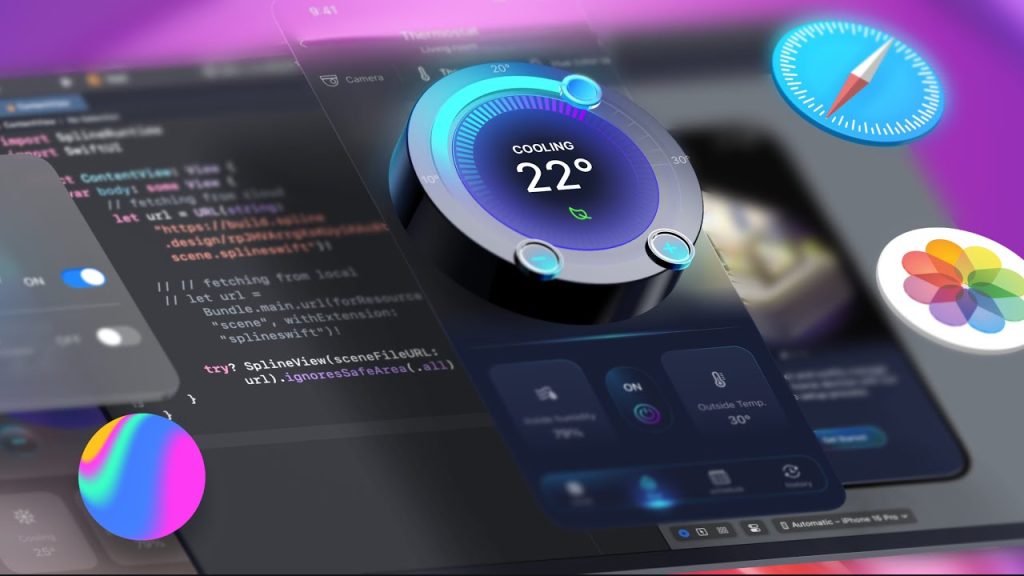
How Skeuomorphism Looks Different in 2025
The new wave of skeuomorphic design doesn’t look like 2010’s glossy chaos. Instead, it’s:
- Subtle and strategic: Using depth where it helps, not everywhere
- Softly layered: Light shadows, soft bevels, and blurred glass surfaces
- Material-inspired: Mimicking real-world materials like glass, fabric, or metal, but abstracted
- Motion-enhanced: Using parallax, springy transitions, and micro-interactions to suggest physicality
Some examples you’ll notice:
- Buttons that slightly “press in” when tapped, rather than just changing color
- Cards with faint raised shadows that suggest lift
- App icons that feel softly three-dimensional, but not cartoonish
- Sliders and toggles that behave like their real-world versions (not just swap colors)
This isn’t your old skeuo. It’s skeuo reimagined for a mature, modern UI landscape.
Apps and Systems Embracing Modern Skeuomorphism
Curious where you can spot this trend in the wild? Here are some examples already in use:
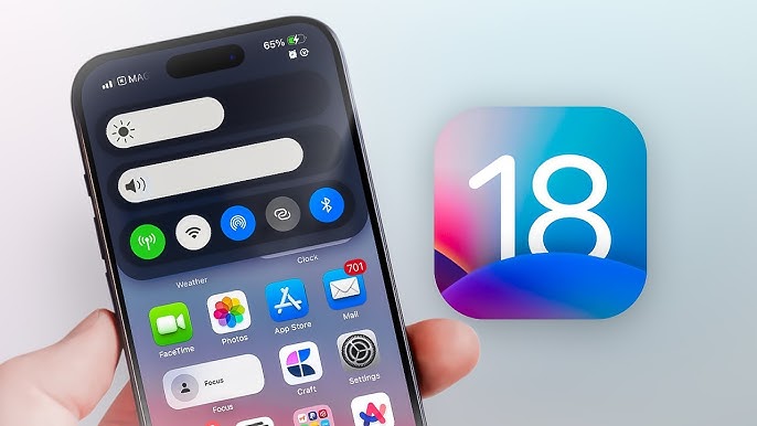
- iOS 18: Notice how widgets use soft depth, blurred layers, and motion parallax when you move your phone.
- Windows 12 Fluent Design: Subtle lighting effects and depth cues make the interface feel more tactile and polished.
- Samsung One UI 8: Their latest apps have slightly lifted cards, tactile button presses, and shadows that hint at layering without clutter.
- Productivity apps like Craft and Notion: Their updated UI styles use subtle skeuo elements like paper-like surfaces, shadowed cards, and physics-based scrolling.
It’s clear: across mobile, desktop, and web, the skeuomorphic comeback is happening quietly but powerfully.
The Psychology Behind Skeuomorphism’s Return
This shift isn’t just aesthetic—it’s psychological.
When users encounter interfaces with subtle physicality:
- They feel more confident exploring
- They experience less cognitive load because elements behave predictably
- They build muscle memory faster thanks to tactile cues
A 3D-ish button feels “pressable.” A slightly raised card feels “draggable.” Your brain doesn’t have to work hard to guess what’s interactive.
This emotional comfort matters even more as we spend more of our lives online—shopping, socializing, working, learning. UI that feels cold and clinical creates distance. UI that feels warm and physical builds trust and delight.
That’s why skeuomorphism’s return to UI design in 2025 feels like a smart evolution, not a regression.
Best Practices for Modern Skeuomorphism in UI Design
Thinking of sprinkling some skeuo into your next project? Here are the golden rules in 2025:
- Use depth purposefully, not everywhere. Depth should guide attention, not overwhelm.
- Focus on touchpoints: Buttons, toggles, cards, and switches are ideal places to add physicality.
- Stay subtle: If it looks like a novelty or theme park ride, you’ve gone too far.
- Respect accessibility: Ensure color contrast, focus states, and sizing aren’t compromised by fancy visuals.
- Pair realism with minimalism: Clean layouts + tactile elements = the best of both worlds.
Good skeuomorphic UI today feels intuitive first—and pretty second.
How Skeuomorphism Impacts Mobile, Desktop, and AR/VR Interfaces
It’s also interesting to see where skeuomorphism is growing fastest.
On mobile: It’s about tactile feedback—making small screens feel dynamic and alive without clutter.
On desktop: It’s about making multitasking easier—using depth and layers to hint at stacking, hierarchy, and grouping.
In AR/VR: It’s absolutely essential. A floating menu in VR needs depth cues, textures, and motion to feel real—or users get disoriented.
Across all these platforms, skeuomorphism’s comeback is helping bridge the gap between the digital and physical worlds.
Skeuomorphism’s Future: Where It’s Headed Beyond 2025
If the trend continues—and it will—expect to see:
- More dynamic lighting effects that simulate real environments
- AI-personalized textures (imagine an app background that subtly changes to match your mood)
- More 3D UI frameworks like Flutter’s Impeller Engine, WebGPU, and iOS SceneKit becoming mainstream
- Skeuo combined with generative AI: Think realistic, responsive UIs that adjust to user preferences in real time
Skeuomorphism isn’t a fad reborn—it’s a natural evolution of UI design as technology and human expectations converge.
And personally? We’re here for it.
FAQs
1. What is skeuomorphism in UI design?
Skeuomorphism is when digital interfaces mimic the appearance or behavior of real-world objects to make them feel intuitive.
2. Why is skeuomorphism returning in 2025?
Users crave more tactile, emotional, and intuitive digital experiences, and device capabilities now support rich visuals without sacrificing performance.
3. How is new skeuomorphism different from the old style?
Modern skeuo is subtle, strategic, and minimal—it uses depth and motion without overwhelming realism or kitschy textures.
4. Where is skeuomorphism most useful today?
Mobile apps, AR/VR environments, operating systems, and productivity tools are using skeuo to improve engagement and usability.
5. Is skeuomorphism good for accessibility?
When done carefully, yes—it can aid discoverability and interaction. But designers must ensure that added depth doesn’t hinder color contrast or keyboard navigation.
Leave a Reply