
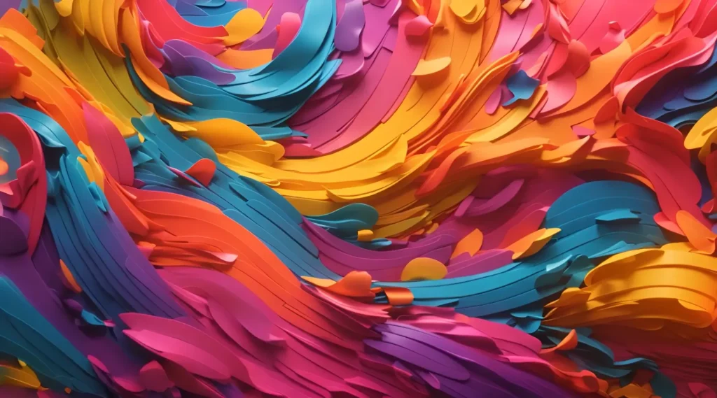
Color has always been a powerful tool in UI design. It sets mood, communicates hierarchy, grabs attention, and builds brand recognition. But in 2025, something interesting is happening: instead of bold, saturated color blocks, designers are embracing soft gradients and subtle color transitions to create calmer, more sophisticated experiences.
These aren’t your neon Instagram gradients from 2017, either. The new style is more refined—think whisper-light shifts between tones, delicate fades, and colors that move so smoothly you barely notice the transition until you feel it.
In this article, we’ll explore why soft gradients and subtle color transitions are dominating UI design right now, how they differ from the gradient crazes of the past, and how you can use them to make your next project feel fresh, elegant, and future-proof.
Let’s dive into how soft gradients and subtle color transitions are reshaping UI color trends in 2025.
Why Color Matters More Than Ever in UI
Before we get into the specifics of gradients, let’s zoom out for a second.
In a world where users expect faster, simpler, more intuitive digital experiences, color becomes one of the most immediate ways to communicate.
Good use of color can:
- Guide user focus
- Create emotional engagement
- Reinforce brand identity
- Build perceived quality and craftsmanship
- Reduce cognitive load by visually grouping related actions
But loud, chaotic colors can overwhelm users, especially when everyone is multitasking and screen-fatigued. That’s where soft gradients and subtle transitions come in—they create visual interest without visual aggression.
In 2025, good color design is about feeling, not shouting.
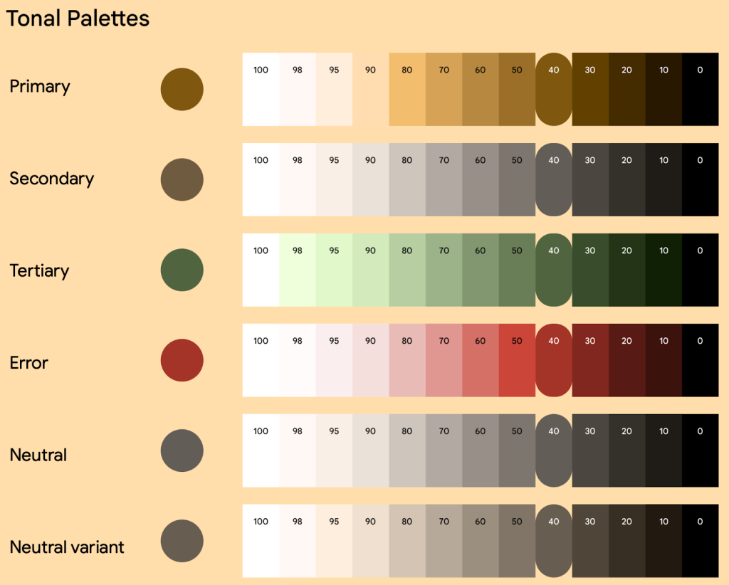
How Soft Gradients Differ from Old-School Gradients
You might be thinking, “Wait, weren’t gradients a thing already?”
Yes—but today’s gradients are fundamentally different from the ones we saw a few years ago.
Here’s how:
| Past Gradients | 2025 Gradients |
|---|---|
| High contrast, bright colors (pink to purple to blue) | Gentle, near-tonal shifts (dusty pink to soft peach) |
| Often used as backgrounds | Used as subtle fills for components |
| Flashy and attention-grabbing | Quiet and atmospheric |
| Hard stops and obvious color changes | Smooth, almost imperceptible transitions |
The goal now is not to wow users with color fireworks—it’s to create an environment. To make digital spaces feel calming, intelligent, trustworthy.
Where You’re Seeing Soft Gradients in UI Right Now
You’ll spot these new gradients in all kinds of interfaces today:
- Backgrounds: Instead of solid colors, light gradients add atmosphere without clutter.
- Buttons: Primary CTAs with soft vertical gradients feel more tactile and inviting.
- Cards: Slight background shifts to differentiate card content areas.
- Overlays and modals: Subtle fades between white and transparent backgrounds.
- Loading screens: Animated gradient shimmers instead of spinning icons.
Brands from fintech to wellness apps are using these techniques to build credibility, reduce visual fatigue, and make interfaces feel premium.
Examples of Brands Using Subtle Color Transitions
Here are just a few brands nailing the soft gradient trend:
- Apple (iOS 18): Their Control Center and Notification Center backgrounds now feature extremely light glassy gradients, enhancing depth.
- Canva: Their new workspace UI uses pastel transitions in toolbars and menu backgrounds.
- Headspace: Smooth sunrise-inspired gradient shifts on meditation screens create calmness.
- Monzo Bank: Updated mobile dashboards use ultra-subtle blue-to-purple backgrounds for financial summaries.
In all cases, color is doing work—but it’s doing it in a way that feels natural and sophisticated, not forced.
Why Users Love Soft Gradients
Let’s be real: users don’t sit around saying, “Wow, I love this gradient.”
But they feel it. And here’s why soft gradients resonate:
- Reduced eye strain compared to harsh contrast
- More natural transitions that mimic real-world lighting
- Subconscious mood enhancement (calm, trust, clarity)
- Perceived sophistication and design maturity
In other words, soft gradients and subtle color transitions in UI feel like an evolution toward more human digital experiences.
Best Practices for Using Soft Gradients in UI Design
Thinking of updating your color system? Here’s how to do soft gradients right:
- Stay tonal: Use colors close together on the color wheel (analogous colors) for a more natural shift.
- Avoid loud contrasts: The shift should be barely noticeable, not distracting.
- Use gradients as background noise: Let them support content, not compete with it.
- Keep motion minimal: If animating gradients, use slow, ambient transitions—not fast sweeps.
- Think about layering: Soft gradients + light shadows can add incredible depth without heaviness.
- Test across devices: Gradients can behave differently on OLED screens vs. standard LCDs.
Done well, your users shouldn’t even consciously notice the gradient—it should just feel right.
Common Mistakes to Avoid with Soft Gradients
Despite their subtlety, it’s easy to mess up soft gradients if you’re not careful.
Here’s what to watch out for:
- Color banding: Cheap gradients can show ugly color steps. Always use high-quality image exports or native CSS gradients.
- Over-saturation: Even soft gradients can feel heavy if colors are too strong.
- Bad layering: Gradients that clash with text legibility or UI elements create confusion.
- Over-animation: Motion in gradients should feel ambient, not distracting.
- Ignoring accessibility: Ensure text contrast still meets WCAG standards on gradient backgrounds.
Basically: use gradients to enhance, not to dominate.
How to Create Beautiful Soft Gradients in Practice
Some quick design tricks:
- Start with two very similar shades (e.g., light blue and slightly lighter blue).
- Set your gradient angle to something natural (like 90° or 120°), not harsh 0°/180° splits.
- Add a little noise texture (1-2%) over the top to prevent banding.
- Animate shifts across 10–15 seconds if doing background motion.
And always test in real-world lighting conditions—not just on your MacBook Pro under ideal conditions!
The Tools Leading the Gradient Revolution
Some tools making it easier than ever to create beautiful soft gradients:
- Figma: Powerful gradient stops, plus plugins like “Noise & Texture” for natural effects.
- CSS Gradients: Modern CSS3 syntax allows ultra-smooth browser-native gradients without heavy files.
- Haikei.app: Generative gradient backgrounds + subtle blob morphs for advanced visuals.
- Lottie + After Effects: For animated gradient transitions embedded as lightweight JSON.
You no longer need Photoshop wizardry to create gorgeous transitions.
Why Soft Gradients Are the Future of UI Color Design
In 2025 and beyond, users are craving digital spaces that feel:
- Calm, not chaotic
- Friendly, not sterile
- Alive, not mechanical
Soft gradients support that vision. They humanize interfaces, guide attention without yelling, and create emotional atmospheres without overwhelming visuals.
More than just a “trend,” soft gradients and subtle color transitions are becoming a language—one that speaks to users on a subconscious level.
And as AR, VR, foldables, and ambient computing environments rise, this need for gentle, immersive visual environments will only grow stronger.
If you want your designs to feel timeless, sophisticated, and user-centered in 2025, mastering the art of the subtle gradient is non-negotiable.
FAQs
1. What are soft gradients in UI design?
Soft gradients are gentle color transitions between similar tones, used to create depth and mood without harsh contrasts.
2. Why are soft gradients popular in 2025?
They reduce visual fatigue, feel more natural, and help build emotionally resonant interfaces.
3. Are animated gradients a good idea?
Yes, if done subtly—slow ambient motion works better than flashy shifts.
4. What tools are best for creating soft gradients?
Figma, CSS native gradients, Haikei.app, and lightweight Lottie animations are top choices.
5. How can I avoid bad gradient designs?
Stay tonal, avoid oversaturation, test contrast carefully, and use texture or slight noise to prevent banding.
Leave a Reply