Just like fashion, UI design has its fair share of “what were we thinking?” moments. Some trends looked amazing when they launched—but let’s be honest, not all of them aged gracefully. In fact, many UI design styles and techniques that once ruled the web are now gone and abandoned, replaced by smarter, faster, and more inclusive alternatives.
Whether you’ve been designing for years or just started, it’s helpful to know what’s out so you don’t accidentally bring back a relic that slows down your users, makes them cringe, or just doesn’t belong in 2025.
Let’s take a look at the top 10 UI trends that have officially left the building—and why we’re better off without them.
1. Splash Pages
Ah yes, the good old “Welcome to our website” screen.
For a long time, splash pages were seen as an opportunity to impress visitors with flashy animations or massive logos. But these days? They’re mostly dead weight.
Why it’s gone:
- They waste users’ time with an extra click
- Terrible for SEO and page speed
- Users just want to get to the content
In 2025, every second counts. Splash pages are one of the first things to go when we talk about UI design trends that are gone and abandoned.
2. Flash-Based Interfaces
If you’ve been in web design long enough, you probably remember Adobe Flash. Entire sites were built with it—and while they looked cool at the time, Flash is now buried for good.
Why it’s gone:
- Flash is no longer supported by browsers (officially dead since 2020)
- It wasn’t mobile-friendly
- It had major security issues
- It wasn’t accessible
Modern UI design embraces lightweight frameworks, animations powered by CSS and JavaScript, and responsive layouts that just work across devices.
3. Skeuomorphism (in its original form)
Back in the early 2010s, everything had to look like something from real life. Notepad apps looked like actual notebooks. Buttons looked like they had shadows and seams. It was… a lot.
Why it’s gone:
- It cluttered interfaces with unnecessary visual noise
- It made UIs feel dated and over-designed
- It didn’t scale well across devices and screen sizes
To be fair, a softer version of skeuomorphism is making a comeback (hello, neo-skeuomorphism), but that overly glossy, leather-stitched look? That’s gone for good.
4. Overused Carousels
At one point, every homepage had a carousel. It was the go-to solution when teams couldn’t decide what content to show—so they showed everything.
Why it’s gone:
- Users rarely click past the first slide
- They kill performance on mobile
- They’re inaccessible for screen readers
- They create decision fatigue
Nowadays, designers opt for focused hero sections, smart content prioritization, or interactive storytelling that doesn’t involve sliding distractions.
5. Auto-Playing Video Backgrounds with Sound
Remember visiting a site and suddenly hearing music or someone talking? Yeah, no thanks.
Why it’s gone:
- Users hate unexpected audio
- It interrupts browsing and feels aggressive
- It eats bandwidth—especially on mobile
- Accessibility nightmare
Auto-playing videos are still used (muted), but auto-play with sound is a giant red flag in today’s UI design world. If your site talks to users without permission, expect a quick bounce.
6. Scroll Jacks
Scroll jacking is when a website hijacks your scrolling behavior and forces you to scroll at its own pace. Sounds annoying? It was.
Why it’s gone:
- It breaks expected browser behavior
- It frustrates users, especially on mobile
- It creates accessibility issues
- It can conflict with assistive technology
Modern UI design values user control. We no longer force people to experience the site one scroll-chunk at a time. We trust them to explore at their own pace.
7. Infinite Spinners (Without Progress Info)
There was a time when loading spinners were everywhere—and they offered zero feedback. Just a circle. Spinning. Forever.
Why it’s gone:
- No idea if the page is broken or just slow
- Kills user trust
- Causes abandonment if users don’t know what’s happening
Today, smart UI includes loading indicators with clear feedback:
- “Loading results…”
- “Fetching new messages”
- Skeleton loaders that mimic real content layout
A simple fix that’s made a massive difference in UX.
8. Tiny Click Targets
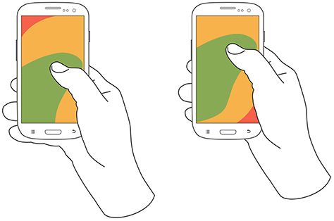
In the early mobile web days, some buttons were so small you needed surgeon hands to tap them. Menus, icons, dropdowns—they all shrunk in the name of minimalism.
Why it’s gone:
- Bad for accessibility
- Terrible on mobile
- Doesn’t meet modern UX tap-size standards (at least 44x44px recommended)
Today, tap targets are large, easy to hit, and provide clear visual feedback. Tiny tap zones? They belong in the past.
9. Full Flashy Loading Screens
Some designers once thought users would enjoy watching a 10-second loading animation. They’d design full-screen intros, complete with spinning logos or progress bars.
Why it’s gone:
- Users don’t want to wait unless they have to
- Feels like filler, not function
- Adds unnecessary steps between intent and action
Now, if something’s loading, we keep users informed, engaged, or even let them start interacting before it’s fully ready (progressive loading FTW).
10. Endless Modals and Pop-Ups
Remember when you’d visit a site and immediately get:
- A newsletter pop-up
- Then a cookies warning
- Then a chatbot in the corner
- Then a promo code modal?
That experience drove people insane.
Why it’s gone:
- Too much at once overwhelms users
- Slows down performance
- Often blocks core functionality
- Feels intrusive
The modern approach is more respectful. Designers now use timed, triggered, or contextual modals that feel part of the journey—not interruptions.
Why Knowing What’s Gone is Just as Important as What’s Trending
Sure, it’s fun to keep up with what’s hot in UI design—but knowing what to leave behind is just as valuable. When we stop using outdated patterns, we create:
- Better performance
- Better accessibility
- Less frustration
- More trust
The top 10 UI design trends that are gone and abandoned were retired for a reason. They failed to serve users well, or simply couldn’t keep up with modern web standards.
As a designer or developer in 2025, your job isn’t just to add cool features. It’s also to simplify, streamline, and unlearn old habits that no longer work.
FAQs
1. Are carousels completely dead in UI design?
Not completely, but they’re rarely effective. Most users don’t interact with them beyond the first slide.
2. What’s wrong with skeuomorphism?
Nothing—if done subtly. The old, overly realistic version just doesn’t work well on modern screens or responsive layouts.
3. Should I still use video in UI design?
Yes, but keep it muted and purposeful. Never autoplay with sound unless you want users to leave instantly.
4. Can I still use modals?
Of course—but be strategic. Use them sparingly, contextually, and never stack multiple ones.
5. Why is scroll jacking so hated?
It removes user control and creates a disorienting experience, especially on mobile or for users with accessibility needs.
Leave a Reply