In 2025, Microsoft is taking a refreshingly quiet but impactful step forward in UI design. Instead of flashy overhauls, it’s delivering a smoother, smarter, and more human-centric experience with its latest Fluent 2 sign-in redesign.
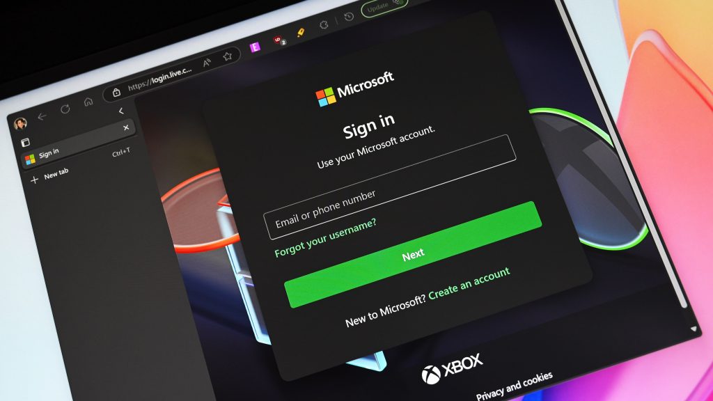
You may have already noticed it if you’ve signed into your Outlook account recently or opened your Xbox app. What used to be a fairly functional—but frankly dull—sign-in screen is now cleaner, more responsive, and more in tune with modern expectations around accessibility, security, and personalization.
So what exactly changed? And why is this such a big deal in the context of UI trends for 2025?
Let’s dive into what makes Microsoft’s Fluent 2 sign-in redesign a new era for UI simplicity and security, and why designers, developers, and digital product teams should take notes.
Why Microsoft Redesigned the Sign-In UI in 2025
Let’s start with the “why.” Microsoft didn’t need to update its sign-in screen. It worked. People signed in every day without much complaint. But that’s also what made it so ripe for improvement.
The old version was:
- Visually outdated
- Lacking theming options like dark mode
- Heavily reliant on passwords
- Designed with minimal accessibility accommodations
Microsoft’s new Fluent 2 update aims to fix all of that—not with wild reinvention, but with thoughtful improvement.
It reflects a broader shift in design thinking. We’re moving past novelty and aiming for harmony. The Fluent 2 design system is all about making digital interactions feel more personal, fluid, and secure—and this sign-in experience is a perfect example.
A Visual First Impression That Feels Modern
One of the first things you’ll notice in the new sign-in experience is how polished everything feels.
No more boxy layouts or overly bold branding. The new interface uses:
- Softer corners
- Better spacing between elements
- Clean typography
- Refined animations
It also responds beautifully to your device theme. If your system uses dark mode, the sign-in screen respects that automatically. That’s not just aesthetic—it’s a small nod of respect to users who value visual comfort.
Everything from the loading indicator to the “Forgot Password” link has been rethought. It feels subtle, but when you use it daily, those micro-upgrades add up fast.
And yes, this redesign is rolling out across Microsoft services—not just Windows, but Xbox, Outlook, and Teams too. That consistency is key to Fluent 2’s promise.
Fluent 2’s Design Philosophy in Action

Fluent 2 is Microsoft’s design language for the next generation of experiences. But what does that really mean?
In the context of the sign-in experience, it translates to:
- Using fewer visual distractions
- Allowing breathing room between elements
- Matching branding with function
- Letting content take the lead, not the container
Microsoft’s Fluent 2 sign-in redesign isn’t trying to impress with visuals. It’s trying to reduce friction.
For instance, input fields use micro-interactions to show focus states, buttons scale subtly on hover, and the whole flow is designed to reduce anxiety. That’s important—signing in is often the first (and sometimes most annoying) barrier between you and your productivity.
When a screen feels thoughtful, you feel respected. That’s the Fluent 2 way.
Security Meets Simplicity: The Passwordless Push
Let’s talk about passwords—and how Microsoft wants you to stop using them.
The new sign-in flow is built around passkey-first and passwordless authentication. That means:
- You can sign in with your device’s biometric system (fingerprint, face)
- You can approve a login with Microsoft Authenticator
- You don’t have to remember complex strings for every device
The UI has been restructured to prioritize these methods. Password entry isn’t gone—but it’s no longer front and center. It’s now a fallback, not the default.
This makes the sign-in process:
- Faster
- Less error-prone
- More secure
And it aligns with current trends across Google, Apple, and enterprise systems worldwide.
The interface also offers just enough context to keep users informed without being overwhelming. For example, it tells you when a passkey is being used or confirms your device was recognized. No pop-ups, no extra steps—just clarity.
Microsoft’s Fluent 2 Sign-In Redesign on Gaming Platforms
Where this UI update shines even more is on Xbox and gaming-related apps.
Gaming platforms tend to need flexible, fast login experiences that also feel familiar. Microsoft delivered by adapting Fluent 2 to the gaming ecosystem without sacrificing identity.
What’s different in the Xbox version of the redesign?
- Larger tap targets for controller input
- Brighter contrast to work well on TVs
- Brand-aligned theming (using Xbox green and typography)
- More obvious multi-user switching
And crucially—it’s just as secure. Passwordless sign-in is supported here too. No more fiddling with passwords on an on-screen keyboard. That alone is a huge UX win.
Accessibility Is No Longer Optional
The Fluent 2 redesign doesn’t just look better—it works better for more people.
Here’s what the new sign-in UI includes for accessibility:
- High contrast mode support
- Larger default touch zones
- Improved tab navigation and screen reader support
- Text scaling based on system preferences
- Reduced motion options
Microsoft has been slowly improving in this area over the years, but this is the first time their sign-in screen has really felt accessibility-first.
This is a big deal. For many users with disabilities, authentication flows can be a barrier. That’s no longer acceptable in 2025.
With this redesign, Microsoft is quietly saying: “We see you, and we’ve thought of you.”
The Future of Enterprise Authentication
So far, most of the rollout has focused on consumer accounts. But Microsoft has hinted that the Fluent 2 experience will eventually extend to business accounts as well—through Azure AD and Microsoft Entra.
If you’ve ever had to log into your work email and juggle security keys, passwords, and 2FA codes… you know how messy it gets.
Expect the same principles of this redesign—cleaner flows, more passkey support, and intuitive layout—to be applied in enterprise environments soon. That could revolutionize the often bloated and overly complicated world of enterprise sign-ins.
Why Microsoft’s Fluent 2 Sign-In Redesign Matters for Designers
Even if you’re not a Microsoft user, this redesign should matter to you as a designer.
It shows a shift in priorities:
- Reducing visual clutter
- Designing for trust
- Elevating accessibility
- Making “default” experiences better
Login flows are everywhere—in SaaS apps, mobile games, banking dashboards. If users have to interact with it daily, it should feel calm, not stressful.
Microsoft is raising the bar. And they’re doing it in a way that’s not screaming for attention—just delivering a smoother path from login to value.
And that’s why Microsoft’s Fluent 2 sign-in redesign is a new era for UI simplicity and security. It represents a new kind of “minimal,” one rooted in intention and empathy—not just aesthetic trends.
FAQs
1. What is Fluent 2?
Fluent 2 is Microsoft’s latest design system focusing on clarity, fluid motion, accessibility, and adaptability across devices.
2. Can I still use passwords with the new sign-in?
Yes, but Microsoft encourages passwordless options like biometrics and passkeys for faster, more secure access.
3. Does the new design support dark mode?
Absolutely—it respects your system theme and provides a fully functional dark version of the UI.
4. Is the new sign-in experience available on Xbox?
Yes, Xbox and other Microsoft apps like Teams and Outlook are getting the Fluent 2 sign-in flow.
5. Will this affect enterprise users?
Not immediately, but Microsoft plans to expand Fluent 2’s principles into work and school accounts soon.
Leave a Reply