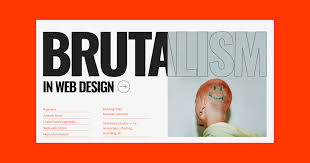
You’ve probably seen them—websites that look a little raw, kind of awkward, and totally unpolished. We’re talking clashing fonts, massive buttons, weird spacing, and a vibe that screams “I do what I want.” That’s not a design accident. It’s brutalism in web design, and yep, it’s a real thing.
Globally, brutalist design is making waves, but in Australia, it’s showing up in a uniquely bold way. From Melbourne startups to Sydney’s underground art collectives, brutalist websites are starting to pop up with a vibe that’s unapologetically different.
So… is brutalism in Australian web design here to stay, or is it just a weird little rebellion against overly polished templates?
In this article, we’ll break down what brutalist design is all about, explore how Aussie designers are making it their own, and take a look at whether this trend has staying power—or if it’s just an artistic detour.
What is Brutalist Web Design, Anyway?
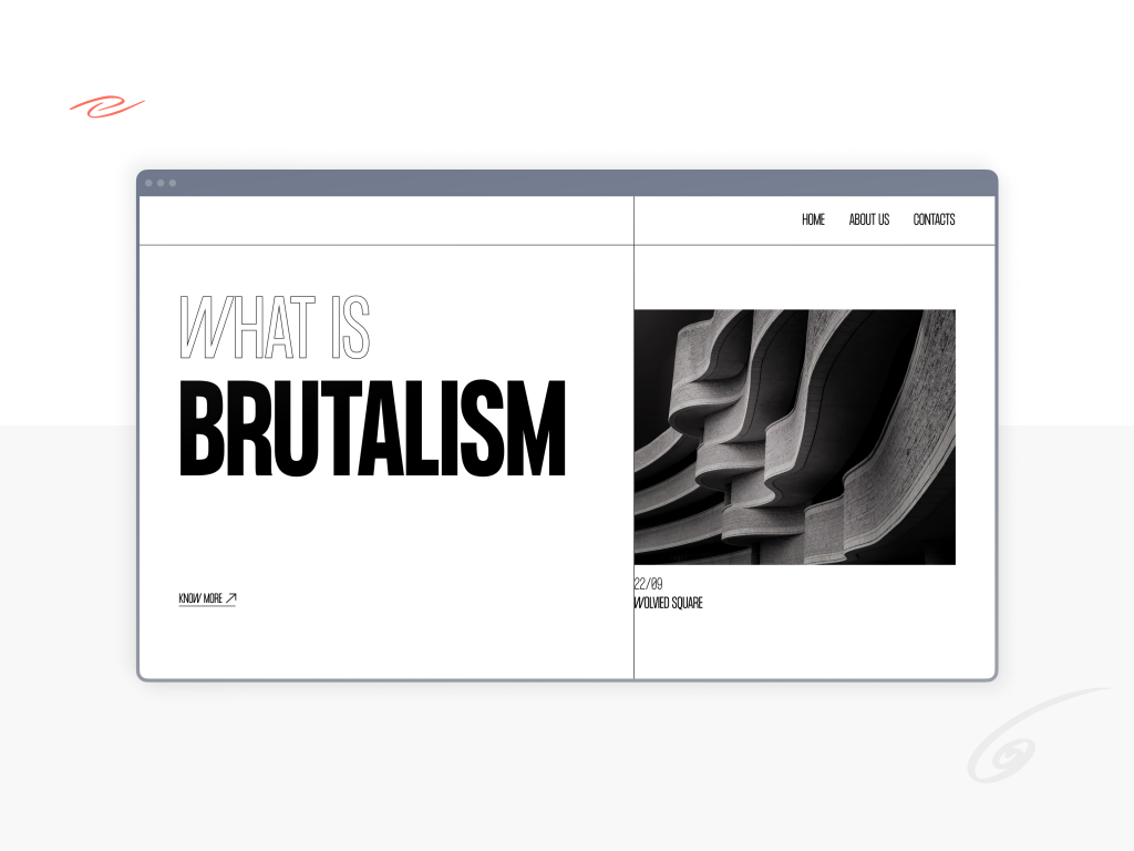
Brutalism comes from the French term “béton brut,” which means raw concrete. In architecture, it refers to buildings that look blocky, heavy, and unapologetically industrial—think exposed concrete, raw textures, no-nonsense functionality.
Now take that same ethos and drop it into a website.
A brutalist website might have:
- Jarring typography
- Intentionally basic HTML
- Clashing colors
- Pixelated images
- No real grid or layout system
- Buttons that feel too big or way too small
It’s like the designer said, “Who cares about best practices? Let’s just get weird.”
But here’s the twist: underneath that chaos, there’s often very deliberate intent. Brutalism strips away the fluff to focus on function—or, sometimes, just to make you feel something.
Why Australian Designers Are Embracing the Brutalist Vibe
Let’s face it—Australia has always had a bit of a rebellious streak. We’ve got a creative scene that doesn’t like being boxed in, and the same goes for our web designers.
Brutalism in Australian web design is growing because:
- It cuts through the noise. In a sea of perfect Squarespace clones, brutalist websites stand out.
- It feels honest. There’s no fluff or fancy polish—just raw ideas and bold visuals.
- It aligns with underground culture. Artists, musicians, and indie publications love it.
- It challenges the rules. And Aussie creatives love a bit of rule-breaking.
In places like Melbourne’s inner north or Sydney’s Inner West, you’ll find design agencies and artists leaning into brutalism as a way to carve out digital space that doesn’t feel corporate.
The Aesthetic of Rebellion: What Brutalist Sites Look Like in Australia
So what does an Aussie brutalist website actually look like?
Let’s check out a few real-world vibes:
- Felt Zine-inspired layouts: Glitchy, interactive, and a bit off-kilter. Often found in online galleries or art collectives.
- Text-heavy homepages: Huge H1s, overlapping paragraphs, and scroll-breaking visuals. A favorite among zines and activist sites.
- Hyper-minimal black-and-white layouts: It feels broken on purpose, but it’s totally clickable. You’ll see these on underground fashion brands or DJ collectives.
- No navigation bars. Or if they exist, they’re shoved in a corner, upside-down, or just hover awkwardly.
In other words: it’s digital design that feels physical—heavy, clunky, tactile, and bold. And weirdly enough, when you see it done right, it can be kind of… beautiful?
User Engagement: Does Brutalism Actually Work?
Here’s the million-dollar question: if these sites are so weird, do people even stick around?
The answer? Sometimes—when it makes sense for the brand.
Let’s break it down:
Pros for user engagement:
- High memorability: You won’t forget a brutalist site, even if you don’t love it.
- Strong brand identity: Perfect for artists, musicians, or fashion brands who want to stand out.
- Loyal niche audiences: Brutalism often resonates with communities that value originality over polish.
Cons:
- Confusing UX: Some brutalist sites can be hard to navigate.
- Bad for mainstream audiences: If your grandma can’t figure out where the menu is, that’s probably a problem.
- Not great for accessibility: A lot of brutalist layouts ignore WCAG standards, so designers need to be careful.
But here’s where Australian web designers are getting clever—they’re mixing brutalist aesthetics with modern usability. It’s like a soft-core brutalism: messy-looking, but secretly structured under the hood.
You get the aesthetic shock, but the buttons still work. And that’s where user engagement doesn’t suffer—it thrives.
How Aussie Designers Are Making Brutalism Their Own
Brutalism in Australia isn’t just a copy-paste of global trends. Designers here are infusing it with local flavor.
Some key features of the Australian brutalist web style:
- Laid-back tone of voice: Raw visuals paired with casual Aussie language = approachable rebellion.
- Environmental edge: A lot of local sites use brutalist styles to push sustainability or anti-corporate messages.
- Cultural mashups: You’ll find brutalism mixed with First Nations artwork, street photography, or archival scans.
- Mobile-first weirdness: Brutalist mobile UIs that flip, scroll sideways, or break every convention—but still load lightning fast.
In Melbourne especially, we’re seeing this in the portfolios of digital artists, music producers, zine publishers, and niche agencies. And in Sydney, it’s being used in underground media collectives and experimental tech start-ups.
Is Brutalism a Smart Move for Your Website?
So should your site jump on the brutalism train? It depends.
Brutalism works best for:
- Creative industries (music, art, fashion, media)
- Portfolios where personality is everything
- Youth-focused brands that want to appear raw and real
- Events or pop-ups with a short shelf life and big attitude
But it’s probably not ideal for:
- Government websites (please, no)
- Health services (clarity and accessibility matter most)
- Financial institutions (trust = predictability)
- Corporate clients (unless they’re super brave)
Basically, brutalism is like chilli sauce. A little can add flavor. Too much can burn the whole thing down.
Melbourne and Sydney agencies are using it carefully—sometimes as a section of a site, or in micro-interactions, rather than making the whole platform brutalist. And that balance is where it really shines.
Tools and Frameworks to Try It Yourself
Wanna try a bit of brutalist flair in your next build? Here’s what some Australian designers are using:
- Hand-coded HTML/CSS (yep, old-school is back)
- No-framework landing pages—just raw, fast, and weird
- Astro and Eleventy for minimal JavaScript and fast performance
- Tailwind CSS—ironically useful for structured chaos
- SVG filters and variable fonts to mess things up visually
You don’t need to go full brutalist. Start by breaking the grid, removing animations, or designing in grayscale. Then push it further, depending on your audience.
FAQs
1. What is brutalist web design?
A raw, bold design style that embraces minimalism, weird layouts, and anti-aesthetic visuals.
2. Why is brutalism trending in Australia?
Aussie designers love rebellion, and brutalism lets them break away from polished, generic design.
3. Is brutalist web design bad for accessibility?
It can be—but smart designers use structure underneath the chaos to stay accessible.
4. Who should use brutalist design?
Creative industries, niche brands, and artists. Not great for banks or hospitals.
5. Is brutalism just a trend?
It may evolve, but the desire to stand out with bold digital design is definitely here to stay.
Leave a Reply